
C# WPF Master-Detail View Navigation: A Data-Driven Approach
2.82/5 (3 votes)
Master-detail view navigation using manageable data-driven and code-behind techniques
Introduction
Let's say you want to group some top level nodes on the left side of a window. Each top level node can have child items. You also want to just show one and only one top level node and its children at a time, usually when you click the node. When you select an item (Master) under the node, the item's view (Detail) will display on the right side of the window.
If we have an app about programming technologies, navigation on the left side of the window could be something like this:
C# .NET
C# / .NET Books
Blogs
.NET Tools
WPF XAML
WPF / XAML Books
XAML Tools
You may be wondering why I bother to write this article since the above navigation structure can be implemented by either a tree view or a list view with group headers.
The first reason is that I want to show how to use expandable / collapsible node panels using animation with a storyboard for a dynamic UI look and feel.
The other reason is the whole navigation structure is done code-behind (without XAML) so that new nodes can be added in a data-driven fashion, which means manageable code.
Background
Animation with storyboards in WPF will not be covered in this article in detail. I use only the basics to animate height property of a node panel (containing the node and child items) to achieve the effect of expanding or collapsing a node.
Using the Code
When launched, the app looks like this:
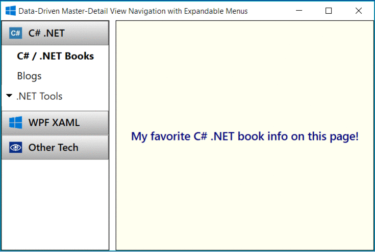
As shown, the expanded C# .NET is one panel with 3 items. C # / .NET Books item is currently selected.
private StackPanel BuildNodePanel(string nodeName, string nodeHeader, string pngFileName,
                                    params NodeAction[] nodeActions)
{
    var nodePanel = new StackPanel
    {
        Name = nodeName,
        Height = _NodePanelDefaultHeight
    };
    Button headerButton = BuildNodeHeader(nodeHeader, pngFileName);
    nodePanel.Children.Add(headerButton);

    foreach (var nodeAction in nodeActions)
    {
        BuildNodeLabel(nodePanel, nodeAction);
    }

    return nodePanel;
}
private void BuildNodeLabel(StackPanel nodePanel, NodeAction nodeAction)
{
    var label = new Label
    {
        Name = nodeAction.ToString(),
        Content = GetNodeActionDescription(nodeAction),
    };
    label.MouseLeftButtonDown += NodeItemLabelMouseLeftButtonDown;
    nodePanel.Children.Add(label);
}
BuildNodePanel() builds a panel and any number of actions nodes under it. nodeName is a kind of ID. nodeHeader is for display such as "C# .NET". BuildNodeLable() builds a label such as "C# / .NET Books". NodeItemLabelMouseLeftButtonDown is an event handler for activating a detail view on the right side of the window.
Now the important part of the navigation is to build animation with a storyboard for each selected node panel.
private Storyboard BuildStoryboard(StackPanel navMainPanel, StackPanel selectedNodePanel)
{
    var storyboard = new Storyboard();
    foreach (var nodePanel in navMainPanel.Children.OfType<StackPanel>())
    {
        double panelHeight = (nodePanel == selectedNodePanel) ?
                                nodePanel.Children.Count * _NodePanelDefaultHeight :
                                _NodePanelDefaultHeight;
        var doubleAnimation = new DoubleAnimation(panelHeight,
                                                    new Duration(TimeSpan.FromMilliseconds(500)))
        {
            AccelerationRatio = 0.6,
            DecelerationRatio = 0.4
        };

        Storyboard.SetTarget(doubleAnimation, nodePanel);
        Storyboard.SetTargetProperty(doubleAnimation,
                                       new PropertyPath(FrameworkElement.HeightProperty));
        storyboard.Children.Add(doubleAnimation);
    }
    return storyboard;
}
Notice the logic for panelHeight. For selectedNodePanel, its height will expand with doubleAnimation (i.e., show the panel and child items). For a non-selected panel, only the panel header will show, hence the height of _NodePanelDefaultHeight. All of doubleAnimation are added to the storyboard.Children. When the storyboard runs, it will achieve the effect of expanding the selected panel while collapsing all other panels.
The event trigger for a storyboard to run looks like this:
Storyboard storyboard = BuildStoryboard(navMainPanel, nodePanel);
var eventTrigger = new EventTrigger { RoutedEvent = UIElement.MouseLeftButtonDownEvent };
eventTrigger.Actions.Add(new BeginStoryboard { Storyboard = storyboard });
nodePanel.Triggers.Add(eventTrigger);
With the support of programmatically created storyboards, it is easy to build dynamic panels and child items. All you have to do is to define a bunch of NodeActions (I call this 'data-driven').
public enum NodeAction
{
    [Description("C# / .NET Books")]
    CsdnBooks,

    [Description(".NET Tools")]
    CsdnTool,
    ....
}
That's all! It is now a good time to download the source code to take a look.
Points of Interest
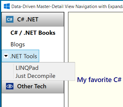
Did you notice the down-arrow next to the .NET Tools item in the screenshot above? It is for popup menu support. The navigation logic remains the same. Please see source code for details on this bonus feature.
History
- 7/5/2018: Updated