
Create a WPF Custom Control, Part 2
4.90/5 (39 votes)
How to create a WPF custom control, using Expression Blend and Visual Studio
Introduction
In Part 1 of this article, we created a control template for an Outlook 2010 task button in Expression Blend. It looked nice, but it wasn't terribly useful. For one thing, all of the colors were hard-coded into the template, which seriously limits the template's flexibility. For another thing, the image and text used by the template were hard-coded as well, which means that the template would have to be copied into each button on which it was used.
In this part of the article, we are going to wrap the control template in a custom control, which will eliminate the hard-coding that we used in Part 1. The result will be a flexible, general purpose task button that we can add to a project and use pretty much like any other button.
Changes from Version 1.0.0
The current version of the demo project is Version 1.0.1. This version corrects an error spotted by reader freefeb in the <Image> declaration in Generic.xaml. Images should now display correctly in task buttons.
Step Four: Create a Value Converter
Before we get to the custom control itself, we have one more bit of housekeeping to do. The color values for our button are all shades of a base color. In Part 1, we grabbed various shades of blue from Outlook 2010, using the Expression Blend Eyedropper tool. Later in this part, we are going to bind these values to the Background property of our button. To do that, we are going to need to specify different shades of the background color. And, that task will require the use of an IValueConverter object.
We won't go into a whole lot of detail about IValueConverter here. If you aren't familiar with the interface, take another detour and learn the basics. We will assume you have a general understanding of IValueConverter from this point on.
Our value converter will take a parameter, namely, the percentage of the base color that we want to return from the converter. The converter takes a SolidColorBrush (passed in as a hex value from XAML) as its value, and converts the brush color to an HLS value. Then, it adjusts the luminance of the HLS value to make it lighter or darker, using a percentage passed in to the converter as the 'parameter' argument. The adjustment is done as a percentage of the base color's luminance. For example, if the base color has a luminance of 80%, and we pass in 85% as the adjustment factor (via the 'parameter' argument), then the HSL color's luminance will be adjusted to 68% (85% of 80%).
As a quick side note, there are two models for performing color adjustments, HLS and HSB. I prefer the HLS model, but many people prefer the HSB model. I have included conversion methods and IValueConverter classes for both models in my article, WPF Color Conversions, on CodeProject. So, if you prefer HSB, the IValueConverter in the demo project can easily be swapped out for the HSB converter from that article.
We will set the IValueConverter aside for now - we will use it later when we assemble the custom control. For now, let's turn our attention to creating the control itself.
Step 5: Create the Custom Control
At last, we have arrived at the point in our journey where we actually create the custom control. It feels like we have been hiking through the Grand Canyon for a couple of days, and we have finally reached the Colorado River. But before we create our custom control, let's look at the difference between user controls and custom controls.
Custom Controls vs. User Controls
A custom control is no more than a class that wraps a control template. Custom controls can be a bit confusing, because WPF does not give you a design surface to work with. That is one of the big differences between user controls and custom controls.
A user control is really a fragment of a view. Like a window, a user control has a surface onto which other controls can be dropped. The developer drops controls onto the design surface to compose the view that the user control will represent. For this reason, user controls are sometimes referred to as 'composite controls'.
An iconic example of a user control is a color picker. A color picker is made up of several controls, including sliders for RGB values, a Rectangle to preview the selected color, and buttons to submit or cancel the selection. User controls often use the Model-View-ViewModel pattern to communicate with the rest of the application. The properties of their constituent controls are bound directly to the view model, rather than to custom properties of the controls themselves.
A custom control is a very different creature. A custom control is not a composite of constituent controls. Instead, it is often derived from a single control. For example, we will derive our custom control from the RadioButton class. That approach allows us to inherit the behavior of a RadioButton (we specifically want to use the IsChecked property) and add our own custom properties to the control (we will be adding ImagePath and Text properties).
The Structure of Custom Controls
As we noted above, custom controls do not provide a design surface, as do user controls. Instead, custom controls rely on a bit of a gimmick. WPF contains built-in support for themes. Any control template in a resource dictionary named Generic.xaml, located in a root-level folder named Themes, will be considered part of the default theme for an application. WPF uses this mechanism to provide the resource dictionary for our custom control's template.
So, our custom control will consist of two elements:
- A class that will contain the code for our custom control; and
- A Themes/Generic.xaml resource dictionary that will contain its control template.
We created the control template in Part 1. Now, it is time to assemble the custom control itself.
Create the Custom Control
In Visual Studio 2008, create a new WPF Custom Control Library called Outlook2010TaskButton. Visual Studio will create a solution with the following structure:
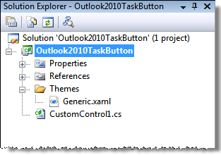
As you can see, Visual Studio has created a class for our custom control (currently named CustomControl1.cs), and a Themes subfolder which contains a Generic.xaml resource dictionary. We will start by filling out the custom control class.
Create the Class
We begin by renaming CustomControl1.cs to TaskButton.cs. We know that we will need two custom properties:
Image: This property will take anImageSourceobject that represents the image we want to display on the button.Text: This property will take the text we want to display on the button.
Why not simply use a ContentPresenter instead of custom properties, and let the templated button decide what content to present? As we noted in Part 1, we are creating a special purpose button - one that emulates an Outlook task button. We lock the content in the control template so that we can enforce our standards for this type of button.
Add Dependency Properties
We will need to add the two custom properties we will need as dependency properties. We won't go into a long explanation of dependency properties here - take another detour if you aren't familiar with them. Suffice it to say that custom control properties have to be set up as dependency properties.
Dependency properties look strange to those of us who are used to plain old .NET properties, but they aren't really that different. They simply follow slightly different conventions:
- Dependency properties are backed by
staticvariables that are given the name of the property, with the word 'Property' appended. So, the backing variable for theImagePathproperty isImagePathProperty. - The getters and setters for a dependency property can only call the
GetValue()andSetValue()methods, and they can only pass the backing variable for the property. Any other code that might be put in a getter or a setter is handled through a system of callbacks. - The backing variables have to be registered with WPF before they can be used. The initialization can be performed when the variable is declared, or in the class constructor. I use the latter method.
For our task button, all the custom control class has to do is implement the two dependency properties we need. So, it looks like this:
using System.Windows.Controls

namespace Outlook2010TaskButton
{
    /// <summary>
    /// An Outlook 2010 Task Button
    /// </summary>
    public class TaskButton : RadioButton
    {
        #region Fields

        // Dependency property backing variables
        public static readonly DependencyProperty ImageProperty;
        public static readonly DependencyProperty TextProperty;

        #endregion

        #region Constructor

        /// <summary>
        /// Default constructor.
        /// </summary>
        static TaskButton()
        {
             // Initialize as lookless control
             DefaultStyleKeyProperty.OverrideMetadata(typeof(TaskButton),
               new FrameworkPropertyMetadata(typeof(TaskButton)));

            // Initialize dependency properties
            ImageProperty = DependencyProperty.Register("Image",
               typeof(ImageSource), typeof(TaskButton), new UIPropertyMetadata(null));
            TextProperty = DependencyProperty.Register("Text", typeof(string),
               typeof(TaskButton), new UIPropertyMetadata(null));
        }

        #endregion

        #region Custom Control Properties

        /// <summary>
        /// The image displayed by the button.
        /// </summary>
        /// <remarks>The image is specified in XAML as an absolute or relative path.
        /// </remarks>
        [Description("The image displayed by the button"), Category("Common Properties")]
        public ImageSource Image
        {
             get { return (ImageSource)GetValue(ImageProperty); }
             set { SetValue(ImageProperty, value); }
         }

        /// <summary>
        /// The text displayed by the button.
        /// </summary>
        [Description("The text displayed by the button."), Category("Common Properties")]
        public string Text
        {
             get { return (string)GetValue(TextProperty); }
             set { SetValue(TextProperty, value); }
        }

        #endregion
    }
}
Notice that the ImageProperty has a type of ImageSource, even though we pass it a relative path in XAML. WPF has a built-in ImageSourceConverter that loads the image from the relative path passed in and hands the image to the Image property. In the original version of this article, I used an ImagePath property, which took the relative path passed in from XAML. That turned out to be the wrong approach, and WPF was not always able to resolve the relative path to the button image. Changing the ImagePath property (a String type) to an Image property (of type ImageSource) resolved the problem.
Notice also that we an apply standard .NET property attributes to our custom control properties. For example, the Category attribute specifies the property category in which the property should appear in Expression Blend and Visual Studio, and the Description attribute specifies the text description that will appear for the property in Visual Studio.
Add the Control Template
When we created our custom control project, Visual Studio created a simple control template for our task button:
<ControlTemplate TargetType="{x:Type local:TaskButton}">
    <Border Background="{TemplateBinding Background}"
        BorderBrush="{TemplateBinding BorderBrush}"
        BorderThickness="{TemplateBinding BorderThickness}">
    </Border>
</ControlTemplate>
We are going to replace it with the control template we created in Part 1, but before we do that, notice the TemplateBinding objects in the default template. A TemplateBinding binds a property in a control template to a property of the templated control. When we create an instance of our task button and set its Background, BorderBrush, and BorderThickness properties, the TemplateBinding objects will pull these values into the control template. We will use this technique in our control template after we copy it in.
For now, we simply replace the default control template with the template from Part 1. First, we delete the default template, leaving the outer <ControlTemplate> element. Then, we copy the control template from Part 1, omitting its outer <ControlTemplate> element, and paste it into the outer <ControlTemplate> element of the default template.
Regular Bindings vs. TemplateBindings
As we will see a bit later, there are some quirks associated with property bindings. In some instances, you have to use regular Binding objects. A notable example is when you need to use one of WPF's built-in value converters, such as the converter that returns an ImageSource object from an image path. TemplateBinding objects don't have access to these converters, so as we will see below, we have to use a regular Binding object to get the image specified by the task button's ImagePath property.
In other cases, a regular Binding object won't work. For example, I learned during the course of this project that a regular Binding object won't work inside a control template if the binding relies on a custom value converter, such as the HlsValueConverter we use for the task button. If a regular Binding object is used, the value converter does not get called. So, you have to use a TemplateBinding object.
In other cases, you can use either a regular Binding object or a TemplateBinding object. I recommend always starting with a TemplateBinding object. If that doesn't work, try changing the property binding to a regular Binding object and see if that change resolves the problem.
Set the Path to the Button Image
If you are actually performing these steps as we go along, the first thing you probably noticed after you pasted the control template is an exception that reads: The file calendar.png is not part of the project or its 'Build Action' property is not set to 'Resource'. Remember that in our control template, we hard-coded the image path in Part 1 - now, we need to change the hard-coded path to a property binding.
You can find the button's content markup around line 115 of Generic.xaml. Here is what the image path looks like before we modify it:
<Image Source="calendar.png" ... />
And, here is what it looks like after we modify it:
<Image Source="{Binding Path=ImagePath,
    RelativeSource={RelativeSource TemplatedParent}}" ... />
The important change is to the Source property. Rather than hard-coding the source, we have bound it to the ImagePath property of the custom control.
There are a couple of points to note with respect to this binding:
- We have used a
Bindingobject, rather than aTemplateBinding. That's because WPF needs to resolve the image path passed in to anImageSourceobject. TheTemplateBindingobject can't do that, since it doesn't have access to WPF's built-in value converters. - We added a
RelativeSourceobject to the binding. That's because we need to resolve the image path from the location of the task button we instantiate on a design surface, such as a WPF window. Without theRelativeSource, WPF would try to resolve the image path from the location of the control template.
The TemplatedParent value to which we set the RelativeSource object is actually part of a RelativeSourceMode enum, which lists the various modes a RelativeSource can assume. We will see another use for a System.Windows.Data.RelativeSource object later, when we set the Background property of our task button.
Set the Button Text
Our control template still hard-codes the button text:
<TextBlock Text="Calendar" ... />
We want to replace the hard-coded Calendar with a binding to the custom control's Text property. And, in this case, it's pretty simple:
<TextBlock Text="{TemplateBinding Text}" ... />
We can use a TemplateBinding object to do the binding, because we do not need access to built-in value converters or other features that require a full Binding object. And, we don't need a RelativeSource object, since we don't need to resolve anything relative to the location of an instance of our control. So, a simple TemplateBinding, of the sort we saw in the default template that Visual Studio created for us, does nicely.
Create a Demo Project
At this point, we have a functioning task button. Let's see how it looks:
- In Visual Studio 2008, add a WPF Application project to your solution, and call it TaskButtonDemo.
- Add an image file to the demo project; the image should be 24 x 24 pixels. The demo project uses calendar.png, the image file from Part 1.
- Next, add a reference to the custom control project to the demo project.
- Compile the solution, and add a
<TaskButton>to Window1.xaml.
To add the task button, you will need to add an XML namespace declaration to the custom control assembly. Window1.xaml should now look like this:
<Window x:Class="TaskButtonDemo.Window1"
    xmlns="http://schemas.microsoft.com/winfx/2006/xaml/presentation"
    xmlns:x="http://schemas.microsoft.com/winfx/2006/xaml"
    xmlns:custom="clr-namespace:Outlook2010TaskButton;assembly=Outlook2010TaskButton"
    Title="Window1" Height="300" Width="300">
    <Grid>
        <custom:TaskButton ImagePath="calendar.png" Text="Calendar" />
    </Grid>
</Window>
Compile the application and run it. You should see a window that looks like this:
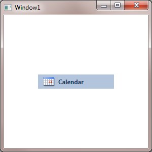
There is a quirk related to how the control is set up. Since both the background and text colors are bound to the Background property of the control, text will not appear on the control until its Background property is set; nor will the State effects. Once the Background property is set, all should appear.
Add the Value Converter
The only shortcoming of our button is that it is still hard-coded to shades of blue. Before we refactor the XAML to data-bind the control's color properties, we will need to add an IValueConverter to perform color adjustments. We will add the file HlsValueConverter.cs from the WPF Color Conversions article discussed above.
We will need to add the converter to the control template, as well. It goes in the <ControlTemplate.Resources> section, and it looks like this:
<local:HlsValueConverter x:Key="ColorConverter" />
Now, we are ready to use the value converter in the control template.
Data Bind Color Properties
We need to link the button's color properties to the color properties of the custom control. And, if we are going to emulate the Outlook 2010 task button, we will want to be very specific about how we do that binding:
- The button's background color should be the same as the host window's background. We can accomplish that result by creating a data binding in the instance of the control we create.
- The borders used in the various state effects should be shades of the background color. That way, when we change the background color of the button, the borders will change along with it.
Originally, I had planned to set up the control template bindings to automatically bind the button background to the host window background, all from within the control template. I ultimately decided that approach was a bit too restrictive, so the control template binds to the custom control's Background property. When a task button is instantiated in a WPF window (or a user control), the developer can bind the control's Background property to the window's Background property. That way, if the window color is changed, the change will flow through to any task buttons on the window automatically.
For now, set the Window1.Background property to #FFB2C5DD in the demo project, which will color the window to match the button.
Now, we begin the process of refactoring the hard-coded color values to data-bound colors. We will base everything on the custom control's Background property. Let's start with the BorderGrid layer, which consists of a background, an outer border, and an inner border. Here is what the markup looks like before we begin:
<Grid x:Name="BorderGrid" Margin="0" Background="#FFB2C5DD" Opacity="0">
    <Grid.Effect>
        <DropShadowEffect ShadowDepth="4" Opacity="0.1"/>
    </Grid.Effect>
    <Rectangle x:Name="OuterStroke"
       Stroke="#FF859EBF" Margin="0"/>
    <Rectangle x:Name="InnerStroke"
      Stroke="#FFD9E7F5" Margin="1" Opacity="1"/>
</Grid>
First, we will bind the Grid's Background to the custom control's Background:
<Grid x:Name="BorderGrid" Margin="0"
    Background="{TemplateBinding Background}" Opacity="0">
That one is pretty simple. Next, we set the outer border. This is a darker shade of the Background - let's try 80% of the background color:
<Rectangle x:Name="OuterStroke" Stroke="{TemplateBinding Background,
    Converter={StaticResource ColorConverter}, ConverterParameter='0.8'}"
    Margin="0"/>
As you can see, we have added the color converter to the binding, which will adjust the border color to a darker shade.
Next, let's set the inner border. This object is set the same way, except that it is a lighter shade of the background color. Let's try 120%:
<Rectangle x:Name="InnerStroke" Stroke="{TemplateBinding Background,
    Converter={StaticResource ColorConverter}, ConverterParameter='1.2'}"
    Margin="1" />
Note that we used TemplateBinding objects to perform the color bindings on these Rectangles. We are required to use TemplateBinding objects, because we make use of a value converter. If we use regular Binding objects, the value converter would never get called, and the outer and inner border would not appear in the MouseOver or Selected states.
Set the Background Property
We now have the MouseOver state data bound, rather than hard-coded. To see how it looks, let's switch back to Window1.xaml in the demo project. We created a task button there earlier; now, we need to bind the task button's Background property to the same property for the window:
<custom:TaskButton ImagePath="calendar.png" Text="Calendar"
    Background="{Binding Path=Background,
    RelativeSource={RelativeSource FindAncestor,
    AncestorType={x:Type Window}}}" />
Once again, we use a RelativeSource object to bind the Background property. But this time, we use the RelativeSourceMode that searches up the WPF element tree to find a particular ancestor of the control being set. In this case, it is a Window object - the window that hosts the task button.
Note that all of the color property values are derivatives of the background color value. So, when we instantiate a TaskButton in a project, we need to only set its Background property, and all of the State effects are generated automatically.
Compile the solution and run it. When you move your mouse over the task button, it should light up in the usual manner. And, if you change the background color of Window1, the task button should change to the same color.
Completing the Control
There are other color properties in the control template that we need to refactor to property bindings. We won't go over those in detail here, since they are done the same way as the BorderGrid. You can examine Generic.xaml in the project in the attached solution to see the XAML for the control template.
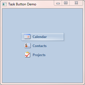
Once you have completed the control, add a couple more task buttons to Window1. When you select one of them, you will see any other selected button deselect, just like the task buttons in Outlook 2010. And, the beauty of the arrangement is that each task button can be implemented with a single line of markup.
Conclusion
That brings us to the conclusion of the project. It may seem like a lot of work just to create a templated button, but look at what it has accomplished: the button is simple to implement in a project, it has a consistent look and feel, and it has fairly sophisticated effects. Plus, working out how to create the button teaches a lot of WPF skills that I know I have avoided for far too long. I hope you found the journey as worthwhile as I did - all in all, it was a very worthwhile way to stay somewhat productive while enjoying my holiday time with family and friends.
As always, comments and corrections are welcome. And, your vote is always appreciated!
History
- 2010-01-06
- Changed
ImagePathproperty (of typeString) toImageproperty (of typeImageSource) - 2010-01-26
- Corrected typos in dependency properties code snippet
- Updated source code to correct errors in class
TaskButton - 2010-10-09
- Corrected an error in the source code provided with the article
- Added a paragraph at the beginning of the article explaining the update