WPF DataGrid Practical Examples
4.96/5 (251 votes)
This article provides a number of practical examples which demonstrate how to perform validation, styling, and DataSet integration with the new WPF DataGrid.
Contents
- Introduction
- Article Overview
- Installing the WPF Toolkit
- Binding to a DataSet
- Binding in a Layered Application
- Validation
- Styling
- Column Templates
- Styling the Validation Error Indicator
- Row Details
- Styling the Column Header
- Having Some Fun ...
- Summary
Introduction
A DataGrid is a user interface component for displaying tabular data to the user, typically providing sorting and editing functionality, among others. DataGrids have been the work-horse of various frameworks such as ASP.NET (GridView) and Windows Forms (DataGridView). However, DataGrids in WPF are rather conspicuous in their absence!
Fortunately, the absence of this control has not hampered the popularity of WPF. The versatility of the ListView control allows very flexible read-only DataGrid functionality. Also, the lack of a DataGrid within the WPF APIs was an excellent opportunity for third party component providers; see Michael Sync's blog for a roundup of the five leading third party WPF DataGrids.
Eventually, in August 2008, Microsoft released its DataGrid CTP (Community Technology Preview - a public beta) to CodePlex to coincide with the release of the .NET Framework 3.5 SP1 and Visual Studio 2008 SP1. The .NET Service Packs provided additional WPF functions including IEditableCollectionView, BindingGroup, and alternating row styles which are all used within the WPF DataGrid. Another small yet very highly welcome feature of SP1 is the Binding.StringFormat which provides a simple mechanism for formatting bound data, as described in this blog post.
More recently, on October 22 2008, DataGrid v1 was released. This is the last update that we will see of the DataGrid before .NET 4.0 is released, and includes new features such as row validation, row details, and design-time support.
Article Overview
Currently, there is a lack of documentation and examples demonstrating common DataGrid usage scenarios (which is to be expected, as it is an out-of-band release). This article provides a number of simple usage examples which will hopefully be of use to anyone considering using the WPF DataGrid.
I cannot, of course, cover everything. If you are having problems with making the DataGrid do what you want, post a comment at the bottom of this article, and I will do my best to help.
Installing the WPF Toolkit
The WPF DataGrid is part of the WPF Toolkit. The steps to add the DataGrid control to your project are as follows:
- Install the .NET Framework 3.5 SP1.
- Download the WPF Toolkit - either source or binaries (the toolkit is entirely open source).
- Run WPFToolkit.msi to install the WPFToolkit.dll and the WPF Toolkit design-time binaries to your Program Files folder.
- Reference the WPFToolkit.dll in your project.
Binding to a DataSet
Probably, one of the most frequent uses of a DataGrid is to provide the user with CRUD functions (create, read, update, delete) for managing a persistent data source. This example describes how to connect a Typed DataSet to the DataGrid in such a way that row modifications, deletions, and insertions are written to the database.
Displaying Data from a DataSet
For this example, and the others in this article, I am using the ubiquitous Northwind database. Details of how to download it for SQL Express are given in the MSDN library. The DataSet design for these examples was created via simple drag and drop from the Server Explorer. For a thorough DataSet tutorial, I would recommend this Data Access Layer tutorial.
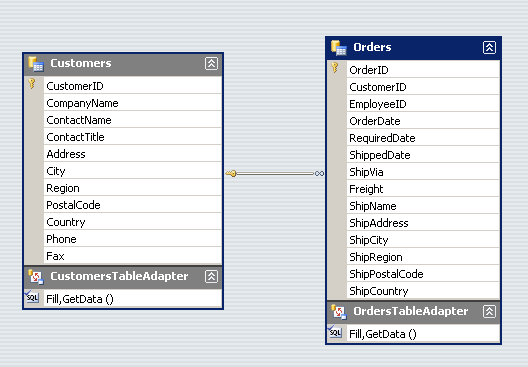
The simplest method for displaying the Customers table within the WPF DataGrid is to add the control to our window as shown below. Note the addition of the "http://schemas.microsoft.com/wpf/2008/toolkit" namespace:
<Window x:Class="WPFDataGridExamples.DataSetCRUDExample"
    xmlns="http://schemas.microsoft.com/winfx/2006/xaml/presentation"
    xmlns:x="http://schemas.microsoft.com/winfx/2006/xaml"
    xmlns:dg="http://schemas.microsoft.com/wpf/2008/toolkit"
    Title="Northwind Customer" Height="300" Width="600">

    <Grid>
        <dg:DataGrid ItemsSource="{Binding}"/>
    </Grid>
</Window>
Then, construct an instance of our typed dataset, and populate it using the generated Table Adapter:
public DataSetCRUDExample()
{
    InitializeComponent();

    // construct the dataset
    NorthwindDataSet dataset = new NorthwindDataSet();

    // use a table adapter to populate the Customers table
    CustomersTableAdapter adapter = new CustomersTableAdapter();
    adapter.Fill(dataset.Customers);

    // use the Customer table as the DataContext for this Window
    this.DataContext = dataset.Customers.DefaultView;
}
The resulting window will contain a grid which displays all the columns of the Customers table, thanks to the AutoGenerateColumns property of the DataGrid which defaults to true.
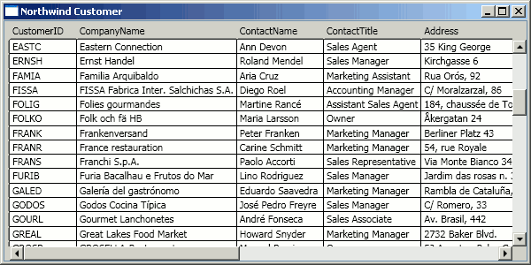
This works well enough; however, one of the advertised features of the WPF DataGrid is design-time support. If you right-click on the DataGrid in the Visual Studio designer, you will see a DataGrid entry in the context menu. However, the sub-menu is a little sparse, and displays the message "You need to set ItemsSource to enable some column operations". The problem is that the DataGrid designer is unable to inspect the contents of the ItemsSource property of the DataGrid if it has been constructed in the code-behind.
An alternative method for providing data to your controls is through the use of an ObjectDataProvider. This class enables you to instantiate an object within your XAML resources for use as a data source. You can then invoke methods on this class in order to provide data to your controls. This method yields a few extra benefits which are described in Beatriz Stollnitz's blog.
The following class effectively performs the same dataset population steps as above:
public class CustomerDataProvider
{
    private CustomersTableAdapter adapter;

    private NorthwindDataSet dataset;

    public CustomerDataProvider()
    {
        dataset = new NorthwindDataSet();
        adapter = new CustomersTableAdapter();
        adapter.Fill(dataset.Customers);
    }

    public DataView GetCustomers()
    {
        return dataset.Customers.DefaultView;
    }
}
And, the modified XAML below uses the ObjectDataPerovider class to define an instance of the above class as our data source. Note that we are still binding the DataGrid's ItemsSource to the inherited DataContext.
<Window ...>

    <Window.Resources>
        <!-- create an instance of our DataProvider class -->
        <ObjectDataProvider x:Key="CustomerDataProvider"
            ObjectType="{x:Type local:CustomerDataProvider}"/>
        <!-- define the method which is invoked to obtain our data -->
        <ObjectDataProvider x:Key="Customers"
          ObjectInstance="{StaticResource CustomerDataProvider}"
          MethodName="GetCustomers"/>
    </Window.Resources>

    <DockPanel DataContext="{Binding Source={StaticResource Customers}}">
        <dg:DataGrid ItemsSource="{Binding}" Name="dataGrid"/>
    </DockPanel>
</Window>
With the above code, the design-time support of the DataGrid is now available, allowing you to configure which columns are present, their bindings, sorting, etc.

This design-time support is certainly nice to have; however, it is very easily missed as it inserts a single menu option into an existing context menu. The WPF designer (Cider) does not follow the conventions of the Windows Forms and ASP.NET designers which indicate that a control has design-time support by the presence of a small button in the top right corner.
Performing Updates
When the user edits the Customers data within the DataGrid, the bound in-memory DataTable is updated accordingly. However, these updates are not automatically written back to the database. It is up to the developer to decide when changes to the DataTable are written back to the database depending on the requirements of the application. For example, in some cases, you might wish to submit a batch of changes via a "Submit" button, or you may wish to have the database updated as the user commits each row edit. In order to support these, the rows that the DataTable contains have a RowState property which indicates whether they contain changes which should be synchronized with the database. The synchronization process is easily achieved via the TableAdapter's Update method.
The following example shows how the RowChanged and RowDeleted events can be handled so that changes in the DataTable state are written to the database each time the user changes a row:
public CustomerDataProvider()
{
    NorthwindDataSet dataset = new NorthwindDataSet();

    adapter = new CustomersTableAdapter();
    adapter.Fill(dataset.Customers);

    dataset.Customers.CustomersRowChanged +=
        new NorthwindDataSet.CustomersRowChangeEventHandler(CustomersRowModified);
    dataset.Customers.CustomersRowDeleted +=
        new NorthwindDataSet.CustomersRowChangeEventHandler(CustomersRowModified);
}

void CustomersRowModified(object sender, NorthwindDataSet.CustomersRowChangeEvent e)
{
    adapter.Update(dataset.Customers);
}
The complete example above can be found in the DataSetCRUDExample class which shows how a CRUD interface can be created for a DataSet with a few lines of code.
Master / Detail View
A classic use of a DataGrid is in the display of master / details data, a common example is the display of Orders (master) in one table with OrderLines (details) displayed in another. When you select a row in the master table, the rows displayed in the details table should change to display only those which relate to the selected master row.
In this example, synchronized views of the Customer (master) and Orders (detail) tables of the Northwind database will be displayed.
The XAML below demonstrates how a master / detail view may be achieved. A second data source is added, again via the ObjectDataProvider, with the window displaying two DataGrids, each bound to their respective data sources.
<Window ... >

    <Window.Resources>
        <!-- the customers datasource -->
        <ObjectDataProvider x:Key="CustomerDataProvider"
           ObjectType="{x:Type local:CustomerDataProvider}"/>
        <ObjectDataProvider x:Key="Customers" MethodName="GetCustomers"
           ObjectInstance="{StaticResource CustomerDataProvider}" />

        <!-- the orders datasource -->
        <ObjectDataProvider x:Key="OrdersDataProvider"
           ObjectType="{x:Type local:OrdersDataProvider}"/>
        <ObjectDataProvider x:Key="Orders" MethodName="GetOrdersByCustomer"
                ObjectInstance="{StaticResource OrdersDataProvider}" >
            <ObjectDataProvider.MethodParameters>
                <x:Static Member="system:String.Empty"/>
            </ObjectDataProvider.MethodParameters>
        </ObjectDataProvider>
    </Window.Resources>

    <Grid>
        <Grid.RowDefinitions>
            <RowDefinition Height="*"/>
            <RowDefinition Height="*"/>
        </Grid.RowDefinitions>
        <Grid.ColumnDefinitions>
            <ColumnDefinition Width="*"/>
        </Grid.ColumnDefinitions>

        <dg:DataGrid Grid.Row="0"
              ItemsSource="{Binding Source={StaticResource Customers}}"
              SelectedValuePath="CustomerID"
              SelectionChanged="CustomerGrid_SelectionChanged"/>

        <dg:DataGrid Grid.Row="1"
              ItemsSource="{Binding Source={StaticResource Orders}}"/>

    </Grid>
</Window>
The OrdersDataProvider class looks almost exactly the same as the CustomersDataProvider. The one difference being the presence of the GetOrdersByCustomer method. This method takes a CustomerID as a parameter, using it to construct a filter that selects the Order rows which relate to the given customer. The ObjectDataProvider within the XAML is able to pass parameters to this method, which is shown below:
/// <summary>
/// Obtains all the orders for the given customer.
/// </summary>
public DataView GetOrdersByCustomer(string customerId)
{
    if (customerId == null || customerId == string.Empty)
    {
        return null;
    }

    DataView view = NorthWindDataProvider.NorthwindDataSet.Orders.DefaultView;
    view.RowFilter = string.Format("CustomerID='{0}'", customerId);
    return view;
}
When this method is invoked for the first time, an empty string is supplied as the CustomerID, and no rows are returned. When the user selects a new customer in the upper grid, the SelectionChanged event is raised. The event handler is shown below:
private void CustomerGrid_SelectionChanged(object sender, SelectionChangedEventArgs e)
{
    DataGrid grid = sender as DataGrid;

    // pass the customer ID to our Orders datasource via the ObjectDataProvider
    ObjectDataProvider orderProvider = this.FindResource("Orders") as ObjectDataProvider;
    orderProvider.MethodParameters[0] = grid.SelectedValue;
}
The above code simply sets the first MethodParameter on the Orders ObjectDataProvider to the newly selected CustomerID, which is obtained from the Customer grid's SelectedValue property (note that this is because the SelectedValuePath is set to CustomerID). The ObjectDataProvider takes care of notifying any control which is bound to it that the data has changed. The complete example is shown below:

Any updates / deletions to the Customer or Order rows are written to the database. However, the interface is a little peculiar in that when inserting a new order row via the bottom DataGrid, you have to type in the related CustomerID. It would make sense to remove this column and the generated ID from the interface.
The first step is to use the "Generate Columns" command on the Visual Studio Designer. We can then remove both the generated OrderID column and the CustomerID foreign key column:
<dg:DataGrid Grid.Row="1" ItemsSource="{Binding Source={StaticResource Orders}}"
             AutoGenerateColumns="True" RowEditEnding="DataGrid_RowEditEnding">
 <dg:DataGrid.Columns>
    <!-- <dg:DataGridTextColumn
       Binding="{Binding Mode=OneWay, Path=OrderID}" Header="OrderID"/> -->
    <!-- <dg:DataGridTextColumn
       Binding="{Binding Path=CustomerID}" Header="CustomerID" /> -->
    <dg:DataGridTextColumn
      Binding="{Binding Path=EmployeeID}" Header="EmployeeID" />
    <dg:DataGridTextColumn
      Binding="{Binding Path=OrderDate}" Header="OrderDate" />
    <dg:DataGridTextColumn
      Binding="{Binding Path=RequiredDate}" Header="RequiredDate" />
    <dg:DataGridTextColumn
      Binding="{Binding Path=ShippedDate}" Header="ShippedDate" />
    <dg:DataGridTextColumn
      Binding="{Binding Path=ShipVia}" Header="ShipVia" />
    <dg:DataGridTextColumn
      Binding="{Binding Path=Freight}" Header="Freight" />
    <dg:DataGridTextColumn
      Binding="{Binding Path=ShipName}" Header="ShipName" />
    <dg:DataGridTextColumn
      Binding="{Binding Path=ShipAddress}" Header="ShipAddress" />
    <dg:DataGridTextColumn
      Binding="{Binding Path=ShipCity}" Header="ShipCity" />
    <dg:DataGridTextColumn
      Binding="{Binding Path=ShipRegion}" Header="ShipRegion" />
    <dg:DataGridTextColumn
      Binding="{Binding Path=ShipPostalCode}" Header="ShipPostalCode" />
    <dg:DataGridTextColumn
      Binding="{Binding Path=ShipCountry}" Header="ShipCountry" />
 </dg:DataGrid.Columns>
</dg:DataGrid>
A handler for the RowEditEnding event is added so that the CustomerID can be obtained from the SelectedValue property of the Customers DataGrid prior to committing the edited Order row:
private void DataGrid_RowEditEnding(object sender, DataGridRowEditEndingEventArgs e)
{
    // drill down from DataGridRow, through row view to our order row
    DataGridRow dgRow = e.Row;
    DataRowView rowView = dgRow.Item as DataRowView;
    NorthwindDataSet.OrdersRow orderRow =
          rowView.Row as NorthwindDataSet.OrdersRow;

    // set the foreign key to the customer ID
    orderRow.CustomerID = CustomerGrid.SelectedValue as string;
}
The complete example above is found in the MasterDetailExample class. However, please note that any exception that occurs when the data is being updated is not being handled, which will result in the in-memory DataTable no longer being synchronized with the database.
Binding in a Layered Application
The previous example demonstrated how to bind the DataGrid to a DataSet. This example is simple to implement; however, it results in a tight coupling between your database schema and your user interface. If you modify the structure of your database, perhaps to optimise performance, the generated DataSet will have to be updated and also the user interface code. This may be acceptable for small scale software developments where you save time and money by coupling the DataSet directly to your UI code; however, for large scale developments, you will typically want to decouple the two and move towards a layered architecture.
This example demonstrates how to use a DataGrid to perform CRUD operations via binding where the database integration is decoupled via a Data Access Layer (DAL).
The Architecture
This example is a simple CRUD application which allows the user to edit items in the Customers table of the Northwind database. The example has a Data Access Layer, which exposes Find/ Delete/Update methods that operate on simple data objects, and a Presentation Layer that adapts these objects in such a way that they can be bound effectively by the WPF Framework. Because we are only performing CRUD functions, I have not added a Business Logic Layer (BLL); if you are a purist, you could add a pass-through BLL; however, I feel it would add little to this example.
The key classes within this architecture are shown below:
The Data Access Layer exposes an interface for managing the lifecycle of the Customer Data Objects. The class which implements this interface uses a typed DataSet as a database integration layer; however, this is hidden from the clients of the DAL. The presence of this layer means that we are not directly coupled to the database schema or the generated dataset schema, i.e., we can change our schema, yet still provide the interface given below to our clients:
public interface ICustomerDataAccessLayer
{
    /// Return all the persistent customers
    List<CustomerDataObject> GetCustomers();

    /// Updates or adds the given customer
    void UpdateCustomer(CustomerDataObject customer);

    /// Delete the given customer
    void DeleteCustomer(CustomerDataObject customer);
}
public class CustomerDataObject
{
    public string ID { get; set; }

    public string CompanyName { get; set; }

    public string ContactName { get; set; }
}
As you can see, there are no UI framework specific interfaces or classes (such as ObservableCollection) exposed by the DAL. The problem here is how to bind the customers returned by ICustomerDataAccess.GetCustomers to our DataGrid and ensure that changes are synchronised with the database.
We could bind the DataGrid directly to our customer collection, List<CustomerDataObject>; however, we need to ensure that the UpdateCustomer and DeleteCustomer methods on our DAL interface are invoked at the appropriate points in time. One approach that we might take is to handle the events / commands exposed by the DataGrid in order to determine what action it has just performed or intends to perform on the bound customer collection. However, in doing so, we would be writing integration code that is specific to the DataGrid. What if we wanted to change the UI to present a ListView and a number of TextBoxes (details view)? We would have to re-write this logic. Also, none of the DataGrid events quite fit what we want. There are "Ending" events, but no "Ended" events; therefore, the data visible to event handlers is not in its committed state. A better approach would be if we could adapt our collection of Customer objects in such a way that they could be bound to any suitable WPF UI control, with add/edit/remove operations synchronised with the database via our DAL.
Handling Delete Operations
The ObservableCollection class is a good candidate for our data binding needs. It exposes a CollectionChanged event which is fired whenever items are added or removed from the collection. If we copy our customer data into an ObservableCollection and bind this to the DataGrid, we can handle the CollectionChanged event and perform the required operation on the DAL. The following code snippet shows how the CustomerObjectDataProvider (which is defined as an ObjectDataProvider in the XAML) constructs an ObservableCollection of CustomerUIObjects. These UI objects simply wrap their data object counterparts in order to expose the same properties.
public CustomerObjectDataProvider()
{
    dataAccessLayer = new CustomerDataAccessLayer();
}

public CustomerUIObjects GetCustomers()
{
    // populate our list of customers from the data access layer
    CustomerUIObjects customers = new CustomerUIObjects();

    List<CustomerDataObject> customerDataObjects = dataAccessLayer.GetCustomers();
    foreach (CustomerDataObject customerDataObject in customerDataObjects)
    {
        // create a business object from each data object
        customers.Add(new CustomerUIObject(customerDataObject));
    }

    customers.CollectionChanged += new
      NotifyCollectionChangedEventHandler(CustomersCollectionChanged);

    return customers;
}

void CustomersCollectionChanged(object sender, NotifyCollectionChangedEventArgs e)
{
    if (e.Action == NotifyCollectionChangedAction.Remove)
    {
        foreach (object item in e.OldItems)
        {
            CustomerUIObject customerObject = item as CustomerUIObject;

            // use the data access layer to delete the wrapped data object
            dataAccessLayer.DeleteCustomer(customerObject.GetDataObject());
        }
    }
}
When a user deletes a row with the DataGrid control, the CollectionChanged event is fired on the bound collection. In the event handler, we invoke the DAL DeleteCustomer method with the wrapped data object passed as the parameter.
Handling delete operations is relatively straightforward, but how about updates or insertions? You might think that the same approach can be used, the NotifyCollectionChangedEventArgs.Action property does include Add operations; however, this event is not fired when the items within the collection are updated. Furthermore, when a user adds a new item to the DataGrid, the object is initially added to the bound collection in a non-initialized state, so we would only ever see the object with its default property values. What we really need to do is determine when the user finishes editing an item in the grid.
Handling Updates / Inserts
To determine when a user finishes editing a bound item, we need to delve a little deeper into the binding mechanism itself. The DataGrid is able to perform an atomic commit of the row which is currently being edited; this is made possible if the bound items implement the IEditableObject interface which exposes BeginEdit, EndEdit, and CancelEdit methods. Typically, an object implementing this interface would return to its state at the point when the BeginEdit method was called as a response to the CancelEdit method being invoked. However, in this instance, we are not really concerned about being able to cancel edits; all we really need to know is when the user has finished editing a row. This is indicted when the DataGrid invokes EndEdit on our bound item.
In order to notify the CustomerDataObjectProvider that EndEdit has been invoked on one of the objects in the bound collection, the CustomerUIObject implements IEditableObject as follows:
public delegate void ItemEndEditEventHandler(IEditableObject sender);

public event ItemEndEditEventHandler ItemEndEdit;

#region IEditableObject Members

public void BeginEdit() {}

public void CancelEdit() {}

public void EndEdit()
{
    if (ItemEndEdit != null)
    {
        ItemEndEdit(this);
    }
}

#endregion
When items are added to the CustomerUIObjects collection, this event is handled for all the items in the collection, with the handler simply forwarding the event:
public class CustomerUIObjects : ObservableCollection<CustomerDataObject>
{
    protected override void InsertItem(int index, CustomerUIObject item)
    {
        base.InsertItem(index, item);

        // handle any EndEdit events relating to this item
        item.ItemEndEdit += new ItemEndEditEventHandler(ItemEndEditHandler);
    }

    void ItemEndEditHandler(IEditableObject sender)
    {
        // simply forward any EndEdit events
        if (ItemEndEdit != null)
        {
            ItemEndEdit(sender);
        }
    }

    public event ItemEndEditEventHandler ItemEndEdit;
}
The CustomerObjectDataProvider can now handle this event to receive the notification of CommitEdit being invoked on any of the bound items. It can then invoke the DAL methods to synchronise the database state:
public CustomerUIObjects GetCustomers()
{
    // populate our list of customers from the data access layer
    CustomerUIObjects customers = new CustomerUIObjects();

    List<CustomerDataObject> customerDataObjects = dataAccessLayer.GetCustomers();
    foreach (CustomerDataObject customerDataObject in customerDataObjects)
    {
        // create a business object from each data object
        customers.Add(new CustomerUIObject(customerDataObject));
    }

    customers.ItemEndEdit += new ItemEndEditEventHandler(CustomersItemEndEdit);
    customers.CollectionChanged += new
      NotifyCollectionChangedEventHandler(CustomersCollectionChanged);

    return customers;
}

void CustomersItemEndEdit(IEditableObject sender)
{
    CustomerUIObject customerObject = sender as CustomerUIObject;

    // use the data access layer to update the wrapped data object
    dataAccessLayer.UpdateCustomer(customerObject.GetDataObject());
}
The above code will handle both insert and update operations.
In conclusion, this method adapts the data items and collection provided by the DAL into UI items and collections which are more appropriate for data binding within the WPF Framework. All database synchronisation logic is performed by handling event from this bound collection; therefore, there is no WPF DataGrid specific code.
One final note: the above example does not include error handling. For example, foreign key constraint violations will result in the bound CustomerUIObjects collection no longer being synchronised with the database. Unfortunately, the WPF DataGrid v1 has a bug whereby it does not catch exceptions when IEditableObject.EndEdit is invoked, leaving no obvious way of cancelling the edit operation. If anyone has a good workaround, please let me know!
Validation
Validation within the WPF DataGrid occurs both at the cell level and at the row level. Cell level validation makes use of the standard Binding validation mechanisms which are described in great detail in this excellent CodeProject article. Row level validation makes use of the new .NET SP1 feature, BindingGroups. A binding group does pretty much what you would expect, it groups together a number of bindings, allowing them to be validated as a single entity. The advantage of this approach is that it allows validation of more complex rules, such as "start date must come before end date", on your data objects, something which is not possible when validating the bindings for each individual property. A detailed overview of binding groups can be found on Vincent Sibal's blog, and their usefulness extends far beyond that of validating DataGrid rows.
However, it should be noted that the validation support for the WPF DataGrid is currently a bit patchy. The row level validation which was advertised as part of the first DataGrid CTP didn't quite make the release, and the recently released DataGrid v1 still has a number of validation related issues.
This article will present a few common validation scenarios, demonstrating how the DataGrid can be configured to perform these tasks. Note that the examples I give all delegate the validation logic to the bound object itself, rather than having the rules which dictate whether an object state is valid or not live entirely within the UI. Both are, of course, possible; however, it is my preference that the validation logic should not live in the presentation layer.
Validation on Exceptions
A common approach to validation is to have your object's property setters throw an exception if the passed value is not valid for whatever reason. The WPF Framework includes a validation rule, ExceptionValidationRule, for this very purpose. It simply catches any exception thrown when the bound property is set, and extracts the exception message. The .NET 3.5 SP1 framework provides a useful shorthand for utilizing this rule. The following XAML snippet shows two equivalent bindings, with the second making use of the ValidatesOnException property on the Binding class which simply adds the appropriate ExceptionValidationRule instance to the ValidationRules collection:
<!-- explicit addition of ExceptionValidationRule -->
<TextBox>
    <TextBox.Text>
        <Binding Path="Name">
            <Binding.ValidationRules>
                <ExceptionValidationRule />
            </Binding.ValidationRules>
        </Binding>
    </TextBox.Text>
</TextBox>

<!-- implicit addition of ExceptionValidationRule -->
<TextBox Text="{Binding Path=Name, ValidatesOnExceptions=True}"/>
To demonstrate how a DataGrid can catch validation exceptions, this example will utilise a simple data object:
public class Person
{
    private readonly Regex nameEx = new Regex(@"^[A-Za-z ]+$");

    private string name;

    public string Name
    {
        get { return name; }
        set
        {
            if (value == null)
                throw new ArgumentException("Name cannot be null");

            if (!nameEx.Match(value).Success)
                throw new ArgumentException("Name may only " +
                          "contain characters or spaces");

            name = value;
        }
    }

    private int age;

    public int Age
    {
        get { return age; }
        set
        {
            if (value < 0 || value > 110)
                throw new ArgumentException("Age must be positive " +
                                            "and less than 110");

            age = value;
        }
    }
}
If we simply enable validation for a DataGrid which is bound to a collection of the above data type with ValidatesOnException enabled, we can see that validation is being applied because any cell that contains a validation error is indicated with a red outline:
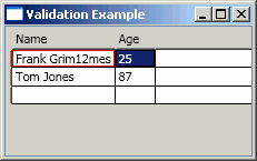
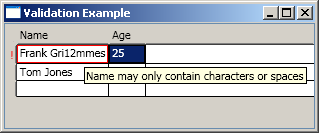
However, there is no feedback to the user regarding the nature of the error, and there is no indicator on the row to alert the user.
Often, validation failures are displayed as a tooltip relating to the data input control, as follows (see the aforementioned CodeProject article for further details and examples):
<Style TargetType="{x:Type TextBox}">
    <Style.Triggers>
        <Trigger Property="Validation.HasError" Value="true">
            <Setter Property="ToolTip"
              Value="{Binding RelativeSource={RelativeSource Self},
                    Path=(Validation.Errors)[0].ErrorContent}"/>
        </Trigger>
    </Style.Triggers>
</Style>
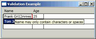
However, implicit styles do not work for elements generated by DataGrid columns. Instead, styles can be applied to DataGrid cells via the ElementStyle and EditingElementStyle properties. However, there is one final twist: the code for DataGridTextColumn programmatically applies a few styles to the TextBox which it generates when the cell is in edit mode. We have to replicates these styles, namely zero padding and border thickness, in our applied style.
The XAML to display this data object within a DataGrid that reports validation errors is given below:
<Window ... >
    <Window.Resources>

        <!-- the data source for this Window -->
        <ObjectDataProvider x:Key="PersonDataSource"
          ObjectType="{x:Type local:PersonDataSource}"/>
        <ObjectDataProvider x:Key="People"
          ObjectInstance="{StaticResource PersonDataSource}"
          MethodName="GetPeople"/>

        <!-- style to apply to DataGridTextColumn in edit mode  -->
        <Style x:Key="CellEditStyle" TargetType="{x:Type TextBox}">
            <Setter Property="BorderThickness" Value="0"/>
            <Setter Property="Padding" Value="0"/>
            <Style.Triggers>
                <Trigger Property="Validation.HasError" Value="true">
                    <Setter Property="ToolTip"
                            Value="{Binding RelativeSource={RelativeSource Self},
                                    Path=(Validation.Errors)[0].ErrorContent}"/>
                </Trigger>
            </Style.Triggers>
        </Style>

    </Window.Resources>

    <DockPanel DataContext="{Binding Source={StaticResource People}}">

        <dg:DataGrid Name="dataGrid" AutoGenerateColumns="False"
                     ItemsSource="{Binding}">
            <dg:DataGrid.Columns>
                <dg:DataGridTextColumn Header="Name"
                   EditingElementStyle="{StaticResource CellEditStyle}"
                   Binding="{Binding Path=Name, ValidatesOnExceptions=True}"/>
                <dg:DataGridTextColumn Header="Age"
                   EditingElementStyle="{StaticResource CellEditStyle}"
                   Binding="{Binding Path=Age, ValidatesOnExceptions=True}"/>
            </dg:DataGrid.Columns>
        </dg:DataGrid>

    </DockPanel>
</Window>
Which gives the following result:
A common interface feature of the DataGrid is the presence of an indicator which alerts the user to an error on a particular row. The WPF DataGrid has this feature; however, it is only displayed if the Validation.HasError attached property is true for the row. In order to enable this, we add a dummy validation rule to the grid as follows:
<dg:DataGrid Name="dataGrid" AutoGenerateColumns="False" ItemsSource="{Binding}">

    <dg:DataGrid.RowValidationRules>
        <local:RowDummyValidation/>
    </dg:DataGrid.RowValidationRules>

    <dg:DataGrid.Columns>
        <dg:DataGridTextColumn Header="Name"
           EditingElementStyle="{StaticResource CellEditStyle}"
           Binding="{Binding Path=Name, ValidatesOnExceptions=True}"/>
        <dg:DataGridTextColumn Header="Age"
           EditingElementStyle="{StaticResource CellEditStyle}"
           Binding="{Binding Path=Age, ValidatesOnExceptions=True}"/>
    </dg:DataGrid.Columns>

</dg:DataGrid>
This validation rule simply returns ValidationResult.ValidResult regardless of the input value. The net result being that the validation error indicator is now displayed against the row, as illustrated below:
Validation with IDataErrorInfo
A popular alternative to the previous example, where exceptions are thrown on the property setters of the data objects, is the use of the IDataErrorInfo interface. Objects that implement this interface are validated on demand, rather than each time their state changes. For a discussion of how this can make your business objects more useable, the article Fort Knox Business Objects makes interesting reading. They also have the advantage that they are able to validate state which depends on multiple properties; there is clearly a synergy here with BindingGroups. The following example is a business object that shares similar constraints to the previous Person object; however, this object has a further rule that StartDate must be before EndDate.
public class Appointment : IDataErrorInfo
{
    private readonly Regex nameEx = new Regex(@"^[A-Za-z ]+$");

    public string Name { get; set; }

    public int Age { get; set; }

    public DateTime StartTime { get; set; }

    public DateTime EndTime { get; set; }

    #region IDataErrorInfo Members

    public string Error
    {
        get
        {
            StringBuilder error = new StringBuilder();

            // iterate over all of the properties
            // of this object - aggregating any validation errors
            PropertyDescriptorCollection props = TypeDescriptor.GetProperties(this);
            foreach (PropertyDescriptor prop in props)
            {
                string propertyError = this[prop.Name];
                if (propertyError != string.Empty)
                {
                    error.Append((error.Length!=0  ? ", " : "") + propertyError);
                }
            }

            // apply object level validation rules
            if (StartTime.CompareTo(EndTime) > 0)
            {
                error.Append((error.Length != 0 ? ", " : "") +
                              "EndTime must be after StartTime");
            }

            return error.ToString();
        }
    }

    public string this[string columnName]
    {
        get
        {
            // apply property level validation rules
            if (columnName == "Name")
            {
                if (Name == null || Name == string.Empty)
                   return "Name cannot be null or empty";

                if (!nameEx.Match(Name).Success)
                    return "Name may only contain characters or spaces";
            }

            if (columnName == "Age")
            {
                if (Age < 0 || Age > 110)
                    return "Age must be positive and less than 110";
            }

            return "";
        }
    }

    #endregion
}
These objects are bound to a grid with the following XAML:
<dg:DataGrid  Name="dataGrid" AutoGenerateColumns="False"
              RowStyle="{StaticResource RowStyle}" ItemsSource="{Binding}">

    <dg:DataGrid.RowValidationRules>
        <local:RowDataInfoValidationRule ValidationStep="UpdatedValue" />
    </dg:DataGrid.RowValidationRules>

    <dg:DataGrid.Columns>
        <dg:DataGridTextColumn Header="Name" Binding="{Binding Path=Name}"/>
        <dg:DataGridTextColumn Header="Age" Binding="{Binding Path=Age}"/>
        <dg:DataGridTextColumn Header="Start" Binding="{Binding Path=StartTime}"/>
        <dg:DataGridTextColumn Header="End" Binding="{Binding Path=EndTime}"/>
    </dg:DataGrid.Columns>

</dg:DataGrid>
The row validation rule in the above example is given below:
public class RowDataInfoValidationRule : ValidationRule
{
    public override ValidationResult Validate(object value,
                    CultureInfo cultureInfo)
    {
        BindingGroup group = (BindingGroup)value;

        StringBuilder error = null;
        foreach (var item in group.Items)
        {
            // aggregate errors
            IDataErrorInfo info = item as IDataErrorInfo;
            if (info != null)
            {
                if (!string.IsNullOrEmpty(info.Error))
                {
                    if (error == null)
                        error = new StringBuilder();
                    error.Append((error.Length != 0 ? ", " : "") + info.Error);
                }
            }
        }

        if (error != null)
            return new ValidationResult(false, error.ToString());

        return ValidationResult.ValidResult;
    }
}
This rule iterates over all of the items within the binding group (i.e., the DataGrid row) probing them for errors. In this case, the IDataErrorInfo.Error property is used for object level validation.
The image below shows the use of IDataErrorInfo in action:
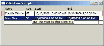
Note also that because the validation error does not relate to an individual property of our business object, none of the DataGrid cells are highlighted. In order to make the failure more obvious, the style of the row has been modified to add a red border.
<!-- Row Style-->
<Style x:Key="RowStyle" TargetType="{x:Type dg:DataGridRow}">
    <Style.Triggers>
        <Trigger Property="Validation.HasError" Value="true">
            <Setter Property="BorderThickness" Value="1"/>
            <Setter Property="BorderBrush" Value="Red"/>
            <Setter Property="ToolTip"
              Value="{Binding RelativeSource={RelativeSource Self},
                     Path=(Validation.Errors)[0].ErrorContent}"/>
        </Trigger>
    </Style.Triggers>
</Style>
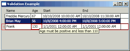
The WPF Framework also has a stock validation rule for use with objects that implement IDataErrorInfo. This can be automatically added to the validation rules for a binding via the ValidatesOnDataError property. This works fine when editing an existing row; however, when a new row is added, for some reason, validation is applied to the newly created object, and re-validation attempts fail to remove the error. I delved into the implementation of BindingExpression, but got rather lost along the way! A simple solution is to implement a validation rule which uses the IDataErrorInfo interface, but simply probes for the error of the bound property, as follows:
public class CellDataInfoValidationRule : ValidationRule
{
    public override ValidationResult Validate(object value,
                                     CultureInfo cultureInfo)
    {
        // obtain the bound business object
        BindingExpression expression = value as BindingExpression;
        IDataErrorInfo info = expression.DataItem as IDataErrorInfo;

        // determine the binding path
        string boundProperty = expression.ParentBinding.Path.Path;

        // obtain any errors relating to this bound property
        string error = info[boundProperty];
        if (!string.IsNullOrEmpty(error))
        {
            return new ValidationResult(false, error);
        }

        return ValidationResult.ValidResult;
    }
}
With the above rule associated with our column bindings, you can now give feedback regarding which cell has a validation error (in the case where the validation error relates to an individual object property):
Validation with Bound DataSets
The WPF DataGrid is able to perform an atomic commit of the contents of an individual row, or alternatively, dispose of any changes made if the user hits the Escape key. This functionality is made possible when the bound objects implement the IEditableObject interface. When a DataTable is bound to the DataGrid, the view associated with the table is bound. This exposes the rows via the DataRowView wrapper class which implements this interface. To have this behaviour in your own business objects, you have to implement IEditableObject yourself; however, there are a few simple patterns that can be applied; see, for example, this method which uses an object state snapshot.
When a new row or changes to an existing row is committed to a DataTable, constraints are checked (e.g., nullable columns, unique constraints) and an exception thrown if they are violated. It would make sense to catch these exceptions and display the problem as a validation error to the DataGrid user. Unfortunately, the WPF DataGrid v1 has a bug whereby it does not catch exceptions when IEditableObject.EndEdit is invoked.
The workaround given here uses validation to ensure that all the DataTable constraints are satisfied before the updates are committed. The following slightly lengthy validation rule can be applied at cell and row level. The rule will check a column (or all the row's columns) for length, unique, and null constraints.
public class DataRowValidation : ValidationRule
{
    public override ValidationResult Validate(object value,
                                     CultureInfo cultureInfo)
    {
        // if this rule is being applied to a cell we
        // will be inspecting a binding expression
        if (value is BindingExpression)
        {
            // obtain the row which is being validated
            BindingExpression expression = value as BindingExpression;
            DataRow row = ((DataRowView)expression.DataItem).Row;

            // determine the column to validate
            string propertyName = expression.ParentBinding.Path.Path;

            return ValidateColumn(propertyName, row);
        }

        // if this rule is being applied to a cell
        // we will be inspecting a binding group
        else if (value is BindingGroup)
        {
            BindingGroup group = (BindingGroup)value;

            // iterate over all the bound items (this should always be one!)
            foreach (var item in group.Items)
            {
                DataRow row = ((DataRowView)item).Row;

                // validate against the metadata for each column
                foreach (DataColumn column in row.Table.Columns)
                {
                    ValidationResult result = ValidateColumn(column.ColumnName, row);
                    if (result != ValidationResult.ValidResult)
                    {
                        return result;
                    }
                }
            }
        }

        return ValidationResult.ValidResult;
    }

    /// <summary>
    /// Validates a DataRow value associated with the given named column
    /// </summary>
    private ValidationResult ValidateColumn(string columnName, DataRow row)
    {
        DataTable table = row.Table;
        DataColumn column = table.Columns[columnName];
        object cellValue = row[column.ColumnName];

        // check for null values
        if (cellValue == null || cellValue.Equals(string.Empty) ||
            cellValue.Equals(System.DBNull.Value))
        {
            if (!column.AllowDBNull)
            {
                return new ValidationResult(false,
                       column.ColumnName + " cannot be null");
            }
            else
            {
                return ValidationResult.ValidResult;
            }
        }

        // check string length constraints
        if (column.DataType == typeof(string))
        {
            string strVal = cellValue as string;
            if (strVal != null && strVal.Length > column.MaxLength)
            {
                return new ValidationResult(false, "Length of " + column.ColumnName +
                                            " should not exceed " + column.MaxLength);
            }
        }

        // check for unique constraints
        if (column.Unique)
        {
            // iterate over all the rows in the table
            // comparing the value for this column
            foreach (DataRow compareRow in row.Table.Rows)
            {
                if (compareRow!=row && cellValue.Equals(compareRow[column]))
                {
                    return new ValidationResult(false, column.ColumnName +
                                                " must be unique");
                }
            }
        }

        return ValidationResult.ValidResult;
    }
}
The example in the attached source code presents a UI for editing the Customer table. One other subtlety of this example is that the primary key is read only, because the generated DataSet's update methods assume that the primary key has not been modified. However, when the data grid selection changes to the empty row at the bottom, the column's read-only state is toggled to allow the user to add a new Customer row.
It should be noted that the validation method detailed above is quite inefficient. Also, it has only been tested on a rather small set of column types. However, the approach could be extended further. Hopefully, in the .NET 4.0 release of the DataGrid, this issue will be fixed!
Styling
The WPF DataGrid can be styled in a highly flexible manner by applying Styles or Templates in the same way as for all of the other WPF controls. Many of the grid's properties such as CellStyle and RowStyle are quite obvious. Rather than exhaustively cover all the various styling properties, this section will cover some of the DataGrid specific features, and also how to style some of the more tricky parts of the grid.
Column Templates
The WPF DataGrid has columns of type Text, Hyperlink, CheckBox, and ComboBox. If these column types do not fulfill your needs, either in read-only mode or when the cells are in edit mode, then you can define your own column type using templates. Users of the ASP.NET GridView will find this approach very familiar; you simply define a DataTemplate for rendering your data in read-only or edit mode.
The following example uses the DatePicker control, which is also part of the WPF Toolkit, to provide a more intuitive interface for selecting a date:
<!-- defines a custom column -->
<dg:DataGridTemplateColumn Header="Date Of Birth" >
    <!-- editing template -->
    <dg:DataGridTemplateColumn.CellEditingTemplate>
        <DataTemplate>
            <dg:DatePicker
               SelectedDate="{Binding Path=DateOfBirth, Mode=TwoWay}"
               BorderThickness="0"/>
        </DataTemplate>
    </dg:DataGridTemplateColumn.CellEditingTemplate>
    <!-- standard template -->
    <dg:DataGridTemplateColumn.CellTemplate>
        <DataTemplate>
            <TextBlock>
                <TextBlock.Text>
                    <Binding Path="DateOfBirth"
                       ConverterCulture="en-GB"
                       StringFormat="{}{0:d}"/>
                </TextBlock.Text>
            </TextBlock>
        </DataTemplate>
    </dg:DataGridTemplateColumn.CellTemplate>
</dg:DataGridTemplateColumn>
An example is given below:
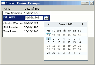
Note also that the read-only view of this cell uses the StringFormat property of the Binding class to specify a format which matches that which is used by the DatePicker. Interestingly, the DatePicker picks up the current culture, whereas the TextBlock binding does not (yes, I live in the UK!).
Styling the Validation Error Indicator
The standard validation error indicator is a red exclamation mark which is displayed at the left hand side of the row. The DataGridRow has a ValidationErrorTemplate which defines the appearance of this indicator. With the example given below, the exclamation mark is rendered within a red circle in order to give it a more striking appearance. Also, a tooltip is defined that displays the validation error message. The templated control which displays the error indicator is a child of the DataGridRow; therefore, we can obtain the validation errors from the row via a FindAncestor RelativeSource binding.
<Style x:Key="RowStyle" TargetType="{x:Type dg:DataGridRow}">
    <Setter Property="ValidationErrorTemplate">
        <Setter.Value>
            <ControlTemplate>
                <Grid>
                    <Ellipse Width="12" Height="12"
                        Fill="Red" Stroke="Black"
                        StrokeThickness="0.5"/>
                    <TextBlock FontWeight="Bold" Padding="4,0,0,0"
                        Margin="0" VerticalAlignment="Top" Foreground="White" Text="!"
                        ToolTip="{Binding RelativeSource={RelativeSource
                                 FindAncestor, AncestorType={x:Type dg:DataGridRow}},
                                 Path=(Validation.Errors)[0].ErrorContent}"/>
                </Grid>
            </ControlTemplate>
        </Setter.Value>
    </Setter>
</Style>

Row Details
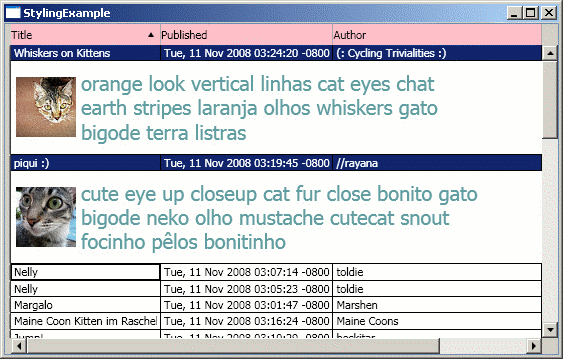
The WPF DataGrid has an interesting feature called RowDetails, which is an area of customisable content beneath each row. You can use the RowDetailsVisibilityMode property of the DataGrid to specify whether to display details just for the selected rows or for all the rows.
The following example shows a DataGrid bound to an XML source (the latest photos tagged with "cat" from Flickr). The RowDetails displays the image thumbnail and its associated tags:
<XmlNamespaceMappingCollection x:Key="map">
<XmlNamespaceMapping Prefix="media" Uri="http://search.yahoo.com/mrss/"/>
</XmlNamespaceMappingCollection>
<XmlDataProvider x:Key="FlickrFeed" XPath="//item[string-length(title)>0]"
Source="http://api.flickr.com/services/feeds/
photos_public.gne?tags=cat&lang=en-us
&format=rss_200"/>
...
<Grid Binding.XmlNamespaceManager="{StaticResource map}">
<dg:DataGrid AutoGenerateColumns="False"
SelectionMode="Extended"
ItemsSource="{Binding Source={StaticResource FlickrFeed}}"
RowDetailsVisibilityMode="VisibleWhenSelected">
<dg:DataGrid.RowDetailsTemplate>
<DataTemplate>
<StackPanel Orientation="Horizontal" Margin="5">
<Image Source="{Binding XPath=media:thumbnail/@url}"
Width="60" Height="60"/>
<StackPanel Orientation="Vertical" Margin="5">
<TextBlock Foreground="CadetBlue" FontSize="20"
Width="400" TextWrapping="Wrap"
Text="{Binding XPath=media:category}"/>
</StackPanel>
</StackPanel>
</DataTemplate>
</dg:DataGrid.RowDetailsTemplate>
<dg:DataGrid.Columns>
<dg:DataGridTextColumn Header="Title"
Binding="{Binding XPath=title}" Width="150"/>
<dg:DataGridTextColumn Header="Published"
Binding="{Binding XPath=pubDate}"/>
<dg:DataGridTextColumn Header="Author"
Binding="{Binding XPath=media:credit}" Width="*"/>
</dg:DataGrid.Columns>
</dg:DataGrid>
</Grid>

Styling the Column Header
The style of the column header can easily be modified via the ColumnHeaderStyle of the DataGrid. However, if you modify the background colour of the column header, you will find that the sort arrows disappear! This is because the arrows are not part of the ColumnHeader template; instead, they are added programmatically.
The ColumnHeader template contains a DataGridHeaderBorder. This element is used to render the sort arrows, and optionally render a thin separator between each header if SeparatorVisibility is set to Visible. This rendering takes place within the OnRender method of this class; however, if a Background or BorderBrush is set, the rendering is performed by the standard WPF Border class; therefore, arrows and separators are lost.
The following example shows how sort arrows can be manually added to the header template in order to replace this behaviour:
<Style x:Key="HeaderStyle" TargetType="{x:Type dg:DataGridColumnHeader}">
    <Setter Property="VerticalContentAlignment" Value="Center" />
    <Setter Property="Background" Value="Pink" />
    <Setter Property="Template">
        <Setter.Value>
            <ControlTemplate TargetType="{x:Type dg:DataGridColumnHeader}">
                <Grid>
                    <dg:DataGridHeaderBorder .../>
                    <Thumb ... />

                    <Path Name="UpArrow" Fill="Black" HorizontalAlignment="Right"
                          VerticalAlignment="Center"
                          Margin="0,0,7,0" Visibility="Hidden">
                        <Path.Data>
                            <PathGeometry>
                                <PathFigure StartPoint="0,0">
                                    <LineSegment Point="6,0"/>
                                    <LineSegment Point="3,5"/>
                                    <LineSegment Point="0,0"/>
                                </PathFigure>
                            </PathGeometry>
                        </Path.Data>
                    </Path>
                    <Path Name="DownArrow" Fill="Black" HorizontalAlignment="Right"
                          VerticalAlignment="Center" Margin="0,0,7,0"
		        Visibility="Hidden">
                        <Path.Data>
                            <PathGeometry>
                                <PathFigure StartPoint="0,5">
                                    <LineSegment Point="6,5"/>
                                    <LineSegment Point="3,0"/>
                                    <LineSegment Point="0,5"/>
                                </PathFigure>
                            </PathGeometry>
                        </Path.Data>
                    </Path>
                </Grid>
                <ControlTemplate.Triggers>
                    <Trigger Property="SortDirection" Value="Descending">
                        <Setter TargetName="UpArrow"
                                Property="Visibility" Value="Hidden"/>
                        <Setter TargetName="DownArrow"
                                Property="Visibility" Value="Visible"/>
                    </Trigger>
                    <Trigger Property="SortDirection" Value="Ascending">
                        <Setter TargetName="DownArrow"
                                Property="Visibility" Value="Hidden"/>
                        <Setter TargetName="UpArrow"
                                Property="Visibility" Value="Visible"/>
                    </Trigger>
                </ControlTemplate.Triggers>
            </ControlTemplate>
        </Setter.Value>
    </Setter>
</Style>
Property triggers on the control template are used to toggle the visibility of the named paths, with the result shown below:
Having Some Fun ...
The final example is just a demonstration of the type of styling that can be applied to a WPF DataGrid. We have all the usual suspects, rounded glass effect tabs for column headings, grouping with a customised Expander template, mouse-over highlighting, etc.
For details of how this style was assembled, download the article source and pick apart the code. There is nothing special in there, just the usual application of styles and cut-n-paste control template modification.

Summary
This article has been a bit of a mixed-bag of samples; however, I hope that some of you out there will find something of use to you. The WPF DataGrid, although currently rough around the edges, is a control with great potential. Personally, I hope Microsoft puts a lot more effort into the design-time support of this control and the WPF Framework, in general. Currently, I feel that the "bar" for developing WPF applications is quite high, a richer design-time experience. All the automated generation of bound controls would certainly help open up WPF to a far wider audience.
Finally, if you have any questions, or can think of other WPF DataGrid related areas that you feel need exploring, please let me know in the comments section below.
Resources
The following is a collection of resources that may be of interest to users of the DataGrid:
- Detecting the row and column clicked on the WPF DataGrid - It is not as straightforward as it may seem to determine where a user has clicked on the
DataGrid, this blog post shows you how to do it. - WPF DataGrid: Dissecting the Visual Layout - An excellent article that describes the various component parts of the
DataGrid. - Committing changes cell-by-cell - How to commit the changes made as the user moves from cell to cell.
- Styling the DataGrid - A guide to styling the WPF
DataGrid. - Multiselection with checkboxes - How to style the
DataGridso that each row has a checkbox which can be used to toggle selection.
History
- 01/02/2009 - Added a Resources section
- 18/11/2008 - Added a new section, Binding in a layered application
- 12/11/2008 - Initial article upload

