
Highly Customizable Data Grids in Expression Blend
0/5 (0 vote)
Explore the fast and highly customizable UI controls in Infragistics NetAdvantage for WPF Line of Business from the perspective of a Microsoft Expression Blend user. In revealing much of the data grid’s object model, I cover some of the more popular ways to format and style grids in Blend.
The premier control of the NetAdvantage® for WPF user interface toolset is definitely the xamDataGridTM. I think this Infragistics® WPF data grid outperforms similar types of controls found elsewhere. Especially as an Microsoft Expression Blend user of these WPF controls, I have found Infragistics’ xamDataGrid to be fast and highly customizable. Since the data grid is so highly customizable, there are many parts of the object model you can approach for its styling and formatting. In this article, I am going to cover some of the more popular ways to customize the grid.
You can download a free trial of NetAdvantage for WPF today to get your hands on a copy of the user interface controls I use in this article.
Creating a Sample Project
Clearly, the coolest thing about the xamDataGrid is how intelligently it will format data for you. Simply bind a collection to the grid and it will extract data fields from properties and assign editors with default formatting. To illustrate this point, let’s create a WPF 4.0 project in Expression Blend with sample data and bind the sample data to the xamDataGrid.
Create a new WPF Application project in Expression Blend 4. For this project it is important to make sure that you choose .NET version 4.0. For part of this project we will be using the xamColorPickerTM control which is one of the new .NET 4.0 controls in NetAdvantage for WPF. I’ve named my test project XDG101.

Next add resources to NetAdvantage for WPF. Right-click on the References folder in the Project panel.
In Blend you will need to navigate to the folder which contains the DLL for the assemblies. Navigate to the Program Files folder and locate the Infragistics\NetAdvantage 2010.2 folder (You may have a later version of NetAdvantage tools installed, most of this article should apply equally to you however some screenshots and filenames may differ in later versions).

Within this folder there are two folders we must refer to: Both the WPF and the WPFCommon folders contain DLLs we will be using. Note that the WPFCommon folder is there to faciliate common DLLs shared with the NetAdvantage for WPF Data Visualization, an edition of NetAdvantage that’s sold separately and is geared towards business intelligence-focused development on WPF.
In the WPFCommon\Bin folder add the “InfragisticsWPF4.v10.2.dll” to the project References.
Return to the Add References dialog and add the following DLLs from the WPF\CLR4.0\Bin folder:
- InfragisticsWPF4.Controls.Editors.XamColorPicker.v10.2.dll
- InfragisticsWPF4.DataPresenter.v10.2.dll
- InfragisticsWPF4.Editors.v10.2.dll
Now from the Data panel in Blend add data to the project to be used at run time. This time I am adding the data to “This document” which will add the instantiation of the data source to the main window rather than to the application.

On adding sample data, by default a Collection is added composed of a class that contains two properties. The first property should be a string with Lorem ipsum formatting. Leave this property as is except click on the name of the property to rename the property to ‘ProductName’.

The second default property should already be a Boolean type. Rename this property to ‘ForSale’.
Next click on the Plus icon button to the right of the Collection in the Data panel to add another property. Clicking on the button will add a default String property. Rename the property ‘Icon’. To the right of the property you can customize the type and formatting. Change the newly added property to be Type Image.

On changing to type Image leave the Location field blank. This will cause Blend to add sample images to the project for you. With Location you can add a folder of your own Images to the data.
Next add a property named ID of Type Number of Length 4.

Next add a property named ColorKey of Type String, Format Colors.

Finally, add a property named Price of Type Number and Length 2.
Next we will add an instance of the xamDataGrid to main layout of the Main Window. You can quickly locate the xamDataGrid by using the search field in the Assets panel.

Double click on the xamDataGrid in the Assets list or drag it into the design space for the window.
Blend will position the element on adding it by setting certain Layout properties. To make the xamDataGrid fill the entire Window, reset all properties in the Layout category of the Properties panel. Reset is an option in the Advanced Layout menu which will clear a property to its default setting. The Advanced Layout menu is accessed by clicking on the rectangle to the right of every property.

To assign the data to the xamDataGrid, select the control in the Objects and Timeline panel and locate the DataSource property in the Content category of the Properties panel.
Access the DataSource Advanced Layout menu and choose the Data Binding option.

In the subsequent Create Data Binding dialog we will assign the Collection to the binding expression. This is located in the Data Field tab.

After selection the Collection and closing the dialog, you will find the xamDataGrid populated with the data we created.

Data Formatting
Next I will illustrate a few things you can do to customize the formatting for the data. First of all notice the labels for each header how they match the property names. We will want to override the text for the labels. We will want to override the width and height of the icon. We will move the icon to be the first field in the grid. We will remove the floating decimal numbers on the ID field. We’ll format the Price number field as currency. And finally we’ll assign the xamColorPicker element to be the editor for the ColorKey field.
To override how the fields are generated we will need to disable the xamDataGrid AutoGenerateFields feature. This property is located in the FieldLayoutSettings property on the data grid. In the properties panel locate FieldLayoutSettings (should be in the Behavior category). Clicking on the New button next to this property will add an instance of this property which we can customize. Blend will expand to show the properties in FieldLayoutSettings. Here locate and check off the AutoGenerateFields property.

Next we will need to add a custom FieldLayout which will define how each field will appear in the xamDataGrid. In Properties locate the FieldLayouts (Collection) property (which should be in the Miscellaneous category). Clicking on the button with the ellipse will display a dialog which will prompt us to add an instance of a FieldLayout.

In the FieldLayout Collection Editor dialog add on instance of a FieldLayout.

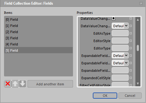
In the properties for the added FieldLayout you will find a Fields Collection property. Click on the Fields Collection button to bring up the Field Collection Editor dialog. Here we will be adding a Field for each property in our data source.
Clicking on the ‘Add Another Item’ button will invoke the Select Object dialog. Here you can choose between adding a Field or an Unbound Field. As the name implies Unbound Fields are for adding Fields that are not derived from a property from the data source directly.

Add a Field object.
A Field will show up in the Field Collection Editor dialog with properties for that Field appearing on the right of the dialog. Here is where we can make the first field point to the Icon property. To do this we must assign the Field Name property to match the name of the property from the bound data.
Type the work ‘Icon’ in the Name field.
We don’t need a Label for the icon image, so type a space in the Label field.
Finally, to limit the width and height of the icon, type 30 in both Width and Height fields.

To add and customize the next field, we will need to “add another item” to the Field Collection Editor. If you hit the OK button and closed the editor, simply click on the Fields ellipse button again in the FieldLayout Collection Editor dialog.
Add a new Field.
The next field we will assign the ProductName property to. Since ProductName needs to be separated by a space to be more human friendly, assign ‘ProductName’ to the Field Name property and ‘Product Name’ to the Label property. Also set the Width of this property to ‘160’.

Add a third Field and set the following properties:
Name: ‘ForSale’
Label: ‘For Sale’
Width: ‘70’
Add a fourth Field with the following properties:
Name: ‘ID’
Label: ‘ID’
Width: ‘60’
Add a fifth Field with the following properties:
Name: ‘ColorKey’
Label: ‘Color Key’
Finally, add the last Field with the following properties:
Name: ‘Price’
Label: ‘Price’
Width: ‘70’
Press OK on both dialogs to close them both. Build or run the project and you will see the grid update with the new field layout.
The following is the XAML which Blend generated for us:

Editor Formatting
To finish the formatting, we will need to add a few styles. To create styles with Expression Blend, you need to have an instance of the type of object you wish to style. This is problematic when the object you wish to style already exists in a context which Blend does not provide access to. For example, the xamDataGrid instantiates derivations of xamEditorsTM for each field type. Since the instance is implicitly assigned, Blend will not allow us to create a style for one of these editors since there is no explicit instance Blend can reference. To work around this you can either create the style in the XAML text editor or temporarily add an instance of the type of editor you wish to style, create the style for the editor, remove the temporary instance of the editor then assign the style to the xamDataGrid Field. We will do the latter.
Make sure the LayoutRoot in the Objects and Timeline panel is selected before proceeding.
In Assets search type xamNumericEditorTM and double-click on the editor control to add it to the Window.
With the temporary xamNumericEditor selected in Objects and Timeline, select the Object -> Edit Style -> Create Empty menu item from the top menu bar.

In the subsequent Create Style Resource dialog name the style ‘NumericEditorIDStyle’ and make sure to add it to the current document.

Blend will place the designer into Style editing mode. In this mode, any change to a property will become a Setter in the current style.
To format the xamNumericEditor to not show numbers after the decimal point, we will want to assign a mask to the Mask property.
Type ‘nnnnn’ in the Mask property (this pattern of characters will match any 5-digit long sequence of numerals).
Click on the Return Scope button to exit Style editing mode.

Now that we have our style, we don’t need the xamNumericEditor.
Delete the xamNumericEditor element in the Objects and Timeline panel.
However, we have the style which was added to the Resource Dictionary of the Window.

To apply the style, we will need to assign it to the Field.Settings.EditorStyle property for the ID field.
To return to this editor, click on the xamDataGrid FieldLayouts (Collection) property ellipse button, click on the Fields (Collection) ellipse button in the FieldLayout Collection Editor dialog, select the fourth Field in the Field Collection Editor dialog, and click on the New button next to the Setting property for the ID field.
Settings will expand to show additional settings properties for that field. Locate the EditorStyle property. In the Advanced Options for EditorStyle, the Local Resources option is disabled, so instead we will add a custom expression.

In the Custom Expression popup dialog add the following text:
{StaticResource NumericEditorIDStyle}
This should apply the formatting to the ID field immediately.
To apply currency formatting to the Price field, we simply need to change the Editor Type from xamNumericEditor to xamCurrencyEditorTM. This change will be made in similar fashion as the ID field except we will not need a style. Before we can do this, we will need a reference to the mscorlib assembly namespace.
The following instruction is the only instruction where you must switch to the XAML editor. Add the following text to the Window tag in the XAML editor:
xmlns:sys="clr-namespace:System;assembly=mscorlib"
As you might imagine, it would be nice if Expression Blend had the ability to add references to namespaces and the ability to add a Style to any type of object. Maybe in a future version.
Return to the design editor, and open the Price Field properties by returning the the xamDataGrid FieldLayouts, Fields dialogs. The last Field is the Price Field. Click on the New button for Settings.
In the Settings properties locate EditAsType and in its Advanced Options add the following text to the Custom Expression option:
{x:Type sys:Decimal}
Finally, add the following custom expression to the advanced options for the property EditorType:
{x:Type igEditors:XamCurrencyEditor}
The following XAML will be generated from the two added custom expressions:

On pressing OK on the two dialogs the Price field will update to display current locale formatted currency.
CellValuePresenter DataTemplate Override
The final change we will make to customize the formatting for the grid is the ColorKey field. Here we will create a CellValuePresenter Style which will contain a DataTemplate definition. The DataTemplate will bind the ColorKey value to the SelectedColor property on the xamColorPicker control.
If you refer to Infragistics documentation for creating a CellValuePresenter Style you will find various XAML examples. Once again, this is another scenario where Blend cannot create this style from scratch without a little help as the CellValuePresenter is another object which is created behind the scenes for every field. The CellValuePresenter defines how the value for each cell is presented within the UI of the xamDataGrid Record.
Additionally, since the xamDataGrid will always instantiate instances of this control, this element is not added to the XML that Blend reads to know what to display in Assets. To work around these few Blend limitations, we will briefly return to the XAML editor one last time.
In the XAML editor, add the following text to the LayoutRoot content (before or after the xamDataGrid block of XAML).
<igDP:CellValuePresenter/>
On returning to the designer a CellValuePresenter will appear in the Objects and Timeline. Now we have an object that we can style.

Select the CellValuePresenter, then in the Object menu on the top menu bar select the ‘Edit Style’ -> ‘Create Empty’ option.
Name the style ‘ColorKeyCellStyle’ in the Create Style Resource dialog.

To assign a non-xamEditor control to the cell value presenter, we will need to create a DataTemplate which hooks up this control. In the Style editor the breadcrumb control at the top of the designer allocates a menu for doing just that.
At the top of the designer a control will show a palette menu next to the CellValuePresenter label. This will show all the template editors available for this style. Select the second template editor for editing the ContentTemplate. From here create an empty template.

In the Create DataTemplate Resource dialog, add the following style name: ‘ColorCellDataTemplate’.
Blend places the designer in edit mode for the DataTemplate.
Add the xamColorPicker control from Assets to the DataTemplate Grid.

After making sure the xamColorPicker is selected in the Objects and Timeline panel, locate the SelectedColor property from in the xamColorPicker Properties category.
Next go to the SelectedColor Advanced Options and choose the Data Binding option.
In the Create Data Binding dialog, make sure Data Context tab is selected and add the following text to the ‘Use a custom path expression’ field:
Value
Also make sure all Layout properties are set to default. Blend will probably set the HorizontalAlignment to Left. This will end with confusing results. So it is important that both Horizontal and Vertical alignments are set to Stretch.
Return scope to the Window layout and delete the temporary CellValuePresenter from the LayoutRoot.
To assign the style to the ColorKey field, return to FieldLayouts for the xamDataGrid and Fields for the FieldLayout.
Select the second to last Field in the Field Collection Editor dialog.
Add New Settings for the ColorKey field.
Locate the CellValuePresenterStyle property and select Advanced Options.
Advanced Options will allow us to select the ColorKeyCellStyle from the Local Resources option.

There is one last caveat to work around. Blend always uses the DynamicResource keyword when assigning styles. You may encounter a problem with assigning a CellValuePresenter style using DynamicResource at run time. Since the style is defined locally, we can change DynamicResource to StaticResource. You can do this in the XAML or by simply choosing the Custom Expression option in Advanced Options. Since we already assigned the local resource, the Custom Expression field will show the expression. Here change DynamicResource to StaticResource.

Dismiss the open dialogs by pressing OK and run the application. You will find the xamColorPicker displaying the color in the ColorKey field.
In the Data panel you can customize the sample data by adding more records.

If you elements do not show up, then there may be a type in the XAML or a style was not assigned correctly. If elements show up but are oddly placed, then a Layout property was assigned that needs to be cleared.
I’ve attached my project using the WPF data grid for easy reference.
Despite a few of the caveats with working with custom styles in Expression Blend, having Blend automate the generation of the XAML for you limits manual XAML typos, and is useful in that XAML will display properties and event names, and it provides specialized editors for working with styles and templates.

In a future article, I will demonstrate applying styles to override background, highlight and hover brushes for cells, header labels, and row summaries as well as how to override text styles for cells and labels.
For now, you can download a free trial version of NetAdvantage for WPF user interface controls to try out for yourself these projects using the WPF data grid, color picker, editors and more from Infragistics that are included.
Copyright © 2010-2011 Infragistics, Inc. All rights reserved. Infragistics and NetAdvantage are registered trademarks of Infragistics, Inc. xamDataGrid, xamEditor, xamCurrencyEditor, xamNumericEditor and xamColorPicker are trademarks of Infragistics, Inc. All other marks or trademarks are the property of their respective owner(s).