
Javascript Flow Chart and Workflow with C# ASP.NET MVC
4.95/5 (24 votes)
Using JSPlumb with ASP MVC to create flow-chart and work-flow applications
Introduction
As soon as we wake in the morning, we start to make decisions - do we stay in bed? (weekend, yea!), or get out of the bed? (get to work, must catch the train...). Once we make that first decision, we might take an action (grab a coffee!), or ponder another decision (do I need to visit the bathroom first?). As the day progresses, our life is one decision after another. Its the same in every organization. In one way, we can say that life, and how it goes, is based on infinite possibilities of flow-states :)
This article is about a very useful Javascript library called 'JS plumb', and how it can help us build flow-chart or work-flow style capabilities into our .net web based applications. As you might expect these days, its not restricted to .net, and not restricted to MVC, but for this article, that's what I've chosen to focus on.

Background
I have frequently come across situations where I wish to give the user the some form of decision making in how a program executes. This may be based on a simple series of hard-coded states (yes/no, if X then choose from a list of Y actions), or may be more complex with an underlying automation system such as that provided by Windows workflow foundation. I always loved the visual aspect of workflow foundation, and missed the ability to be able to provide that wonderful drag and drop work-flow-builder experience we have in visual studio to the end user.
When I came across JSPlumb, I was immediately excited by the possibilities. It's a very flexible library that manages objects on a canvas and the connections between them - its focus is on providing a solution for the 'plumbing' part of a flow-chart or work-flow style user interface. As with a lot of these libraries, there is an open source community edition, and one that's more advanced. The latter is known as JSPlumb Toolkit and comes with commercial support. JSPlumb uses SVG and runs on all browsers from IE9 and up.
The basics
Before we start jumping into code, lets have a look at the basics of how things hang together visually with flow-charts, and JSPlumb in particular.

There are a lot of common things you will be aware of in the above diagram:
- a workfow or flow-chart usually has some kind of starting point
- there are lines that connect things together
- we have shapes that represent decisions that have to be made, and actions to be taken
- the direction of the connection between shapes is usually represented by arrows, and annotated with text of some kind.
If we zoom in on that picture a little bit closer, JSPlumb defines things as follows:

The visual objects are split into two groups. There are the objects of interest which are called the 'source' and 'target', and then the things that connect these objects. Each source or target can have 0:M anchor positions. The anchors are points on the object that the connectors can hook onto. Connectors allow objects to be linked together. Connectors link to an end-point at an anchor at either end on the source or target - as they are bidirectional, there is no start or end 'end-point', simply, endpoints!
Getting started
The first thing to understand about the library is that works using a series of DIV objects that you define. Unlike other JS libraries that get you to define a DIV as a boundry and use this as a canvas to draw on, JSPlumb simply says - "tell me what DIVs are your flow-chart shapes, and I will connect them". This makes sense, given the name of the library - its not flowchartJS or WorkFlowJS, its about joining things together, its literally the 'plumbing' !
To demonstrate this, lets define two DIVs, and then join them together with JSPlumb. First, the divs...
<div class="shape" id="shape1"></div>
<div class="shape" id="shape2"></div>
and some styling
  .shape {
  float:left;
  margin:10px;
  width: 100px;
  height: 100px;
  border: solid 1px;
}
And now, the magic....
        jsPlumb.ready(function() {
            jsPlumb.connect({
                source:"shape1",
                target:"shape2"
            });
        });
In the same way we can direct Javascript to trigger when the DOM is ready, in this case we tell jsPlumb to execute the 'connect' method for our first two shapes onces its loaded and ready to go. Heres how it looks once rendered ... all smiley-face like!

We didn't have to define the position for the connection or the anchor or endpoint shape - it used its own defaults, 'bottom' and 'round'.
Shapes
The building blocks of our flowchart are shapes - we connect them together, but the shape tiself usually signifies something. Diamonds or triangles mean decisions, circles convergance points, etc. It all depends on the application (think flow-chart versus entity relationship diagram versus web based work-flow). JSPlumb is not responsible for styling the shapes, thats up to you, and your old friend CSS. Whatever you stlye, JSPlumb will hook up. Here are some examples you may commonly see in a flow-chart application.
NB: You can get some great CSS Shape examples at CSS Tricks, for fine tuning of colours you could do worse than refer to HTMLColorCodes.

HTML Declaring the CLASS to style each DIV
        <div id="shape1" class="shape square"></div>
        <div id="shape2" class="shape circle"></div>
        <div id="shape3" class="shape triangle-down"></div>
        <div id="shape4" class="shape parallelogram"></div>
CSS styling for each example
.shape {
  float:left;
  margin:80px;
  width: 100px;
  height: 100px;
  border: solid 1px;
}

.square {
    width: 100px;
    height: 100px;
    background: #76D7C4;
}

.circle {
    width: 100px;
    height: 100px;
    background: red;
    -moz-border-radius: 50px;
    -webkit-border-radius: 50px;
    border-radius: 50px;
  background: #F7DC6F
}

.triangle-down {
    width: 0;
    height: 0;
    border-left: 50px solid transparent;
    border-right: 50px solid transparent;
    border-top: 100px solid red;
}

.parallelogram {
    width: 150px;
    height: 100px;
    -webkit-transform: skew(20deg);
       -moz-transform: skew(20deg);
         -o-transform: skew(20deg);
    background: blue;
}
Lets see what else we can do to tweak the endpoints and connections. First, lets look at the anchors, the points on the shape itself that the connectors hook onto.
Anchors
Changing where the connectors anchor is done by setting the anchors property
        jsPlumb.ready(function() {
            jsPlumb.connect({
                source:"shape1",
                target:"shape2",
                anchor:"Top"
            });
        });
Valid options are:
Top(also aliased asTopCenter)TopRightRight(also aliased asRightMiddle)BottomRightBottom(also aliased asBottomCenter)BottomLeftLeft(also aliased asLeftMiddle)TopLeftCenter
Some examples:

In addition to the static anchors listed above, there are other options available to you including Dynamic and Peripheral. The latter are interesting, as they are dynamically created depending on the type of shape you define the object source or target DIV to be. For example, if you have a decision object, you might choose a diamond shape - in this case the library will automatically put the anchors in the most logical position which would be the corners of the diamond. You get similar options using for example the circle/oval - the documentation for jsplumb anchors outlines what you need to know should you need this level of flexibility.
Endpoints
Endpoints are the intersection of connectors and anchors. They can be styled using some built-in shapes, images or custom CSS (yes, good ole Bob finally made it as an end-point .. success at last!)

Different endpoint types you can use are as follows
-
Dot This Endpoint draws a dot on the screen. It supports three constructor parameters:
radius- Optional; defaults to 10 pixels. Defines the radius of the dot.cssClass- Optional. A CSS class to attach to the element the Endpoint creates.hoverClass- Optional. A CSS class to attach to the element the Endpoint creates whenever the mouse is hovering over the element or an attached Connection.
-
Rectangle Draws a rectangle. Supported constructor parameters are:
widthOptional; defaults to 20 pixels. Defines the width of the rectangle.heightOptional; defaults to 20 pixels. Defines the height of the rectangle.cssClassOptional. A CSS class to attach to the element the Endpoint creates.hoverClassOptional. A CSS class to attach to the element the Endpoint creates whenever the mouse is hovering over the element or an attached Connection.
-
Image Draws an image from a given URL. This Endpoint supports three constructor parameters:
srcRequired. Specifies the URL of the image to usecssClassOptional. A CSS class to attach to the element the Endpoint creates.hoverClassOptional. A CSS class to attach to the element the Endpoint creates whenever the mouse is hovering over the element or an attached Connection.
-
Blank Does not draw anything visible to the user. This Endpoint is probably not what you want if you need your users to be able to drag existing Connections - for that, use a Rectangle or Dot Endpoint and assign to it a CSS class that causes it to be transparent.
Connectors
The lines that allow us to create the links between shapes are connectors. Like endpoints and anchors, they have different options that we can use. The connector carries with it some of the other concepts:
- Anchors are the places on the shapes that connectors can hook onto
- Endpoints are a visual representation of one end of a connection, which are mostly but not always attached visibly to shapes, giving an indication of where connectors can hook onto
JSPlumb has four standard connectors - a bezier curve (this is the default), a straight line, a 'flowchart' mode, and a 'state machine' mode.
Connectors and their options are generally specified using the connector property when we call any of the following methods
jsPlumb.connectjsPlumb.addEndpoint(s)jsPlumb.makeSourcejsPlumb.makeTarget
Here are some examples of building a connection, and setting the type of connection that is rendered
Example 1 - JSPlumb Connector - Bezier with different curve radius
  jsPlumb.connect({
  source:"shape1",
  target:"shape2",
  connector:[ "Bezier", { curviness:150 } ]
});

  jsPlumb.connect({
  source:"shape3",
  target:"shape4",
  connector:[ "Bezier", { curviness:50 } ]
});

Example 2 - JSPlumb Connector - Straight and flowchart connectors with options
  jsPlumb.connect({
  source:"shape1",
  target:"shape2",
  connector:[ "Straight" ],
  anchors:["Top", "Bottom"],
  endpoint:[ "Rectangle", { width:20, height:40 }]
});

  jsPlumb.connect({
  source:"shape3",
  target:"shape4",
  connector:[ "Flowchart", {cornerRadius:15}]
});

  jsPlumb.connect({
  source:"shape5",
  target:"shape6",
  connector:[ "Flowchart", {stub:10, gap:20}]
});

The options used above are 'cornerRadius', which puts a curve on the corner of the connector as it connects, 'gap' which introduces a space between the connector and the endpoint, and 'stub' which gives a squared edge to the connection.
In addition to talking about the connector options, there we have two other concepts we have still to talk about:
- Overlays are UI elements that can be used to decorate a connector - for example an arrow indicating direction of the connector, or a text overlay on the connector line itself describing the connection.
- Groups allow you to have a collection of elements 'grouped' inside another element, which can be collapsed and expanded - this could be very useful in a work-flow chart to allow the user to drill down into detail on a particular workflow process.
Overlays
The lines that make up the connectors have options available to them as well. Amongst these are overlays. These are elements like display text along the conneciton line and arrowheads. In the following example code we are going to do a few things with the overlay, add some text and style it, and add a number of different arrows.
FIrst, lets see the end result, then we'll look at how its built up

As I want to offload the styling for the 'Sample text' overlay label onto a CSS class, we'll define this first
.labelClass {
    background-color:yellow;
    padding:0.4em;
    font:16px sans-serif;
    color:#444;
    z-index:21;
    border:1px solid red;
}
Now lets look at the JSPlumb setup code
  jsPlumb.connect({
  source:"shape1",
  target:"shape2",
  paintStyle: { strokeStyle: "orange", lineWidth: 5 },
  connector:[ "Bezier", { curviness:100 } ],
  overlays:[
     [ "Arrow", { width:20, length:15, location:[.1], foldback: 1,
                paintStyle: { strokeStyle: "red", lineWidth: 2 } }
                ],
     [ "Arrow", { width:20, length:15, location:[.2],
                paintStyle: { strokeStyle: "green", lineWidth: 2 } }
                ],
     [ "Arrow", { width:20, length:15, location:[.3], direction:-1,
                paintStyle: { strokeStyle: "blue", lineWidth: 2 } }
                ],
     [ "Arrow", { width:50, length:30, location:[.9] } ],
     [ "Label", {
                   label:"Sample text",
                        location:0.5,
                        id:"label",
                        cssClass:"labelClass"
                    }],
    ]
});
As before, we start by declaring the source and target shapes.
source:"shape1", target:"shape2"
next, we define how we want the main paint style to look
paintStyle: { strokeStyle: "orange", lineWidth: 5 }
our connector is a bezier curve
connector:[ "Bezier", { curviness:100 } ]
and here come the overlays....
The first one is an arrow. Its location is 10% from the source '.1'. The location works either as a proportional value from 0 to 1 inclusive (so in this case, '.1' = 10%), or as an an absolute value, where negative values mean distance from target, and positive values (greater than 1) mean the distance from source. Foldback refers to the fold at the base of the arrow. Negative numbers cause it to float out, like a diamond shape, positive number make for a skinny pointy arrow. We'll see an example of this shortly.
"Arrow", { width:20, length:15, location:[.1], foldback: 1,
     paintStyle: { strokeStyle: "red", lineWidth: 2 } }
The main feature of the next arrow is it uses the default foldback, and we have changed the stroke color.
[ "Arrow", { width:20, length:15, location:[.2],
paintStyle: { strokeStyle: "green", lineWidth: 2 } }
Coming hot on the heels of Mr. Foldback, comes Ms.Reverse! ... here we set the 'Direction' property to be '-1'. The default is '1'.
[ "Arrow", { width:20, length:15, location:[.3], direction:-1,
                paintStyle: { strokeStyle: "blue", lineWidth: 2 } }
                ],
The last arrow of this example is a biggie - we change the dimensions of it by adjusting the width and length.
[ "Arrow", { width:50, length:30, location:[.9] } ]
Getting text in is very simple. You will recall that earlier we defined some CSS to style our label - here is where we call it.
     [ "Label", {
                   label:"Sample text",
                        location:0.5,
                        id:"label",
                        cssClass:"labelClass"
                    }]
The key bits from the above code are the 'label' which feeds the text you wish to display, and the cssClass we wish to use for styling.
Heres a closer look at how the arrows work with another example, you can follow the code underneath to see how each one is designed.

  jsPlumb.connect({
  source:"shape3",
  target:"shape4",
  connector:[ "Straight"],
  anchors: ["Right", "Left"],
  paintStyle: { strokeStyle: "orange", lineWidth: 1 },
  overlays:[
     [ "Arrow", { width:30, length:25, location:[.2], foldback: 1,
                paintStyle: { strokeStyle: "red", lineWidth: 2 } }
                ],
     [ "Arrow", { width:20, length:15, location:[.4],
                paintStyle: { strokeStyle: "green", lineWidth: 1 } }
                ],
     [ "Arrow", { width:20, length:15, location:[.65],  foldback: 2,
                paintStyle: { strokeStyle: "red", lineWidth: 8 } }
                ],
     [ "Arrow", { width:20, length:15, location:[.8], direction:-1,
                paintStyle: { strokeStyle: "blue", lineWidth: 2 } }
                ]
    ]
});
Groups
The library has a concept called 'Groups' that works pretty much as you would expect, with an additional bonus. Grouping allows you to take a set of shapes, and group them together within the scope of a parent container. Any connectors from these child shapes to other shapes on your UI are retained. Now there are two cool things to note:
- when you drag/move the parent/group container shape, all of the child shapes within it move with it.
- you can collapse and expand the 'parent' group container, and as you do, any connectors that were previously linked visually to other shapes, are 'proxied' up onto the groups collapsed element.
Heres an screenshot that shows grouping:

Ref: documentation page about grouping in JSPlumb.
Other useful things:
Common options
A lot of the time you may find you are repeating yourself with setting endpoint styles, connectors, etc. It may also be the case that in a complex applicaiton you want to have one set of styles for one type of element, and another set for the next. To help with this, we can pass in a plain old Javascript object as a 'common option' into Endpoint, Connector, Anchor and Overlay methods.
var commonEndpoint = {
      stub:"90",
      gap:"15"
};

  jsPlumb.connect({
  source:"shape5",
  target:"shape6",
  connector:[ "Flowchart", commonEndpoint]
});
Drag and drop
Another useful, and I think critical feature of a good flowchart/diagram utility is the ability to drag and drop elements onto the canvas. Drag/drop is initiated by introducing the 'draggable' method to an element:
<code data-lang="javascript">jsPlumbInstance.draggable($(".someClass"));</code>
More documentation about drag and drop here: https://jsplumbtoolkit.com/community/doc/dragging.html
Snap to grid
For a better, more organised layout, its handy to be able to 'snap' your elements on the canvas to a grid if you need.

There is an extremly useful site that demonstrates a good technique for doing this amongst other things at 'Free developer tutorials'
Saving and loading
Being able to save the users work and load it back again for them is rather critical, there are a number of solutions available for this (bingle is your friend!) ... this solution from stack-overflow works as it says on the tin....
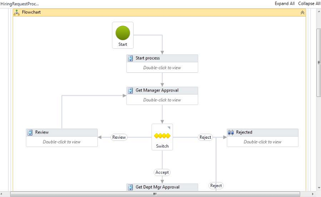
Bringing it all together - Flowchart for MVC
I have put together (attached to the top of this article), a very basic demo (based on the stack code referred to above). It allows us to click a button to add different types of elements for our flowchart, and save the chart both to a local textarea and also to our MVC controller. It should be sufficent together with the walk-through of different features above to allow you to get started!
Steps
(1) Add chart elements by clicking buttons, or load simple example chart by clicking 'load from server'

(2) result of loading from server

Happy charting, and dont forget, if you liked the article, please give it a vote!
History
08/Nov/2017 - Version 1