
Creating Responsive Website using Bootstrap
4.95/5 (12 votes)
Create a single responsive website for different device sizes such as for large desktop devices, laptop devices tablet devices and on mobile devices. This article describes the basic concepts of creating responsive website using Bootstrap.
Introduction
As a web developer, you might have noticed that earlier we had different websites for desktop and mobile devices, which requires extra development effort and management. Responsive website design allows us to create a single website which can respond to different device sizes.
This article describes how to create a responsive website using twitter Bootstrap.
Responsive Design
By responsive design, I mean that creating a single responsive website which can render well on multiple device sizes. A single website which runs on different device sizes such as on large desktop devices, laptop devices, tablet devices and on mobile devices. So responsive design concepts enable us to create a single responsive website instead of creating multiple layouts for different devices.
Bootstrap
Bootstrap is a complete HTML, CSS and JavaScript framework to create a creating responsive website. Bootstrap provides responsive CSS classes, CSS components and JavaScript components.
Bootstrap uses mobile first approach to create responsive websites. As per mobile first approach, bootstrap emphasises to first create the website for mobile devices and later enhancing and enriching the website render it on other large devices as well.
Visual Breakpoints
Bootstrap categories different devices in 4 categories on the basis of device width such as extra small devices, small devices, medium devices and large devices. Bootstrap provides different notation based on these categories and defines CSS classes on the basis of that.

- All the devices having width <
768pxfall in the category of extra small devices such as mobile devices. Bootstrap provide "xs"to represent these devices. - All the devices having width >=
768pxand <992pxare fall in the category of small devices such as tablet devices. Bootstrap provide "sm"to represent these devices. - All the devices having width >=
992pxand <1200pxare fall in the category of medium devices such as laptop devices. Bootstrap provide "md" - All the devices having width >=
1200pxare fall in the category of large devices such as large desktop devices. Bootstrap provide "lg"
12 Column Grid Layout structure
Bootstrap provides 12 column grid layout structure to make the layout responsive. Bootstrap divides the complete device width into 12 columns. A number specified with the class represents the element having that class will take the specified number of column space of total 12 column.
Example: If we define a class '.col-sm-6' on the <div> element then this means that this <div> element will take the 6 column space of total 12 column on small, medium and large devices and complete 12 column on extra small devices.

Add Bootstrap in Project
Create a new website using Visual Studio. If you do not have visual studio then you can choose any editor of your choice.
Install the Bootstrap Nuget package from Nuget package manager. In case you are using the different IDE then download compiled version of bootstrap from http://getbootstrap.com/getting-started/#download by clicking download bootstrap button.
The website will contain the following folders after successful installation.
Content- includes the bootstrap.cssScripts- include the bootstrap.js and jquery.js. jQuery is installed because boostrap.js has dependency on jQuery library.- fonts

Creating Basic Layout
Add an HTML page Home.html and add the below code.
Add reference of bootstrap.css on the head on the page
Add reference of jQuery-1.9.1.js and bootstrap.js at bottom of the body tag. We generally load script at bottom of the page to improve the page laod time as we want aur HTML and CSS to load first.
<!DOCTYPE html>
<html>
<head>
    <title>Home</title>
	<meta charset="utf-8" />
    <meta name="viewport" content="width=device-width,
    initial-scale=1, maximum-scale=1, user-scalable=no">
    <link href="Content/bootstrap.css" rel="stylesheet" />
    <link href="Content/Site.css" rel="stylesheet" />
</head>
<body>
    <header class="container">
       <h2>Header</h2>
    </header>
    <section class="container" >
        <div class="row">
            <div class="col-md-3 leftNav">
                Left Navigation
            </div>
            <div class="col-md-6 content">
                Content Area
            </div>
            <div class="col-md-3 reletedContent">
                Relate content
            </div>
        </div>
    </section>
    <footer class="container">
        <h2>Footer</h2>
    </footer>
    <script src="Scripts/jquery-1.9.1.js"></script>
    <script src="Scripts/bootstrap.js"></script>
</body>
</html>
Notice the below code, this ensure the proper rendering of the web page on mobile devices. user-scalable=no defines that user is not allowed to zoom page on mobile devices.
<meta name="viewport" content="width=device-width,
initial-scale=1, maximum-scale=1, user-scalable=no">
This will create the <header> <footer> and main container section. Add class .container on header, footer and section elements.
Inside section add a <div> with the class .row.
Inside .row class add 3 column classes for let Nav, main content and for other related content. Define class .col-md-3, col-md-6, col-md-3 respectively. These classes will divide the total 12 column structure in 3:6:3 ratio.
So left nav will take the first 3 column, main content area will take the next 6 column and other related content will take the last 3 column space.
Add Navigation Item
Bootstrap provides the Navbar component to display navigation item. Bootstrap navbar component provides the toggle button (3 small horizontal lines on the right side) to show and hide the navigation items.
Add below code below the header section.
<nav class="navbar navbar-inverse container-fluid navbar-fixed-top">
        <div>
            <!-- Brand and toggle get grouped for better mobile display -->
            <div class="navbar-header">
                <button type="button" class="navbar-toggle collapsed"
                data-toggle="collapse" data-target="#bs-example-navbar-collapse-1"
                aria-expanded="false">
                    <span class="sr-only">Toggle navigation</span>
                    <span class="icon-bar"></span>
                    <span class="icon-bar"></span>
                    <span class="icon-bar"></span>
                </button>
                <a class="navbar-brand"
                href="http://modernpathshala.com">Bootstrap Demo</a>
            </div>
            <!-- Collect the nav links, forms, and other content for toggling -->
            <div class="collapse navbar-collapse" id="bs-example-navbar-collapse-1">
                <ul class="nav navbar-nav">
                    <li class="active"><a href="Home.html">
                    <span class="glyphicon glyphicon-home"></span>
                    Home</a></li>
                    <li><a href="#">
                    <span class="glyphicon glyphicon-king"></span>
                    About</a></li>

                </ul>
                <form class="navbar-form navbar-left" role="search">
                    <div class="form-group-sm">
                        <div class="input-group">
                            <input type="text"
                            class="form-control" placeholder="Search">
                            <span class="input-group-btn">
                                <button class="btn btn-success btn-sm">Go!</button>
                            </span>
                        </div>
                    </div>

                </form>
                <ul class="nav navbar-nav navbar-right">
                    <li><a href="#"><span class="glyphicon
                    glyphicon-log-in"></span> Login</a></li>
                    <li><a href="#"><span class="glyphicon
                    glyphicon-user"></span> Register</a></li>

                </ul>
            </div><!-- /.navbar-collapse -->
        </div><!-- /.container-fluid -->
    </nav>
Bootstrap Navbar component consists of 2 main parts
- <div> element with the .
navbar-headerdisplayed on mobile devices it includes toggle button and brand name and logo information. - <div> element with .
navbar-collapseconsists of links and form control for search functionality.
Class .navbar-fixed-top is used to fix the position of navbar on top on page scroll. Similarly, we have class .navbar-fixed-bottom to fix the navbar on the bottom of the page.
Below is the desktop and mobile view of navbar.
Desktop View

Mobile View

Adding Glyphicons
Glyphicon is an icon library which uses Unicode characters to display an icon. Glyphicons provide different classes to represent the different icon. The class name starts with .glyphicon-*. The official site of glyph icons is http://glyphicons.com/. All the glyph icons are not free but with the Bootstrap, we can use some of them free.
To create an icon we just need to add a <span> element and need to provide 2 classes. One is .glyphicon and other is .glyphicon-* icon specific class.
<span class="glyphicon glyphicon-home">
The above line will create the home icon. I have added some icon above in Add Navigation Item Section. The complete list of icon classes is available at http://getbootstrap.com/components/#glyphicons
Add Panels
Panels are container elements and used to contain the other content. Sometimes we need to display some content inside the box then we can use panels. Bootstrap provides responsive panels.
A panel contains 3 sub parts
- Panel header
- Panel body
- Panel footer
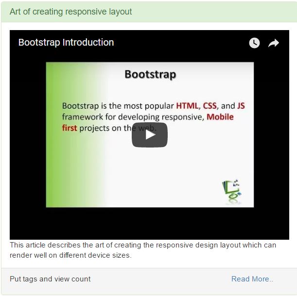
<div class="panel panel-primary">
    <div class="panel-heading">
        <h2 class="panel-title">Column Offset using Bootstrap</h2>
    </div>

    <div class="panel-body">
        This article describes the art of creating the responsive design
        layout which can render well on different device sizes.
    </div>

    <div class="panel-footer">
        <div class="row">
            <div class="col-xs-9">
                <p>Put tags and view count</p>
            </div>
            <div class="col-xs-3">
                <a href="#">Read More..</a>
            </div>
        </div>
    </div>

</div>
To create a panel we need to add class .panel. We can use other contextual classes such as .panel-default, .panel-success, .panel-error, .panel-info, .panel-warning to create different type of panels along with the class .panel.
- Use class
.panle-headerto create panel header and class.panel-titleto create panel title. - Use class
.panel-bodyto create panel body. - Use class
.panle-footerto create panel footer.

Add Jumbotron
Jumbotron is used to display the leading text on the web page. We can use jumbotron to highlight some information on the page. Bootstrap provide class .jumbotron to create jumbotron component.
<div class="jumbotron">
    <h2>Bootstrap</h2>
    <img class="img-responsive img-thumbnail"
    src="Content/Images/article1.png" />
    <p class="text-justify">Bootstrap is HTML,
    CSS and JavaScript framework for developing responsive,
      mobile first websites. Bootstrap makes front-end web development faster and easier.
     It's made for folks of all skill levels, devices of all shapes,
     and projects of all sizes.</p>
    <p><a class="btn btn-success btn-default"
    href="#">Start Learning</a></p>
</div>
Below image displays Jumbotron.

Add Responsive Images
Generally images are displays as in-line element on the browser. So bootstrap provide class .img-responsive to create responsive images. This class displays the images as a block element and also make them responsive for different device sizes. So just add class .img-responsive on <img> element to create rersposnive image. I have added an resposnive image inisde the jumbotron component above.
Bootstrap also provide other classes for the images.
img-rounded- to create rounded corner imageimg-thumbnail- to create thumbnailimg-circle- Crop the image in shape of circle.
<img class="img-responsive img-thumbnail" src="Content/Images/article1.png" />
Add Responsive Tables
Tables are used to display structuctured data in the form of row and column. Boostrap provide the class .table to create a responsive table. Class .table will define the layout of table and set the border. Add class .table-responsive to make the table responsive.
Bootstrap provide other table classes mentioned below:
.table-striped -Make the different colour of alternate rows so that table rows look like as strips..table-condensed -Reduces the table row height and make the table condense..table-hover -Provide the hover effect on hover event.
<table class="table table-responsive table-striped table-condensed table-hover">
    <tbody>
        <tr class="success">
            <td>Class name</td>
            <td>Description</td>
        </tr>
        <tr>
            <td>table</td>
            <td>Define a table</td>
        </tr>
        <tr>
            <td>table-responsive</td>
            <td>Class to make a table responsive</td>
        </tr>
        <tr>
            <td>table-striped</td>
            <td>Make a table like as stripe</td>
        </tr>
        <tr>
            <td>table-hover</td>
            <td>Create hover effect</td>
        </tr>
    </tbody>
</table>
Preview is displayed in the image of Panel section.
Embed responsive Video
Bootstrap provide the classes to make the embedding responsive. Most of the time we require to display 3rd party application inside our web page. So we can use <embed>, <iframe>, <video> or <object> tag to embed these 3rd party applications.
Bootstrap provide the class .embed-responsive to create responsive embedding. We can also provide aspect ratio to dispaly differnt aspect ratio.
.embed-responsive-16by9- Display the embed or video in width and height ratio of 16:9.embed-responsive-4by3- Display the embed or video in width and height ratio of 4:3
<div class="embed-responsive embed-responsive-4by3">
    <iframe src="https://www.youtube.com/embed/afsdfsdSg5l_Eo" width="425" height="350"></iframe>
</div>
So this will embed a responisve video for desktop, tablet and mobile devices from YouTube.
Conclusion
So we have used several bootstrap component to create a responsive website which looks like as below. You can download the complete code of the application from attchment.
Desktop View

Mobile View

For more detailed information on how to create this website step by step displayed in this article, please refer complete video tutorial series.