
Passing Custom-Properties into Styled/Templated Control with triggers
Simple way to pass custom(Attached) properties into a style-based control-template with triggers
Introduction
A few days ago, one of my colleagues came to me with a question - 'What is the easiest way to pass special properties into a templated control with triggers?' Later he came back with a solution he found on the internet, once saw it, I thought I could do better...
Background
For my test app I've choose to template a Button-Control in the well know pattern consist of a style with a template setter.
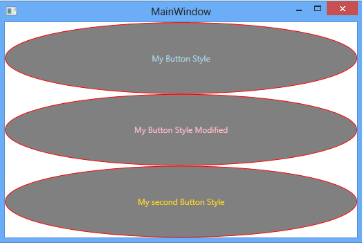
The Button will be Templated into an ellipse shaped Button, with the content (text). This content will be colored depending on Mouse-Over state.
Using the code
As it is implied from the test-app description we will need two special properties:
- Content(text)- Brush while Mouse-Over.
- Content(text)- Brush while Mouse-Not-Over.
In WPF the term 'special'/'additional' properties usually directly translates to 'Attached-Properties'. So, I've added two of the matching types to my project (located inside the
MainWindow's code-behind partial class , for simplicity.
public static SolidColorBrush  GetMouseOverBrush(DependencyObject obj)
{
    return (SolidColorBrush )obj.GetValue(MouseOverBrushProperty);
}

public static void SetMouseOverBrush(DependencyObject obj, SolidColorBrush  value)
{
    obj.SetValue(MouseOverBrushProperty, value);
}

// Using a DependencyProperty as the backing store for MouseOverBrush.
// This enables animation, styling, binding, etc...
public static readonly DependencyProperty MouseOverBrushProperty =
    DependencyProperty.RegisterAttached("MouseOverBrush",
    typeof(SolidColorBrush ), typeof(MainWindow), new PropertyMetadata(new SolidColorBrush(Colors.Green)));

public static SolidColorBrush  GetNotMouseOverBrush(DependencyObject obj)
{
    return (SolidColorBrush )obj.GetValue(NotMouseOverBrushProperty);
}

public static void SetNotMouseOverBrush(DependencyObject obj, SolidColorBrush  value)
{
    obj.SetValue(NotMouseOverBrushProperty, value);
}

// Using a DependencyProperty as the backing store for NotMouseOverBrush.
// This enables animation, styling, binding, etc...
public static readonly DependencyProperty NotMouseOverBrushProperty =
    DependencyProperty.RegisterAttached("NotMouseOverBrush", typeof(SolidColorBrush ),
    typeof(MainWindow), new PropertyMetadata(new SolidColorBrush(Colors.LightBlue)));
These properties values can be set in three different layers:
- At the Attached-Property default value - as the property 'basic' default value (as seen above).
- At the style-level setters- acting as the Style's default value for these properties (as seen in derived style code).
- At the actual implementation of the style (styled-button on this case (second button))
After declaring those properties, the template (inside the style's 'template' property-setter), can use these properties in the following manner:
<Style x:Key="MyButtonStyle" TargetType="Button">
    <Setter Property="Template">
        <Setter.Value>
            <ControlTemplate TargetType="Button">
                <Grid >
                    <Ellipse x:Name="ell"  Fill="Gray" Stroke="Red"/>
                    <ContentPresenter  x:Name="tb"  Content ="{TemplateBinding Content}"
                      HorizontalAlignment="Center" VerticalAlignment="Center"
                      TextElement.Foreground="{TemplateBinding  app:MainWindow.NotMouseOverBrush}"
                      IsHitTestVisible="False"/>
                </Grid>
                <ControlTemplate.Triggers>
                    <Trigger SourceName="ell" Property="IsMouseOver" Value="True">
                        <Setter Property="TextElement.Foreground"
                          TargetName="tb" Value="{Binding RelativeSource={RelativeSource TemplatedParent},
                          Path=(app:MainWindow.MouseOverBrush)}"/>
                    </Trigger>
                </ControlTemplate.Triggers>
            </ControlTemplate>
        </Setter.Value>
    </Setter>
</Style>
And derived(based-on) styles can change them like this:
<Style x:Key="MySecondButtonStyle" BasedOn="{StaticResource MyButtonStyle}" TargetType="Button">
    <Setter Property="app:MainWindow.MouseOverBrush" Value="LightGreen"/>
    <Setter Property="app:MainWindow.NotMouseOverBrush" Value="Gold"/>
</Style>
Last, the Styled-Button implementation:
<Button Grid.Row="0" Content="My Button Style" Style="{StaticResource MyButtonStyle}" />
<Button Grid.Row="1" Content="My Button Style Modified" Style="{StaticResource MyButtonStyle}"
   app:MainWindow.MouseOverBrush="Yellow" app:MainWindow.NotMouseOverBrush="Pink"/>
<Button Grid.Row="2" Content="My second Button Style" Style="{StaticResource MySecondButtonStyle}"  />
That's it. hope You've found it useful.