
Using DrawingContext to create custom-drawn elements in WPF
3.89/5 (9 votes)
Introduction to WPF DrawingContext api
Introduction
This article explains how to use WPF DrawingContext api to create custom drawn elements. I have taken a simple example of a Horizontal Axis which can be reused in any chart control.

Background
Most of the elements and controls in the WPF Standard Library such as ComboBox for example are composed of multiple elements internally. If you inspect the visual tree of a ComboBox, you will find that it contains a toggle button and a popup. It is a preferred method to create elements and controls by combining existing elements, but it might be an overkill in some cases. Large number of elements in a visual tree(or even small number of heavy elements) can cause the main element to become very heavy and consume more memory, thereby causing performance issues.
There is a solution to this problem and it involves letting the element take control of the rendering of its content by using DrawingContext class. It is a very memory efficient way of building a composite element. It also simplifies the visual tree of the element and makes it lighter.
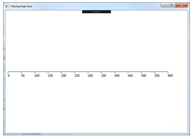
DrawingContext is a lightweight class which can be used to render rectangles, lines, text or any arbitrary geometric shapes. It can also be used to add visual effects to the rendered content. In this article, we will take the example of a horizontal axis line with labels and ticks as shown in figure below and see how we can build it using DrawingContext.
Using the code
public class HorizontalAxis : FrameworkElement
    {
        private Pen mainPen = new Pen(Brushes.Black, 1.0);
        private double startPoint = 0.0;
        private double endPoint = 600.0;

        protected override void OnRender(DrawingContext drawingContext)
        {
            base.OnRender(drawingContext);

            //Draw horizontal line from startPoint to endPoint
            drawingContext.DrawLine(mainPen, new Point(startPoint, ActualHeight / 2),
                                             new Point(endPoint, ActualHeight / 2));

            // Draw ticks and text
            for (double i = 0.0; i <= endPoint; i++)
            {
                if (i % 50 == 0)
                {
                    // Draw vertical ticks on the horizontal line drawn above.
                    // They are spaced apart by 50 pixels.
                    drawingContext.DrawLine(mainPen, new Point(i, ActualHeight / 2),
                                                     new Point(i, ActualHeight / 1.25));

                    // Draw text below every tick
                    FormattedText ft = new FormattedText(
                       (i).ToString(CultureInfo.CurrentCulture),
                                    CultureInfo.CurrentCulture,
                                    FlowDirection.LeftToRight,
                                    new Typeface(new FontFamily("Segoe UI"),
                                        FontStyles.Normal,
                                        FontWeights.Normal,
                                        FontStretches.Normal),
                                    12,
                                    Brushes.Black,
                                    null,
                                    TextFormattingMode.Display);

                    drawingContext.DrawText(ft, new Point(i, ActualHeight / 1.2));

                }
            }
        }
    }
You can use the HorizontalAxis component in your xaml file as shown below
<local:HorizontalAxis VerticalAlignment="Center" MinHeight="20"/>
As seen in the code above, I have created a custom component called HorizontalAxis which inherits from FrameworkElement class. FrameworkElement class adds support for layouting, events, data binding and dynamic resources, styles and animation support to HorizontalAxis.
However, there is still the problem of drawing the horizontal line, ticks and labels. We can draw content by overriding the OnRender method. The OnRender method is an overridable method inherited from UIElement which receives an object of type DrawingContext as an argument. The DrawingContext object contains useful methods to draw text and shapes(for eg. DrawRectangle, DrawEllipse). In our case, we have used DrawLine and DrawText methods. DrawLine method draws a line between the specified points and DrawText method draws text at the specified location.
In order to draw the ticks, we can simply draw small vertical lines which are equally spaced apart by 50 pixels. Each such vertical line has text drawn below it.
You can see the following output on the screen.
Note that when you use these commands to draw content, you are actually storing a set of render data that will be later used by the graphics system to render the content. The content is not being drawn to the screen in real time.
We can also add blur effects or any kind of effects for that matter. Just call the PushEffect method and pass in the effect that you want as an input argument. In order to stop the effect being applied to subsequent drawings, call Pop method.