
Why Mobile First?
5.00/5 (7 votes)
What is Mobile First and what are its advantages. Implementing the approach and results stats.
Introduction
Much has been written about Mobile First, and there are good books about this topic. Still, the majority of developers and companies do not use it in their projects, or are not even aware of this approach. This is why I want to tell you about it briefly and using examples; this will be useful information for those who never heard about this approach.
I will attempt to answer three main questions:
- What is Mobile First and what are its advantages
- Implementing the approach
- Results stats
What is Mobile First?
This year, the amount of people using mobile devices to access the Internet reached 60%. Therefore, mobile traffic is becoming more important, and website owners must reckon with this statistic. In practice, mobile phone and tablet users spend less time online and prefer websites on the first few lines of search results. At the same time, PC users can spend more time looking for information. Therefore your website must be well optimised for search engines (SEO), and satisfy all Mobile First requirements, so that the user experience of your website via a mobile device is supremely convenient and user-friendly.
Therefore, some of the most important requirements in Mobile First development are:
- Show the most important content first.
- The website must be light and optimised, as a mobile network connection speed can be slow depending on the user’s location.
- The website must not load more resources than needed for the user to receive the required information, as mobile Internet is still expensive. Additional information must be downloaded only if the user requests it.
So, Mobile First is a method of developing an optimised website for varying mobile devices, taking into account the network connection speed. As well as the importance of essential content to the end user.
Recently, search giant Google has written about the importance of this approach:
“Starting April 21, we will be expanding our use of mobile-friendliness as a ranking signal. This change will affect mobile searches in all languages worldwide and will have a significant impact in our search results. Consequently, users will find it easier to get relevant, high quality search results that are optimized for their devices.”
Read full post.
Video about the significance of Mobile First by Olivier Rabenschlag – Head of Creative Agency Development, Google
Advantages of the Mobile First approach.
To remind you, today the number of users who utilize mobile devices to surf the web reached 60%. Therefore, the use of Mobile First when developing a website bestows significant advantages primarily for these users.
- One website for all devices.
- Users will see the important page content first.
- Fast page loading at low connection speeds.
- Convenient interface for navigation on a mobile screen.
- Minimal amount of web resources required for showing the main content – economy of mobile Internet traffic.
- Top positions in Google search results.
Implementation.
Implementation of the approach will be demonstrated using the Moff (Mobile First Framework). It is a JavaScript framework that is tailored to Mobile First development. We will consider the approach using the example of a page with detailed information about a car.
Determining the Important Part of the Content
Usually, such a page contains a lot of data. We must decide what is more important here for the user.
Detailed list of data on the page:
- The main car photo
- Small thumbnails of additional pictures
- Manufacturer, model and specifications
- Price
- Description
- Performance checklist
- Equipment
- User comments
- Social networks Facebook, Twitter, g+
- List of similar cars
Assume that the most important features of this list are the main photo, manufacturer, model and specifications, price, performance checklist and equipment.
Then we markup a page where we will only add this information.
<!DOCTYPE html>
<html lang="en">
<head>
	<title>Mobile First page.</title>
	<meta charset="utf-8">
	<meta http-equiv="X-UA-Compatible" content="IE=edge">
	<meta name="viewport" content="width=device-width, initial-scale=1">
	<link rel="stylesheet" href="styles/styles.css">
</head>
<body>
<div class="container">
	<header role="banner">
		<div class="header">
			<div class="header_logo">
			<img src="images/logo.jpg"></div>
			<div class="header_info">
				<div class="header_info_company-name">Company Name</div>
				<div class="header_info_description">Company description</div>
			</div>
		</div>
	</header>
	<main role="main">
		<div class="vehicle">
			<div class="vehicle_images">
				<div class="vehicle_images_main">
					<img src="images/preview1.jpg">
				</div>
			</div>
			<div class="vehicle_info">
				<h1 class="vehicle_info_title">2015 Nissan Versa Note</h1>
				<p class="vehicle_info_description">
					Lorem ipsum dolor sit amet, consectetur adipiscing elit,
					sed do eiusmod tempor incididunt ut labore et dolore magna aliqua.
					Ut enim ad minim veniam, quis nostrud exercitation
					ullamco laboris nisi ut aliquip ex ea commodo consequat.
					Duis aute irure dolor in reprehenderit in voluptate
					velit esse cillum dolore eu fugiat nulla pariatur.
					Excepteur sint occaecat cupidatat non proident,
					sunt in culpa qui officia deserunt mollit anim id est laborum.
				</p>
			</div>
			<div class="vehicle_details">
				<ul class="vehicle_details_list">
					<li><span class="vehicle_details_label">
					Model:</span> Versa Note</li>
					<li><span class="vehicle_details_label">
					Body:</span> 4D Hatchback</li>
					<li><span class="vehicle_details_label">
					Engine:</span> 1.6L 4-Cylinder DOHC 16V</li>
					<li><span class="vehicle_details_label">
					Fuel:</span> Gasoline</li>
				</ul>
			</div>
			<div class="vehicle_equipment">
				<h3>Standard</h3>
				<ul class="vehicle_equipment_list">
					<li>Brake assist</li>
					<li>Dual front side impact airbags</li>
					<li>Rear window defroster</li>
					<li>Passenger door bin</li>
					<li>Driver door bin</li>
					<li>Occupant sensing airbag</li>
					<li>Traction control</li>
					<li>CD player</li>
					<li>Trip computer</li>
					<li>Electronic Stability Control</li>
					<li>Front anti-roll bar</li>
					<li>Power steering</li>
					<li>Rear window wiper</li>
					<li>Front reading lights</li>
					<li>Overhead airbag</li>
					<li>ABS brakes</li>
				</ul>
			</div>
		</div>
	</main>
	<footer role="contentinfo">
		<div class="footer">
			<div class="footer_created">
				Created by Company.com
			</div>
			<div class="footer_copy">
				<ul class="footer_copy_list">
					<li class="footer_copy_item">
					<a href="#">Copyright</a></li>
					<li class="footer_copy_item">
					<a href="#">Contact</a></li>
					<li class="footer_copy_item">
					<a href="#">Sitemap</a></li>
				</ul>
			</div>
		</div>
	</footer>
</div>
</body>
</html>
Ideally, this is the size of traffic that can be spent by the user to receive this data. We will attempt to reach this level with minimal deviation. First, create the styles to display the pages on mobile devices. Only then, the styles are adapted to screens of other sizes using media query.
@media (min-width: 768px) {
	/*Tablet and desktop styles*/
}
Adding Complementary Information
Now, we must add the rest of the data in a way that will make the user aware of it, and he can receive the data by requesting it.
Here, the Moff framework Data Events helpers and AMD possibilities come to the rescue.
Adding Thumbnails for the Main Photo
We must show the user that there are additional pictures available. For this, we must add a link under the main picture that leads to the thumbnails.
<div class="vehicle_images">
	<div class="vehicle_images_main">
		<img src="images/preview1.jpg">
	</div>
	<div class="vehicle_images_thumbs">
		<a href="thumbs.html"
		data-load-target=".vehicle_images_thumbs"
		data-load-screen="sm md lg" data-load-module="vehicle-gallery">
			See more images...
		</a>
	</div>
</div>
Here, we use Data Events helpers that facilitate the reception of information when it is requested. Clicking on the link, an AJAX query will be sent to the address indicated in the href attribute. The request result will be written into the element indicated in the data-load-target attribute. The important thing here is the fact that the data-load-screen attribute regulates the values at which the thumbnails will be automatically downloaded. Screen sizes are taken from the Twitter Bootstrap CSS framework. So, define the registered module identifier in the data-load-module attribute, which will be loaded after the result of the AJAX query is pasted.
After the link is clicked, the following takes place:
- Ajax query is sent to the link URL and the result is pasted on the page
- Registered module is loaded (vehicle-gallery)
- Dependencies are loaded (jQuery and Slick-carousel)
- The main file module is downloaded
- The module is initialized
Now let’s consider the registration of this module.
Module Class Definition.
Moff framework has a modular system, which can be used to implement the vehicle-gallery module class. Moff modules are independent elements of the system that have their own business logic and can have dependencies to external libraries.
Moff.modules.create('VehicleGallery', function() {
	var _module = this;

	var _mainImage;

	function setMainImage() {
		_mainImage = _module.find('.vehicle_images_main img')[0];
	}

	function initializeSlickJs() {
		$(_module.find('.vehicle_images_thumbs-list')).slick({
			infinite: true,
			slidesToShow: 5,
			slidesToScroll: 1
		})
	}

	function handleMainImage() {
		$(_module.scope).on('click', '.vehicle_images_thumbs-item img', changePreview);
	}

	function changePreview() {
		var index = this.src.match(/thumb(\d+)/);
		_mainImage.src = 'images/preview' + index[1] + '.jpg';
	}

	this.scopeSelector = '.vehicle_images';

	this.init = function() {
		setMainImage();
		initializeSlickJs();
		handleMainImage();
	};
});
During the class initialization we launch slick-carousel to create a carousel with our thumbnails and install the handler for their preview.
Module Registration
Module registration takes place using the object that contains a unique identifier, can contain module dependencies and the main module class file.
<script src="/bower_components/moff/dist/moff.min.js"></script>
<script>
	Moff.amd.register({
		id: 'vehicle-gallery',
		depend: {
			js: ['/bower_components/jquery/dist/jquery.min.js',
			'/bower_components/slick-carousel/slick/slick.min.js'],
			css: ['/bower_components/slick-carousel/slick/slick.css']
		},
		file: {
			js: ['js/vehicle-gallery.js']
		},
		afterInclude: function() {
			Moff.module.initClass('VehicleGallery');
		}
	});
</script>
In our example, we noted jQuery in dependencies, and its slick-carousel plugin that creates a carousel using the thumbnails. Dependencies load synchronously, in the order that you determine. After the dependencies, the vehicle-gallery.js. module class loads. After the module file and its dependencies are loaded, we initialise the module using an afterInclude event.
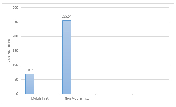
Results Statistics
Let’s sum up the Mobile First page creation results. The lower graph shows that the non-optimised page is 73% heavier than the page adapted to Mobile First requirements. This way, you can save 186.94 KB, that the user may not even need when viewing your webpage.
Conclusion
In this manner, we do away with downloading a large amount of secondary resources that are still available at the user’s request.
In this article, only one example of loading additional information has been considered. A complete example can be viewed on the framework website.
P.S. In this tip, I wanted to illustrate the right way of using the Mobile First approach, with the assistance of the Moff framework.
Original resource: Why Mobile First?