
CSS3 Animations on a HTML5 page
4.99/5 (51 votes)
Introduction to CSS3 Animations
Introduction
This article is fifth in the series of 12 articles that will take us through learning HTML5 and CSS3.
This article is intended to introduce the below concepts
- Working with HTML5 Audio and Video tags
- CSS3 Text Effects (Outline, Shadow, Wrap, etc.)
- CSS3 Transitions
- CSS3 2D and 3D Transforms
- CSS3 Animations
And we also have some assignments in between.
- Assignment 1 - Create 3D test effect using shadows
- Assignment 2 - Create a Neon Text effect on hover
- Assignment 3 - Create INSET Text style using shadows
- Assignment 4 - Create a Banner using CSS Animation
- Assignment 5 - Create a Timer using CSS Animation
Background
The articles related to basics of HTML and CSS will help understanding this article better. Below are the links.
- Beginning with HTML and CSS - Part 1/12
- Beginner's Guide to HTML5 & CSS3 - Part 2 of 12 (Linking James Jensen's article) ,
- Beginning with HTML and CSS - Part 3/12
- Beginning with HTML and CSS - Part 4/12 - Laying Out Your First Web Page


Working with HTML5 Audio and Video tags
HTML5 introduced native support to include audio and video files on our pages without the need for plugins like flash. Most of us would agree that relying on a plug-in to deliver media would not be the most considered way.
Lets look at the each of the tags below
Audio:
HTML5 enables the native audio playback using the <audio> tag, this makes it a lot easier to add media to a page. In fact it’s just one or two lines of code that’s needed to add media. And yes, this is supported by all major browsers.
The <audio> element lets us add audio directly to a webpage with a UI containing controls like Play/Pause/Volume. This is a standard HTML element and can be controlled using simple HTML attributes and styled with CSS.
HTML5 defines a number of attributes for Audio element. Let’s look at the most common attributes of this tag before trying out some examples.
|
Name |
Values |
Examples |
Comments |
|---|---|---|---|
|
Id |
String : An Identifier for the element |
Id=”AwesomeAudio1” |
This is rather a global attribute for all HTML elements and defines the ID of the element. |
|
src |
String : URL or path of the audio file. |
|
This attribute is used to provide the location of the audio file. |
|
preload |
|
|
This attribute is used to direct the browser on how to load the audio file. When the value is “preload”, browser would load the audio file when the page loads. “Metadata” would specify only metadata to be loaded on page load and “none” specifies that the audio file and metadata not to be loaded on the page load. |
|
autoplay |
Boolean:
|
|
Specifies whether or not to start playing the audio as soon as the object has loaded. This attribute when set to true would override the preload attribute as a autoplay would need to force a preload. |
|
controls |
String:
|
|
Specifies whether or not to display audio controls (such as a play/pause button etc). |
|
muted |
|
|
Specifies whether or not to start playing the audio muted. |
|
Loop |
|
|
Specifies whether or not to restart playing the audio once completed. |
Now having said that the HTML5 audio tag is supported by many of the major browsers, we will also have to look at handling scenarios when the tag or the audio type is not supported.
The first scenario is when we specify a audio source that’s of a particular type (say mp3) and is not supported by the browser, in this case there are two things we could do.
If you have audio available in different formats then we can specify multiple sources each point to the same audio, in this case new nested elements called <source> are created with src attributes instead of defining the src attribute in the Audio tag. The first recognized and supported format will be used.
Below are some examples on how to include multiple and single Audio source.
Single:
<audio id="audio1" controls source src=“Audio/Kalimba.ogg” type=”audio/ogg”/>
Multiple:
<audio id="audio1" controls>
<source src=“Audio/Kalimba.ogg” type=”audio/ogg”>
<source src=“Audio/Kalimba.mp3” type=”audio/mp3”>
</audio>
Now what if the Browser doesn’t support Audio tag at all, then we still need a Fall back right ?
There can be two ways to handle this.
1. Simply inform the user that the Audio is not supported in this Browser and mention the browser that you would work. Something like below.

2. Fall back to traditional way of using a plugin like media player. This can be done in different ways, however to keep this simple I am showing the simplest way of doing this with in HTML.
To do this we can include a media player object after the Source tags within Audio tag. When the browser doesn’t recognize the Audio tag it would embed the content in object tag. Below is the code and a screenshot on how this works.
<h2>Audio</h2>
<audio controls>
    <source src="Audio/kalimba.ogg">
    <source src="Audio/kalimba.mp3">
<object id="audioPlayer">
<param name="filename" value="./Audio/kalimba.mp3">
     <embed src="./Audio/kalimba.mp3" width="300" height="40"/>
    </object>
</audio>

Video:
HTML5 enables the native video playback using the <video> tag. Embedding a Video on a page is very similar to embedding an Audio, the important attributes described above works for videos as well, below is one attribute that’s different and an important one for a video.
- Poster : Will display a picture while the video downloads and before the user decides to play the video. If absent, the first frame of the video will be shown.
- Syntax: poster = "Valid Image filename"
- Example: <video controls poster="./images/photo1.jpg">
Let’s see an example. In our below example we have implemented the same fall back as in audio. When you run this in Chrome you will see the Rajni.mp4 play because Chrome wouldn’t support Wildlife.avi.
<h2>Video</h2>
<video controls width="500" height="350" poster="./images/photo1.jpg">
    <source src="Video/Wildlife.avi">
    <source src="Video/Rajni.mp4">
<object id="mediaplayer">
<param name="filename" value="./Video/Wildlife.avi">
     <embed src="./Video/Wildlife.avi" width="500" height="350"/>
</object>
</video>
Result:


CSS3 Text effects
We saw in our previous lessons how some decorations and effects can be applied a text to make our page look more appealing.
Today we will look at some more important text effects and also how we could use them to make our web page fancy.
The main text effects we would be learning and experimenting with will be:
- Text Wrap
- Text Overflow
- Text Transform
- Text Shadow
Text Wrap:
There are 4 values that this attribute can take. The Text-Wrap is not supported in any of the browsers yet and hence we might not be able to experiment with all the values. However, below are the values and their explanations
- normal - Line breaks allowed only at break points
- usage: text-wrap: normal;
- none - No Line break allowed. Text that does not fit in the element, overflows it
- usage: text-wrap: none;
- unrestricted - Lines may break between any two characters
- usage: text-wrap: unrestricted;
- suppress - Line breaking is suppressed within the element. The browser may only break lines within the element if there are no other valid break points in the line
- usage: text-wrap: suppress;
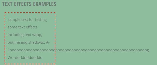
Below is a screen with Text-wrap set to normal. You see that wherever the line could break it broke but the long word had to over flow.
Text-overflow:
Now the overflow of a text beyond the borders isn’t really good, so what could we do to make it look better? First thing we should set the overflow property of the div to hidden so that we don’t see this.

With this the problem is that the user will never know there is a long text, hence we use the new HTML5 attribute called Text-overflow. The text overflow takes the below values and we have examples demonstrating the results of some of those values below.
- clip - Default value. Clips the text
- ellipsis - Append an ellipsis ("...") at the end of the line to indicate there is more text
- string - Append the given string to represent clipped text
Let’s try these .. below is the code and the screenshot of the effects of setting text-overflow values.
<span style="text-overflow:clip;overflow:hidden; border:2px dashed red;width:200px;margin:10px;padding:10px;">Clip : sample text for testing some text effects including text wrap, outline and shadows. A-LooooooooooooooooooooooooooooooooooooooooooooooooooooooooooongWordddddddddddd</span>

span style="text-overflow:ellipsis;border:2px dashed yellow;overflow:hidden;width:200px;margin:10px;padding:10px;">Ellipsis: sample text for testing some text effects including text wrap, outline and shadows. A-LooooooooooooooooooooooooooooooooooooooooooooooooooooooooooongWordddddddddddd</span>

Text-Transform:
Text-transform is the simplest of all the text-effects and it simply specifies how to capitalize an element’s text. It usually is used to make all-uppercase in headers or Capitalise each word in a statement. It also supports all-lowercase. Below are the values and their descriptions that this attribute takes.
- capitalize - Capitalises the first letter of every word.
- uppercase - Forces every letter into uppercase.
- lowercase - Forces every letter into lowercase.
Example:
<div>style="text-transform:capitalize : <span style="border: 1px dashed yellow; font-weight: bold; text-transform: capitalize">capitalize</span></div>
<div>style="text-transform:lowercase : <span style="border: 1px dashed red; text-transform: lowercase; font-weight: bold;">LOWERCASE</span></div>
<div>style="text-transform:uppercase : <span style="border: 1px dashed yellow; text-transform: uppercase; font-weight: bold;">uppercase</span></div>
Result:
Text-Shadow:
Text shadows are one of the most sought after text-effects by web designers to make their text catchy. The text-shadow property helps us achieve the Photoshop like drop shadow effect very easily. Using shadows we can add depth, dimension and also lift an element from the page which in turn would catch user’s attention.
Text shadow property is simple to understand and use. Below is the syntax.
text-shadow:X-offset Y-offset Blur-Radius Color {, X-offset Y-offset Blur-Radius Color{,..}} ;
X-Offset: This length value will define how far left(negative value) or right(positive value) your shadow will be placed below your text
Y-Offset : This length value will define how far below(positive value) or above(negative value) your shadow will be placed below your text
Blur-Radius: This is a length value with default=0. The higher this value, the bigger the blur; the shadow becomes wider and lighter.
Color: This specifies the color of the shadow.
A simple example.
<div style="text-shadow: 6px/*X-Offset*/ -9px/*Y-Offset*/ 1px/*Blur Radius*/ white/*Shadow Color*/; color: black; font-weight: bold;">Text Shadow</div>
Result:

In the above syntax we also that there are repetations of these values with a comma to separate them. This means we can have n number of shadows with different position, color and blur Radius. Lets add another shadow to our example with bigger blurr and position it below our text.
<div style="text-shadow: 6px/*X-Offset*/ -9px/*Y-Offset*/ 1px/*Blur Radius*/ white/*Shadow Color*/, 6px/*X-Offset*/ 9px/*Y-Offset*/ 5px/*Blur Radius*/ red/*Shadow Color*/; color: black; font-weight: bold;">Text Shadow</div>
Result:

With some creativity we can create cool effects using text shadows, one of the famous effects is text on fire effect. Lets see how to create one.
To make a fire we need 4 things, here things are colors. And they are white, yellow, some orange and red. Lets place them in that order in the shadow property.
<div style="margin-left:30px; color: #fff;
    text-shadow:
    0px -1px 0px white,
    0px -2px 0px yellow,
    0px -10px 0px #ff8000,
    0px -18px 0px red;font-size:80px">
On Fire, pretty hot</div>
And we will see something like below

Now lets blur out those shadows and see what happens, remember the color of the fire should gradually fade away. To acheive this we will increase the blur radius gradually. We shall go from 4 to 40px of blur radius.
<div style="margin-left:30px; color: #fff;
    text-shadow:
    0px -1px 4px white,
    0px -2px 10px yellow,
    0px -10px 20px #ff8000,
    0px -18px 40px red;font-size:80px">
On Fire, pretty hot</div>
And the result, is very Hot!! ;)

Assignments :
I probably will keep going about what we can do with text-shadows but let’s try doing the below ones as assignments. I am sure you will love cracking this, if you are short of time please refer to the solution attached which has the below ones solved.
Assignment 1:
Create a 3D text, results should look something like below. Use :Hover in the style selector so that the 3D effects appear only when you hover over the text.
Assignment 2:
Create a NEON text, results should look something like below. Use :Hover in the style selector so that the NEON effects appear only when you hover over the text.
Assignment 3:
Create a Simple INSET effect for your text. Result below.

CSS3 Transitions
Some CSS properties are animatable, which means we can use these properties in animations and transitions. Sounds awesome, but how ?
Let’s look at transition in this section and cover the animation later. So what is transition?
Well, google almost got it right but it didn’t know we were talking in CSS-ish and not English :)
In CSS, transition simply means an effect that let an element gradually change from one style to another. How do we use it?
To do this, you must specify two things:
- transition-property : the CSS property you want to add an effect to
- transition-duration: the duration of the effect, default value is 0 and you will have no effect with 0.
And there are 2 more optional things you can specify:
- transition-timing-function: The property that specifies the speed curve of the transition effect. There are some predifined properties as below.
- ease: Default value. Transition effect starts slow gradually increase and then end slowly like a bell curve.
- linear: Transition happens with the same speed from start to end
- ease-in: Transition effect starts slow gradually increase till end.
- ease-out: Transition effect ends slow.
- ease-in-out: Specifies a transition effect with a slow start and end.
- transition-delay: The transition-delay property specifies when the transition effect will start.
Each of the above properties can be defined seperately like below.
transition-property:width;
transition-duration:2s;
transition-timing-function: linear;
transition-delay: 2s;
Or the same can be defined in shorthand : Like below.
transition:width 1s linear 2s;
Lets look at an example. In this example we will define a div with 100px width and on hover we will increase the width to 200px and font-xize to 40px. We will also apply transition to width property.
<div id="exTransition">Transition Example</div>

#exTransition
{
    background-color:aliceblue;
    border:3px solid;
    height:100px;
    width:100px;
    font-size:10px;
    text-align:center;
    border-radius:20px;
    transition: width 2s,;
}

#exTransition:hover
{
   width:200px;
   font-size:40px;
}
And the result:
Cool, isn’t it? However, the text increases suddenly while the width transitions gradually. Well, we can apply transition to font-size property too. We can apply the transition to any number of properties separated by commas. Below is an example of multi property transitions and its result.
#exTransition
{
    background-color:aliceblue;
    border:3px solid;
    height:100px;
    width:100px;
    font-size:10px;
    text-align:center;
    border-radius:20px;
    transition: width 2s,font-size 2s;
}
Result:
Another quick example on how to display edited result images on hover. Here we are showing a black and white version of the same image on hover but with a nice transition.
<div id="exTransition2" class="shadow">
<img class="top" src="images/color.jpg" />
<img class="bottom" src="images/BlackNwhite.jpg" />
</div>

#exTransition2 {
  position:relative;
  height:200px;
  width:400px;
  margin:0 auto;
}

#exTransition2 img
{
  position:absolute;
  left:0;
  -webkit-transition: opacity 1s ease-in-out;
  max-width:100%; max-height:100%
}

#exTransition2 img.top:hover
{
  opacity:0;
}
Result:
CSS3 2D and 3D Transforms
Well, get ready for some geometry with x, y and z’s..
The Transformation module basically allows us to transform an element. The transform here can mean one of the below.
- Translate
- Skew
- Scale
- Rotate
Before getting into what these are and how to use them, lets look at some basics of geometry. We are going to use simple geometrical representations below to explain these transformations, please note that these representations are not to be scaled.
2D Transformations:
In a 2D plan we would have two measurable axis, namely X and Y. And any given point in the plan can be expressed in (x,y) expression where x and y can be negative, zero or postive values. Below is how we can represent the same.

At the same time we can also represent a point on plane in degrees with respect to a Origin. The default value of Origin will be (x=0,y=0), however any point on the plan can be defined as origin. Below is a quick representation of what degrees mean and how their values are distributed across the 2D plane.

Now lets look at different transformation methods one by one, in this section we will only look at 2D transformations and then we will move into the 3D part of it.
Transform:Translate: Translate in CSS context is to MOVE, moving elements from one point to another in a specific direction. The method accepts 2 Values, X and Y. As we saw above X value would represent the horizantal axis which moves left and right . Y, the vertical axis which will move above and below.
Below is a pictorial representation of the same.
Syntax:
There are three methods for translate as mentioned below. However the first one can accomplish what the other two can as well.
- Transform: translate(x,y): Move horizantally by x Pixels and vertically by y pixels
div {
    width: 100px;
    height: 100px;
    transform: translate(10px, 25px);
}
- Transform: translateX(x): Move horizantally by x Pixels
div {
    width: 100px;
    height: 100px;
    transform: translatex(10px);
}
- Transform: translateY(y): Move vertically by y pixels
div {
    width: 100px;
    height: 100px;
    transform: translatey( 25px);
}
Example: In our example we are translating the div from left to right with a liner transition on hover.
<div id="exTranslate" style="background-color:aliceblue;border:3px solid;height:100px;width:100px;clear:both" ></div>

#exTranslate:hover
{
    -webkit-transform:translate(600px,0px);
    -webkit-transition: ease-in-out 3s;
}
Result:
Transform:Scale: The scale method allows us to enlarge or reduce the elements from its original size.
The scale’s value is the same as the translate method above, it also contains X and Y but here we don’t have to specify the units because the x and y values will be multiplied with original x and y values. For instance here in the below representation we are doubling the size by saying Transform:scale(2,2), shrink it to half the size by saying Transform:scale(0.5,0.5).

Lets look at an example to double the size of a div by saying Transform:scale(2,2) in the css and also apply some transition.
<div id="exScale" style="background-color:aliceblue;border:3px solid;height:100px;width:100px;clear:both" >Scale</div>
#exScale:hover
{
    -webkit-transform:scale(2,2);
    -webkit-transition: ease-in-out 2s;
}
Result:

Transform : Rotate: The Rotate method rotates a given element along the axis, so it will use the polar coordinates instead of X-Axis and Y-Axis. Hence, we will be specifying the value in degrees. Below representations shows how rotation works. When the value is negative it rotates anti-clockwise.

Lets quickly look at an example.
Lets rotate our div by 90 degress on hover and apply a transition too while doing so.
<div id="exRotate" style="background-color:aliceblue;border:3px solid;height:100px;width:100px;clear:both" >Rotate</div>
#exRotate:hover
{
    -webkit-transform:rotate(90deg);
    -webkit-transition: ease-in-out 2s;
}
The result:

Transform :Skew: Using the skew method results in sort of parallelogram. It also contains two values of the X and Y-axis. However, the value itself is stated in degree, instead of linear measurements like we use for the scale or the translate method. Below is the representation of how the degree value is translated into skewing angle. Again the diagrams are not to be scaled, they are just for understanding the concept.

Since this method is easy to understand I am giving you a example directly here. Please let me know if any of you would need more details here.
Let’s skew a div by 20 degrees and apply transition similar to above examples.
<div id="exSkew" style="background-color:aliceblue;border:3px solid;height:100px;width:100px;clear:both" >Skew</div>
#exSkew:hover
{
    -webkit-transform:skew(20deg);
    -webkit-transition: ease-in-out 2s;
}
Result:

3D Transformations:
I will try to keep this section specific to only 3D since many of the above methods from 2D are same in 3D except that now along with X and Y axis we will also have one more dimension of Z Axis.
In 2D space the Z axis value is always zero.
For instance with translate method we can now move left/right (Along X-Axis), up/down (Along Y-Axis) and front/back(Along Z-Axis) or a combination of all these. Below is a picture to help you imagine another axis on our 3D plane.

The same goes with methods rotate and scale. However Skew method doesn’t apply to 3D as we can only skew an element in 2 dimensions.
So instead of getting into explanation let’s understand our 3 dimensional world of CSS through an example.
Whenever we (at least myself) think of a 3D diagram we think of a Cube because that’s the easiest one and probably the first 3D drawing we did for most of us. Below is how we draw a 3D cube.

Isn’t it easy and fun ? :)
Now as you can see there are 6 sides to this cube front, back, top, bottom, left and right.
Let’s create the same in HTML by adding 6 divs to represent 6 sides first. And we will add a Div to contain these sides like a block. Since we will be applying some styles specific to each side we will assign some style classes to these as well. We will get to styling later.
<div class="block" style="text-align:center;font-size:40px;">
    <div class="sides  front1">Front</div>
    <div class="sides  back1"><br/>Back</div>
    <div class="sides  left1">Left</div>
    <div class="sides  right1"><br/>Right</div>
    <div class="sides  top1">Top</div>
    <div class="sides  bottom1"><br/>Bottom</div>
</div>
If you try to see how these look you probably wouldn’t like it because all you see is side names.
Now let’s add some dimensions, border, shadows and color to this block and the sides.
.block
{
    display: inline-block;
    margin-top: 50px;
    width: 300px;
    height: 300px;
    position: relative;
}

.sides
{
    width: inherit;
    height: inherit;
    position: absolute;
    opacity: 0.7;
    box-shadow: inset 0 0 90px rgba(0, 0, 0, 0.5), 0 0 50px rgba(0, 0, 0, 0.2);
    background: #fff;
    border: 1px solid #000;
}

Now its better, but it still isn’t 3D. Because, all our divs are just stacked one behind another. Now lets make some changes to how these sides are oriented.
We need the front to move 150px forward and backward 150px(i.e;-150px) so that they form the front and back edges of the 300px z-Axis plane.
.front1
{
    -webkit-transform: translate3d(0, 0, 150px);
}

.back1
{
    -webkit-transform: rotateY(180deg) translate3d(0, 0, 150px); //x=0,y=0 and z=150
}
Notice that we are first rotating the back side along Y axis by 180 degrees and then moving 150px forward. This way the Back will be facing the outside of the cube instead of inside.
Not let’s do the same with Top and Bottom. The only difference here is that we need to rotate both Top and bottom along X axis by 90 and -90 degress respectively and then move 150 px. This will make them form the edges of 300px Y-Axis(vertical) plane.
.top1
{
    -webkit-transform: rotateX(90deg) translate3d(0, 0, 150px);
}
.bottom1
{
    -webkit-transform: rotateX(-90deg) translate3d(0, 0, 150px);
}
We now repeat the same with left and right but rotating both of them by -90 degrees along Y axis.
.left1
{
    -webkit-transform: rotateY(-90deg) translate3d(0, 0, 150px);
}
.right1
{
    -webkit-transform: rotateY(90deg) translate3d(0, 0, 150px);
}
Even after adding all that we still don’t see the 3D image isn’t it?
That’s because without we defining how far this element is placed from the view it will always look like a 2D space. Below is the property used to specify the same.
Perspective: The perspective property defines how many pixels a 3D element is placed from the view. This property allows you to change the perspective on how 3D elements are viewed. When defining the perspective property for an element, it is the CHILD elements that get the perspective view, NOT the element itself.
Now let’s also wrap the whole thing in a div with class called wrapper so that the child elements get the perspective and add a perspective property to the wrapper class.
.wrapper
{
    display: inline-block;
    margin-top: 50px;
    width: 300px;
    height: 300px;
    -webkit-perspective: 1200;
 }

.block
{
    position: relative;
    width: inherit;
    height: inherit;
}
Below is how it would now look.

Looks awesome isn’t it? Hold it; there is a lot more awesomeness here.
Now what if we rotate this block on hover along the X axis?
Let’s try that using the rotate and transitions we learnt earlier.
.block:hover
{
    -webkit-transform: rotateX(360deg);
    -webkit-transition: all 6.0s linear;
}
Below is the result.

Well still do not see what we wanted isn’t it?
Again, CSS helps us out here to preserve that 3D we built by using a property called -webkit-transform-style.
transform-style : The transform-style property specifies how nested elements are rendered in 3D space. The values can be flat or preserve-3d. Flat is the default value and will result in what we saw above so for us preserve-3d is needed.
Let’s add this property and value to both Block and Wrapper classes.
-webkit-transform-style: preserve-3d;
Now lets see what we got..

Now that’s awesome !!
So that’s it. That’s the 3D transformation learning through application.
CSS3 Animations
Yes, you read it right. You can now do animations using CSS3. This can replace the flash animations, gif images and javascripts we have used in the past to get the animation effects on our pages.
Below is how we used to create animations while sitting in some boring lectures, isn’t it?

Through this, we know that animation is nothing but displaying different frames in a sequence at some speed.
CSS3 takes the same understanding and defines the below elements that help us create animations.
@keyframes:
Think of keyframe as a rule that defines the animation action. During the animation we can change styles and we can do so multiple times.
Within key frames we can specify when the change will take effect using percentages with 0% being the beginning of the animation and 100% the end.
Below is the syntax of a CSS key frame.
@keyframes animationname {keyframes-selector {css-styles;}}
All the above are required properties and below are the property descriptions
- Animationname: This is the identifier for the animation
- keyframes-selector: Percentage of the animation duration. It can have values from 0-100% or From&To. We can have any number of selectors inside an animation/keyframe.
- css-styles: CSS style properties that will be applied.
Example: In the below animation we are moving an element up and down and left&right.
@keyframes mymove

{
0%   {top:0px;left:0px}
25%  {top:200px;left:10px}
50%  {top:100px;left:20px}
75%  {top:200px;left:10px}
100% {top:0px;left:0px}
}
Now that we have the animation defined how to apply this to our elements. That’s the easy part. We have property by name animation that helps with that. Below are the details.
Animation: This property is a shorthand for 8 properties given below
- animation-name : Name of the animation/keyframe that needs to be applied
- animation-duration : Duration of the animation during which all the defined animations take palce
- animation-timing-function : Speed curve of the animation – refer to transition-timing-function which has the same values that this property can take.
- animation-delay : Delay before the animation will start
- animation-iteration-count : Number of times an animation should be played, infinite being the max.( Strong note: You are not allowed to give a value above infinite ;) )
- animation-direction : Specifies whether or not the animation should play in reverse on alternate cycles
- animation-fill-mode : Specifies what values are applied by the animation outside the time it is executing
- animation-play-state : Specifies whether the animation is running or paused
Most of the properties above are self explanatory. I will try to quick describe some of them which aren’t.
Animation-Dirrection: This property can take one of the below values. The values and their descriptions are below
- normal : This is the default value.
- reverse : The animation to be played in reverse direction
- alternate : The animation to be played as normal every odd time (1,3,5,etc..) and in reverse direction every even time (2,4,6,etc...)
- alternate-reverse : The animation to be played in reverse direction every odd time (1,3,5,etc..) and in a normal direction every even time (2,4,6,etc...)
Animation- play-state: Below are the values and their descriptions.
- paused : Specifies that the animation is paused
- running : Default value. Specifies that the animation is running
Now let’s try an example, rather a simple on as the length of this article has grown beyond control. I will try and include more examples in my source code.
We created a nice cube in our previous section. Let’s use the same and animated it so that it keeps rotating on X-Axis and then on Y-Axis until infinity. But before that lets put our beloved BOB in middle of the cube.
To get Bob to be in the middle we just need another div at (0,0,0) //(x,y,z) which has Bob’s image. Below is the code.
<div class="sides  vermid1"><img style="margin-top:100px;opacity:1.0;" src="images/bob.png" /></div>
.vermid1
{
    -webkit-transform: translate3d(0, 0, 0px);
    border:none;
    box-shadow:none;
    background-color:transparent;
}
Now let’s define our key frame
@-webkit-keyframes block
{
    50%
    {
         -webkit-transform: rotateX(360deg);
    }
    51%
    {
         -webkit-transform: rotateY(360deg);
    }
}
Now apply this animation the block class
.block
{
    position: relative;
    width: inherit;
    height: inherit;
    -webkit-transition: transform 0.6s;
    -webkit-transform-style: preserve-3d;
    -webkit-animation-duration:3s;
    -webkit-animation-timing-function:linear;
    -webkit-animation-iteration-count:infinite;
    -webkit-animation-name: block;
    -webkit-animation-play-state: running;
    -webkit-animation-direction: alternate-reverse;
}
And that’s it. Let’s see how our Bob is liking his new ride..
Looks like Bob is loving it, are you??
If yes, then lets take 2 assignments. The solutions are included above if you get stuck.
Create a Banner for your site using CSS3 Animations and transitions. Below is something I have in my solution but you can add whatever you like.
Hint: Use animation-delay property
Create a stop watch to show the time spent on the page.
Hint: Use Overflow:hidden property to hide the numbers out of the frame. Below is what is on the solution.

Vendor Pre-fix:
Please note that I have used all –webkit- properties as I was testing with Chrome. All my assignments and solutions will only work with Chrome. But there are some easy fixes out there that we can use to avoid adding prefixes to our CSS sheet.
One such example is PrefixFree (http://leaverou.github.io/prefixfree/). This lightweight Java script will replace all the properties with their prefixed version at the time of load. However this will not work for pages that are static or local. Hence this is not used in my examples and hence, my sample and solution is limited to Chrome.
Points of Interest:
It was a pleasure writing this article and the most challenging part was to quit playing with different animations and concentrate on finishing the article. I am sure you will all like this.
Though I lack in creativity, my friends from the online community have posted loads of ideas to borrow from. I have borrowed the cube and the clock idea from many sources and I am very thankful for their efforts in sharing their knowledge and expertise.
Using the code:
There are 2 Zip files above. 1 is the initial page with examples and the 2nd one is the solution to the assignments in this article.
Download the Zip files and extract them. You are all set to look at the pages in Chrome. Due to time constraint I have only add styles with vendor-prefix specific to Chrome. Have fun!!
Also please note that I have not included the audio and video files to keep the source size small. Please add your own audio video files with the names in the source html.