
Beginner's Guide to HTML5 & CSS3 - Part 5 of 12
5.00/5 (7 votes)
Getting Fancy With HTML5 & CSS3
In the previous article in this series, we created a simple web page based on a sketch, and worked with CSS definitions to make the web page look good. In this article, we will look at some special visual and auditory features that HTML5 brings to the table.
- Set up the Environment
- Working with HTML5 Audio and Video Elements
- CSS3 Text Effects
- CSS3 2D and 3D Transforms
- CSS3 Transitions
- CSS3 Compatibility Revisited
- CSS3 Animations
The files we will use in this article can be found right here:
Zip file contents:
- __animate_simple.html
- __animation_3D.html
- __music.html
- __transforms.html
- __transition.html
- __video.html
- electro-interlude.mp3
- electro-interlude.ogg
- somepicture.png
- vanity_template.html
Set up the Environment
Just above this section, the article provides links to files that we will use in this part of the series. Unzip these files into your working directory.
Because we will now create multiple pages for your vanity web site, we should add links to the navigation section. The following code shows links created with a file naming scheme that will be used throughout the rest of this series:
    ...
    <ul>
        <li><a alt="My Story" href="MyStory.html">My Story</a></li>
        <li><a alt="Links" href="Links.html">Links</a></li>
        <li><a alt="Music" href="Music.html">Music</a></li>
        <li><a alt="Video" href="Video.html">Video</a></li>
    </ul>
...Copy vanity_template.html and rename the new file music.html. Another good thing to do would be to change the page title text to "Music" or something that you like.
Just as easily, you can remove the leading underscores from the music and video file names and use them as your working examples. It's all up to you and how you want to proceed.
We are now ready.
Working with HTML5 Audio and Video Elements
Audio
In past versions of browsers, audio and video capabilities had to be experienced with a plugin. HTML had no native capabilities of viewing media other than static images. Javascript code changed things a bit by offering some limited animation, but surfers needed plugins like Flash to view actual video or listen to music.
With HTML5, this has changed. HTML5 offers two native elements that the designer can use to bring video and audio to the masses:
<video></video>
<audio></audio>
<source></source>
Each of these elements uses the global attributes. The source element is a child of the video and audio elements and should be used if the src attribute in the video and audio elements is not used. The method for loading video and audio is similar to each other:
<!-- Samples of Audio and Video -->
<video controls>
    <source src="mymovie.ogg" type="video/ogg"/>
    <source src="mymovie.mp4" type="video/mp4"/>
    <p>Your browser does not support the VIDEO element</p>
</video>
<audio controls autoplay loop>
    <source src="music.ogg" type="audio/ogg" />
    <source src="music.mp3" type="audio/mpeg" />
    <p>Your browser does not support the AUDIO element </p>
</audio>
The above are just examples of what you can do when you add one of these elements to your page. An explanation of some of the attributes for these elements is shown below:
- controls: Shows controls on the page when this attribute is present.
- autoplay: Automatically starts the audio or video when the control is loaded.
- loop: Plays the video or audio in a continuous loop.
We will add an audio element to the Music page by dropping it into the content area between the closing header and opening footer tags. The way you denote the main content of an HTML5 page is to use the main element as the container.
The main element can only be used once per page. It is a block element, so you can alter its position, border, etc. However, because the intent of the W3C is to use the main element as a way to denote primary content, we should consider using it only in that fashion, with no layout or rendering tricks:
    <main>
        ...  <!-- plain vanilla main with no funky CSS stuff -->
    </main>
And to continue in the HTML5 tradition, we will build our content as a series of articles, optionally grouped by sections. Naturally, the W3C was kind enough to supply us with elements:
<section></section>
<article></article>
The section and article elements give your HTML5 document a great way to define content organization, mainly with items that are listed or stacked in a defined area on the web page. This is done in our Music.html file thusly:
...
</nav>
<main>
<h2>Music</h2>
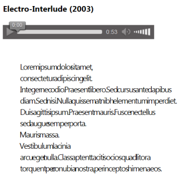
<article>
<audio controls>
<source src="electro-interlude.ogg" type="audio/ogg" />
<source src="electro-interlude.mp3" type="audio/mpeg" />
</audio>
</article>
</main>
<footer>
... The music files are contained in the archive mentioned at the top of this article. Make sure they have been unzipped into the directory where your HTML5 document sits, and then load the document in your browser. You should see this if your browser supports the HTML5 audio element:

There is little need to always have two or more audio formats, unless you want to provide varying degrees of quality, and order your source tags from best to worst. Because the included music files are so much alike, the casual listener would not be able to tell whether the OGG file or the MP3 file was the one actually playing.
By the way, if your browser displays a bunch of text under the audio control, do not fret. That text is part of the Text Effects section below.
Video
Integrating video into your HTML5 document is just as simple as with audio.
    ...
    <style type="text/css">
        ...
        video {
            width: 300px;
        }
    </style>
    ...
    <main>
        <h2>Video</h2>
        <article>
            <h4>The Electric Penguin</h4>
            <video controls>
                <source src="http://www.jjensen2.com/assets/electric-penguin.ogv" type="video/ogg" />
                <source src="http://www.jjensen2.com/assets/electric-penguin.mp3" type="video/mpeg" />
                <p>Your browser does not support HTML5 video.</p>
            </video>
        </article>
    </main>
    ...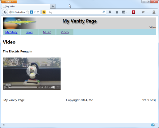
Instead of including the video files with this article's download, the video is streamed from a remote source. However, just like with the audio, the code for the video shows two sources for the file: one in OGG format and the other in MP4.
The included file, Video.html, contains all the code from the example above and should render like you see in the picture.
One cool thing that is under consideration is the capability of displaying captions and subtitles. When the talk leads to implementation, it will be a welcome feature, especially for web designers who wish to have a worldwide audience and supply language-specified subtitles.
CSS3 Text Effects
Text effects include:
- Handling white space in text
- Spacing between letters or words
- Creating shadows or outlines
Handling White Space in Text
By default, white space is collapsed backwards along the text direction. (The direction is Left-to-Right for English and Right-to-Left for Arabic, e.g.) So, text that looks like this in the HTML5 document:
Words with big spacing.
Will render like this:
Words with big spacing.
The way white space is treated differently in CSS is through the white-space property. Here are the possible values and what they mean:
normal: This is the default. Normal rendering will collapse white space and ignore the line-breaks in the HTML5 document, wrapping text at the end of the container on the page.
pre: This preserves the white space present in the HTML5 document. All spaces, tabs, and line-breaks in the document are honored. No wrapping is done on the text in the browser.
pre-wrap: This honors the white space, just like pre, but it allows text to wrap at the end of the container or window.
pre-line: This collapses all white space, just like normal, but it honors the line breaks in the document.
nowrap: The nowrap value will restrict any wrapping, keeping the text in one continuous line. It also collapses all white space.
To see this in action, copy the following lorem ipsum text paragraph into the document just under the audio element closing tag. We will pretend that it is a description of the music.
If you are using the included __music.html file, the text is already in place.
                <p>
        Lorem ipsum dolor    sit amet,
        consectetur adipiscing elit.
        Integer nec odio.  Praesent libero. Sed cursus ante dapibus
        diam. Sed nisi. Nulla quis sem at nibh elementum imperdiet.
        Duis      sagittis ipsum. Praesent mauris. Fusce nec tellus
        sed augue    semper porta.
         Mauris massa.
         Vestibulum lacinia
        arcu eget     nulla. Class aptent taciti sociosqu ad litora
        torquent per        conubia nostra, per inceptos himenaeos.
                </p>
Be sure to keep all the spacing when copying, including the leading tabs. This is what you will see rendered in a narrow browser window:

Notice how all the white space has collapsed. All the text on each line begins at the left edge of the window. This is default behavior. Now we will add a class attribute to the paragraph element called "spacetest" and create a CSS rule for this class:
    .spacetest {
        white-space: pre;
    }
    ...
    <p class="spacetest">
        ...
</p> 
Notice how the value of "pre" completely retains the whitespace from the document. Now let's change it to "pre-wrap".
white-space: pre-wrap;

This is what "pre-line" will do:
white-space: pre-line;

And this is a shot of "nowrap". Just what you would expect.
white-space: nowrap;

Spacing Between Letters or Words
CSS gives us two properties to use that alter the spacing between words and letters (kerning): word-spacing and letter-spacing. The values for these properties is either "normal" or a measurement which can be either positive or negative. Negative values remove spacing and positive values add spacing to the normal spacing with the font.
The values can be measured as follows ("2" is an arbitrary value):
    2px   - Pixels
    2em   - Font-relative unit
    2ch   - Number of characters (font-relative)
Here is what can happen when you remove spacing between both words and letters. Replace the CSS definitions for the spacetest class with the following and refresh the browser:
    .spacetest {
        white-space: pre;
        word-spacing: -4px;      /* shrink space between words                 */
        letter-spacing: -0.15ch; /* shrink kerning by 15 100ths of a character */
    }
Creating Shadows or Outlines
The way old-timer web designers created shadows under text was through a graphics application or div layering. With CSS, we can create shadows and even outlines with a property called text-shadow. The format for this property is the following:
text-shadow: X-offset Y-offset Blur-Radius Color, {additional shadows...} ; The X and Y offset values originate at the upper-left corner of the text. So, positive offsets go down and to the right. The blur radius indicates the number of pixels the shadow is blurred. Omitting this value defaults to a blur radius of zero (no blur). The color may also contain an alpha value. Here are some samples and what they would do to the title of your practice web site:
    /* ------------------------------- */
    /*   Deep shadowy gray             */
    /* ------------------------------- */
    text-shadow: 4px 6px 3px #888;
    /* ------------------------------- */
    /*   Blue and orange shadow        */
    /* ------------------------------- */
    text-shadow: 2px 2px 2px darkblue, 3px 3px 2px orange;
    /* ------------------------------- */
    /*   Maroon with no blur           */
    /* ------------------------------- */
    text-shadow: 3px 4px maroon;
    /* ------------------------------- */
    /*   Yellow glow                   */
    /* ------------------------------- */
    text-shadow:
        -2px -2px 4px yellow,
         2px  2px 4px yellow,
        -2px  2px 4px yellow,
         2px -2px 4px yellow;
    /* ------------------------------- */
    /*   Bold cyan outline             */
    /* ------------------------------- */
    text-shadow:
        -1px -1px lightcyan,
         1px  1px lightcyan,
        -1px  1px lightcyan,
         1px -1px lightcyan;
    /* ------------------------------- */
    /*   Very faint white backlight    */
    /*   Needs darker background       */
    /* ------------------------------- */
text-shadow: 0 0 6px white; 
Finally, here is how you make text look like it is burning:
    /* ------------------------------- */
    /*   Burning the words up          */
    /* ------------------------------- */
    text-shadow:
         0px    -2px   2px  yellow,
        -2px    -4px   4px  yellow,
        -4px    -6px   6px  orange,
        -6px    -8px   8px  orange,
        -8px    -10px  10px red,
        -10px   -12px  12px red,
        -12px   -14px  14px black;
One more text property that the Webkit user agent supports is "-webkit-text-stroke". It only seems to work on Chrome (tested on version 34.0.1847.116 m) and Opera (version 20.0.1387.91).
-webkit-text-stroke: {color} {width} Feel free to use any of the examples shown to dress up the title text. It could use it. The code in the zip file uses the first example shown above.
CSS3 2D and 3D Transforms
CSS transformations alter the shape or position of the CSS box, morphing the contents as needed. Transformations are performed via one property called transform. The format of this property is simple:
transform: transform-action1 | transform-action2 | ... transform-actionN
The transform actions contain a set for 2-dimensional transforms, and their corollaries for 3-dimensional transformations. Generally, we have translate, scale, rotate, and skew (perspective) types of actions:
transform: none
/* ------------------------------------------------------ */
transform: translate(x, y)
transform: translateX(value)
transform: translateY(value)
transform: scale(x, y)
transform: scaleX(value)
transform: scaleY(value)
transform: rotate(angular-value)
transform: matrix(value1, value2, ... valueN)
transform: skewX(angular-value)
transform: skewY(angular-value)
/* ------------------------------------------------------ */
transform: translate3d(x, y, z)
transform: translateZ(value)
transform: scale3d(x, y, z)
transform: scaleZ(value)
transform: rotate3d(x, y, z, angular-value)
transform: rotateX(angular-value)
transform: rotateY(angular-value)
transform: rotateZ(angular-value)
transform: matrix3d(value1, value2, value3 ... valueN)
transform: perspective(value)
The value "none" removes all transformations. The others perform specific tasks.
Translate actions adjust an element's position.
Scale actions change the size of the element.
Rotate actions rotate the element around an axis.
Skew and perspective actions stretch the element along an edge.
Matrix actions perform all of the above and are generally never hand-coded. There are tools online which can help with this, if you really want to try.
Translate
Translation is movement. When we translate an element, we move it. Very simple.
The file __transforms.html in the zip file holds the base code for our transform examples. If we comment out the last four div elements, you can load the file in the browser and see two divs stacked with no transformations:
Enter a transformation in the blocky-2 class CSS definition, and you will see what the translate function does to the div:
    ...
    .blocky-2 { transform: translate(110px, 10px); }
    ...
Ok. We can do the same thing with the top and left properties, right? Well, the transform rules allow animation when we create transitions, which is in the following section. For now, we can just play around with placements.
Scale and Rotate
Let's add some other transform functions to this same definition and see what it does:
    ...
    .blocky-2 { transform: translate(110px, 10px) rotate(30deg) scale(0.75); }
... 
Here we added rotate and scale, which turned block #2 30 degrees around its center and then shrunk it to 75% of its original size. The units we use here are important. While the translate function accepts several different kinds of linear measurement units, the rotate function takes angular measurements, and the scale function takes a relative unit measurement.
- angular measure: Use "deg" for degrees and "rad" for radians. If you don't know the difference, then just use deg and all will be well.
- relative unit: With this, the value range is a float between 0.0 and 1.0, where 1.0 is equivalent to an unmodified value, and 0.0 is too small to be seen.
Skew
The skew functions perform a stretch along edges:
    ...
    .blocky-1 { transform: skewX(-0.2rad) translate(20px, 0); }
    .blocky-2 { transform: skewX(30deg) skewY(15deg) translate(150px, 10px) ; }
... 
On block 1, we skewed it 0.2 radians in a negative direction on the x axis. On block 2, we skewed it along both the x and y axes.
Skewing may seem a bit difficult to understand, because we need to use angular units for a linear change. Here is basically how skewing works:

When we skew, we mark an angle as given by the parameter. Then, we move the appropriate edge in the direction given. Positive angular measurements run clockwise for skewY and counter-clockwise for skewX. In the illustration, the origin for the skewY measurements come from the line along the x axis and the skewX from the line along the y axis.
If you want the right side to point up, use skewY with a negative angle.
If you want the bottom to shift to the right, use skewX with a positive angle.
The picture also shows how the box would be skewed with an argument of -30 degrees for each axial transformation. Also note that the +60 degree measurement continues beyond the dimensions of the element. It would also be prudent to mention that skew measurements of (+/-) 90 degrees render an invisible line.
3-Dimensional Transformation
Transformation for 3-dimensional objects follows the same principals as 2-dimensional objects (elements). The difference is that the 3D transform functions operate best on a set of elements transformed as the faces of a 3-dimensional object.
    #cube .front  { transform: rotateY(  0deg) translateZ( 100px ); }
    #cube .back   { transform: rotateY(180deg) translateZ( 100px ); }
    #cube .right  { transform: rotateX( 90deg) translateZ( 100px ); }
    #cube .left   { transform: rotateX(-90deg) translateZ( 100px ); }
    #cube .top    { transform: rotateY( 90deg) translateZ( 100px ); }
    #cube .bottom { transform: rotateY(-90deg) translateZ( 100px ); }
Imagine you have defined 6 div elements named "front", "back", etc., just like the above code example. The code above rotates and translates the div elements to form a cube:

Many such models are possible, but the code to create them can get very complex.
CSS3 Transitions
Warping our elements is fine and dandy, but not terribly useful. After all, if we need to show something in a specific position, we could just set the top and left properties and be done with it. It follows, then, that transforming contributes to another CSS feature, and it does.
Transitions are descriptions of how a CSS state should change from one value to another. For instance, when an element changes its class from one name to another, the differences between the two classes can transition according to the values in the transition property.
Javascript is often used to change class names, but CSS offers one convenient pseudo-class called ":hover". This pseudo-class contains CSS definitions for an element when the mouse hovers over it. To demonstrate, we will create one div with an initial CSS state and a :hover definition with a different state:
    ...
    <style>
        .spinner {
            width: 60px;
            height: 60px;
            border: 1px solid green;
            background-color: green;
            -webkit-transition: -webkit-transform 2s, width 2s,
                                height 2s, background-color 2s;
              -msie-transition:   -msie-transform 2s, width 2s,
                                height 2s, background-color 2s;
               -moz-transition:    -moz-transform 2s, width 2s,
                                height 2s, background-color 2s;
                 -o-transition:      -o-transform 2s, width 2s,
                                height 2s, background-color 2s;
                    transition:         transform 2s, width 2s,
                                height 2s, background-color 2s;
        }
        .spinner:hover {
            width: 100px;
            height: 100px;
            background-color: red;
            -webkit-transform: rotate(-90deg);
              -msie-transform: rotate(-90deg);
               -moz-transform: rotate(-90deg);
                 -o-transform: rotate(-90deg);
                    transform: rotate(-90deg);
        }
    </style>
    ...
    <body>
        <div class="spinner" id="trans1"></div>
    </body>
Copy the code from above and paste it into your own document or load the file __transition.html from the zip file to see the transition in action. When you move the mouse over the green box, it rotates, resizes, and changes color. Moving the mouse away undoes the transition.
CSS3 Compatibility Revisited
The transitions and transformations, you may have noticed, are repeated with other definitions that have "-webkit-" and so forth prepended to the properties. Each user agent (UA) tends to assimilate new CSS properties in their own fashion until the W3C finalizes their recommendations. It is the web developer's job to accommodate as many UAs as possible so that their web pages perform properly on as many machines as possible.
In this tutorial, the articles will drop the UA-specific prefixes from now on and just show the base property names.
In case you were wondering, here is a list of each prefix and the user agent it signifies:
- -webkit- : Chrome/Safari engine
- -msie- : IE 9 and earlier
- -moz- : Firefox
- -o- : Presto engine with Opera
Having multiple definitions in your CSS document does not harm anything. User agents ignore properties they do not recognize.
IE 11
Apparently, IE 11 changed their UA identification and several transform properties do not seem to be supported. There is a way to get IE 11 to rotate and translate, but you must use their proprietary property called filter. This article will not address the use of the filter property.
CSS3 Animations
The CSS short-hand property animation and its kin control animated transitions, often without user interaction. There are several properties available for animation, but this article will only cover two of them:
    animation {name} {duration} {timing-function} {iteration-count}
    @keyframes  { {transitions} }
The @keyframes at-rule is necessary for an animation to play. Let us take a look at a simple animation that oscillates a div from left to right and back again:
         ...
        <style type="text/css">
            ...
            .slider-ease {
                animation: divmove 4s ease infinite;
            }
            ...
            @keyframes divmove {
                0% { transform: translate(0px,0px); }
                50% { transform: translate(300px, 0px); }
                100% { transform: translate(0px,0px); }
            }
            ...
        </style>
    </head>
    <body>
        <div class="slider-ease">ease</div>
        ...
    </body>
Load the file __animate_simple.html to see this in action. Note that the file has an example div for five of the timing functions so that you can compare how they operate.
animation: The name of the animation is "divmove". This connects the animation to the keyframes defined with the same name. We want the animation to last for two seconds. We use a timing function called "ease", and we want this to iterate forever.
@keyframes: We have three keyframes. The first is the starting point. It is not necessary, but present to demonstrate the ability to define an initial frame. There are two other keyframes, one at 50% and the other at 100%. The transformation at 50% tells the browser to render the div 300 pixels to the right. The transformation at the 100% keyframe places the div back at the origin.
Here are some of the timing functions currently available:
- ease : smooth acceleration and deceleration
- ease-in : smooth acceleration with abrupt end
- ease-out : abrupt start with smooth deceleration
- ease-in-out : shorter acceleration and deceleration than ease but quicker in the middle
- linear : static velocity
3-Dimensional Animation
The animation of 3-dimensional objects uses the 3D transformation properties listed in the previous section, along with the animation and keyframe capabilities demonstrated above.
Load the file __animation_3D.html into your browser. It demonstrates an animated cube that slowly spins about an imaginary axis. The concept is not difficult, just tedious to code.
The document creates a div called "cube". Inside cube, the sides of the cube are defined and transformed, forming a 6-sided cube. The animation rotates the cube div, and not the individual sides. But, because the cube div contains the sides, they rotate in the same manner as the cube div.
It is like putting an object into a glass box and gluing it in place, then rotating the box, making it seem like the object itself was rotating.
Summary
A lot of fancy CSS capabilities were demonstrated in this article. Besides learning how to incorporate audio and video into your web site, the article also demonstrated many of the CSS properties used to decorate text, reposition or morph elements, and incorporate simple animations.
Other articles in this series:
- Part 1 - Writing Your First Code
- Part 2 - Building on the Basics
- Part 3 - Styling Your First Web Page
- Part 4 - Laying Out Your First Web Page
- Part 5 - Getting Fancy With HTML5 & CSS3
History
2014-04-14: Initial Posting