
The Idiot's Guide to Modern Web Design Part 4/12
0/5 (0 vote)
Part 4 of 12 to become a web design rock god! (Laying Out Your First Web Page)
Introduction to the Course
Welcome to the Idiot's Guide to Modern Web Design. This 12 part course will take you from run-of-the-mill idiot to web design rock god!
Part 4 - Laying Out Your First Web Page
Now that you know how to create and use CSS documents, let's get to the layout a of a web page.
<DIV> and <SPAN>
Before we get on with (not so) complex CSS ideas, let's look at some HTML layout features - the difference between <DIV> and <SPAN>.
Div - defines a new block. It starts a new line with its content.
Span - defines a small snippet of a div. It creates a new grouping within the div that continues inline. It continues without showing any signs of a break. Take a look at this:
<div>
    My Div
</div>
<div>
    My sentence has a <span> Span </span> in it
</div>
Will look like:
My sentence has a Span in it
Notice how the span shows no sign of an extra tag in between, but this allows us to apply CSS just to the span.
The Box Model
The box model is the model of how almost everything is laid out.
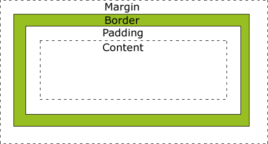
Margin - Spaces the object from all the other objects. It has a transparent background.
Border - The line that goes around the object. It is like the frame of the object. The colour of the border is inherited from the box unless defined in the border: property.
Padding - The space between the border and content. The background colour is the same as the contents'
Content - The actual objects. Where all the text, images etc. appear.This has both the width: and height: properties.
Using the box model
When using the box model, you don't have to define all the steps. For instance, if you only need a border then you would only use the border:
All box model properties should be defined in pixels (px). All properties (except width and height) can be side specific. If a side is not specified, the style will be applied to all sides.
e.g.
margin: 10px;
border: 10px solid black;
padding: 10px;
width: 240px;
height: 100px;
background-color:yellow;
Should look like this:

Note that the total width of the box is 300px (because of both left and right margins, borders and paddings are extra measurements on the width) The height is 160px.
margin: 10px;
border-left: 10px solid red;
padding: 10px;
width: 240px;
height: 100px;
background-color:yellow;
Will look like this:

Notice that this is the same styles - but 2 things are different. The border is only on the left and the colour of the border is red. (We will discuss border styles later in the part) Notice that the total width will be 290px and total height 140px (because the border is only on the left)
Border Styles
The border is different to both the padding and margin because it has its own styles and colours.
To define certain styles or properties of a border you can name them directly like this:
border-[location]-[property]:[value];or
border-[location]:[width] [style] [colour]; or
border-[property]:[value]; Location - can be either top, left, right or bottom. If you want to define all sides, just leave it out.
Property - can be either width, style or colour. To define some or all the properties in one statement, just leave it out. Then the values will be set in the value set.
Value - can be a single value like border-width:5px or can be multiple values. When it is multiple values they follow a specific order: [width] [style] [colour] The CSS will not work if you leave one value out! Here is the supported value definitions:
Width - the size in pixels the selected border must be.
Colour - the colour the selected border must be. Can either be a named colour (e.g. red), an RGB colour (e.g rgb(255,0,0) ) or a hex code (e.g. #FF0000)
Style - the style the selected border must be. Here is a list of styles that can be used. The text inside is the keyword to be used. All have 5px width and Red as the colour(to show that some effects are colour dependant)
Dimension
The Dimension property might seem to have no use now, but when you start building responsive websites (ones that respond to screen width) it will be vital. It is actually a group of properties. They are used like max-width:100px; not dimension:width; But first the common keywords of sizing:
auto - automatically resizes to fit its content
length - a fixed value, normally in pixels
% - a percentage of the parent container
inherit - inherits the parents' dimension property. All the dimension properties support inherit. For example, if the parent uses auto the child will 'inherit' auto
Now the supported Dimension properties:
width & height - Sets the default height and width. Supports auto, length and %
max-width & max-height - Sets the maximum width and height for an element. Supports none, length and %
min-width & min-height - Sets the minimum width and height for an element. Supports none, length and %
Display
This defines how the element will be displayed in relation to other elements. I am only going to list only the main values. If you would like to see the complete list, check it out on the W3C's Website here. The display property is used as follows:
display: [value]; inline - is the default value. It makes the element behave like a <span> It will find the first space big enough to fit in, even on the same line as other elements
block - makes the element behave like a <p> It will start a new line and place itself as close to the left as possible.
inline-block - a combination of inline and block. The contents of the element will be formatted as a block, but the element itself will be formatted as inline.
none - makes the element disappear. A space is not kept for it.
initial - returns the property to what it was when the page was first opened. This is useful when JavaScript is used to change the layout of the page
inherit - inherits the parents' display property.
Positioning
There are three types of positioning in CSS - fixed, absolute and relative. All positioning values are used as follows:
position: value; CSS Positioning property is used in conjunction with the top: left: right: and bottom: These properties can have both positive and negative values (px or %) And effect the positioning of the element. The effect differs from type to type.
Fixed
This fixes the element on the browser window. Even if the page is scrolled it will not move. The top, left, right and bottom properties position it. e.g. If an element was fixed with top:100px; and left:100px; the element will always be at position (100,100) on the browser window.
Absolute
This will get an absolute position on a parent tag that has a position other than static (default positioning). if none is found, it will use the html tag as a position (this will be the top left corner of the page). The top, left, right and bottom properties will offset the element from the point it uses for positioning.
Relative
This will position the element according to its normal position. The top, left, right and bottom properties will offset the element from that point.
Z-Index
Normally, HTML elements defined later will be on top of the element before it. You can use the Z-index to change that. The higher the Z-index, the closer the element will be to the top of the pile. You can define the property like this:
z-index:[value]; Floating
You can also float elements within their parent container. Elements can only be floated horizontally. Elements before the floating element will not be affected, but elements after it will flow to fill its space, so it can be it was defined to be. Elements can be floated to the left or right, inherit their float or just have no float. Floating can also be cleared in the same way. Clearing has one extra value - clearing both floats. Here is the Syntax:
float:[left/right/none/inherit];
clear:[left/right/both/none/inherit];
Align
Align is similar to float, but does not let other elements flow in its place.
There are several aligns, but we will focus on just 3.
horizontal-align - Aligns elements horizontally in their parent container.
vertical-align - Aligns elements horizontally in their parent container.
text-align - Aligns text within its parent container
Each have several values, but the most common are left, right and centre (Vertical-align has top, middle and bottom). Here is the CSS syntax:
horizontal-align:left;
vertical-align:bottom;
text-align:center;
Lists
The CSS styling for lists allows you to inset item markers for both unordered as well as ordered lists and even use an image as the item marker.
To add a marker to an ordered or unordered list, you must use the list-style-type property. Here are some examples:
list-style-type:circle; - Example
list-style-type:upper-roman;I. II. III. IV. V. etc.
list-style-type:lower-alpha; a. b. c. d. e. etc.
There are many different styles; too many to include here. All the supported styles can be found on the W3C's website here.
Images as Markers
To use an image as a marker, simply use the list-style-image property like this:
list-style-image: url("myimage.gif"); There is also a list-style-position property that defines whether the marker is inside or outside the content flow.
All the above properties can be grouped into one line of CSS code by using the shorthand property, list-style: It works in the same way that the border: property worked.
Tables and The End
Tables can manipulated by CSS like most other elements. You can apply width: height: Border: padding: colour: text-align: or almost any other property to a table. The sky is the limit! Play around with CSS, as practice makes perfect. See what works and what doesn't. Soon enough you will know exactly what to use where to get the layout in your head.
Hope you surived this technical Part and see you in Part 5!
jACQUES B-)
History & Notes
v1 - Original Released for The HTML5 & CSS3 Tutorial Competition
Note: Because of the nature of the competition, I might not be able to finish both articles in the week. So the next part published might not be the next in the series. However, I will keep a record of the criteria for the missed articles and they will all hopefully be completed by 1 July 2014. Sorry for the inconvenience.