
Easy to Learn .NET 6.0 and Angular - Getting Started Admin LTE Design - Part 3
4.86/5 (3 votes)
Get started with .NET 6.0 and Standalone Angular Template for using Admin LTE bootstrap design to make a simple website
Introduction
All this time, I planned to publish .NET 6.0 and Angular series of articles. In this series, I have planned to publish articles like:
- Easy to learn .NET 6.0 and Angular - Getting Started Angular Template – Part 1
- Easy to learn .NET 6.0 and Angular - Getting Started Angular Standalone Template – Part 2
- Easy to learn .NET 6.0 and Angular - Getting Started Admin LTE Design – Part 3
- Easy to learn .NET 6.0 and Angular - Getting Started Multi Language – Part 4
- Easy to learn .NET 6.0 and Angular - Getting Started Publish to IIS – Part 5
- Easy to learn .NET 6.0 and Angular - Getting Started WEB API – Part 6
- Easy to learn .NET 6.0 and Angular - Getting Started WEB API CRUD SQL SERVER – Part 7
In this article, we will see in detail how to getting started with .NET 6.0 and Standalone Angular Template for using the Admin LTE bootstrap design to make a simple website.
In this article, we will use our previous article .NET 6.0 and Standalone Angular Template source to apply the Admin LTE design. Kindly read my previous article which explains in a very detailed step by step manner about getting started with .NET 6.0 and Standalone Angular Template.
The reason why we use AdminLTE is as its open-source admin dashboard which was been developed using Bootstrap. If we want to build a client and admin kind of website, then it's best to use the AdminLTE admin dashboard, Client and Admin website, we can say the e-Commerce websites, MES and all kind of Management websites.
For example, we can consider the shopping card websites as which has multiple user roles and the dashboard and page options for each role might be different. I have made a simple demo sample of the use case of a Shopping cart website as you can see from the below image which has several user types and also I have added the basic modules which the shopping cart website will be having.

User Roles
Admin
Super Admin: The Super Admin is the main user of the Shopping Cart users as he will be having all the controls of shopping cart site. Sometimes, the Super Admin can also be the software development team who develops the site and also the owner of the shopping cart to monitor and control all other rolls. The important site setting and menu masters will handle only by this Super Admin for the safety and security reason.
Admin: Admins can be created by the Super Admin and all the site control will be handled by the main admin as he can create staffs and also, he can accept, delete and monitor all the activities of vendors customers, staffs and guest users.
Staff: The Staff might have the limited roles example if a staff is sales staff, then he can monitor and all the sales part of the shopping cart site, if the staff is related to delivery management, then he can view all the orders and made delivery and track and monitor the delivery status and check and confirm weather the delivery is done successfully or not.
Client
Vendors: Vendors can be registered and can be approved by the Admin or SuperAdmin, after approval the vendors can upload their products to the shopping cart site, they can view all the ordered details of their products like delivered, canceled, pending order details.
Customers: The customers are the end users who will register in the shopping cart site, search for their needed items and do shopping, The customers can view their Cart details, order history details and track the delivery status of their ordered items. The customer can also cancel the ordered item based on the condition made by the vendors.
Guest users: The Guest Users are guest checkout users are allowed to do shopping without registration and logging to the shopping cart site.
The Online shopping site will also have the basic modules like User Modules to create and manage the user, creating role and manage the users based on the role. Products as the admin, staff or the Vendors can add and manage their items based on category with item details like sales cost, item images, item delivery cost, etc. apart from this some more basic menu like Order Managements, Sales Management, Delivery & Tracking Management, etc.
So here, we can see as each user role, the dashboard can be different for the admins as well for the clients, for making the website more standard look and feel, we can use the AdminLTE admin dashboard Bootstrap design by this, our website can also be easily access in multiplatform like Mobile, Tablet and in any PC which has internet and easy access anywhere anytime.
Background
- Visual Studio 2022
- Node.js – If you don’t have Node.js install Node.js (download link)
- Angular CLI (download link)
- Admin LTE Admin Dashboard Template (download link)
AdminLTE
From the AdminLTE web site link, we can download the latest AdminLTE Bootstrap design documents.

After downloading, unzip the AdminLTE folder and we can see all the needed pages, plugins, scripts, css and demo pages will be added inside the folder.

To check the ADMINLTE page, we can open the demo pages from the folder as Index.html, index2.html, index3.html along with the iframe HTML with different themes. If we open any of the demo HTML page, we can see the demo of the AdminLTE design as here, we have opened the dashboard with the menus at the left and some plugins to show the dashboard more rick to the end users.

Using the Code
Note: We will be using our previous article source to apply the AdminLTE Bootstrap template for the project in step-by-step ways. Note here, I will be copying the needed folders and files from the downloaded AdminLTE folders to our Angular and .NET 6.0 Angular Standalone Template Project.
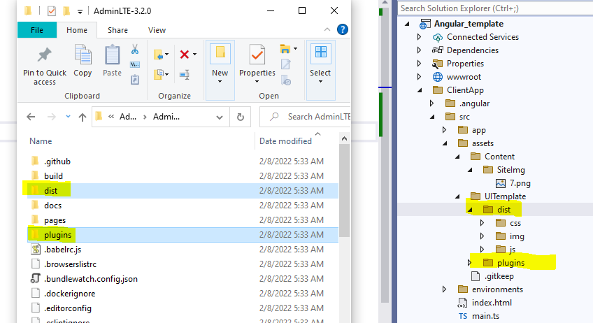
Step 1
Create Content folder inside the assets folder and inside Content folder, create two more folders as SiteImg and UITemplate. Inside the UITemplate, we will copy all the dist, JavaScript and Plugin folders of the AdminLTE and in the SiteImage folder will be used to save the images which we used for our website.

Step 2
The Drag and drop both the dist and plugins folder from the downloaded AdminLTE folder to our Angular project UITemplate folder.

Step 3
Next, you can open the Index.html in editor from the AdminLTE folder and copy the header link and Script part.
Step 4
Now, let’s design our Online Shopping cart dashboard page for this first, we need to add the css and JavaScript plugins to our Angular Index page.
Open the Index.html file from your Angular Project.

Paste the header and script part to our Angular index.html file.
<!DOCTYPE html>
<html lang="kr">

<head>
    <meta charset="utf-8" />

    <meta http-equiv="Content-Type" content="text/html; charset=UTF-8" />
    <meta http-equiv=Content-Type content="text/html; charset=windows-1252">
    <title>LINK5 BOT2U </title>
    <base href="/" />
    <meta name="viewport" content="width=device-width, initial-scale=1" />
    <link rel="icon" type="image/x-icon" href="favicon.ico" />
    <link rel="stylesheet" href="assets/UITemplate/dist/css/video-js.css">
    <link rel="stylesheet" href="assets/UITemplate/dist/css/video-js.min.css">
    <!-- Google Font: Source Sans Pro -->
    <link rel="stylesheet"
     href="https://fonts.googleapis.com/css?family=Source+Sans+Pro:300,400,400i,
     700&display=fallback">
    <!-- Font Awesome Icons -->
    <link rel="stylesheet"
     href="assets/UITemplate/plugins/fontawesome-free/css/all.min.css">
    <!-- Theme style -->
    <link rel="stylesheet" href="assets/UITemplate/dist/css/adminlte.min.css">
    <link rel="stylesheet"
     href="assets/UITemplate/plugins/overlayScrollbars/css/OverlayScrollbars.min.css">

    <!-- daterange picker -->
    <link rel="stylesheet"
     href="assets/UITemplate/plugins/daterangepicker/daterangepicker.css">
    <!-- iCheck for checkboxes and radio inputs -->
    <link rel="stylesheet"
     href="assets/UITemplate/plugins/icheck-bootstrap/icheck-bootstrap.min.css">
    <!-- Bootstrap Color Picker -->
    <link rel="stylesheet"
     href="assets/UITemplate/plugins/bootstrap-colorpicker/css/
     bootstrap-colorpicker.min.css">
    <!-- Tempusdominus Bootstrap 4 -->
    <link rel="stylesheet"
     href="assets/UITemplate/plugins/tempusdominus-bootstrap-4/
     css/tempusdominus-bootstrap-4.min.css">
    <!-- Select2 -->
    <link rel="stylesheet" href="assets/UITemplate/plugins/
     select2/css/select2.min.css">
    <link rel="stylesheet"
     href="assets/UITemplate/plugins/
     select2-bootstrap4-theme/select2-bootstrap4.min.css">
    <!-- Bootstrap4 Duallistbox -->
    <link rel="stylesheet"
     href="assets/UITemplate/plugins/bootstrap4-duallistbox/
           bootstrap-duallistbox.min.css">
    <!-- BS Stepper -->
    <link rel="stylesheet"
     href="assets/UITemplate/plugins/bs-stepper/css/bs-stepper.min.css">
    <!-- dropzonejs -->
    <link rel="stylesheet"
     href="assets/UITemplate/plugins/dropzone/min/dropzone.min.css">
    <!-- Theme style -->
    <link rel="stylesheet" href="assets/UITemplate/dist/css/adminlte.min.css">

    <link rel="stylesheet"
     href="assets/UITemplate/plugins/jquery-ui/jquery-ui.css" />
    <link rel="stylesheet"
     href="assets/UITemplate/js/jqueryconfirm/js/custom.jqueryconfirm.js" />

    <link rel="stylesheet"
     href="assets/UITemplate/js/jqueryconfirm/dist/jquery-confirm.min.css" />
    <!-- SweetAlert2 -->
    <link rel="stylesheet"
     href="assets/UITemplate/plugins/sweetalert2-theme-bootstrap-4/bootstrap-4.min.css">
    <!-- Toastr -->
    <link rel="stylesheet" href="assets/UITemplate/plugins/toastr/toastr.min.css">

</head>
<body >
    <app-root>Loading...</app-root>

</body>
</html>

<!-- REQUIRED SCRIPTS -->
<!-- jQuery -->
<!-- jQuery -->
<script asp-append-version="true"
 src="assets/UITemplate/plugins/jquery/jquery.min.js"></script>
<!-- jQuery UI 1.11.4 -->
<script asp-append-version="true"
 src="assets/UITemplate/plugins/jquery-ui/jquery-ui.min.js"></script>

<script asp-append-version="true"
 src="assets/UITemplate/plugins/jquery-ui/jquery-ui.js"></script>
<script asp-append-version="true"
 src="assets/UITemplate/plugins/jquery-ui/jquery-ui.min.js"></script>
<!-- Bootstrap 4 -->
<script asp-append-version="true"
 src="assets/UITemplate/plugins/bootstrap/js/bootstrap.bundle.min.js"></script>
<!-- Resolve conflict in jQuery UI tooltip with Bootstrap tooltip -->
<script>
    $.widget.bridge('uibutton', $.ui.button)

    $(function () {
        var Toast = Swal.mixin({
            toast: true,
            position: 'top-end',
            showConfirmButton: false,
            timer: 3000
        });
    }
</script>

<script src="https://unpkg.com/systemjs@0.19.47/dist/system.js">
</script>
<!-- Bootstrap 4 -->
<script src="assets/UITemplate/plugins/bootstrap/js/bootstrap.bundle.min.js"></script>
<!-- overlayScrollbars -->
<script src=
"assets/UITemplate/plugins/overlayScrollbars/js/jquery.overlayScrollbars.min.js">
</script>
<!-- AdminLTE App -->
<script src="assets/UITemplate/dist/js/adminlte.js"></script>

<!-- daterangepicker -->
<script src="assets/UITemplate/plugins/moment/moment.min.js"></script>
<script src="assets/UITemplate/plugins/daterangepicker/daterangepicker.js"></script>
<!-- Tempusdominus Bootstrap 4 -->
<script src="assets/UITemplate/plugins/tempusdominus-bootstrap-4/js/
 tempusdominus-bootstrap-4.min.js"></script>
<!-- Summernote -->
<script src="assets/UITemplate/plugins/summernote/summernote-bs4.min.js"></script>
<!-- overlayScrollbars -->
<script src="assets/UITemplate/plugins/overlayScrollbars/js/
             jquery.overlayScrollbars.min.js"></script>

<!-- daterangepicker -->
<script src="assets/UITemplate/plugins/moment/moment.min.js"></script>
<script src="assets/UITemplate/plugins/daterangepicker/daterangepicker.js"></script>
<!-- Tempusdominus Bootstrap 4 -->
<script src="assets/UITemplate/plugins/tempusdominus-bootstrap-4/js/
             tempusdominus-bootstrap-4.min.js"></script>
<!-- Summernote -->
<script src="assets/UITemplate/plugins/summernote/summernote-bs4.min.js"></script>
<!-- overlayScrollbars -->
<script src="assets/UITemplate/plugins/overlayScrollbars/js/
             jquery.overlayScrollbars.min.js"></script>

<script src="assets/UITemplate/plugins/toastr/toastr.min.js"></script>
<script src="assets/UITemplate/js/jqueryconfirm/dist/jquery-confirm.min.js"></script>
<script src="assets/UITemplate/js/jqueryconfirm/js/custom.jqueryconfirm.js"></script>

<!-- Select2 -->
<script src="assets/UITemplate/plugins/select2/js/select2.full.min.js"></script>
<!-- Bootstrap4 Duallistbox -->
<script src="assets/UITemplate/plugins/bootstrap4-duallistbox/
             jquery.bootstrap-duallistbox.min.js"></script>
<!-- InputMask -->
<script src="assets/UITemplate/plugins/moment/moment.min.js"></script>
<script src="assets/UITemplate/plugins/inputmask/jquery.inputmask.min.js"></script>
<!-- date-range-picker -->
<script src="assets/UITemplate/plugins/daterangepicker/daterangepicker.js"></script>
<!-- bootstrap color picker -->
<script src="assets/UITemplate/plugins/bootstrap-colorpicker/js/
             bootstrap-colorpicker.min.js"></script>
<!-- Tempusdominus Bootstrap 4 -->
<script src="assets/UITemplate/plugins/tempusdominus-bootstrap-4/js/
             tempusdominus-bootstrap-4.min.js"></script>
<!-- Bootstrap Switch -->
<script src="assets/UITemplate/plugins/bootstrap-switch/js/bootstrap-switch.min.js">
</script>
<!-- BS-Stepper -->
<script src="assets/UITemplate/plugins/bs-stepper/js/bs-stepper.min.js"></script>
<!-- dropzonejs -->
<script src="assets/UITemplate/plugins/dropzone/min/dropzone.min.js"></script>

<!-- SweetAlert2 -->
<script src="assets/UITemplate/plugins/sweetalert2/sweetalert2.min.js"></script>
<!-- Toastr -->
<script src="assets/UITemplate/plugins/toastr/toastr.min.js"></script>
Step 5
Now let’s add the Header, Navigation, Footer and dashboard folder inside our Angular App folder.
Inside the dashboard page, we will create our main dashboard landing design page, In the layout folders, we add the footer, Top navigation bar and the side menu bar part of our shopping cart website.

footer Component
Now let’s add footer component inside our footer folder and add the below HTML and component code.
footer.component.html
<footer class="main-footer">
<img src="assets/Content/SiteImg/logo.png" alt="Shanu Cart"
style="height:36px;width:36px">
<strong>Copyright © 2022-2023 .</strong>
<div class="float-right d-none d-sm-inline-block">
<strong>Shanu <b>Cart</b> </strong> - Shop your need's from Anywhere Anytime
</div>
</footer>
footer.component.ts
import { Component, Inject } from '@angular/core';
@Component({
  selector: 'app-footer',
  templateUrl: './footer.component.html'
})
export class FooterComponent {

}
navbar Component
Now let’s add Top Navigation Bar for our shopping cart site and let’s add the component inside our navbar folder and add the below html and component code.
Note: Here in navbar, I have also added the language selection option for our Shopping Cart Site. In the next article, we will see in detail as how to add multi language option for our Angular projects.
navbar.component.html
<!-- Navbar -->
<nav class="main-header navbar navbar-expand navbar-dark" style="height:40px;">
  <!-- Left navbar links -->
  <ul class="navbar-nav">
    <li class="nav-item">
      <a class="nav-link" data-widget="pushmenu" href="#" role="button"
       enableRemember="true"><i class="fas fa-bars"></i></a>
    </li>
    <li class="nav-item">
      <h5 class="nav-link">
        <i class="fa fa-bug"></i>
        <strong>Shanu  <b>Cart</b> </strong>
      </h5>
    </li>
  </ul>

  <!-- Right navbar links -->
  <ul class="navbar-nav ml-auto">
    <li class="nav-item dropdown">
      <a class="nav-link" asp-controller="Home"
      asp-action="Index">  Welcome Shanu !</a>
    </li>
    <!-- Messages Dropdown Menu -->
    <li class="nav-item dropdown">
      <a class="nav-link" data-toggle="dropdown" href="#">
        <i class="fas fa-language"></i>
      </a>
      <div class="dropdown-menu dropdown-menu-lg-right dropdown-menu-right"
           style="max-width: 20px;width:20px">
        <a href="#" class="dropdown-item">
          <!-- Message Start -->
          <div class="media">
            <img src="../../../../assets/Content/SiteImg/KOR.png"
             alt="Korean" class="img-size-32 mr-lg-4 img-circle"
             style="height:24px;width:24px;">
            <div class="media-body">
              <h3 class="dropdown-item-title">
                KOREA
              </h3>
            </div>
          </div>
          <!-- Message End -->
        </a>
        <div class="dropdown-divider"></div>
        <a href="#" class="dropdown-item ">
          <!-- Message Start -->
          <div class="media">
            <img src="../../../../assets/Content/SiteImg/ENG.png"
             alt="English" class="img-size-32 mr-lg-4 img-circle"
             style="height:24px;width:24px;">
            <div class="media-body">
              <h3 class="dropdown-item-title ">
                ENGLISH
              </h3>
            </div>

          </div>
          <!-- Message End -->
        </a>
      </div>
    </li>
    <li class="nav-item">
      <a class="nav-link" data-widget="fullscreen"
      href="#" role="button">
        <i class="fas fa-expand-arrows-alt"></i>
      </a>
    </li>
    <li class="nav-item">
      <a class="nav-link" data-widget="pushmenu" href="#" role="button"
       enableRemember="true"><i class="fas fa-bars"></i></a>
    </li>
  </ul>
</nav>
navbar.component.ts
 import { Component, Inject } from '@angular/core';
@Component({
  selector: 'app-navbar',
  templateUrl: './navbar.component.html'
})
export class NavBarComponent {

}
Sidebar Component
Now let’s add our main menus for our Shopping Cart website. Let’s add Angular component inside our sidebar folder and add the below HTML and component code.
Note: For demo purposes, I have made the static menus. The actual Admin and client modules menu will be dynamic and loaded based on user logged in role from the database. Later in this article series, I will try to add a new article which explains as how to make the dynamic menu and display based on role in our shopping cart site.
sidebar.component.html
<!-- Main Sidebar Container -->
<aside class="main-sidebar sidebar-dark-primary elevation-4">
  <!-- Brand Logo -->
  <a class="brand-link" [routerLink]="['/dashboard']">

    <img src="../../../../assets/Content/SiteImg/logo.png" alt="Shanu Cart"
     class="brand-image" style="opacity: .8">
    <span class="brand-text font-weight-light">Shanu Cart</span>
  </a>
  <!-- Sidebar -->
  <div class="sidebar">
    <!-- Sidebar Menu -->
    <nav class="mt-2">
      <ul class="nav nav-pills nav-sidebar flex-column"
       data-widget="treeview" role="menu" data-accordion="false">
        <li class="nav-item">
          <a class="nav-link" [routerLink]="['/dashboard']">
            <i class="nav-icon fas fa-th"></i>
            <p>
              Dashboard
              <span class="right badge badge-danger">New</span>
            </p>
          </a>
        </li>
        <li class="nav-item">
          <!--<a class="nav-link" [routerLink]="['/fetch-data']">-->
          <a class="nav-link" [routerLink]="['/home']">
            <i class="nav-icon fas fa-th"></i>
            <p>
              About Us
            </p>
          </a>
        </li>
        <li class="nav-item">
          <!--<a class="nav-link" [routerLink]="['/fetch-data']">-->
          <a class="nav-link" [routerLink]="['/items']">
            <i class="nav-icon fas fa-th"></i>
            <p>
              Item Sales
              <span class="right badge badge-danger">New</span>
            </p>
          </a>
        </li>

        <li class="nav-item">
          <a class="nav-link" [routerLink]="['/']">
            <i class="nav-icon fas fa-copy"></i>
            <p>
              Products
              <i class="fas fa-angle-left right"></i>
              <span class="badge badge-info right">3</span>
            </p>
          </a>
          <ul class="nav nav-treeview">
            <li class="nav-item">
              <a class="nav-link" [routerLink]="['/']">
                <i class="far fa-circle nav-icon"></i>
                <p>Category</p>
              </a>
            </li>
            <li class="nav-item">
              <a class="nav-link" [routerLink]="['/']">
                <i class="far fa-circle nav-icon"></i>
                <p>Add Item</p>
              </a>
            </li>
            <li class="nav-item">
              <a class="nav-link" [routerLink]="['/']">
                <i class="far fa-circle nav-icon"></i>
                <p>Search Item</p>
              </a>
            </li>

          </ul>
        </li>
        <li class="nav-item">
          <a class="nav-link" [routerLink]="['/']">
            <i class="nav-icon fas fa-copy"></i>
            <p>
              Orders
              <i class="fas fa-angle-left right"></i>
              <span class="badge badge-info right">3</span>
            </p>
          </a>
          <ul class="nav nav-treeview">
            <li class="nav-item">
              <a class="nav-link" [routerLink]="['/']">
                <i class="far fa-circle nav-icon"></i>
                <p>Order Details</p>
              </a>
            </li>
            <li class="nav-item">
              <a class="nav-link" [routerLink]="['/']">
                <i class="far fa-circle nav-icon"></i>
                <p>Address Book</p>
              </a>
            </li>
            <li class="nav-item">
              <a class="nav-link" [routerLink]="['/']">
                <i class="far fa-circle nav-icon"></i>
                <p>Delivery Status</p>
              </a>
            </li>

          </ul>
        </li>
      </ul>
    </nav>
    <!-- /.sidebar-menu -->
  </div>
  <!-- /.sidebar -->
</aside>
sidebar.component.ts
import { Component, Inject } from '@angular/core';
@Component({
  selector: 'app-sidebar',
  templateUrl: './sidebar.component.html'
})
export class SideBarComponent {

}
Step 6
Dashboard Component
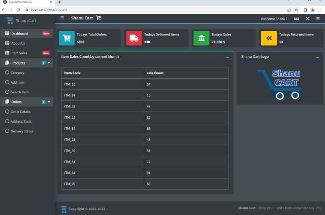
Now let’s design the admin part main landing dashboard page. Here, I made a very simple dashboard design which display Todays Total Order, Todays Delivered Items, Todays Sales and Todays Returned Items. We also add an HTML table to display current month item sales by item code.
Note: In our previous series article, I have explained how to add the WEB API Controller and then bind the WEB API result in our Angular Application. Here in this article, I have done the same format and added the WEB API to return the Item sales count and banded the result in the dashboard as well.
Later in this series, we will see in detail by using the database connection and performing the crud operation using .NET 6 and Angular Standalone Template.
dashboard.component.html
<section class="content">
  <br />
  <div class="container-fluid">
    <div>
      <div class="row">
        <div class="col-12 col-sm-6 col-md-3">

          <div class="info-box mb-3 shadow">
            <span class="info-box-icon bg-info elevation-1">
              <i class="fa fa-cart-arrow-down"></i>
            </span>

            <div class="info-box-content">
              <span class="info-box-text">Todays Total Orders</span>
              <span class="info-box-number">
                5000

              </span>
            </div>
            <div class="icon">
              <i class="ion ion-bag"></i>
            </div>
            <!-- /.info-box-content -->
          </div>
          <!-- /.info-box -->
        </div>
        <!-- /.col -->
        <div class="col-12 col-sm-6 col-md-3">
          <div class="info-box mb-3 shadow">
            <span class="info-box-icon bg-danger elevation-1">
              <i class="fa fa-truck"></i>
            </span>

            <div class="info-box-content">
              <span class="info-box-text">Todays Delivered Items</span>
              <span class="info-box-number">230</span>
            </div>
            <!-- /.info-box-content -->
          </div>
          <!-- /.info-box -->
        </div>
        <!-- /.col -->
        <!-- fix for small devices only -->
        <div class="clearfix hidden-md-up"></div>

        <div class="col-12 col-sm-6 col-md-3">
          <div class="info-box mb-3 shadow">
            <span class="info-box-icon bg-success elevation-1">
              <i class="fa fa-university"></i>
            </span>

            <div class="info-box-content">
              <span class="info-box-text">Todays Sales </span>
              <span class="info-box-number">23,000 $</span>
            </div>
            <!-- /.info-box-content -->
          </div>
          <!-- /.info-box -->
        </div>
        <!-- /.col -->
        <div class="col-12 col-sm-6 col-md-3">
          <div class="info-box mb-3 shadow">
            <span class="info-box-icon bg-warning elevation-1">
              <i class="fa fa-angle-double-left" aria-hidden="true"></i>
            </span>

            <div class="info-box-content">
              <span class="info-box-text">Todays Returned Items </span>
              <span class="info-box-number">13</span>
            </div>
            <!-- /.info-box-content -->
          </div>
          <!-- /.info-box -->
        </div>
        <!-- /.col -->
      </div>
      <!-- /.row -->
      <!-- Main row -->
      <div class="row">
        <div class="col-md-8">
          <div class="card card-outline card-success">
            <div class="card-header">
              <h3 class="card-title">Item Sales Count by current Month </h3>
              <div class="card-tools">
                <button type="button" class="btn btn-tool" data-card-widget="collapse">
                  <i class="fas fa-minus"></i>
                </button>
              </div>
            </div>

            <div class="card-body" style="display: flex; justify-content: center;">
              <table class="table table-bordered table-striped" *ngIf="itemsdetails">
                <thead>
                  <tr>
                    <th> Item Code </th>
                    <th> sale Count </th>
                  </tr>
                </thead>
                <tbody>
                  <tr *ngFor="let itemdetail of itemsdetails">
                    <td>{{ itemdetail.itemCode }}</td>
                    <td>{{ itemdetail.saleCount }}</td>
                  </tr>
                </tbody>
              </table>
            </div>

          </div>
        </div>

        <div class="col-md-4">
          <div class="card card-outline card-primary">
            <div class="card-header">
              <h3 class="card-title">Shanu Cart Logo</h3>
              <div class="card-tools">
                <button type="button" class="btn btn-tool" data-card-widget="collapse">
                  <i class="fas fa-minus"></i>
                </button>
              </div>
              <!-- /.card-tools -->
            </div>
            <!-- /.card-header -->
            <div class="card-body" style="display: flex; justify-content: center;">
              <img src="../../assets/Content/SiteImg/logo.png" style="width:60%;" />
            </div>
          </div>
        </div>
      </div>
      <!-- /.row (main row) -->
    </div><!-- /.container-fluid -->
  </div>
</section>
bashboard.component.ts
import { Component, Inject } from '@angular/core';
import { HttpClient } from '@angular/common/http';

@Component({
  selector: 'app-dashboard',
  templateUrl: './dashboard.component.html',
})
export class DashboardComponent {
  public itemsdetails: ItemDetails[] = [];

  constructor(http: HttpClient) {
    http.get<ItemDetails[]>('/ItemDetails').subscribe(result => {
      this.itemsdetails = result;
    }, error => console.error(error));
}
}
interface ItemDetails {
  itemCode: string;
  saleCount: number;
}
Note
Add all the above components and routing to our app.module.
Step 7
app.component.html
Now let's add the below code to our app component as here, we added all our Navigation Bar, Side Bar, Footer to be displayed in main app component.
<body class="dark-mode sidebar-mini sidebar-collapse">
  <app-navbar></app-navbar>
  <app-sidebar></app-sidebar>

  <div class="content-wrapper">
    <nav style="background-color: #49b0fa;height:2px ;">
    </nav>
    <router-outlet></router-outlet>
  </div>
  <app-footer></app-footer>
</body>
Note: I have also added one more app component named as items and bind the item sales count in that page and in the side, menu click, we display our Admin dashboard pages.
Step 8
Build and Run
Now it's time to see our Admin Dashboard page. When we run our application, we can see the Dashboard page like below. Here, I display the item sales details from the WEB API and rest of the details as the static content later in this series of we can see how to bind all the results from database.

When we click on the Item Sales menu from the link, we display the current month Items sales details. Rest of the menu I made it as the static for the demo purpose.

Points of Interest
Hope this article helps you to understand how to get started with ASP.NET Core and Angular Standalone project using Visual Studio 2022 and designing our .NET 6 application using the Admin LTE Bootstrap Templates. In the next part, we will see more in detail about how to use the ASP.NET Core and Angular to make Admin LTE designs.
History
- 15th June, 2022: Initial version