
Streaming at Scale with Azure Event Hubs for Kafka Developers Part 3: Analyzing and Visualizing the Data
0/5 (0 vote)
In this article we finish building our application by adding Power BI to build reports and dashboards on top of our Cosmos DB dataset.
In the previous article, we created an Azure Event Hub that allows Kafka-based applications to send messages, showing how some minor configuration changes within our Kafka applications can connect to Event Hubs. Then we created an Azure Function that listened to the Event Hub and pushed the content of messages into a Cosmos DB.
In this article, we further expand on that by exploring the data that goes into a Cosmos DB, creating more Functions to split the same message into different data types, then building visualizations within Power BI for reporting purposes.
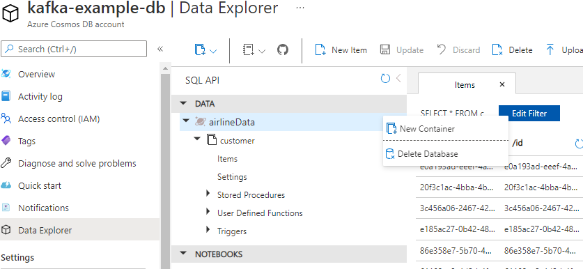
Checking the Data
Let’s begin by exploring the current data within our Cosmos DB instance. Open the Azure portal and navigate to the Azure Cosmos DB account we created in the second article. There should be an option for Data Explorer on the left side that will allow us to view all the data within our Cosmos DB. Expand the Data option, and there should be a database called airlineData with a container called Customer. If we click the Items option under our container, all the items stored within Customer should appear. When we click an id, the schema for that document and the data contained appear on the right side of the viewer.

Creating More Functions
As we can see from our data, the JSON object has a few nested elements. When we build our reports, it’s better to flatten our data into separate documents and tables. To allow for this, let’s separate our current function into four different ones by following the steps below:
- Create a customer object using the name as the ID
- Create a unique flight object without the origin or destination child objects, and include the airline name, number of stops, and price with the ID
- Create a unique origin object that is part of the flight with the origin details and the flight ID
- Create a unique destination object that is part of the flight with the destination details and the flight ID
Let’s start with modifying our current airline-customer-save by opening the file function.json and replacing the id with customer_name and partitionKey with /customer_name. This sets the customer table to use the customer’s name as the identifier. We also must update our function to manually pull out the customer elements by using the following code:
       event_body = json.loads(event.get_body().decode('utf-8'))
        customer = {
            "customer_name": event_body["customer_name"],
            "phoneNumber": event_body["phoneNumber"],
            "city": event_body["city"],
            "country": event_body["country"],
        }
        doc.set(func.Document.from_json(json.dumps(customer)))
This essentially sets our saved object to contain only the elements in which we are interested.
With this function updated, we must create the other functions to process the message differently. We can do this by using the Create New Function option on the Azure tab or by copying the function folder and renaming the components. However, before we can run this, we should start from scratch by deleting the database from the Cosmos DB. We can do this by reopening the data explorer in the Cosmos DB service, right-clicking on the database, and selecting Delete Database.
With the database deleted, we can now deploy our functions and rerun our test application to generate more messages. This example generates several messages — around 200 with a wait time of 50 milliseconds — in order to improve the visualizations within Power BI. After finishing, we have a flattened data set in a Cosmos DB on which we can build some visualizations.
Connecting Power BI
Power BI comes in two flavors — a server-based version and a desktop-based version — with only a few differences. This article uses the free, desktop-based version from Microsoft’s website.
Download and install Power BI, open the application and click Get data on the splash screen. Power BI can interact with several different databases, objects, and cloud-based services. We are specifically looking for Azure Cosmos DB. Select this option, then click connect. Enter the URL from the Cosmos DB overview page. Then, enter the database name and click OK.

Power BI then tries to connect to the Cosmos DB, but we must enter the key for authentication before it can do so successfully. You can find your key in the Keys section of the Cosmos DB account.

If you'd like learn more about, or share what you know about Azure Cosmos DB, check out the Azure Cosmos DB Conf; a free online virtual developer event organized in collaboration with the Azure Cosmos DB community.
Transforming Our Data
Once we have authenticated with Cosmos DB, Power BI should display four different tables to select. When we click these tables, we see that each data structure has a single Document column with Record as the value. Because a Cosmos DB is a NoSQL database, each document can have a schema. Therefore, we must use Power BI to flatten the structure by using the Transform Data option.

We need to expand the Document column for each of our tables by clicking the icon next to Document. This displays a screen with the names of the columns we want to expand and the table to include. For each of the tables, select the appropriate columns and click OK. If you leave the original column name selected, it adds Document to every column name.

We also want to change a few more things with our data, including the column types and particular values.
Open the flight table and on the icon to the left of Document.price or price, change the Column Type to Currency fixed decimal number. We also want to change the non-stop value in the Document.stops column to 0. To do this, select the column, click the Transform tab, and select Replace Values. This allows us to replace the non-stop value with 0. Finally, change the column type of Document.stops to include a whole number.

Once we have updated these values, we click Close and Apply on the Home menu to apply all changes to our data set.
Building Visualizations
One of the most straightforward visualizations we can build is a summary table. There is a Visualization tab on the right side of the main screen. Look for the table item and select it to add it to our Report pane. With the table selected, we can start adding columns. Power BI interprets our data to create a table-based report for us. If we add the Airline field from the flight table in the Fields section, we can see all of the different airlines. Furthermore, if we select the price field, the table sums the airline prices and provides a total. We can even sort by the different column headings.

We can also change visualization on the fly to turn the table into something a bit more visual. If we click the stacked bar chart icon on the Visualizations tab, the table becomes a sorted bar chart.

Power BI has several out-of-the-box visualizations that suit any dataset. For instance, if we remove this visualization by clicking the hamburger icon and selecting Remove, then add the map visualization onto our canvas and then drag the destination country onto the Location filter, we have a map of all the destinations to which people have flown.

We have merely touched on the capabilities of Power BI. We can manipulate our data in many other fashions, such as linking tables, creating multi-value visualizations, and combining columns.
Summary
In this series, we built an example Kafka application and experienced how a few minor configuration changes enabled it to connect to a serverless Event Hub message pipeline. We created serverless functions that processed those messages to form a dataset stored in Cosmos DB. Finally, we used that data set to explore potential visualizations with Power BI. We accomplished all of this without installing or managing complex server infrastructure — or moving away from Python.
Microsoft has a great video resource for learning Power BI that can show you more possibilities. And, with a free $200 credit when you sign up to Azure, you can build something like this quickly and easily.
To learn how to accelerate foundational app development, check out The Developer’s 7-Step Guide to Low-Code App Development.