WPF: Compact Navigation Menu
4.96/5 (30 votes)
Creating a compact navigation menu using a ListBox

Introduction
Navigation menus can enhance the quality of the user experience of your WPF application but how do you go about adding a compact navigation menu without using a third party control or the UWP NavigationView? In this article, I'll go over how you can create one using a ListBox. All the functionality required to create the navigation menu will be done using XAML only; so no code-behind, commands or frameworks.
Background
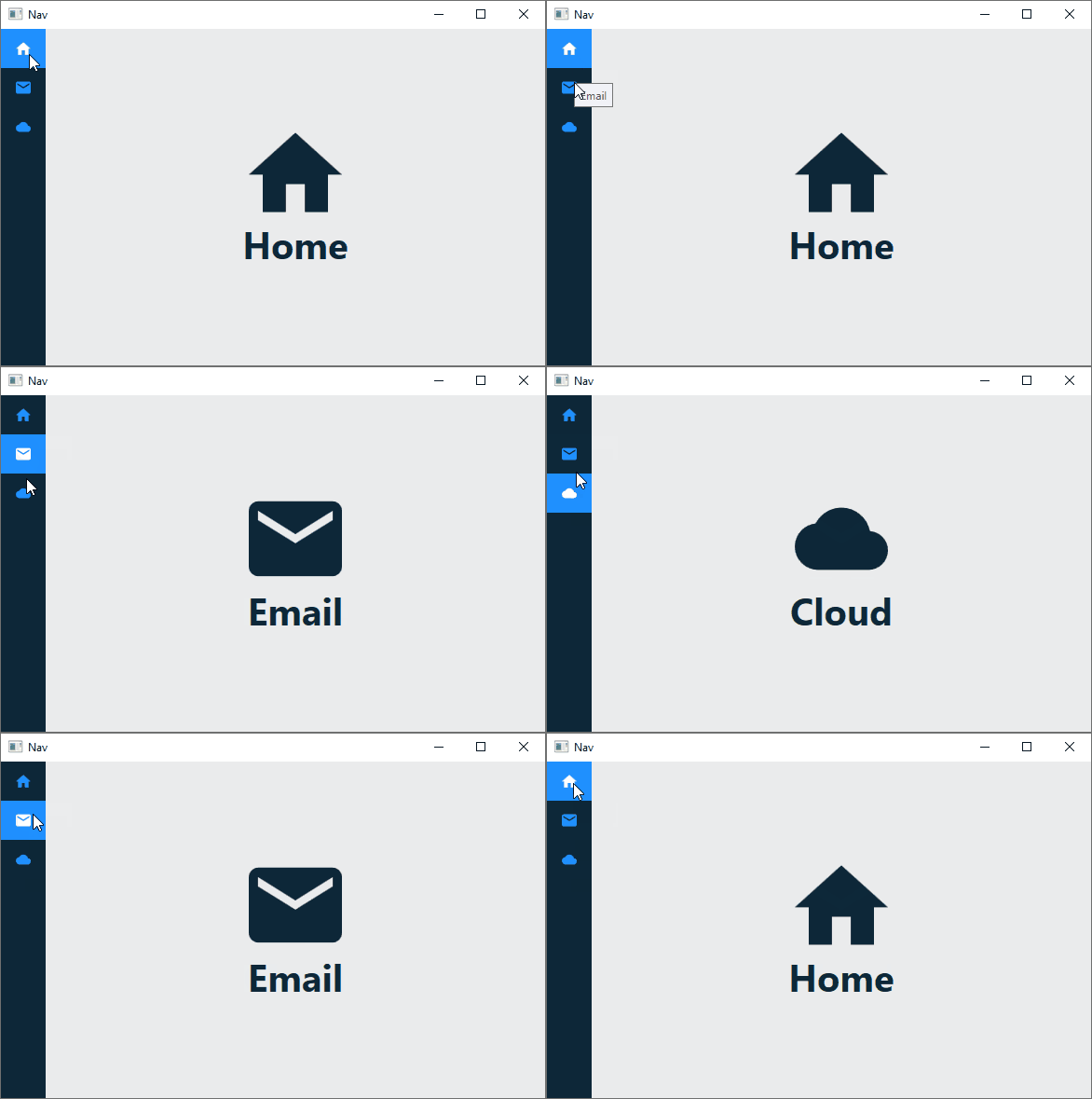
The sample application for this article has three views which the user can switch between: HomeView, EmailView and CloudView. The views are user controls and don't have much content except for an icon and text indicating which view is which.
<UserControl x:Class="CompactNavigationMenu.Views.EmailView"
            xmlns="http://schemas.microsoft.com/winfx/2006/xaml/presentation"
            xmlns:x="http://schemas.microsoft.com/winfx/2006/xaml"
            xmlns:mc="http://schemas.openxmlformats.org/markup-compatibility/2006"
            xmlns:d="http://schemas.microsoft.com/expression/blend/2008"
            xmlns:local="clr-namespace:CompactNavigationMenu.Views"
            xmlns:iconPacks="http://metro.mahapps.com/winfx/xaml/iconpacks"
            xmlns:vm="clr-namespace:CompactNavigationMenu.ViewModels"
            mc:Ignorable="d"
            d:DesignHeight="450" d:DesignWidth="800">
    <UserControl.DataContext>
        <vm:EmailViewModel/>
    </UserControl.DataContext>

    <Grid>
        <StackPanel Orientation="Vertical"
                    HorizontalAlignment="Center"
                    VerticalAlignment="Center">
            <iconPacks:PackIconMaterialDesign HorizontalAlignment="Center"
                                            Foreground="{StaticResource PrimaryDarkBrush}"
                                            Width="100" Height="100" Kind="Email"/>

            <TextBlock FontSize="40" FontWeight="Bold"
                         VerticalAlignment="Center" HorizontalAlignment="Center"
                         Foreground="{StaticResource PrimaryDarkBrush}"
                         Text="{Binding Title}"/>
        </StackPanel>
    </Grid>
</UserControl>
Navigation Menu
A compact navigation menu only displays icons, which the user should be able to easily interpret. As stated in the introduction, I'll highlight how to make a navigation menu using a ListBox but first let's take a look at the layout of the MainWindow.
<Window x:Class="CompactNavigationMenu.MainWindow"
        xmlns="http://schemas.microsoft.com/winfx/2006/xaml/presentation"
        xmlns:x="http://schemas.microsoft.com/winfx/2006/xaml"
        xmlns:d="http://schemas.microsoft.com/expression/blend/2008"
        xmlns:mc="http://schemas.openxmlformats.org/markup-compatibility/2006"
        mc:Ignorable="d"
        Height="400" Width="600" Background="#FFEAEBEC"
        Title="Nav" WindowStartupLocation="CenterScreen">

        ...

    <Grid>
        <Grid.ColumnDefinitions>
            <ColumnDefinition Width="Auto"/>
            <ColumnDefinition/>
        </Grid.ColumnDefinitions>

        <ListBox x:Name="NavigationMenuListBox"
                Style="{StaticResource NavigationListBoxStyle}"
                ItemContainerStyle="{DynamicResource NavigationListBoxItemStyle}"
                ItemTemplate="{DynamicResource NavigationDataTemplate}"
                ItemsSource="{StaticResource NavigationMenuItems}"/>

        <ContentControl Grid.Column="1" Style="{StaticResource NavigationContentStyle}"/>
    </Grid>
</Window>
The Window has a Grid with two columns: The first column hosts the ListBox that acts as the navigation menu while the second column hosts a ContentControl where the three views are switched.
To get the ListBox to act as a suitable menu, a custom ListBox style is required.
<Style x:Key="NavigationListBoxStyle" TargetType="{x:Type ListBox}">
    <Setter Property="Background" Value="{StaticResource PrimaryDarkBrush}"/>
    <Setter Property="ScrollViewer.HorizontalScrollBarVisibility" Value="Disabled"/>
    <Setter Property="ScrollViewer.VerticalScrollBarVisibility" Value="Disabled"/>
    <Setter Property="VerticalContentAlignment" Value="Center"/>
    <Setter Property="HorizontalContentAlignment" Value="Center"/>
    <Setter Property="SelectedIndex" Value="0"/>
    <Setter Property="Width" Value="Auto"/>
    <Setter Property="Template">
        <Setter.Value>
            <ControlTemplate TargetType="{x:Type ListBox}">
                <Border Background="{TemplateBinding Background}"
                        BorderThickness="0"
                        Padding="0"
                        SnapsToDevicePixels="true">
                    <ScrollViewer Padding="{TemplateBinding Padding}"
                                    Focusable="false">
                        <ItemsPresenter SnapsToDevicePixels=
                                    "{TemplateBinding SnapsToDevicePixels}"/>
                    </ScrollViewer>
                </Border>
            </ControlTemplate>
        </Setter.Value>
    </Setter>
</Style>
By default, the Border that makes up the ControlTemplate of a ListBox has its Padding and BorderThickness set to a value of 1. This has the unintended consequence of creating a slight gap between a ListBoxItem and the edges of the ListBox.

In the image above, you can notice a slight gap between the selected item, i.e., the first item, and the edges of the ListBox in its default state. The gap can be partially eliminated by setting the value of the Padding of the Border in the ControlTemplate to zero.
A custom ListBoxItem style is also required to completely eliminate the gap and to give ListBoxItems a custom look when in various states; like a blue Background and white Foreground when selected.
<Style x:Key="NavigationListBoxItemStyle" TargetType="{x:Type ListBoxItem}">
    <Setter Property="Background" Value="Transparent"/>
    <Setter Property="Foreground" Value="{StaticResource PrimaryLightBrush}"/>
    <Setter Property="Margin" Value="-1"/>
    <Setter Property="ToolTip" Value="{Binding}"/>
    <Setter Property="HorizontalContentAlignment"
            Value="{Binding HorizontalContentAlignment,
            RelativeSource={RelativeSource AncestorType={x:Type ItemsControl}}}"/>
    <Setter Property="VerticalContentAlignment"
            Value="{Binding VerticalContentAlignment,
            RelativeSource={RelativeSource AncestorType={x:Type ItemsControl}}}"/>
    <Setter Property="Template">
        <Setter.Value>
            <ControlTemplate TargetType="{x:Type ListBoxItem}">
                <Border x:Name="Bd"
                        BorderBrush="{TemplateBinding BorderBrush}"
                        BorderThickness="{TemplateBinding BorderThickness}"
                        Background="{TemplateBinding Background}"
                        Padding="{TemplateBinding Padding}"
                        SnapsToDevicePixels="true">
                    <ContentPresenter HorizontalAlignment=
                                    "{TemplateBinding HorizontalContentAlignment}"
                                    VerticalAlignment=
                                    "{TemplateBinding VerticalContentAlignment}"
                                    SnapsToDevicePixels=
                                    "{TemplateBinding SnapsToDevicePixels}"/>
                </Border>
                <ControlTemplate.Triggers>
                    <Trigger Property="IsSelected" Value="true">
                        <Setter TargetName="Bd" Property="Background"
                         Value="{StaticResource PrimaryLightBrush}"/>
                        <Setter Property="Foreground" Value="White"/>
                    </Trigger>
                    <MultiTrigger>
                        <MultiTrigger.Conditions>
                            <Condition Property="IsSelected" Value="true"/>
                            <Condition Property="Selector.IsSelectionActive" Value="false"/>
                        </MultiTrigger.Conditions>
                        <Setter Property="Background" TargetName="Bd"
                         Value="{StaticResource PrimaryLightBrush}"/>
                        <Setter Property="Foreground" Value="White"/>
                    </MultiTrigger>
                    <Trigger Property="IsEnabled" Value="false">
                        <Setter Property="Foreground"
                         Value="{DynamicResource {x:Static SystemColors.GrayTextBrushKey}}"/>
                    </Trigger>
                </ControlTemplate.Triggers>
            </ControlTemplate>
        </Setter.Value>
    </Setter>
</Style>
Notice I've set the Margin of the ListBoxItem to -1. This completely eliminates the gap between the ListBoxItem and the edges of the ListBox.
A DataTemplate is required for the ListBox ItemTemplate. The DataTemplate will contain the icon displayed in a ListBoxItem.
<DataTemplate x:Key="NavigationDataTemplate">
    <iconPacks:PackIconMaterialDesign x:Name="MenuItemIcon" VerticalAlignment="Center"
                                        HorizontalAlignment="Center" Margin="12"/>
    <DataTemplate.Triggers>
        <DataTrigger Binding="{Binding}" Value="Home">
            <Setter TargetName="MenuItemIcon" Property="Kind" Value="Home"/>
        </DataTrigger>
        <DataTrigger Binding="{Binding}" Value="Email">
            <Setter TargetName="MenuItemIcon" Property="Kind" Value="Email"/>
        </DataTrigger>
        <DataTrigger Binding="{Binding}" Value="Cloud">
            <Setter TargetName="MenuItemIcon" Property="Kind" Value="Cloud"/>
        </DataTrigger>
    </DataTemplate.Triggers>
</DataTemplate>
I'm using a DataTrigger to change the icon based on a binding which is of type string. You may recall that the ListBox's ItemsSource property was bound to a StaticResource named NavigationMenuItems. The resource is just a collection of strings.
<x:Array x:Key="NavigationMenuItems" Type="system:String">
    <system:String>Home</system:String>
    <system:String>Email</system:String>
    <system:String>Cloud</system:String>
</x:Array>
And that's all that's required to get the ListBox appropriately set up. The ContentControl where the views are switched only requires some minor styling to play along with the ListBox.
<Style x:Key="NavigationContentStyle" TargetType="ContentControl">
    <Setter Property="ContentTemplate" Value="{StaticResource HomeViewTemplate}"/>
    <Style.Triggers>
        <DataTrigger Binding="{Binding ElementName=NavigationMenuListBox, Path=SelectedItem}"
                     Value="Email">
            <Setter Property="ContentTemplate" Value="{StaticResource EmailViewTemplate}"/>
        </DataTrigger>
        <DataTrigger Binding="{Binding ElementName=NavigationMenuListBox, Path=SelectedItem}"
                     Value="Cloud">
            <Setter Property="ContentTemplate" Value="{StaticResource CloudViewTemplate}"/>
        </DataTrigger>
    </Style.Triggers>
</Style>
Views are switched based on the value of the ListBox's SelectedItem. The ContentTemplate of the ContentControl can be either one of three DataTemplates.
<DataTemplate x:Key="HomeViewTemplate">
    <views:HomeView/>
</DataTemplate>

<DataTemplate x:Key="EmailViewTemplate">
    <views:EmailView/>
</DataTemplate>

<DataTemplate x:Key="CloudViewTemplate">
    <views:CloudView/>
</DataTemplate>
Conclusion
That's it, I hope you've gained some useful knowledge from this article. If you prefer taking another approach, you can look at the other available options which I mentioned in the introduction.
History
- 4th August, 2020: Initial post
