
CSS Transitions
A chapter excerpt from Hello! HTML5 & CSS3
 |
Hello! HTML5 & CSS3
Rob Crowther A transition is a short animation between two element states, such as activating a drop-down menu or closing a pop-up message. Instead of having the elements immediately appear or disappear, the menu might slide down, and the pop-up message could fade out. In this article from Hello! HTML5 & CSS3, author Rob Crowther discusses how such effects improve usability by making interfaces more realistic and can be used to clarify relationships. |

One simple way to apply transitions is with a dynamic pseudo-class
like :hover.
In the following sets of screenshots, three of the transformation examples from
the previous section have been applied to the :hover state of a containing <div> with a
transition lasting 10 seconds. Instead of flipping from one state to the other,
the change happens gradually. If you look carefully, the fly-like speck on each
screenshot is the mouse pointer.

This example is from ch09/transforms-5.html with a 10-second transition, downloadable from Hello! HTML5 and CSS3’s source code. All of the other examples in this article can be found in this source code.

This example is from ch09/transforms-6.html with a 10-second transition.

This example is from ch09/transforms-7.html with a 10-second transition:

The transition-duration
property is the only thing required to create the animation:
div div {
    transition-duration: 10s;
}
Although all three elements have unique states when the parent element
is hover,
all three are transitioned according to the previous rule. Look at
ch09/transitions-1.html to see for yourself.
div:hover div:nth-child(1) {
    transform-origin: bottom right;
    transform: rotate(16.5deg);
}
div:hover div:nth-child(2) {
    transform-origin: top right;
    transform: rotate(33deg);
}
div:hover div:nth-child(3) {
    transform-origin: top left;
    transform: rotate(66deg);
}
When transition-duration
is set on the default state of the element (in this case, when it
isn’t hover),
the same duration applies as the transition runs both forward and backward—as
the element enters the hover
state and leaves it, the transition will last 10 seconds as shown
in the results of listing ch09/transitions-3.html.
But you can put transition-duration on the hover state. In this case, it will only
apply as the element enters the hover state. When the element leaves hover, it
immediately snaps back to the starting position—a duration of zero.

This is the critical bit of code from listing ch09/transitions-4.html:
div:hover div { transition-duration: 10s; }
You can also put transition-duration on both states. In the next example, the
transition lasts 10 seconds as it enters the hover state and 5 seconds as it exits.

The duration for exiting the hover state is specified on the rule
without the :hover:
div div { transition-duration: 5s; }
div:hover div { transition-duration: 10s; }
See the complete example in listing ch09/transitions-5.html.
Transition Timing Functions
By default, transitions happen at a constant rate, but you can
adjust that with the transition-timing-function
property. The default value is linear, but several other keywords are
available: ease-in-out,
ease-in, ease-out, and ease. The
difference is much easier to see than it is to explain, so the next four
screenshots show the values in operation side by side over a 20-second
transition.
The quickest out of the blocks is ease-out, followed by ease. Both easein-out and ease-in are
initially slower-moving than linear.
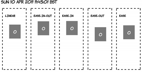
A few seconds later, ease has overtaken ease-out.

As you go past the halfway point, ease-in-out has accelerated and is ahead
of linear.

Toward the end of the transition, ease-in is starting to catch up with the
rest; remember, all five transitions take 20 seconds to complete.

The non-linear
transition timings often appear more natural—things tend to
accelerate and decelerate rather than suddenly start and stop moving.
You’re also not limited to effects on hover; any other dynamic pseudoclass will
work just as well. With a slight modification, our :target example can be made to fade
smoothly in and out.

|

|

|
| 1. The page loads blank. |
2. When you click the first link, the content starts to fade in. |
3. After 10 seconds, the transition completes. |

|

|

|
| 4. Clicking the second link starts two transitions. The current text starts to fade out… |
5. …as the new page starts to fade in. |
6. After 10 seconds, the new content has replaced the old. |
All that’s been added is a <section> element to allow the
paragraphs to be absolutely positioned:
<menu>
    <a href="#one">Show one</a>
    <a href="#two">Show two</a>
    <a href="#three">Show three</a>
    <a href="#four">Show four</a>
</menu>
<section>
    <p id="one">I never am really
satisfied...</p>
    <p id="two">In almost every
computation...</p>
    <p id="three">Many persons who are not
conversant...</p>
    <p id="four">The Analytical Engine has no
pretensions...</p>
</section>
The paragraphs then fade in and out over 10 seconds. The fade-in
uses the timing function ease-in
(start slow and finish fast), and the fade-out uses ease-out so the
disappearing paragraph begins to fade out as quickly as possible, giving
immediate feedback to the user:
section { position: relative; }
p {
    opacity: 0;
    position: absolute;
    transition-duration: 10s;
    transition-timing-function: ease-out;
}
p:target {
    opacity: 1;
    transition-timing-function: ease-in;
}
See the full source code in ch09/transitions-6.html.
Transition Property
So far, the examples have implicitly chosen which properties they will apply to by only listing the changed ones in the transition state. Every property has therefore been subject to the same duration and timing function. But it’s possible to apply multiple transitions to the same element, with each one affecting a different property.
In this part of the article, you’ll take advantage of the fact that all the transition properties accept multiple properties in a comma-separated list. You can declare two transition durations, one of 10 seconds and one of 20, like this:
transition-duration: 10s, 20s;
Then, if you declare transition-property like this
transition-property: top, transform;
the transition of the top property will take 10 seconds, and the transition of the transform property will take 20 seconds. The next example compares two elements with the same transition duration but different transition properties.

As you can see, element one drops quickly and expands slowly, whereas
element two expands quickly and drops slowly. The markup is two <div> elements
inside a <section> with
this CSS applied to it:
section div {
    position: absolute;
    top: 0px;
    transition-duration: 10s, 20s;
    transition-property: top, transform;
}
section div:nth-child(2) {
    left: 200px;
    transition-property: transform, top;
}
section:hover div {
    top: 280px;
    transform: scale(1.5);
}
Transition Delay
You don’t have to start a transition immediately after whatever
action initiated it. The transition-delay
property allows you to specify a wait before a transition starts.
In the following screenshots, element two doesn’t begin transitioning until
five seconds after element one started, and element three’s transition begins a
further five seconds after that.

The code, from listing ch09/transition-delay-1.html, is identical to that from ch09/transitions-3.html except for these two rules:
div div:nth-child(2) { transition-delay: 5s; }
div div:nth-child(3) { transition-delay: 10s; }
The most common use for transition-delay is to chain a number of transitions
together. If you want an element to first move and then enlarge, you specify
two transitions like this:
div {
    transition-duration: 10s, 10s;
    transition-delay: 0, 10s;
    transition-property: top, transform;
}
The element will first transition the top value and then
transition the transform. You can see a full example in the code file
ch09/transitiondelay-2.html. With transition-delay, it’s possible to create
multiple-step animations, providing that at each step a different property is
transitioned.
Triggering Transitions with JavaScript
After a transition is defined on an element, any change in the computed style will trigger the animation. This doesn’t have to be due to a dynamic pseudo-class taking effect; you can also change the styles with JavaScript.
 |
 |
|
Clicking the Change Left button starts an animation. |
Over 10 seconds, the element moves to the left. |
 |
 |
|
Similarly, clicking Change Top starts another animation. |
Over 10 seconds, the element moves down from the top of the page. |
Here’s the HTML for the page:
<menu>
    <button
onclick="clickme('changeleft')">Change left</button>
    <button onclick="clickme('changetop')">Change
top</button>
    <button
onclick="clickme('changecolor')">Change color</button>
    <button
onclick="reset()">Reset</button>
    </menu>
<div id="animateme">Animate Me</div>
The CSS defines the animation and three classes that adjust the relevant properties:
#animateme {
    background-color: #666;
    position: absolute;
    color: #fff;
    left: 100px;
    top: 100px;
    transition-duration: 10s;
}
.changeleft { left: 250px !important; }
.changetop { top: 300px !important; }
.changecolor { background-color: #ff00ff !important; }
Note that you must use !important because otherwise the ID selector
would take precedence. Finally, here’s the JavaScript function to apply the
styles to the element when the buttons are clicked:
function clickme(classname) {
    var el = document.getElementById('animateme');
    el.className += " " + classname;
}
And here’s a reset function to clear the styles:
function reset() {
    var el = document.getElementById('animateme');
    el.setAttribute("style","");
}

This example switches to Opera so you can take advantage of the color input type.

|

|

|
| Set the left and top to 200 and the color to a light blue. | The element animates over 10 seconds as before. | The animation is complete. |

|

|

|
| Set the left to 0, the top to 300, and the color to black. | The element animates from its current position. | After 10 seconds, the new properties are in effect. |
<menu>
    <button onclick="clickme()">Click
Me</button>
    <button
onclick="reset()">Reset</button>
    <label for="myleft">left</label>:
        <input id="myleft" type="number"
value="100">
    <label for="mytop">top</label>:
        <input id="mytop" type="number"
value="100">
    <label for="mycolor">color</label>:
        <input id="mycolor" type="color"
value="#666666">
</menu>
<div id="animateme">Animate Me</div>
function clickme() {
    var el = document.getElementById('animateme');
    var left = document.getElementById('myleft').value;
    var top = document.getElementById('mytop').value;
    var color = document.getElementById('mycolor').value;
    el.setAttribute("style","left: " + left +
"px; top: " + top +
        "px; background-color: " + color +
";");
}

Summary
There are some of the snazzier aspects of CSS3—features that are much loved by graphic designers. Transforms come into their own when combined with another new CSS3 feature: transitions. In this article, you’ve learned about one of the new CSS3 features: transitions.
Here are some other Mnning titles you might be interested in:
 |
HTML5 in Action |
|
HTML5 for .NET Developers |
 |
Sass and Compass in Action |