
A WPF Combo Box with Multiple Selection
4.93/5 (22 votes)
This combo box supports multiple selection, two way binding on the SelectedItems property, and inplace editing of the ItemsSource property.
Introduction
The combo box that ships with WPF does not support selecting multiple items. Furthermore, the WPF list box, while it does support multiple selection, does not allow binding in XAML to the SelectedItems property. This article describes a WPF combo box that supports both. It also describes a list box, which the combo box inherits from, that supports binding to the SelectedItems property.
Requirements and Design Considerations
A Bindable List Box
I'll start by describing the bindable list box, since the combo box is based on it. The name of the control is BindableListBox.
While System.Windows.Controls.ListBox has a SelectedItems dependency property, it is readonly, which means that you cannot bind to it in XAML. But what would it mean if you could? There are a number of possibilities, which makes the whole thing rather ambiguous, and which is most likely why Microsoft doesn't do it. But in the real world, it often comes up as one of those "wouldn't it be nice if" things that would work nicely for your specific situation, but just isn't supported. The reason I mention this is to highlight the importance of defining exactly what a "bindable" SelectedItems property does. Here is how I define it:
- When the property is set by the client, the client's store should reflect all changes. In other words, the property type is
IListand it has a public setter (yes, FxCop issues a warning, but I want to be able to edit the client's list directly.) - When an item is selected or unselected - either through the UI or programmatically - the underlying store should remain synchronized with the visual display.
- Finally, if (and only if) the underlying store supports the
INotifyCollectionChangedinterface, and its contents are modified from outside, the changes should be reflected in the UI. (This follows a pattern used by Microsoft in other places, for example, theItemsSourceproperty ofListBox, as we'll see below.)
Another consideration is the public interface. Assuming MultiListBox inherits from ListBox (it does), then there are basically two choices for the selected item property: define an entirely new property to hold the bound selected items list, or keep the interface unchanged from the base class by hiding the (non virtual) ListBox.SelectedItemsProperty with a "new" property of the same name. I chose the latter, because I like the idea of keeping the interface the same as the base class interface. (A derived class "hides" a member of the base class when it defines a method or property or field that has the same name and signature as that base class member, and the base class member is not marked virtual. The "new" keyword is used to indicate intent to hide a base class member.)
With these two decisions in place, the implementation is relatively straight forward. A BindalbeListBox is simply a ListBox that has hidden the base class's SelectedItems with a property of its own. The change is transparent to the user. There is no need for any XAML, it suffices to inherit all of the default visuals from ListBox.
The Multiple Selection Combo Box
It seems fairly intuitive to me how a combo box with multiple selection should behave. It should behave like a list box with multiple selection, except for the drop down. Unlike the single select ComboBox, the drop down should remain open when a value is selected (or unselected) providing the user the opportunity to select as many items as desired without having to constantly re-open the drop down. The drop down should close when the user clicks anywhere outside the control or on the drop down button (like ComboBox). Also, I want to support a single select mode. When in single select mode, MultiComboBox should behave just like ComboBox.
One of the first questions to ask when designing a combo box that supports multiple selection is what should it inherit from? Is it a Control, a MultiSelector, a ComboBox or a ListBox? If Control it would still be necessary to embed one of the other three or else plan on doing a lot of extra work. MultiSelector might be a good choice, but, for one thing, I couldn't find any examples of how to use it, and for another you would probably end up duplicating a lot of functionality found in ListBox or ComboBox. It might seem obvious at first to inherit from ComboBox. However, since ComboBox doesn't allow multiple selection, you'd still have to embed a ListBox to get that functionality, and it would still be necessary to override the default Template. MultiComboBox is a ListBox because with ListBox we get both multiple selection and single selection modes along with all the standard properties that ListBox and ComboBox have in common, like ItemsSource, SelectedItem, etc. This shows the power of WPF, to be making a combo box that is really a list box masquerading as a combo box.
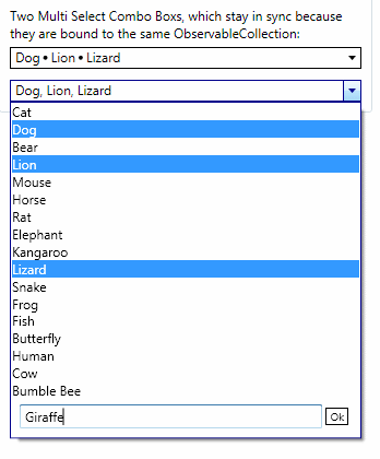
There are a couple of other features I need to implement for my use case, one that the SelectedItems property be bindable in XAML, which is why MultiComboBox inherits from BindableListBox and not ListBox. The other is a little more involved and outside the normal scenario for a combo box, but is needed by my application. This is the ability to add an item to the combo box's items list, while the combo box itself is open. What I need to be able to do, in the drop down itself, is click on a button that says "Create New Item" and have a text box show up where I can enter the new item's text. Then, with the click of an "Ok" button the new text is added to the ItemsSource of the combo box, and is automatically selected. Here is an image taken from the sample app that comes with this article:
Implementation
Implementing BindableListBox entails keeping the base class's SelectedItems and the derived class's SelectedItems synchronized with each other. Other than one or two caveats, it is fairly straight forward and I don't intend to go into it here. If you are interested, please, download the code.
MultiComboBox inherits the ability to select multiple items and to bind to those items in XAML from BindableListBox. So what is needed to make it a combo box? Mainly, it needs the drop down. There are two dependency properties that ComboBox exposes that support the behavior of the drop down: the IsDropDownOpen and MaxDropDownHeight dependency properties. These can be added to MultiComboBox using the AddOwner method of the DependencyProperty class (i.e. ComboBox.MaxDropDownHeight.AddOwner(...) which has the benefit of providing a default value. Once these two properties are in place, much of the work is done in the control's template.
Although MultiComboBox inherits from ListBox I want it to look like a combo box, so I begin the process of creating the Template by studying the template for ComboBox. (To do this, I use .NET reflector in conjunction with the BAMLViewer plugin, which allows me to examine the XAML of the resources defined inside the .NET assembly PresentationFramework.Aero.dll)
The XAML for MultiComboBox is surprisingly similar to the XAML for ComboBox. The main difference is what is used to display the text for the selected items. In ComboBox this is a ContentPresenter that is bound to the SelectionBoxItem property. I chose to use a StackPanel and populate its children property in code, when the selection changes. The other main difference, of course, is the part which houses the buttons and text box used for adding a new item to the ItemsSource collection. This assembly basically just gets tacked on to the bottom of the Popup. Its Visibility property is Collapsed by default, then set to Visible in a Trigger, when IsCreateNewEnabled becomes true. Showing and hiding the drop down (a Popup work the same here as with a ComboBox. Both the toggle button and the popup are bound to the control's IsDropDownOpen property. When the toggle button is checked, IsDropDownOpen becomes true, which causes the popup to open. And vice-versa.
I had to use EventTriggers with StoryBoard animation for showing and hiding the enter new item assembly when the buttons are clicked. This gets a little messy, but it is possible to set Visibility in an event trigger, using a DiscreteObjectKeyFrame inside an ObjectAnimationUsingKeyFrames collection. Here is the complete template:
<ControlTemplate x:Key="MultiSelectComboBoxReadOnlyTemplate"
	TargetType="{x:Type local:MultiComboBox}">
    <Grid>
        <ToggleButton Name="toggleButton" IsTabStop="False"
                      Background="{TemplateBinding Background}"
                      BorderBrush="{TemplateBinding BorderBrush}"
                      BorderThickness="{TemplateBinding BorderThickness}"
                      Template="{StaticResource MultiSelectComboBoxToggleButtonTemplate}"
                      IsChecked="{Binding RelativeSource=
				{RelativeSource TemplatedParent},
			 Path=IsDropDownOpen, Mode=TwoWay}"
                      >
            <StackPanel Name="PART_labelContentPanel" IsHitTestVisible="False"
		Margin="4,0,5,0" Orientation="Horizontal"
                  HorizontalAlignment="{TemplateBinding HorizontalContentAlignment}" />
        </ToggleButton>

        <Popup Name="PART_popup"
               StaysOpen="False"
               AllowsTransparency="True"
               Placement="Bottom"
               IsOpen="{Binding RelativeSource={RelativeSource TemplatedParent},
		Path=IsDropDownOpen}"
               PopupAnimation="Slide">
            <theme:SystemDropShadowChrome Name="Shadow" Color="Transparent"
                                          MaxHeight="{TemplateBinding MaxDropDownHeight}"
                                          MinWidth="{TemplateBinding ActualWidth}">
                <Border BorderBrush="{TemplateBinding BorderBrush}"
                    BorderThickness="{TemplateBinding BorderThickness}"
                    Background="{TemplateBinding Background}">
                    <StackPanel>
                        <ScrollViewer MaxHeight="{TemplateBinding MaxDropDownHeight}" >
                            <ItemsPresenter Margin="{TemplateBinding Padding}"
                            SnapsToDevicePixels="{TemplateBinding SnapsToDevicePixels}" />
                        </ScrollViewer>
                        <Grid Name="EditBoxGrid" Visibility="Collapsed"
					Grid.Row="1" Margin="5" >
                            <Button Name="ShowEditBoxButton" HorizontalAlignment="Right"
                                    Foreground="{TemplateBinding Foreground}"
                                    Style="{StaticResource CreateNewItemButtonStyle}"
                                    Content="Create New Item"
                                    />
                            <Border Margin="3,0,3,3" Name="NewItemEditGroup"
						Visibility="Collapsed">
                                <Grid>
                                    <Grid.ColumnDefinitions>
                                        <ColumnDefinition Width="*"/>
                                        <ColumnDefinition Width="Auto"/>
                                    </Grid.ColumnDefinitions>
                                    <TextBox Grid.Column="0" Background="White"
						Name="PART_textBoxNewItem"/>
                                    <Button Name="PART_newItemCreatedOkButton"
                                        Grid.Column="1"
                                        Margin="3"
                                        Content="Ok"
                                        Foreground="{TemplateBinding Foreground}"
                                        Style="{StaticResource CreateNewItemButtonStyle}"
                                        />
                                </Grid>
                            </Border>
                        </Grid>
                    </StackPanel>
                </Border>
            </theme:SystemDropShadowChrome>
        </Popup>

    </Grid>

    <ControlTemplate.Triggers>
        <Trigger SourceName="PART_popup" Property="HasDropShadow" Value="true">
            <Setter TargetName="Shadow" Property="Margin" Value="0,0,5,5" />
            <Setter TargetName="Shadow" Property="Color" Value="#71000000" />
        </Trigger>
        <Trigger Property="IsMouseOver" Value="True">
            <Setter Property="BorderBrush" Value="{StaticResource ActiveBorderBrush}" />
        </Trigger>
        <Trigger SourceName="toggleButton" Property="IsChecked" Value="True">
            <Setter Property="BorderBrush" Value="{StaticResource ActiveBorderBrush}" />
        </Trigger>

        <Trigger Property="IsCreateNewEnabled" Value="True">
            <Setter TargetName="EditBoxGrid" Property="Visibility" Value="Visible" />
        </Trigger>

        <EventTrigger SourceName="ShowEditBoxButton" RoutedEvent="Button.Click">
            <BeginStoryboard>
                <Storyboard>
                    <ObjectAnimationUsingKeyFrames
				Storyboard.TargetName="NewItemEditGroup"
                                     Storyboard.TargetProperty="Visibility">
                        <DiscreteObjectKeyFrame KeyTime="00:00:00"
				Value="{x:Static Visibility.Visible}" />
                    </ObjectAnimationUsingKeyFrames>
                    <DoubleAnimation Storyboard.TargetName="ShowEditBoxButton"
                                     Storyboard.TargetProperty="Opacity"
                                     To="0" Duration="0:0:0"/>
                    <BooleanAnimationUsingKeyFrames
			Storyboard.TargetName="ShowEditBoxButton"
                                                  Storyboard.TargetProperty="IsTabStop">
                        <DiscreteBooleanKeyFrame Value="False" KeyTime="0:0:0" />
                    </BooleanAnimationUsingKeyFrames>
                </Storyboard>
            </BeginStoryboard>
        </EventTrigger>
        <EventTrigger SourceName="PART_newItemCreatedOkButton"
				RoutedEvent="Button.Click">
            <BeginStoryboard>
                <Storyboard>
                    <ObjectAnimationUsingKeyFrames BeginTime="00:00:00"
                                               Storyboard.TargetName="NewItemEditGroup"
                                               Storyboard.TargetProperty="Visibility">
                        <DiscreteObjectKeyFrame KeyTime="00:00:00"
			Value="{x:Static Visibility.Collapsed}" />
                    </ObjectAnimationUsingKeyFrames>
                    <DoubleAnimation Storyboard.TargetName="ShowEditBoxButton"
                                     Storyboard.TargetProperty="Opacity"
                                     To="1" Duration="0:0:0"/>
                    <BooleanAnimationUsingKeyFrames Storyboard.TargetName=
						"ShowEditBoxButton"
                                                    Storyboard.TargetProperty="IsTabStop">
                        <DiscreteBooleanKeyFrame Value="True" KeyTime="0:0:0" />
                    </BooleanAnimationUsingKeyFrames>

                </Storyboard>
            </BeginStoryboard>
        </EventTrigger>
    </ControlTemplate.Triggers>
</ControlTemplate>
Updating the display of the selected items list has to be done in code, any time the selection changes, and can be handled in the overridden method OnSelectionChanged. A handle to the Panel defined in the Template is obtained and used to, first, clear out the current contents, then add the list of selected items. The items are separated by the DisplaySeparator which can be set in XAML and can be anything that can be visually rendered. One caveat here is that, if the separator is a Visual object, it can only be used as a visual child once, which means that it has to be deep cloned. (I found the method for doing this on the blog of Justin-Josef Angel.)
// <summary>
// Sets the display contents for the label.
// Inserts the DisplaySeparator object between items.
// </summary>
private void LoadLabelContents()
{
    // Ignore if the panel is not present.
    if (_labelPanel == null)
        return;

    // Clear current contents.
    _labelPanel.Children.Clear();

    if (SelectionMode != SelectionMode.Single && SelectedItems != null)
    {
        for (int x = 0; x < SelectedItems.Count; x++)
        {
            // For each selected item, create a content control,
            // set the content of the control to be the selected item,
            // and add the content control to the label panel's children.
            ContentControl itemContent = new ContentControl();
            itemContent.IsTabStop = false;
            itemContent.Content = SelectedItems[x];
            _labelPanel.Children.Add(itemContent);

            if (x < SelectedItems.Count - 1)
            {
                // Add the separator, as defined in the DisplaySeparatory property.
                // This can be anything, including a Visual element
	       // that has been defined in xaml,
                // which can only be the visual child once, so do a deep Clone
                // of the Visual before putting adding it to the label.
                ContentControl separatorContent = new ContentControl();
                separatorContent.IsTabStop = false;
                if (DisplaySeparator is Visual)
                    separatorContent.Content = Clone(DisplaySeparator) as Visual;
                else
                    separatorContent.Content = DisplaySeparator;

                _labelPanel.Children.Add(separatorContent);
            }
        }
    }
    else if (SelectedItem != null)
    {
        ContentControl itemContent = new ContentControl();
        itemContent.IsTabStop = false;
        itemContent.Content = SelectedItem;
        _labelPanel.Children.Add(itemContent);
    }
}
Adding an item to the ItemsSource collection is handled in the Click event of the 'Ok' button. Of course, for this to work, ItemsSource needs to be a collection of string or of a type that can be converted to from string. For the display of items in the drop down to be updated to include the new item, the collection behind the ItemsSource needs to implement the INotifyCollectionChanged interface.
Using the Control
The control is used just like a ListBox, with the addition of a bindable SelectedItems property. One thing to remember is, to receive notification that the selected items changed, without handling the ListBox.SelectionChanged event, use an ObservableCollection or some other collection type that implements INotifyCollectionChanged. This is very useful if the collection is bound to anything else. The same applies to the backing store of ItemsSource.
Additionally, the two properties IsDropDownOpen and MaxDropDownHeight function just as their counterparts in ComboBox.
To enable the feature for adding an item to the Items collection in the DropDown, set IsCreateNewEnabled to true.
Points of Interest
One especially tricky problem turned out to be managing the state of the drop down. There are two basic approaches: setting the popup's StaysOpen property to false and setting it to true. When StaysOpen is false the popup will automatically close itself anytime it detects a mouse click anywhere in the system, whether inside or outside the popup itself, or the current application. When StaysOpen is true the popup will not close unless told to do so. (This is Popup's default behavior.) Going with this approach would involve using a global mouse hook to detect system wide mouse clicks. Doable (there are articles on Code Project that demonstrate how) but using a global hook is somewhat risky and anyway is a lot of extra work. However, using the other approach, setting StaysOpen to false has its challenges as well.
Without doing anything in the code to modify the behavior, and with the template defined as it is above, there is one obvious problem and one subtle one. The obvious problem is that in Multiple selection mode, the drop down closes with any click on an item inside it. Remember, the specified behavior is that the drop down stay open when an item is clicked on, so the user can continue to make selections. The more subtle issue is that the drop down closes on the MouseDown event, but examining the behavior of the built-in combo box reveals that it closes the dropdown on the MouseUp event, which is just a nicer effect. A trick to avoid the first problem is to prevent the popup from receiving the mouse down event. To accomplish this, I override OnPreviewMouseDown (MouseDown event notification never reaches the control so I can't use it) and set the Handled property of the event args to true. But because of this, the underlying list box doesn't receive the click event so I have to manually set the IsSelected property of the ListItem that is currently under the mouse. This gets me what I want when in multiple selection mode. Now what about single selection mode? At this stage, the drop down doesn't close when an item is selected, as it should. Because I would prefer that the drop down close with the mouse up event, I override OnPreviewMouseUp and add code to close the drop down if in single selection mode.
Well, that's about it. I sincerely hope that you find this article and the accompanying code informative, useful and enjoyable.
History
- December 1, 2009: Initial posting