
Data Visualization using Matplotlib
5.00/5 (3 votes)
This article demonstrates Data Visualization using Matplotlib library of Python.


Introduction
Through this article, I wish to demonstrate the method of Data Visualization using Python. More specifically, this article is about using the Matplotlib library of Python to plot the salaries of employees from the emp table of the scott sample schema of Oracle. As such, I will show you how we can connect to Oracle database from a Python program.
Background
Data Visualization is a method of simplifying complex data using visual elements like charts, images, maps, etc. Data Visualization helps a person understand trends and patterns in data in an easy way which otherwise may be difficult to grasp. One of the ways of implementing Data Visualization is by using charts. Matplotlib is a very popular charting library in Python, which can be used to create different types of charts with ease.
cx_Oracle is a Python extension module used to establish connection to an Oracle database from a Python program. We can use cx_Oracle to connect to an Oracle database and execute queries and perform data manipulation(DML) operations like insert, update and delete. For the purpose of this article, we will be using the cx_Oracle module to connect to Oracle and query the records from the emp table of the scott schema to display the salaries of employees in the form of bar and pie charts.
Using the Code
The first step is to download and install Python if not already done. Python can be downloaded from here. The next step is to download and install the Matplotlib library. This can be achieved by using the pip command as follows:
pip install matplotlib
Similarly, we can install cx_Oracle as follows:
pip install cx-Oracle
Following is a simple program that uses the Matplotlib library to display the sin and cos graphs.
# Trigonometric graphs
import matplotlib.pyplot as plt
import numpy
from numpy import sin
from numpy import cos
x = numpy.arange(0,15,0.1)
plt.plot(x,sin(x),label="SIN")
plt.plot(x,cos(x),label="COS")
plt.grid(True)
plt.title("SIN/COS Chart")
plt.xlabel("Angle")
plt.ylabel("Sin/Cos")
plt.legend()
plt.show()
In the above program, the sin() and cos() functions from the numpy package are used to calculate and plot the respective curves. The arange() function generates numbers between 0 and 15 with a step of 0.1. The plot() function creates the line chart, taking the angle, sin/cos and label as parameters. The label parameter is used by the legend() function to display legends on the chart.
On running the above program, the following chart is displayed:
The following program connects to the Oracle database using the cx_Oracle package and fetches details of employees from the emp table of scott schema. Then it creates a bar chart by plotting the name and salary on the X-Axis and Y-Axis respectively.
import cx_Oracle
import numpy as np
import matplotlib.pyplot as plt
con=cx_Oracle.connect("scott/tiger@localhost")
cursor=con.cursor()
cursor.execute("select count(*) from emp")
for row in cursor:
    totalemps=row[0]
t=np.arange(totalemps)
cursor.execute("select ename,sal from emp")
names=[]
salaries=[]
for row in cursor:
    names.append(row[0])
    salaries.append(row[1])
bar_width=0.5
plt.bar(t,salaries,bar_width,label="Salary")
plt.title("Employee Details")
plt.xlabel("Employee")
plt.ylabel("Salary")
plt.xticks(t,names)
plt.grid(True)
plt.legend()
xs=[x for x in range(0,totalemps)]
for x,y in zip(xs,salaries):
    plt.annotate(salaries[x],(x-bar_width/2,y))
plt.show()
In the above program, I have used the connect function of cx_Oracle to connect to the scott schema of Oracle database. Then, I have used the cursor() function to get the cursor object. The cursor object is then used to execute the SQL commands and retrieve the required data from the emp table. I have created two lists to store the names and salaries of employees to be plotted on the bar chart. The arange() function from the numpy package is used to generate sequence numbers for the X-Axis. The matplotlib bar() function plots the salaries on the Y-Axis. The xticks() function shows the employee names on the X-Axis. The annotate() function is used to display data labels on the bars.
Following is the output of the above program:
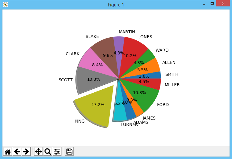
If you want to display the salaries of employees as percentages, then you can draw a pie chart. The following program draws a pie chart of the salaries:
import cx_Oracle
import numpy as np
import matplotlib.pyplot as plt
con=cx_Oracle.connect("scott/tiger@localhost")
cursor=con.cursor()
cursor.execute("select count(*) from emp")
for row in cursor:
    totalemps=row[0]
cursor.execute("select ename,sal from emp")
names=[]
salaries=[]
for row in cursor:
    names.append(row[0])
    salaries.append(row[1])
explode=[0.2 if salaries[x]==max(salaries) else 0 for x in np.arange(0,totalemps)]
plt.pie(salaries,explode=explode,labels=names,autopct="%1.1f%%",shadow=True)
plt.show()
The pie() function takes the salaries list as the first parameter. The explode parameter specifies which pie slices must be exploded. Here, I have determined the slice to be exploded using the max() function. The value corresponding to the highest salary is made 0.2 while all others are 0. This will cause the slice with the highest salary to be exploded. The labels parameter specifies the employee names to be displayed on the slices. The autopct parameter specifies the format for the percentages to be displayed. The shadow parameter specifies whether shadow effect should be displayed for the chart.
The following pie chart is displayed when you run the above program:
Points of Interest
Python enables writing short and compact programs. This makes Python a more suitable as well as interesting choice for data visualization. I hope readers of this article find this stuff useful and interesting.
History
- 23rd April, 2019: Initial version