A Professional Ribbon You Will Use (Now with orb!)
4.96/5 (563 votes)
A serious project on an Office-like Ribbon control
New: Read the guide for embedding the ribbon on the non-client area.

Introduction
Because of the lack of good free Ribbon controls on the web, I decided to write one myself. I've analyzed previous work on ribbon-controls, including those on CodeProject. Unfortunately, most existent controls are merely bad tries. Why? well, some lack nice rendering, some lack resizing features, some lack almost everything. Of course, well developed Ribbon controls are available at a price. This ribbon is free.
Why not WPF? Well mainly, because I needed the Ribbon to add it to my existing WinForms applications. In my opinion (the short version) this is not a "no" to WPF, is just a "not yet". Anyway, you can host a WinForms control in WPF (See this link).
Some of the Design Goals
Performance - This ribbon is contained on a Control window, and every element inside of it is managed as a bunch of bounds inside the control, just as the ToolStrip control does. Although this is difficult to manage from the ribbon's inside code, this is a way to keep it at the best performed ribbon. Believe me, download the demo, run it and resize the window. It performs beautifully.
Consistency with Office's Ribbon - I read once about Jakob Nielsen saying that most users prefer that the programs they use look just like Word, Excel or PowerPoint. This is quite obvious, because people use this software every day. Providing visual consistency with the Office's ribbon is very important because of that, people already know what to expect and that's a usability advantage. I've tried to see that every element in the ribbon looks and behaves exactly like it does in the Office's ribbon.
Ease of use for programmers - The naming of components is consistent with most WinForms naming system, even more with the ToolStrip elements. Property, event and method names for similar elements are named just like in the ToolStrip technology items.
Designer support - I will be adding more and more designer support so you can manage the ribbon 100% from the designer. Give it a try.
I will be providing updates and fixes for bugs, as I discover them or you kindly let me know about them.
Using the Ribbon
The ribbon is located in the System.Windows.Forms namespace, just as every other control, I think it's annoying to use controls named as MyCoolFirm.MyCoolNameSpace.MyCoolSubNameSpace and so on (Please do that only for business objects).
You can add a reference to the compiled DLL: System.Windows.Forms.Ribbon.dll or you can directly copy the source files to a folder on your project. The code is currently designed so you can just copy the source files, it doesn't need any extra resources.
Hands on: Quick Guide
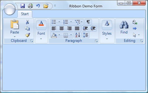
The ribbon is composed mainly by three kind of elements, the tabs, the panels on the tabs (other developers call them groups) and the items inside the panels.


These elements are represented by RibbonTab, RibbonPanel and RibbonItem types. RibbonItem is an abstract class that provides basic functionality for any item hosted on a RibbonPanel or on a RibbonDropDown.
You can add tabs from the smart tag of the Ribbon, you can add panels to the tab by selecting the tab and calling the "AddPanel" verb on the bottom part of the property grid.
The elements on the ribbon are resized according to the available space for the ribbon. This is a key feature of the ribbon. It tries to bring all possible commands to the screen by resizing them, instead of hiding them on an overflow button like the old ToolStrip.
I treat this as three kinds of sizes: Large, Medium and Compact. An additional size is used for panels because panels can be collapsed, and then they will adopt the Overflow size.

Note: There's no way to directly affect the bounds of the elements on the ribbon, the size will always be determined the layout engine inside the ribbon. In fact, the layout depends on two factors: the available horizontal space on the ribbon and the size modes on the items.
If there's no available space on the ribbon for a panel, panel will be collapsed. If all panels are collapsed and space is not available yet, a scroll button will appear so user can scroll the panels horizontally.
Buttons
There's only one type of button: RibbonButton. It can be set to three styles:

RibbonButton adds the SmallImage property so you can set the image shown when button is in medium or compact mode. Although it's not restricted by functionality, it's highly recommended to use just 32 x 32 pixels for Image property and 16 x 16 for SmallImage property. Results are unexpected when sizes are different.
Note: Use the DropDownItems property to add items to the dropdown of the button.
The appearance of the buttons vary through size modes.
ItemGroups
The buttons like those on the Font and Paragraph panels are RibbonButton buttons hosted inside a RibbonItemGroup group.
Items added to RibbonItemGroup will always be measured and treated in compact size mode.
Important: If a RibbonPanel will host RibbonItemGroup objects, you must set the RibbonPanel.FlowsTo property to Right. The layout on those items are treated differently because groups flow as rows.
Lists
Lists are represented by RibbonButtonList and provide two collections: Buttons and DropDownItems. This is because the list can be scrolled on the ribbon and can dropdown more items. The dropdown of list supports resizing by a grip on the south east corner.
If you want the buttons on the list to be shown on the dropdown, you will have to explicitly add another list with those buttons to the DropDownItems property.
Separators
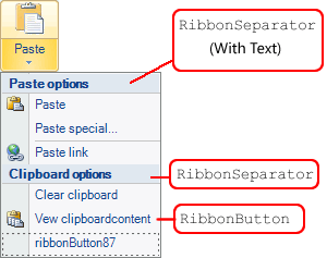
Separators are represented by RibbonButtonSeparator and provides the well known separator functionality. When in a dropdown, separators can actually contain text. When they contain text, they will be rendered differently.

Tutorials
- Getting Started With the Ribbon at ribbon.codeplex.com
Known Bugs
- Multiple dropdowns not managed OK
- Drawing of collapsed panels when mouse down
Things To Do
- Contextual tabs
- ToolTips
- (OK) TextBox, ComboBox
- Checkbox and NumericUpDown RibbonItems
- Orb and Quickaccess tools
- Vista clientarea docking
- Keyboard quick access through Alt key
- Font and Color selectors
- Right to left orientation
- Ribbon minimization
History
- 8 May 2008 - Original post
- 29 May 2008 - Update
Enabledproperty now working- Added
RibbonTextBox- A regular textbox with label and image - Added
RibbonComboBox- (Inherited fromRibbonTextBox) Offers a dropdown - Added
RibbonColorChooser- A button that shows a color bar. See propertyColor
- 23 Feb 2009 - Update
- Orb and orb menu with designer capabilities
- Quick Access Toolbar added
- Some bugs fixed
- 1 May 2009 - Update
- Orb and Quick access embedded on non-client area
- Popup menus fixed!
- Lots of Event handlers supported
- Minor bugs fixed

