
Extended CollapsiblePanel with Dynamic Tooltip
2.75/5 (3 votes)
Oct 26, 2007
4 min read
31808
456
CollapsiblePanel now with a dynamic tooltip


Introduction
This article is based on the article by moditha about his/her CollapsiblePanel control [^]. When I first saw it, I just needed it in one of my projects. So, all the credit for the control itself goes to moditha. However, I wanted to have something more. I wanted to have a floating tooltip when I moved my mouse over the title bar, as you can see in the images above. Also, this tooltip should be visible as long as I'm at the title bar; it should follow my mouse. For this behavior, I searched the internet for JavaScript code and I found just the code I needed here. At this French site, you can find an explanation of just that. So, now I simply needed to get those two together.
Description of the Changes in the Control
To know how the control is built, you can look back to the article CollapsiblePanel Control. What I wanted for my project:
- It should not only be possible to display the default title text in the tooltip, but also variable text. This is different from the title bar as shown in the examples above.
- For using the tooltip, there is a tooltip.js file that contains all the functionality needed to create it. I did not want to include this script in script tags at design time; the code needed should be generated in runtime.
- It should be possible NOT to use it.
So let's get started. These are the new properties I created:
Title
This is where you put your own text in to be displayed in the tooltip. This text will only be shown ifUsePanelTitleForTooltipisfalse. Maybe the property nameTitleis incorrectly used, but the JavaScript code uses this to retrieve the text of this attribute to show in the tooltip and I didn't want to make changes to the JavaScript code.OnMouseOutClientCode
Inside this property, you should fill in the JavaScript function to be called when the user moves his mouse out of the region of the title bar. It should be filled withtooltip.hide(this). This property adds theOnMouseOutattribute to the control, which is needed to perform atooltip.hide. Because this is a custom control, you need to add these kinds of attributes yourself. You can also now decide whether or not you want to add such an attribute. In my case, I've used it. This attribute will only be added ifUseDynamicToolTipis set totrue.OnMouseOverClientCode
Inside this property, you should fill in the JavaScript function to be called when the user moves his mouse over of the region of the title bar. It should be filled withtooltip.show(this). This property adds theOnMouseOverattribute to the control, which is needed to perform atooltip.show. This attribute will only be added ifUseDynamicToolTipis set totrue.UsePanelTitleForTooltip
This property is employed when deciding whether I want to use the default title bar text or my own. If this property is set totrue, it will use the content of theTextproperty to show in the tooltip. If it isfalse, it will use the content of theTitleproperty.UseDynamicToolTipIf this property is set totrue, it will generate a JavaScript to perform the tooltip functionality. It will also create the attributes that are needed to show the tooltip.
Note
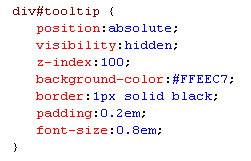
The JavaScript functions like tooltip.show(this) and tooltip.hide(this) are part of the original ToolTip.js file. They should be called to create the tooltip behavior. This is all explained here. You also need a style sheet (not mandatory) to create a style for the tooltip. Currently, the tooltip is styled like this:
Last but not least, you need to add a DIV tag to your page. This will be used to show the tooltip.
Example on Using the Properties

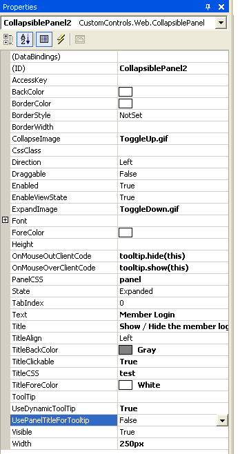
You can also set these properties in the design:
Changes in the Control
In the control, I added these new properties. Nothing special, anyone can do it. However, there are some other changes that I had to make: For the generation of the tooltip JavaScript, I added a new Const. You can check the code for this script. In the OnPreRender override method, I added the following:
if (!Page.IsClientScriptBlockRegistered("ToolTipBlock") &&
    (this.UseDynamicToolTip))
{
    Page.RegisterClientScriptBlock("ToolTipBlock",
        C_TOOL_TIP_SCRIPT + C_TOOL_TIP_SCRIPT_PART_2);
}
The CreateTitle method now looks like this:
private Control CreateTitle()
{
    Label header = new Label();

    header.Text= this.Text;
    header.Width = Unit.Percentage(100);

    //If there is a CSS defined, it will be used

    //instead of the inline styles

    if (this.TitleCSS != string.Empty)
        header.CssClass = this.TitleCSS;
    else
    {
        header.ForeColor=this.TitleForeColor;
        header.BackColor = this.TitleBackColor;
    }


    //if title is clickable, wrap it around a href with

    //an onClick even to call the javascript

    if (this.TitleClickable)
    {
        HtmlAnchor ha = new HtmlAnchor();
        ha.HRef=C_EMPTY_LINK;
        ha.Controls.Add(header);

        //Only allow expanding/collapsing if control is enabled

        ha.Attributes.Add("onClick",GetOnClickScript());

        if (this.UseDynamicToolTip)
        {
            if (this.UsePanelTitleForTooltip)
            {
                if (this.Text != null)
                {
                    ha.Attributes.Add("title",this.Text);
                }
            }
            else
            {
                if (this.Title != null)
                {
                    ha.Attributes.Add("title",this.Title);
                }
            }

            if (this.OnMouseOverClientCode != null)
            {
                ha.Attributes.Add("onMouseOver",GetOnMouseOverClientCode());
            }
            if (this.OnMouseOutClientCode != null)
            {
                ha.Attributes.Add("onMouseOut",GetOnMouseOutClientCode());
            }
        }
        return ha;
    }
    else
        return header;
        //if title is not clickable just pass title in a label element

}
Point of Interest
There are some things that can be changed:
- The functions for the
OnMouseOverandOnMouseOutattributes
Now they are only used to show or hide the tooltip, which is only created if the propertyUseDynamicToolTipis set totrue. However, what if you need some other functionality where the mouse moves over the title bar? Then you could replace the code that creates these attributes outside theif (this.UsePanelTitleForTooltip)constructor. - The style sheet for the tooltip
This is now included somewhere in the project, but you could also create the style at runtime or create a CSS property in the control to style the tooltip.
History
- 26 October, 2007 -- Original version posted