
Programming Windows 10 Desktop: UWP Focus (15 of 15)
Get Started in UWP (moving away from WinForms) Chapter 15: Final chapter delves into various XAML Windows Controls showing examples and dealing with simple layouts.
- AllControls_v001 - 22 KB
- AllControls_v002 - 22.1 KB
- AllControls_v003 - 22.5 KB
- AllControls_v004 - 22.6 KB
- AllControls_v005 - 22.8 KB
- AllControls_v006 - 22.8 KB
- AllControls_v007 - 23.5 KB
Introduction
Remember, you can also get all the source code at my Github repo at https://github.com/raddevus/Win10UWP.
Controls By Function
The list of controls we look at will be guided by this Microsoft doc which lists the UWP controls by function.
I am doing this for two reasons:
-
Understanding how to set up and use the XAML controls is a large part of developing our apps under the UWP paradigm
-
While you can find some examples out there, I found two major problems:
- Rarely, if ever, is a snapshot provided with the XAML examples. It’s quite annoying. Here, in Programming Windows 10 Via UWP, you will get the source and snapshots which will display the expected result. That way, later when you want to use the source as a starting point, you will know how the source will initially render.
-
The current Microsoft examples (and there are a lot of them on Github) do not build with the current version of Visual Studio 2017. The project style they used with the source no longer works and it’s really annoying.
Background
You can read all the chapters before this one:
- Programming Windows 10: UWP Focus (1 of N)[^]
- Programming Windows 10: UWP Focus (2 of N)[^]
- Programming Windows 10: UWP Focus (3 of N)[^]
- Programming Windows 10 Desktop: UWP Focus (4 of N)[^]
- Programming Windows 10 Desktop: UWP Focus (5 of N)[^]
- Programming Windows 10 Desktop: UWP Focus (6 of N)[^]
- Programming Windows 10 Desktop: UWP Focus (7 of N)[^]
- Programming Windows 10 Desktop: UWP Focus (8 of N)[^]
- Programming Windows 10 Desktop: UWP Focus (9 of N)[^]
- Programming Windows 10 Desktop: UWP Focus (10 of N)[^]
- Programming Windows 10 Desktop: UWP Focus (11 of N)[^]
- Programming Windows 10 Desktop: UWP Focus (12 of N)[^]
- Programming Windows 10 Desktop: UWP Focus (13 of N)[^]
- Programming Windows 10 Desktop: UWP Focus (14 of N)[^]
 Print or Kindle Available at Amazon
You can also read the first 8 chapters of the book as a print or kindle book from Amazon:
Programming Windows 10 Via UWP: Learn To Program Universal Windows Apps For the Desktop (Program Win10) [^]
Also, Part 2 (chapters 9 - 15) of this book will be coming soon as print and kindle books.
Create AllControls App
To get started, I’m going to create a new Universal Windows App named AllControls.

We’ve seen the CommandBar at the top of that page, so let’s add one to the bottom so we can see how to do this.
Let’s add the following XAML to the Page, just below the <Grid> element that was placed on the Page by the project template.
<Page.BottomAppBar>
  <CommandBar>
     <AppBarButton Icon="Like" Label="Like" />
     <AppBarButton Icon="Message" Label="Message" />
     <AppBarButton Icon="OpenFile" Label="Open File" />
     <AppBarToggleButton Icon="Accept" Label="Accept" />
  </CommandBar>
</Page.BottomAppBar>

Bottom CommandBar
You can see that a CommandBar has been added to the bottom of our Page.
I’ve added a few random buttons including a Like, Message, Open File and finally an Accept button.
Notice that Accept button (check) is an AppBarToggleButton so that the user can click the button to indicate it is selected or on and click it again to indicate the item is unselected or off.
Build, Run & Try Toggle Button
If you’ve made those changes, go ahead and build the app so we can try out the toggle button.
Of course, the other buttons do not have event handlers set up for them so they will not do anything.
If you run the app, the AcceptToggleButton will start out as the same color as the other buttons (grey in our example), but if you click the Toggle button one time, you’ll see it becomes the highlighted selected color and stays that way.

Let’s add an event handler and some code so that when the Accept button is checked, a ContentDialog will pop up. Notice that this is not the Click event. Instead, this action will only occur when the Accept button is Checked, not when it is unchecked.
First, add the event handler for the Checked event.

Let’s add the method DisplayToggleDialog() that you can use as a basic ContentDialog template for your later projects.
ContentDialog toggleDialog = new ContentDialog
{
     Title = "You've Toggled the Item",
     Content = "The Item is On",
     PrimaryButtonText = "Ok"
  };

  ContentDialogResult result = await toggleDialog.ShowAsync();
}
In this case, the dialog is only a warning and there is only one button, so we don’t get a return value at all.
We call that method when the Accept button is checked.
DisplayToggleDialog();

Build & Run
Get AllControls_v001 to get all of the changes we have made so far.
When you run the app and click the Accept button, the ContentDialog will pop up.

Try Out the Flyout
Now, let’s add a Flyout when the user clicks the OpenFile CommandBar button.
Flyouts are a bit different and are defined in the XAML itself. ContentDialogs can be defined that way too, but that is the only way to describe Flyouts in a UWP.
To add the <Flyout> to our button, we actually add the following XAML as a nested element on the OpenFile button.
<FlyoutBase.AttachedFlyout>
  <Flyout>
     <TextBlock Text="This is some text in a flyout."  />
  </Flyout>
</FlyoutBase.AttachedFlyout>
However, as you know, most of the time when we add an element in Visual Studio Design editor, it will set the element as a single line element. We just need to make our AppBarButton a two-tag element first. It currently looks like:
<AppBarButton Icon="OpenFile" Label="Open File" />
We need to remove that trailing slash (/) and creating a closing tag and add our Flyout code between the tags:
<AppBarButton Icon="OpenFile" Label="Open File" >
  <FlyoutBase.AttachedFlyout>
     <Flyout>
        <TextBlock Text="This is some text in a flyout."  />
     </Flyout>
  </FlyoutBase.AttachedFlyout>
</AppBarButton>
After that, we just need to add the Click event to that button so that when the button is clicked, we can make the Flyout appear.

Code to Display the Flyout
The code to show the Flyout when the button is clicked is very simple.
Switch over to MainPage.xaml.cs and navigate to the AppBarButton_Click event and add the code that follows:
FlyoutBase.ShowAttachedFlyout((FrameworkElement)sender);
We’ve cast the incoming parameter, sender, as the FrameworkElement which is an AppBarButton. The ShowAttachedFlyout method knows that there is an associated Flyout with that button which is the nested element we just added. So when that button is clicked, the flyout appears.
Build and Run, Yet Again
You have to see it to believe it. Get AllControls_v002 code and try it out. Start up the app, click the OpenFile button and you’ll see the message.

Light Dismiss
Flyouts are considered light dismiss which means you can simply click anywhere else in the app and the message will disappear.
Other Odds & Ends
Let’s try a Slider control. It’s very easy to use.
Slider Control
I’m going to add the following XAML to our empty Grid.
       <StackPanel>
       <Slider x:Name="rectSizeSlider" Header="RectangleSize" Minimum="1"
               Maximum="100"
               Value="20" Width="200" />

       <Rectangle x:Name="DarkBlueRect" Fill="DarkBlue" Width="10" Height="10"/>
       </StackPanel>
That adds a StackPanel, a Slider and a Rectangle.
I’m adding the StackPanel just to keep the two controls in close proximity to each other.
When you add the XAML, Visual Studio will render the controls for you in the DesignView.

Of course, you see the basic slider and then the small (10x10) rectangle. I’ve added that so you can see the Slider do something in real time as the app runs.
You can see that I’ve set a few properties (XAML attributes) on the Slider control.
Name:rectSizeSliderHeader:RectangleSizewill display as a text label above the controlMinimum: 1 which is the smallest value the Slider can be set toMaximum: 100 which is the largest value the Slider can be set toValue: 20 represents the currentValueof theSliderWidth: sets the width of theSlidercontrol.
Now, we need to add the ValueChanged event handler. I’m sure you know how to do that so I’ll let you do it now.
Once you’ve added the rectSizeSlider_ValueChanged event handler and you’re in the MainPage.xaml.cs, we can add the code which will resize our rectangle every time the user moves the Slider.
We only have to add one line of code to do our simple work.
DarkBlueRect.Width = DarkBlueRect.Height = rectSizeSlider.Value;
However, the rectSizeSlider_ValueChanged event handler will be fired before the DarkBlueRect is even instantiated, so we need to wrap that line of code in a check just to make sure we don’t try to set a null object’s property values. Otherwise, the app will crash as soon as it starts.
if (DarkBlueRect != null)
{
  DarkBlueRect.Width = DarkBlueRect.Height = rectSizeSlider.Value;
}

Since we named the Rectangle, DarkBlueRect, we can easily reference it in our code.
This line of code says get the rectSizeSlider.Value and set the DarkBlueRect.Height equal to the value and then set the DarkBlueRect.Width equal to the DarkBlueRect.Height. That makes all of the values the same. Since the DarkBlueRect will have the same Width and Height, it will always be a square.
Build, Run, Try the Slider
Go ahead and build the code and slide the Slider back and forth. If you need the code, get the AllControls_v003 project. You will see the Rectangle size change with the value on the Slider.
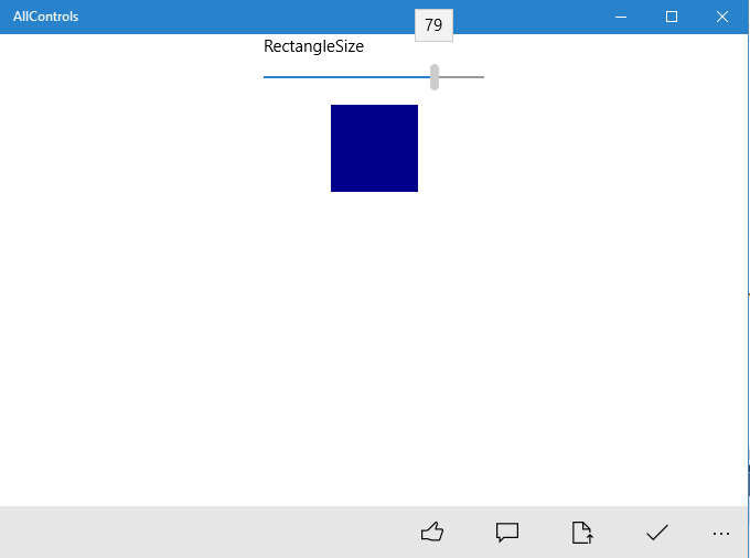
You can see that I took a snapshot when the Slider was set to 79. Of course, the size of the Rectangle is larger also since its Height and Width properties have also been set to 79.
Let’s put a border around the Slider and Rectangle just so we can see how to use the Border control.
Using the Border Control
A border can only have one child so we will have to place our Border around the StackPanel (which contains the two other controls).
When you first add the Border element, you will not see anything appear in the DesignView at all. This is one of the challenges of adding our XAML elements.
The reason you will not see anything appear in the DesignView is because the Border has not BorderBrush (color) and no BorderThickness (defaults to 0).
BorderBrush and BorderThickness
However, if you add a BorderBrush (color) and a BorderThickness, you will see the Border element appear in the DesignView.
When we wrap the StackPanel in the following Border XAML, you will see an orange boundary appear.
<Border BorderBrush="Orange" BorderThickness="5"></Border>

A Controls Boundaries aren’t so Obvious in XAML
This also exposes another issue / challenge that we will constantly have with XAML. We have to create our Layout each time because as you can see, adding the StackPanel directly to the Grid has caused the Grid to expand and take up the entire Page. That isn’t optimal and it is easy to forget it is happening because we don’t normally have borders on the controls that provide us with quick idea of where those boundaries are.
Of course, we can solve this by create a Grid.RowDefinition and Grid.ColumnDefinition and assigning our Border element to a specific Row and Column.
Let’s do that now so I can show you how to easily make your Grid Rows and Columns of equal size.
Grid Rows & Columns of Equal Size
In our case, we want to break our Page up into four equal size areas.
We can do that very simply by adding the following Grid.RowDefinitions and Grid.ColumnDefinitions to our Grid.
<Grid.RowDefinitions>
  <RowDefinition Height="*"/>
  <RowDefinition Height="*"/>
</Grid.RowDefinitions>

<Grid.ColumnDefinitions>
  <ColumnDefinition Width="*"/>
  <ColumnDefinition Width="*"/>
</Grid.ColumnDefinitions>
As soon as you add those definitions to your XAML, you will see the Border contract down to the top left area of the Page.

If nothing else, the Border helps you as a designer to visual boundaries. But, of course, they can also help users to see a number of controls as a group which will work together.
Get the Code
You can get the AllControls_v004 and run it to see a more focused interface now. This will allow us to create sections of the page where we’ll add other controls as we continue through our sample code.

Add Another Border
Let’s add another Border which contains a StackPanel but we’ll change the BorderBrush to Purple so you can differentiate between the first one we added and this one.
Add the following XAML directly after the other Border element:
<Border BorderBrush="Purple" BorderThickness="5" >
  <StackPanel>

  </StackPanel>
</Border>
When you do, it may not be intuitive what the DesignView actually does.

It stacks the new Border element right on top of the previous one. That’s because we have not assigned a Grid.Row and Grid.Column to either of the Border elements so they automatically get added as Grid.Row = “0” and Grid.Column = “0”.
Let’s change our newly added Border so that it is explicitly Grid.Row=”1” and Grid.Column=”0”.
As soon as you make that change, it will probably look more like what you were expecting.

I know we’ve touched upon this in the past, but I’m reiterating it because this is what the life of a UWP developer is going to be like. I’m not sure how I feel about it either, but I guess it’s not all that different from what HTML / CSS / JavaScript / Angular / TypeScript / Microsoft ASP.NET MVC developer’s life is like. However, it is quite different than what WinForms developer’s life was like.
Now, let’s add the following items to our new StackPanel:
ToggleSwitchToggleButtonTextBoxPasswordBoxTextBox
To add those, I simply grabbed each one in the Toolbox (usually found on the Left side of Visual Studio when you are in DesignView) and dragged it and dropped it onto the Page inside the Purple border in the DesignView.

When you drag and drop the controls, Visual Studio will add some properties to some of those controls automatically so our XAML for the second StackPanel now looks like:
<StackPanel>
  <ToggleSwitch Header="ToggleSwitch" HorizontalAlignment="Stretch"
      VerticalAlignment="Stretch"/>
         <ToggleButton Content="ToggleButton" HorizontalAlignment="Stretch"
            VerticalAlignment="Stretch"/>
         <TextBox TextWrapping="Wrap" Text="TextBox"/>
         <PasswordBox  />
         <TextBox TextWrapping="Wrap" Text="TextBox"/>
   </StackPanel>

Content and Header Properties
Notice that generally if the Control contains text on it or within it (such as a Button with text on the button), then you set the Content property to the text that you want to see on the Button.
Of course, this pattern is broken by the TextBox where the property is named Text but that is somewhat different since that text can be altered by the user and the Content cannot be changed by the user.
Header Property
Also, notice that other controls (Slider, ToggleSwitch and TextBox) have a property named Header which will display some text above the control which functions like a label to indicate what the control is being used for. Back in the WinForms development days, we had to add separate Label controls to each of our controls to add these cues to the User Interface.
Alter and Add Headers
Now let’s change the Headers so they make a bit more sense and add some headers to the TextBoxes so the user will have a bit of a clue about what they are used for.
Here’s the updated XAML for our second StackPanel:
<StackPanel>
  <ToggleSwitch Header="Contact Me" HorizontalAlignment="Stretch"
     VerticalAlignment="Stretch"/>
  <ToggleButton Content="Alert Me" HorizontalAlignment="Stretch"
     VerticalAlignment="Stretch"/>
  <TextBox Header="First name:" TextWrapping="Wrap" Text="TextBox"/>
  <PasswordBox Header="Password:" />
  <TextBox Header="Last name:" TextWrapping="Wrap" Text="TextBox"/>
</StackPanel>

Once you make those changes, let’s build and run so we can take a look at the different controls and I’ll show you a problem that occurs with this layout and how to fix it.
Get the Code
If you need the latest code, bet AllControls_v005.
When I run the code, the app remembers the size it was when I had previously run it and it is quite small.

Not All Controls are Visible
The problem is that now it is not possible for the user to get to some of the controls because they are rendered at locations that are off screen.
I can maximize the app so I can see those again, but there is a better way to fix this problem so let’s do that first.
Using the ScrollViewer
Fixing this problem is as simple as wrapping our StackPanel in a ScrollViewer.

Once we do that and run again, you will see that when the cursor moves into that StackPanel, a Vertical scroll bar will automatically appear. That’s a very nice and easy solution.

Here’s a look at the controls in use.
The previous image shows the default unselected ToggleSwitch and ToggleButton and the following one shows them both selected.

I’ve changed the text in the TextBoxes to contain a fake first name and last name and I’ve typed a password that you cannot see in the password box.
The eye icon at right side of the Password box indicates that the user can click (and hold) to see the value in the password box.
When it is clicked, it looks like the following:

Latest Code
Just to make sure you have the latest code, if you need it, you can get the AllControls_v006 (which has the ScrollViewer included).
Another Border and More Controls
Let’s add another Border and assign it to Grid.Row zero and Grid.Column one and make it green.
Since we are going to add a few controls, we will add a ScrollViewer with a StackPanel too.
       <Border BorderBrush="Green" BorderThickness="5"
       Grid.Row="0" Grid.Column="1">
           <ScrollViewer>
               <StackPanel>

               </StackPanel>
           </ScrollViewer>
       </Border>
Let’s add the following Controls:
ComboBox- Two
CheckBoxes - Three
RadioButtons TextBox
I’m going to do a bit of work to get the XAML layout tweaked out so I’ll just provide you with the final XAML. The controls will also include a couple of event handlers to ensure that when you make a RadioButton selection or a ComboBox selection that some code will run.
<Border BorderBrush="Green" BorderThickness="5" Grid.Row="0" Grid.Column="1">
           <ScrollViewer>
               <StackPanel>
                   <ComboBox x:Name="PriceComboBox" Header="Price" Width="150"
                             HorizontalAlignment="Left"  VerticalAlignment="Top"
                             Margin="20" SelectionChanged="ComboBox_SelectionChanged">

                       <x:String>4.39</x:String>
                       <x:String>5.68</x:String>
                       <x:String>7.02</x:String>
                   </ComboBox>
                   <StackPanel >
                       <CheckBox x:Name="AddFeeCheckBox"  Margin="20 3 3 3"
                            Content="Add Fee ($5.00)" Click="AddFeeCheckBox_Click" />
                       <CheckBox x:Name="AddTaxesCheckBox" Margin="20 3 3 3"
                           Content="Include Taxes (x 7.5%)"
                           Click="AddTaxesCheckBox_Click" />
                   </StackPanel>

                   <StackPanel>
                       <RadioButton x:Name="AlignLeftRadio" IsChecked="True"
                           Content="Align Left" Margin="20 3 3 3"
                           Checked="RadioButton_Checked"/>
                       <RadioButton x:Name="AlignCenterRadio"
                           Content="Align Center" Margin="20 3 3 3"
                           Checked="RadioButton_Checked"/>
                       <RadioButton x:Name="AlignRightRadio"
                           Content="Align Right" Margin="20 3 3 3"
                           Checked="RadioButton_Checked"/>
                   </StackPanel>

                   <StackPanel>
                       <TextBox x:Name="FinalCostTextBox" PlaceholderText="final cost"
                            HorizontalAlignment="Left"  Width="250"/>
                   </StackPanel>
               </StackPanel>
           </ScrollViewer>
       </Border>

There’s not a whole lot new here but I do want to point out the PlaceholderText property on the TextBox. It provides a way to give the user a hint about what types of values the TextBox is looking for. In this case, we set it to “final cost”. That text is displayed when the TextBox does not contain any text. However, it is not the Text value of the TextBox, it is only a UI element and has not value.
I basically added four event handlers so that when checkboxes or radiobuttons are clicked, then something will happen. Also, when the user selects a value from the ComboBox, the FinalCostTextBox will get set to a value.
All of the code is very simple so I will just let you look over each of the event handlers to get an idea of what it does.
Here’s what the app looks like when it is running.
Get the Final Code
You can get the final code for AllControls which is AllControls_v007.

A Lot of Material
Once again, we’ve covered a lot of material and I’ve attempted to provide you with some basic examples to get you moving forward with your XAML layouts.
You should be able to take what you’ve learned here and with some research build any kind of UWP app that you would like now.
The Journey Ends
I hope you’ve enjoyed the journey through UWP development and hope you’ll be back for my next book, which should be similar as I delve into the Mobile App development world using Xamarin.
Look for it soon and thanks for reading my book!
History
- 29th December, 2017: First publication