
Programming Windows 10 Desktop: UWP Focus (4 of N)
Get Started in UWP (moving away from WinForm) Chapter 4 Adding Windows Controls (Building the DailyJournal app)
Introduction
This is my continuing effort to tell the story of Desktop development under the UWP paradigm (and examine how feasible it is).
Follow from the beginning with the other entries:
Programming Windows 10: UWP Focus (1 of N)[^]
Programming Windows 10: UWP Focus (2 of N)[^]
Programming Windows 10: UWP Focus (3 of N)[^]
Background
As promised in the previous (rabbit-hole) chapter, let’s jump right into adding some controls to our app and writing some code.
Note: There are more details about the DailyJournal app we are creating in Part 3 of this article. You can also get Step 1 of the DailyJournal project which contains our app icon.
Go ahead and open up the DailyJournal project in Visual Studio. You can get the code we will start with at the top of my previous article (Part 3).
Consider the Basic Layout
We have to think about our layout a bit and as I showed you in the previous chapter we basically want our Main Page to be layed out in the following way:

With that in mind and with the fact that the Project template originally added a Grid XAML element to our Main Page we will alter the Grid element so that it will provide that layout for us.
We do that by adding some additional definitions to the Grid element.
Altering the Grid Layout
To get started I am going to copy some example code from Microsoft’s UWP documentation and paste it into my MainPage.xaml.
Here’s how we need to do that.
Take a look at the current Grid element.

It is a single tag right now. However, we need it to open up so that it is a container type of tag.
Notice that the element currently has that ending / slash. To make the changes we want to make, go ahead and
-
delete that slash /
-
Add a Grid closing tag
</Grid>two lines down*.
*We’re adding an empty line so when we paste our code in, it will be easier.
It’ll look like the following:

Now we will click on that empty line between the Grid tags and paste the code below in:
<Grid.RowDefinitions>
       <RowDefinition/>
       <RowDefinition Height="44"/>
   </Grid.RowDefinitions>
   <Grid.ColumnDefinitions>
       <ColumnDefinition Width="Auto"/>
       <ColumnDefinition/>
   </Grid.ColumnDefinitions>
   <Rectangle Fill="Red" Width="44"/>
   <Rectangle Fill="Blue" Grid.Row="1"/>
   <Rectangle Fill="Green" Grid.Column="1"/>
   <Rectangle Fill="Orange" Grid.Row="1" Grid.Column="1"/>
It’ll look like :

The code came from : https://docs.microsoft.com/en-us/windows/uwp/design/layout/layout-panels
#############################################################################
SideBar : Possible Visual Studio Design View Bug
I noticed that if my Design View was too small then for some reason the DesignView would be rendered as if the MainPage background was transparent. None of the Rectangle shapes in the previous image would show up.
If you don’t see the colors shown in the previous image try resizing the DesignView until you do see them.
#############################################################################
Grid : Rows and Columns
I think the code is helpful because it allows us to easily see that our grid is now broken up into two rows and two columns.
Now, we should be able to tweak the values to what we want. We actually want two columns on the left and only one column on the right.
Basically we want the column on the right to span both columns that are on the left and we don’t actually need the orange column so let’s delete that column now and see what happens.
To do that, go to that line, highlight it and press your [Delete] key.

When you do that it will look like the following:

Bottom Row Turns White
Notice that the bottom column is now the default color (white -- which is the ApplicationBackgroundThemeBrush). However, that column is still there. We want our right column to span the entire height of the Page. Another way to say that is that the column should span all of the rows. To do that we need to add an attribute to that column which is appropriately named Grid.RowSpan.
Grid.RowSpan
When we add that new attribute, we simply provide an integer which indicates the number of rows it should span. In our case the value will be two. Here is the code to add to the Rectangle which is currently filled with the color green.
Grid.RowSpan="2"
When you add that code it will look like the following:

DesignView Automatically Updates
When you make the change, the DesignView automatically updates and the bottom column turns green also, since our one right column is now spanning both rows.
RowDefinitions Explained
Let’s focus on the RowDefinitions and what they mean. The current XAML for RowDefinitions looks like:
<Grid.RowDefinitions>

           <RowDefinition/>

           <RowDefinition Height="44"/>

    </Grid.RowDefinitions>
This defines two rows.
The first row is of undetermined Height or Width since it has no attributes. That means it will be defined by the way other rows impact it.
The second row is defined at a height of only 44 pixels. We can see that the blue and green row at the bottom is very narrow since it is only 44 pixels.
Change Height Attribute
Let’s go ahead and change that value to 250 just so that row is a little larger.
When you make the change it will look like the following:

Run The App - CTRL-F5
Once you’ve made that change, go ahead and run the app. You can press CTRL-F5 which will build the app and run it with debugging turned off.

Resizing Window While App Runs
If you resize the window you will see that the right size will always take up both rows. You will also see that the top left block (red) is proportional while the blue area is always 250 pixels tall.
However, what we need is for red portion to be just large enough to contain our CalendarView and the blue area should be just large enough to contain our ListView. Let’s see if we can make some changes to get it to look like that. Close the app and go back to Visual Studio and we’ll make some changes.
Drag and Drop Controls
I basically used the sample code with the colors so we could target rows and columns a bit easier in this tutorial.
Now we we want to drop a CalendarView onto our Page*.
* From now on, I will refer to our app’s windows as Pages since that is how the XAML element is named.
Add CalendarView
Grab a CalendarView in the toolbox under [All XAML Controls] and drag it over to the Page and drop it in the red box.
Examine XAML
You can see that it adds the CalendarView element in the XAML to the end of the Grid element.
Also, notice that the CalendarView believes we dropped it on with absolute coordinates and the element contains HorizontalAlignment and Margin tags which place it on the Page in relation to other items on the page. That’s not how we want the control to be positioned in this case.
It makes everything look a bit messed up. We need to set some XAML attributes on the CalendarView so that it will actually become one of the Grid’s columns and rows.
First of all, delete the Margin attribute and its values.
Setting GridColumn / GridRow
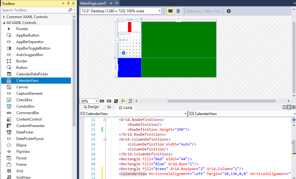
Now, let’s tell the layout that the CalendarView is actually a part of the grid and is GridColumn zero and row zero.
Rendering Order
I’m going to change two things in the XAML and then show you the image. But, first take a close look at the red rectangle in the previous image. It isn’t actually only that small piece that you see. It actually extends behind the CalendarView.
Right now, the rectangle is behind the CalendarView because of the order that the objects are rendered on the screen. With no additional XAML to change the Z-Order the elements (objects) are drawn in the order they appear in the XAML. That means the red rectangle is drawn first then the blue then the green. Finally the CalendarView is drawn on top of the red rectangle. You’re going to see that when I change the XAML so the CalendarView is moved up then the red rectangle will draw with a higher Z-Order number and it will be on top of the CalendarView.
Change your CalendarView XAML so it looks like the following:
<CalendarView HorizontalAlignment="Left" Grid.Row="0" Grid.Column="0" VerticalAlignment="Top"/>
After you make that change, move the line so it is the first item after the <Grid.ColumnDefinitions>
It’ll all look like this when you make that change and move that line.

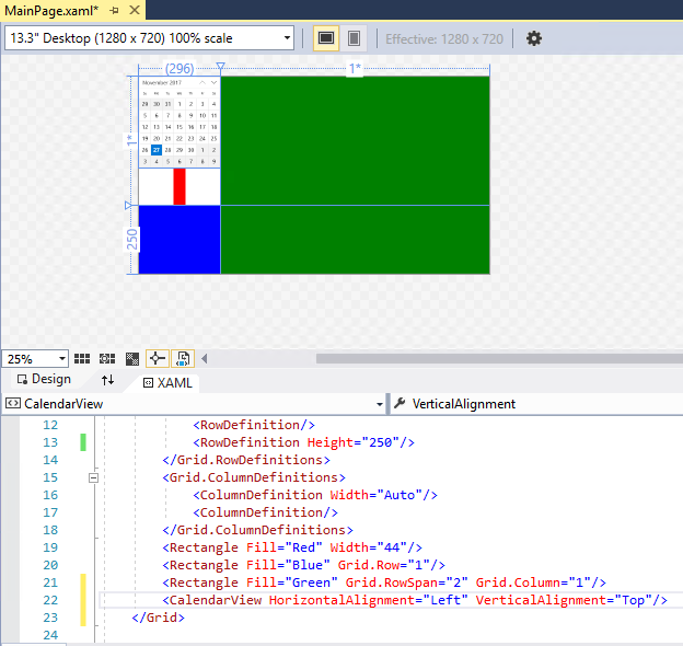
Whitespace (Row) Occurs
Also notice that now it believes there is space for a third row (the white space). We need to fix that.
I believe the way to begin to fix it is to drop on our ListView control into blue area.
Add ListView
I just dragged and dropped a new ListView and it doesn’t really show up in the DesignView. It is in the XAML though, at the bottom of the Grid.

Edit ListView XAML
We’re going to take the same steps to try to fix this control up.
-
Delete the Margin attribute and its values.
-
Move it up in the XAML so it is the next control after the CalendarView
-
Add appropriate Grid.Row and Grid.Column values.
I’m also going to delete the blue Rectangle element.
Here’s the Grid XAML as it now stands.
 <Grid Background="{ThemeResource ApplicationPageBackgroundThemeBrush}" >

       <Grid.RowDefinitions >

           <RowDefinition Height="Auto" />

           <RowDefinition Height="250"/>

       </Grid.RowDefinitions>

       <Grid.ColumnDefinitions>

           <ColumnDefinition Width="Auto"/>

           <ColumnDefinition/>

       </Grid.ColumnDefinitions>

       <CalendarView HorizontalAlignment="Left" Grid.Row="0" Grid.Column="0" VerticalAlignment="Top"/>

       <ListView HorizontalAlignment="Left" Height="100" Grid.Row="1" Grid.Column="0" VerticalAlignment="Top" Width="100"/>

       <Rectangle Fill="Red" Width="44"/>

       <Rectangle Fill="Green" Grid.RowSpan="2" Grid.Column="1"/>

    </Grid>

More Challenges With XAML Design
But we still have that screwy last row which is doing odd things. Also the background color of the ListView is white so you can’t very easily tell where it is located.
Actions I'll take to fix things up:
- I’m deleting the red Rectangle element because we don’t need it for alignment now.
- I’m also going to drop the RichEditBox onto the green rectangle area and try to get it adjusted properly.
VerticalAlignment and HorizontalAlignment Stretch
I had to do some searching to discover how to get the ListView to take up all the space available in its outer container (Grid.Row and Grid.Column). To do that I had to alter the VerticalAlignment and HorizontalAlignment and set them to the value of “Stretch”.
I did the same to the RichEditBox. Here’s the altered XAML so you can follow along:
Altered XAML To Follow Tutorial
 <Grid Background="{ThemeResource ApplicationPageBackgroundThemeBrush}" >

       <Grid.RowDefinitions >

           <RowDefinition Height="Auto" />

           <RowDefinition Height="400"/>

       </Grid.RowDefinitions>

       <Grid.ColumnDefinitions>

           <ColumnDefinition Width="Auto"/>

           <ColumnDefinition/>

       </Grid.ColumnDefinitions>

       <CalendarView HorizontalAlignment="Left" Grid.Row="0" Grid.Column="0" VerticalAlignment="Top"/>

       <ListView Grid.Row="1" Grid.Column="0"

          HorizontalAlignment="Stretch" VerticalAlignment="Stretch" />

       <RichEditBox Grid.Column="1" Grid.Row="0" Grid.RowSpan="2"

                    HorizontalAlignment="Stretch" VerticalAlignment="Stretch"/>

    </Grid>
If you float over the area in the DesignView in Visual Studio it will highlight the control’s boundaries. You can see that the RichEditBox is spanning rows and stretched to the edges.

Controls Can Be Difficult To See In Designer
It is difficult to see controls which are not selected in any way and which do not contain any background color or data and that is the case for our ListView right now.
You can also click on the XAML which represents an item and the item will be activated in the DesignView in Visual Studio.

Programmatically Add Fake Data For Viewing
Now, let’s programmatically add some fake data to the ListView and RichEditBox and run the app and see what we get.
We will add our fake data when the Page is done loading. To do that, click the <Page> element in the XAML (it’s the easiest way to get to it since the DesignView has layers of controls and containers).
After you click the <Page> element, go to the Properties window and click the [Lightning Bolt] icon. That icon allows you to get to the system events that you can write a handler for. In our case we are looking for the Loaded event so scroll down until you see that one.

Double-Click TextBox To Add Event
When you find the Loaded event simply double-click on the TextBox next to the Loaded event. If you double-click properly you will know it because the screen will flash and Visual Studio will move you to the MainPage.xaml.cs where it has automatically added a new method named Page_Loaded().

Your cursor will be blinking inside the { } brackets which is Visual Studio’s way of letting you know it’s ready for you to type some code.
Adding Events Alters XAML
Of course, just like we learned about the Button back in Chapter 2, adding an event adds an attribute to the associated XAML element. If you take a look at the <Page> element back in the XAML you will see the following:

Note: I hadn’t named the XAML Page element so Visual Studio went ahead and referred to the Page object as Page. If we had named it then it would’ve been a bit nicer because then it would’ve named this method <NAME>_Loaded where <NAME> is equal to the value of the Name attribute. This would've made things a bit more clear.
I’ve given the RichEditBox and the ListView each their own name to make them a bit easier to work with by adding a Name=”” attribute to each. Here’s the update XAML for the MainPage.xaml file. If you’re following along go ahead and replace yours entirely and you’ll have a good XAML file to continue with.
<Page

    x:Class="DailyJournal.MainPage"

    xmlns="http://schemas.microsoft.com/winfx/2006/xaml/presentation"

    xmlns:x="http://schemas.microsoft.com/winfx/2006/xaml"

    xmlns:local="using:DailyJournal"

    xmlns:d="http://schemas.microsoft.com/expression/blend/2008"

    xmlns:mc="http://schemas.openxmlformats.org/markup-compatibility/2006"

    mc:Ignorable="d" Loaded="Page_Loaded">

    <Grid Background="{ThemeResource ApplicationPageBackgroundThemeBrush}" >

       <Grid.RowDefinitions >

           <RowDefinition Height="Auto" />

           <RowDefinition Height="400"/>

       </Grid.RowDefinitions>

       <Grid.ColumnDefinitions>

           <ColumnDefinition Width="Auto"/>

           <ColumnDefinition/>

       </Grid.ColumnDefinitions>

       <CalendarView HorizontalAlignment="Left" Grid.Row="0" Grid.Column="0" VerticalAlignment="Top"/>

       <ListView Name="EntriesListView" Grid.Row="1" Grid.Column="0"

           HorizontalAlignment="Stretch" VerticalAlignment="Stretch" />

       <RichEditBox Name="MainRichEdit" Grid.Column="1" Grid.Row="0" Grid.RowSpan="2"

                    HorizontalAlignment="Stretch" VerticalAlignment="Stretch"/>

   </Grid>

</Page>
Once you’ve done that, you can add the following code to the Page_Loaded() method (in MainPage.xaml.cs) so that the EntriesListView will now contain some data. This will work with the XAML above because I named the ListView EntriesListView.
          EntriesListView.Items.Add("super");

          EntriesListView.Items.Add("extra");

           EntriesListView.Items.Add("maximum");

           EntriesListView.Items.Add("advanced");

           EntriesListView.Items.Add("efficient");

Build and Run
Build and run the app (CTRL-F5) so we can begin to get an idea of what it will look like.
Mine looks like:

Values Appear In ListView
Now those values appear in the ListView. It’s a bit shocking to me how much space the CalendarView takes up and how large the text for each item in the ListView is.
But notice that you can already use the RichEditBox for typing. Of course, nothing is saved and it has little other functionality, but if you press Ctrl-Shift-L it will allow you to cycle through numbering / bullet choices to change the text.
Conclusion
That’s not too bad for a day’s work. You’ve learned quite a bit of solid layout using the Grid and it really isn’t that painful and looks fairly close to my original WinForm app.
I’ll stop here so you can catch your breath ( and me too) and think about what you’ve learned.
Next time we’ll start adding more functionality to the app and hopefully get it saving some data as entries which will then show up in our ListView.
History
2017-11-27 - first published