
Programming Windows 10: UWP Focus (2 of N)
Using C# for Desktop Development: Get Started in UWP (moving away from WinForm) -- Chapter 2
Introduction
This article series all started here with :
Programming Windows 10: UWP Focus (1 of N)[^]
Background
Now in Chapter 2 we'll examine everything that is included in the project template and we'll add a bit of code so we can understand the beginning of what XAML actually is.
This is my continuing attempt to tell the story of UWP / UWA and learn how feasible it is to develop desktop apps via UWP.
Creating a new Universal Windows Application is easy using Visual Studio.
All you need to do is go up to the File menu and float over New > menu item. A new menu will pop out that has the Project… choice. (The ellipsis (three dots) indicates that a dialog box will popup when the item is chosen.)

Click on the Project… menu item and a dialog box will appear.

Since I’ve already created some UWA projects, Visual Studio displays that project for me. However, yours may show you something else at first.
If it does, all you have to do is look on the left side where the treeview is displayed and make sure you click down through those items so yours matches the one shown in the previous snapshot.
Project Templates
If you look closely at that treeview you will see that it is subtly telling us that this is a project template. The root node in the treeview is named Templates and under that is C# and then we’ve selected Windows Universal.
Once you make those selections you’ve narrowed down the project type to four main types shown on the right.

We want to select that first one, Blank App (Universal Windows).
.NET Version
You can also see there is a drop list to select the version of the .NET Framework. The default 4.6.1 is good for our purposes.
At the bottom of the dialog box we can name our app.
Let’s name this one FirstApp. To do so just type that in the Name text box

Notice that the Create directory for solution checkbox is selected. That’s the default and that means a directory named FirstApp will be created under the directory shown in the Location text box.
That’s what we want so that we keep all of our apps in their own directory for organization.
Once you have it set up that way, go ahead and click the OK button to create the new application.
When you do, Visual Studio is going to display a dialog box asking you what versions of Windows 10 that you want to support. It wants to know which version you want to Target and which version should be the oldest version it will support (Minimum version).

If you want you can click the Which version should I choose? link and your default browser will open on a Microsoft site which will explain the differences in the versions. It’s a bit confusing unless you really understand what has been released in each Windows 10 version.
The ones shown in the dialog are what Microsoft suggests so I am accepting them.
***********************************************************************************************************
SideBar : Windows 10 Only
Notice that all of these target versions are Windows 10 versions only. This is a subtle hint that previous versions of Windows are not supported under the UWP (Universal Windows Platform).
This is also a point of confusion because previous versions of Visual Studio supported building a type of Universal (XAML-based) app which supported Windows 8.
Here’s a snapshot of Visual Studio 2013 which shows that it had Universal Apps. However, if you build one of those apps in Visual Studio 2013 it will not be supported by the new system.

The project structure is very different and not compatible with Visual Studio 2017 UWP/UWA.
Additionally, if you attempt to open one of those projects with 2017 you will find that it will request that you install more components for Visual Studio.
It will look like the following:

This is an odd incompatibility to me since under the old version of Studio you created a UWA, but now the new Studio doesn’t believe it is actually a UWA. Well, those of us, who are focused on modern UWAs which are deployed only to Win10 can ignore this, but it is something to know if you have an old UWA dev project.
***********************************************************************************************************
Click the [OK] button to continue creating the project.
Depending on how fast your machine is you may see a progress dialog like the following:

Once the new project is created Visual Studio looks somewhat like it did when you first opened it. However, since you know that Solution Explorer displays your project’s structure you’ll see that it is now populated with the folders and files that make up your solution (on the right side of Visual Studio).

Notice that the Toolbox isn’t actually populated either. That’s because the toolbox only becomes populated when you open up one of the XAML (eXtensible Application Markup Language) file which represents your User Interface.
Go ahead and double-click the MainPage.xaml file in the Solution Explorer and Visual Studio will open the file up in the editor.
As it loads it will look like the following:

That little window at the bottom is the XAML code that tells the system how to render (draw) the UI (User Interface) that you will create using Visual Studio.
A Difference From WinForm Dev
In the past, we WinForms developers rarely looked at the designer.cs files which included the code that generated the UI. That all changes with XAML. You need to understand the XAML because you will work very closely with it.
It’s also a reason that the Visual Studio User Interface can be so annoying. Now you need to view the rendered XAML in the design view and the XAML itself in the text editor view. This all takes up a lot of screen space -- as you can see from the previous image.
Once Visual Studio renders the XAML the toolbox will get populated with controls that you can use to create the UI. You can actually grab those controls from the toolbox, drag them and drop them on the XAML form.

NOTE: At times I clip off one side of Visual Studio (or top or bottom) in an attempt to focus more closely on one portion or another, but just know that the missing elements are still there.
The template project contains nothing but a basic background. Also, because the 5 inch phone display was chosen the app looks very small right now.
However, at this point we do have all the framework we need to create a valid running app.
Let’s go ahead and run it just so we can see what it looks like.
At the top of Visual Studio below the menu bar there is a toolbar which contains a dropdown list which looks like the following:

That green right-arrow is the Run button, so if you click it then it will run on whichever platform is currently selected. Most likely your current selection is Local Machine just as mine is, but if it is not, then select it now. After you do that, the list will collapse again and you can go ahead and click the right-arrow to start the app.
It may take a moment for the app to start. Running a UWP app is entirely different than running a WinForm app and a lot more happens in Visual Studio when we run a UWA, including deployment (to a local location). We will talk more about this as we go.
Generic Splash Screen
When you run the app, A splash screen something like the following should appear first:

It is a very generic splash screen and we’ll see how to change that later.
After the splash screen disappears then you’ll see the main app screen.

Very Generic Page
Again, it is very generic because we haven’t added any controls. The small control centered at the top of the form is placed there by Visual Studio as a testing tool when you run your app in debug mode. If you run it without debug that control will not appear.
The control provides some information that will be useful at times when you’re deciding on sizing and other elements about your form.
Right now explaining each of those won’t make much sense so we’ll look at those as we add elements to our screen also.
Program Icon
You will also notice that the program’s icon which shows up on the TaskBar is the generic X.

There’s not much to the app yet, but at least Visual Studio gives us a template that runs. Now, we just need to modify the app to fit our needs. As we do that we’ll learn how to program.
However, before we do that, it will help us to get an overview of everything that Visual Studio has done for us. That way we’ll know what is in the template app that was created for us since the template app is intended to provide guidance when creating a UWA.
Let’s wrap up this chapter by examining everything the program contains at this point. Then, in the next chapter, we’ll start adding some controls and writing some code.
Solution Explorer : Everything the App Contains
I’ve uncollapsed all of the treeview nodes in Solution Explorer to show you everything the app contains.

AssemblyInfo.cs
Under the Properties Node there are two items.
The first thing we see is an AssemblyInfo.cs file. That is the same file that WinForm apps include to describe some things about the application.
Whenever you single click a viewable file in Solution Explorer then the Visual Studio editor will give you a preview version of it like the following:

This is kind of an odd file. It has an extension of cs which indicates that it is CSharp code.
However, the code included is somewhat odd because it is entirely made up of comments (green lines which begin with // ) and assembly attributes. The assembly is the DLL or EXE that is produced when the code is built and these are the attributes of that assembly.
Since they have human-readable names you can make sense of what most of them mean.
For example:
- You can see that this app has name of FirstApp.
- You can also see that the version is set to 1.0.0.0.
We basically only need to change this file when we are changing program property values or updating the version of the app. Again, we’ll learn more about this file as we develop our app.
defaul.rd.xml : Runtime Directives
Next we see the default.rd.xml.
This file is the Runtime Directives file that is for more advanced features. We won’t alter this file in our first app at all. These runtime directive files weren’t used in WinForms so they are new to UWAs, but they allow us to do some advanced things that we don’t need to do right now.
So for now just understanding that this is part of the framework project that Visual Studio creates for us is enough.
Project References
Next under the References node you see three items. The last two are references to core libraries provided by Visual Studio and/or the Operating System so you can access functionality provided by Microsoft’s Software Developers.
For now, we can just know that Visual Studio has set these references up for us to that basic functionality is available and we don’t need to change those items in any way at this point. Later, we may add new references to incorporate more available functionality that we want to use in our app.
The first item listed under References, Analyzers, are the .NET utilities that help you analyze your app for performance, User Interface compatibility, etc.
Project Assets
Next, under the Assets node you can see that we have 7 PNG files. These are all the generic icons and images used in various places in the app and when the app is added to the Windows Store. We’ll learn more about how we change these later.
App.xaml
Finally, we come to the App.xaml and App.xaml.cs files.
The second file is shown as a child node of the first one, because it is the code-behind (CSharp) file for the design file (XAML). The two files work together to create a UI which provides user interactivity with the Windows Form she sees on screen.
XAML
The XAML file describes the User Interface to the system. In other words, you create XAML to create the Windows that appear to your app’s users.
Meanwhile the code that does the work is separated into its own file : the .cs (CSharp) file.
App.xaml Is Different
The App.xaml is not the main Windows Form for our app and so it doesn’t actually render in the Design view. Instead, the App.xaml is application-specific settings (or Application object) that represents the app component which runs in memory.
Main User Interface
Our main UI is actually represented by the MainPage.xaml file which is the one we originally double-clicked earlier to show it in the design view.
We’ll finish up by looking very closely at the default XAML that the template added to our project in the MainPage.xaml file but first let me tell you about the only two other files in our project.
FirstApp_TemporaryKey.pfx
This is a Personal Exchange Format (pfx)which contains a security certificate with public and private keys which allows you to create a publisher certificate to identify your app as being published by you. These files are required to develop and deploy a UWA (Universal Windows App) and so the template project adds one for you. Later we will see how we will get an official PFX and how we can use it to publish our apps in the Windows Store.
This is also the way that app developers (and app companies) assure users that their apps are being installed by known (and safe) publishers.
Package.appxmanifest
The last file shown is the manifest file for your app. This is the UWA's version of a assemblyinfo.cs file though it describes far more things about your app.
When you double-click that file in Solution Explorer a special editor will be activated in Visual Studio.
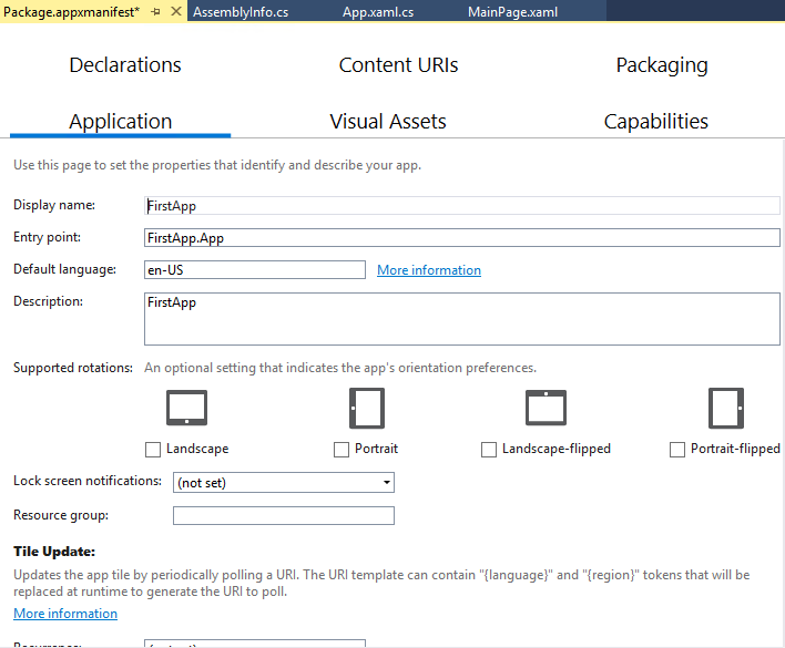
The manifest describes numerous things about your app including:
-
Application - Basic information (such as application name, default language, and whether or not its tile gets update on the Windows 10 Start Menu )
-
Visual Assets - Icons, logos, etc.
-
Capabilities - Communicate over Internet, enable Bluetooth, Access music library, Access microphone, and many more
-
Content URIs - allow or block content at specific addresses
-
Declarations - allow detailed capabilities such as allow camera to do certain behaviors.
-
Packaging - information to uniquely identify your installable package and you as a software publisher
For now it is enough to know we can edit this information and how to get to it. Later when we are more concerned about deployment we will look at these as they become important to us.
Now, let’s switch back to the MainPage.xaml and discover what the template has actually done to create our main UI.
What Is XAML?
XAML stands for eXtensible Application Markup Langugage.
XAML is a type of XML (eXtensible Markup Language). What is XML? XML is simply a structured, text-based, human-readable markup language that became very popular as a common format for disparate systems.
Let’s break up the acronym XML in an effort to get at what it really is and to help us better understand XAML.
Examine The Acronym More Closely
eXtensible : XML is easily extended for multiple uses -- that’s how XAML came into being. Developers at Microsoft have taken the basic XML structure and applied their specifics to it, creating XAML.
Markup : The best way to think about what this means is to think about an (human) editor who marks up the content of one of her writers. The journalist writes the actual content that others will see and then passes it to his editor. The editor reads over it, finds some errors and marks them and finds some other things that need to be changed and marks them for revision. The markup is never seen by the actual reader of the article, but instead is only seen by the author. The markup provides guidance on how the author should render the final article. The markup is metadata (data that describes the story itself) but again is never seen by the final reader.
All of these things are true with markup in our XAML (and XML) too. The markup that we write will not be seen by the user. Instead we are marking up how the User Interface should look and behave. In our case, we are telling the .NET compiler how to create and render the UI for the user. But, of course, the user will never see the markup. This is just like HTML (HyperText Markup Language). The user does not read the HTML, but reads the content that is displayed within an HTML page.
Language: XAML and XML are their own languages and have similar constructs but different nouns (tags) and verbs (attributes).
Nouns and Verbs?
Each node in an XML or XAML document is called a tag and can generally be thought of as a noun. If we take a look at the XAML that the project template created for us, we can see that this seems to hold true.
<Page

   x:Class="FirstApp.MainPage"

   xmlns="http://schemas.microsoft.com/winfx/2006/xaml/presentation"

   xmlns:x="http://schemas.microsoft.com/winfx/2006/xaml"

   xmlns:local="using:FirstApp"

   xmlns:d="http://schemas.microsoft.com/expression/blend/2008"

   xmlns:mc="http://schemas.openxmlformats.org/markup-compatibility/2006"

   mc:Ignorable="d">

   <Grid Background="{ThemeResource ApplicationPageBackgroundThemeBrush}">

   </Grid>

</Page>
As you can see there are actually only two nodes in the the entire XAML document:
-
Page
-
Grid
You can identify nodes (aka tags or elements) because they are wrapped in < >.
It’s just like HTML.
You can see that the Page node has numerous attributes which help to further describe the element. Attributes are located within the tag, before the closing >. Of course each node also has a closing tag which is named the same except it has a slash / . For example the <Page> tag has a closing tag which looks like </Page>.
Nested Elements
One of the main features of XML and XAML is that elements can contain other elements which creates a hierarchy. For example, The <Page></Page> contain the <Grid></Grid> element.
That indicates to both us and the .NET compiler that the Page is the outer container of the Grid element. We can think of that as a Page having a Grid within it.
More About Attributes
Attributes are often a mix of nouns and verbs as in this case we see that there is a Class attribute. However, we will see that when we add behaviors to our XAML elements they will end up being attributes of some noun item. For example, when we drag and drop a button on our Page, when the markup is added to our Page you will see it automatically gets some attributes.
Let’s try that now and add a button to our Page.
But first, let’s make sure you are set on the same device type that I am so things will look similar.
Make sure you choose the 13.3” Desktop (1280 x 720) 100% scale (as shown highlighted in the next image). Also you will probably have to change the Zoom % which is shown highlighted also. Mine is set at 25% just so I can get a reasonable snapshot.

Locate the Button element in the Toolbox and click it and drag it over to the design view* and drop it on your Page. When you do, you should see the button appear (although it will be small) and you will see the XAML appear within the Grid element. It’ll look something like the following:

This makes sense, because it has added a new node named Button (noun) and that Button has some attributes. The first one we can see is Content=”Button”.
*Please note : you must drop the button on the Design View to get the attributes automatically added. You can drop the button onto the XAML view but if you do the attributes are not automatically added.
The Content attribute is the text that appears on the button. So, if we could see the Button we would see that it says, “Button” on it. As I mentioned earlier screen space is at a premium when designing a UWA User Interface because you have to examine the design and the XAML view at the same time.
You can also see that the design view has snapped some bounding lines on the button to serve as guides. Mine show 168 (vertical) and 172 (horizontal). Those are margin values which indicate the number of pixels the top of the button is from the top of the Page and the number of pixels the left side of the button is from the left side of the Page.
If we look at the XAML for the button we can see that those values have been added as an attribute on our button automatically.
<Button Content="Button" HorizontalAlignment="Left" Margin="172,168,0,0" VerticalAlignment="Top"/>
Here’s a list of all the attributes the button has so far:
Content : Text which will appear on Button
HorizontalAlignment : Margin distances are in reference to the Left side of the containing element. Notice I say containing element here and not the page, because this button could be further nested inside another element. In this case, the Page is the outer container but it could be something else.
Margin : 4 values which represent distances from (in order) Left, Top, Right, Bottom of containing element. The order of the margin values may seem odd if you’ve never seen it before. To keep them straight just know that they start at the Left and then go clockwise around the element. Margin is the distance from the containing element to the edge of the contained element (the Button in our case).
VerticalAlignment : Our vertical distances are in reference to the Top of the containing element.
Add A Behavior (Action) For the Button
Let’s add the default behavior for a button (which is the Click). To do that, it is very easy all we have to do is double-click the button in the Design View. Do that now.
When you double-click the button, depending upon the speed of your computer your cursor may turn into a wait cursor. After that Visual Studio will automatically open the MainPage.xaml.cs file for you and display the location where it has added a new method called Button_Click().

However, if you build the app and run it and click the button nothing will happen yet, because there is no code inside the function yet.
Before we add code and run, let’s go back to the XAML and see what Visual Studio added.
Click back on the MainPage.xaml at the top of the Visual Studio editor and we can look at the XAML file again. At first you won’t see anything different because you need to scroll the XAML portion of the window over (scrollbar highlighted in next image) so you can see the new attribute that Visual Studio added to the button.

Button Click Behavior
You can see that Visual Studio has added an attribute named Click and it has set it’s value to “Button_Click” which is the name of the method in our associated MainPage.xaml.cs.
When you build the app, it now knows how to find that method when you click the button.
How does it know how to find the correct method? That is actually defined in the XAML also.
Going back to the top of our XAML we see that Class attribute which looks like the following:

That is telling the compiler that the code-behind for this XAML is defined in a namespace named FirstApp and in a class named MainPage in that namespace.
Now, let’s go back to our MainPage.xaml.cs file and we can verify this.

x:Class XAML Directive
The special x:Class is a XAML directive which tells the compiler that the associated element (<Page> in our case) is part of the class that is defined in FirstApp.MainPage.
What About All Those Other Attributes?
There are numerous other attributes on our <Page> element, so what do those do?
They basically make sure that the items described come from a specific namespace. As a matter of fact that is what xmlns stands for (XML NameSpace). This is a way to insure that the elements which are described are defined by a particular library. In our case they are defined by the default XAML libraries. You can see there is also an added xmlns named local (xmlns:local="using:FirstApp") which refers to our FirstApp namespace so that items which are defined there may also be referenced.
We’ll see more how these namespace definitions matter as we move through the content. For now, just know that the template adds them so we can reference things in the default Microsoft XAML library.
Add Code To Button Click
Let’s end this chapter by adding some code to the Button click method so you can build the app and see the Button actually do something.
Open up MainPage.xaml.cs and go to the Button_Click method and add the following code between the two { } brackets.
          ContentDialog firstAppDialog = new ContentDialog()

           {

               Title = "FirstApp",

               Content = "Hello from FirstApp"

           };

           await firstAppDialog.ShowAsync();
When you paste that code into the method, Visual Studio is going to underline the last line we added with a red squiggly line to warn you that something is wrong. If you float over that line it will try to help you resolve the problem.

Click the [Show potential fixes] link which will pop up some help.
When the help pops up, we want to choose the second choice it offers (make method async stay void).
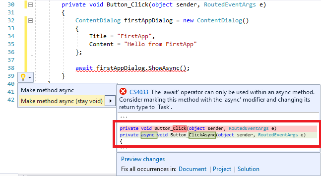
You can see that the help is attempting to show you the current method signature (in pink) and how it is going to alter the method signature (in blue).
When you click on that second choice it will alter the signature of the method and the fix will make the squiggly line go away.

Now, the signature of the method is :
private async void Button_ClickAsync(object sender, RoutedEventArgs e)
Previously it didn’t contain the async keyword and now it does. However, it does still return the same type (void) which means it returns nothing.
Look Very Closely At The Method Name
The problem however, is that the helper renamed our method to Button_ClickAsync (the old one was simply Button_Click). This will cause a problem for us when we build the app.
Let’s go ahead and just rebuild the app. Choose the Build menu item and then select the Rebuild Solution menu item under there.

The build will error out and we will see errors in the Error List window (usually at the bottom of Visual Studio):

It is attempting to tell us that the XAML was trying to find a method named Button_Click but it cannot find it anywhere.
That’s because the helper renamed our method to Button_ClickAysnc. However, it did not help us by changing the reference in our original XAML to match the name. Back in our MainPag.xaml file if we look at the Button’s Click attribute we will see that it still references a method named Button_Click.

Note: I added a carriage return (ENTER) in the XAML so we can see the entire XAML Button definition.
Two Ways To Fix The Build
There are two ways to fix this problem:
-
We can change our Click attribute to be :
Click=”Button_ClickAsync”
-
We can change the method name (in MainPage.xaml.cs) back to Button_Click.
Since I am lazy and I’m already on the XAML, I went ahead and changed the value of the Click attribute.

Now, when you build and run the app and click the Button you should see something like the following:

Conclusion
There are many problems with this first app. But at least we got something running and we understand quite a bit more about XAML and building a basic app now.
Upcoming
In the chapters that follow we will explain the additional challenges of learning to build UWAs which are already becoming apparent. Universal Windows Apps can run anywhere. That requires that a UWA be highly responsive at all times since the app could be running on a Windows Phone (yeah, right) and if it were not responsive it could cause the user to miss calls.
UWP Architecture Forces Different Learning
So the designers of the UWP architecture (the code library we are building upon) have decide to make everything run asynchronously -- multiple processes run at the same time without interrupting each other. However, that means a newer developer instantly has to learn these deeper concepts that devs in the past (WinForm dev) were able to put off to learning for later (or never).
It was actually quite a bit more difficult to demo a simple pop up dialog because of the asynchronous nature of UWAs. In our next chapter we will begin to build an app that has much more functionality and we will encounter and resolve these challenges along the way.
History
11-21-2017 - Article and code first published