Step-by-Step Guide to Silverlight Shape Controls
4.82/5 (16 votes)
In this article, I am going to describe each shape and the process of adding it in our application (whenever we need to). This article is for the beginners who don’t know much about the shape controls.
Table of Contents
- Introduction
- Prerequisite
- Introducing the Shape Controls
- Arc Control
- Block Arrow Control
- Callout Control
- Ellipse Control
- Regular Polygon Control
- Rectangle Control
- Line Arrow Control
- Points of Interest
Introduction
In my previous post, “Introduction to Shapes in Silverlight 4”, I introduced you to various types of Shapes available in Silverlight 4 and informed you that I will post an article describing each one of them and here it is. In this article, I am going to describe each shape and the process to add it in our application (whenever you need). This article is for the beginners who don’t know much about the shape controls. If you have any suggestions/concerns, please use the feedback section to let me know.
Prerequisite
As mentioned in my previous post, you need “Microsoft.Expression.Drawing.dll” assembly to get the new Shape controls in hand to work with. You can get this DLL once you install the Expression Blend SDK to your development PC. If you don’t have the Expression Blend, you can easily download it from the Microsoft Expression site. Apart from this, your development environment should have the following Tools already installed:
- Microsoft Visual Studio 2010
- Silverlight 4 Tools for Visual Studio 2010
Introducing the Shape Controls
Once your development environment is ready, you can open the Expression Blend IDE and create a new Silverlight Application Project. I am demonstrating with the help of Expression Blend here so that it will be easy for you to understand properly.

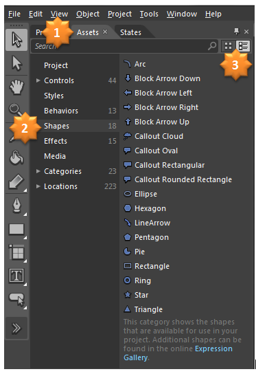
Now, once your project has been created by the IDE, open your “Assets” tab and click on the “Shapes” sub section to expand it at the right. In the right pane, you will see all the collection of the shapes available in Silverlight 4.

Let's start describing one by one. We will discuss both from the IDE and the XAML code. It will be helpful for you to understand. To work with the Shape controls, you need to add one xmlns namespace in your XAML page:

If you are using the Expression Blend IDE (designer), it will add this xmlns namespace automatically when you add the first shape control in your XAML page.
Arc Control
Let’s start with the Arc control. Earlier to Silverlight 4, how can you create an Arc shape? You have to use one Ellipse and two Rectangle controls to design the shape. You have to crop those controls as a Path control. You need more designing knowledge using the Blend IDE. Just think of creating it from the backend code. OMG!!! You have to design the UserControl first as described earlier and the create the instance from the code behind and rotate it as necessary. Let us create a Arc using the Arc shape control. Click on the Arc symbol from the Assets pane and draw it in your designer page.

This will create the below XAML code:

So easy right? Yes, it is very easy to design. Now, from the Properties panel, you can change any attribute of the shape like “StrokeThickness”, “ArcThickness”, “ArcThicknessUnit”, “StartAngel”, “EndAngel”, etc. Setting the “StrokeThickness” will change the thickness of the Arc. Have look into the following snapshot:

Increasing the “ArcThickness” will change the Arc like this:

“StartAngel” and “EndAngel” describes the start and end point of the Arc. Here I used zero as the start angel and 90 as the end angel. Hence, it produced 90 degree Arc. If you set StartAngel as zero and EndAngel as 360, it will create a circle for you. The Ring control available in the list produces the same code.

If you want to draw a Pie in your UI, you can use the Pie shape control available in the list. It internally uses the same Arc control having different StartPoint and EndPoint to produce the Pie Shape. Have a look into the following snapshot:

Setting the StartAngel to 90 and EndAngel to 360 creates the Pie Shape. You can adjust the angels to generate a different pie shape.
Block Arrow Control
If you want to add some arrows in your application for direction, what will you do if you are using the earlier version of Silverlight? Yes, you have to create an Arrow UserControl properly shaped with other controls like Rectangle and/or Paths. Then based on the direction, you had to rotate the control. So irritating!!! No need to tense more. Silverlight 4 is there for you. The Expression Blend SDK now has support for Block Arrow controls. There are four types of Block Arrow Control named “Block Arrow Down”, “Block Arrow Left”, “Block Arrow Top” and “Block Arrow Right”. They are not different controls, only changing the enum property will do the trick for you. So, no need to use transform to rotate the control and no need to use four different controls. From the Assets pane, choose any one of the Block Arrows and draw four shapes of the same. Now, from the properties panel, search for the orientation property. Select “Left”, “Right”, “Up” or “Down” from the orientation dropdown based on your requirement. That’s it. It will change the shape accordingly.

There are some other common properties available for the Block Arrow control e.g. ArrowheadAngle and ArrowBodySize. They are responsible for changing the size of the arrow head and arrow body respectively. You can find those properties in the property panel.

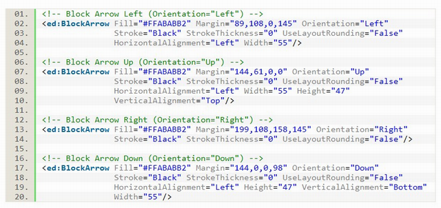
Let’s see the XAML code, which has been generated for our four controls. Here it is:

As you see, the only change between them is the Orientation property. So, just setting the Enum value, you can set the direction of the Block Arrow. ![]()
Callout Control
Before starting with this point, think 10 times if you want to develop a Callout control in earlier version of Silverlight, how would you do this? Any idea? Hmmm… little bit difficult. An hint is to create a vector image and scale it as per need or use some path controls to create the shape. Not a good idea but this needs some effort from a good designer. Am I right? Yes. But now Silverlight gives you those controls inbuilt in the runtime. The choice is yours, how do you want to utilize them. Like the Block Arrow, the Callout control also has four different enum types which you have to set based on your requirement. Here are some examples of Callout Controls:

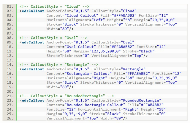
Once you draw a callout control in the XAML designer, in the properties panel, you will see a property called “CalloutStyle”. This dropdown has four enum values called “Cloud”, “Oval”, “Rectangle” and “RoundedRectangle”, which one's set will produce the respective shape in your UI.

The property called “AnchorPoint” gives you the option to change the callout start point for the anchor. This displays as (x, y) coordinate value. The default value for the AnchorPoint is (0, 1.5). Here is the actual XAML code to produce four different types of callout shapes:

You can easily find out the difference between each callout type.
Ellipse Control
This is not a new control in Silverlight 4. It was part of initial version of Silverlight too. You can find it in the System.Windows.dll assembly. Using Ellipse control, you can draw ellipse and circles.

The above code will produce a circle as shown in the below screenshot:

Setting different height & width, you can create an ellipse for your UI. I am not going to discuss more on this control as it’s a common control for all.
Regular Polygon Control
Pentagon, Hexagon, Star and Triangle shape controls use the RegularPolygon internally to generate the said shapes in the UI. The properties called “InnerRadius” and “PointCount” are responsible to generate not only those shapes but other various shapes too. Have a look here:

InnerRadius of 100% and PointCount of 6 produces a Hexagon Shape as shown above. The XAML code for the above shape will look as below:


Inner Radius of 100% and PointCount of 5 generates Pentagon as shown in the above figure.

If you want to create a Star shape, set the InnerRadius to a lower value. Setting InnerRadius to 50% and PointCount to 5 generates a perfect Star shape.

Want to add a Triangle in your page? Set the PointCount to 3. 3 is the minimum value for the PointCount property of the RegularPolygon shape control.

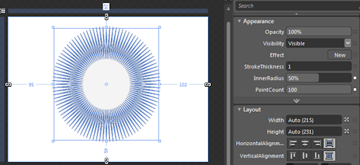
You can also generate a circle using the same RegularPolygon shape control. Set the PointCount to 100 and it will create the above shape. Remember that, 100 is the Maximum value for the PointCount property.

Setting the InnerRadius to 50% and PointCount to 100 will produce the above shape.
Rectangle Control
The Rectangle shape was available in earlier versions too. But, let me describe a bit of it here too. It is available as part of the System.Windows.dll assembly. The default generates a Rectangle shape. But tweaking it with the help of exposed properties, you can generate Rounded Rectangle or even a Circle too.

In the default case, the RadiusX and RadiusY properties will have a value ‘0’ (zero) and hence it generates a pure square/rectangle shape.


Setting those properties higher than zero will render the rectangle with rounded corner. In the above screenshot, it has a value of 20 for both RadiusX & RadiusY. Hence, created a rounded corner. If you set them to a more higher value, it may change to a Circle too.
Line Arrow Control
It’s a new shape control introduced in Silverlight 4. Before going into the deep discussion, think of creating a simple arrow (straight or bendable). To create such kind of arrow will take a good effort from your production development. Now it comes with Silverlight runtime. Tweaking the control by setting proper properties you can make it straight or bended. You can also make it one directional or bi directional. Have a look here:

Here is the XAML code:

Setting the BendAmount to zero will create a straight line for you. You can also change the starting point by changing the StartCorner property of the control.

If you want a fully bended arrow, you can do it by setting the BendAmount property to 1. Remember that 1 is the highest value for the BendAmount. Have a look into the below screenshot:

There are 5 types of ArrowHead. You can set them as the StartArrow and EndArrow property. See the above figure for more details. In the above example, I set the StartArrow as “OvalArrow” and the EndArrow as the default “Arrow”.
Points of Interest
This is all about the new Shape controls. Hope this long article will help you in understanding the basics about them. Please note that all the diagrams were drawn on top of a Grid control and hence had the property Margin set for each one of them. If you are using Canvas, you have to use Height & Width explicitly for the controls. Don’t forget to share this article link with others who might find it very useful. I appreciate your feedback and/or suggestions to improve this article. Don't forget to vote.
History
- 13th September, 2010: Initial post
