
Beginning Hybrid Mobile App Development with Corona SDK - Display Objects
5.00/5 (4 votes)
Display objects and get user input with Corona SDK and Lua
Download Corona SDK Project.zip
Introduction
My first article about the Corona SDK, Beginning Hybrid App Development with Corona SDK, was an introduction to this SDK to develop hybrid applications. I this article we will deal with some simple display objects, and show how a developer can design their business apps using the following objects:
- Button
- Circle
- Image
- ImageRect
- Rect
- RoundedRect
- SegmentedControl
- Slider (range)
- TextBox (native Multiline Input) and
- TextField (native Single line input) for email, phone, website, number, decimal, password and text
In this article we will also take a look at transitions, background color for screens and button click events to mention a few. The Corona SDK has some display objects and widgets to help a developer build some nice looking business applications. As the Corona SDK is mainly for game development, building business apps can also be achieved by following some simple design guidelines and applying these.
Whilst there are some other display objects and other widgets, my purpose is to look at some basic controls to just develop basic everyday applications. What I have noted is that in most cases with game development, the Image display object is used a lot. Attached in this article is the complete application that generates the Android App attached. The running of the app on my device was smooth and impressive after I compiled it. Without further ado, let's look into these controls in detail.
Some silly assumptions: You have read the article Beginning Hybrid App Development with Corona SDK as linked above. You are interested in exploring some other mobile app development frameworks and you have some programming experience.
Background
My previous article mentioned in the Introduction above detailed installing the Corona SDK and creating your first app in it. In this follow up article we look at some display objects and some widgets in details. We discuss the button click events and different screen transitions. Whilst some of these display objects have more properties in them, only the basic properties to create the controls on the screen are highlighted. For more details, one can refer to the previous article for links to ebooks and other Corona SDK related things, especially here.
When you start the attached application, (Start Corona Simulator > File > Open Project > main.lua), you are presented with the following app screen.
Please also take note that the screens below are from the simulator and your end result app will look a little different as it will adapt the native controls of your device OS.
Figure 1

This screen displays various buttons that have been created and each when selected demonstrates that particular item of interest. Let's look at each of these sections.
As discussed before, the main controller for a Corona SDK app is the main.lua file. In the attached app, when this app is started, main.lua starts and then opens up the buttons.lua scene file.
NB: Unfortunately Lua, is not part of the coding languages here and thus there is no syntax highlighting here. Thus I will mark all comments green and code blue.
Using the code
main.lua
-- set the status bar of the app iOS
display.setStatusBar(display.HiddenStatusBar)
local widget = require "widget"
local composer = require "composer"
widget.setTheme("widget_theme_android_holo_light")
-- useful functions
display.setDefault("background", 0,0,0)
composer.gotoScene("buttons", {effect="fade", time = 400})
1. When the app starts, the statusbar is hidden.
2. The widget and composer plugins are loaded to as these will be used to display widgets in the application and perform other app functions.
3. Using the widgets, we set the Theme of the app to android_holo_light. There are various themes that we can set depending on the app that we are developing. These are :
- widget_theme_ios
- widget_theme_android
- widget_theme_ios7
- widget_theme_android_holo_dark
- widget_theme_android_holo_light
4. We set the background color of our scene/form to be white using RGB values 0,0,0.
5. We then use the composer plugin to go to the buttons (.lua) scene. Note that the extension of the file has not been included as the SDK knows what to do. The effect/transition we use is "fade" within 400 milliseconds. There are various effects/transitions that we can use between screens and these are self explanatory here:
- fade
- zoomOutIn
- zoomOutInFade
- zoomInOut
- zoomInOutFade
- flip
- flipFadeOutIn
- zoomOutInRotate
- zoomOutInFadeRotate
- zoomInOutRotate
- zoomInOutFadeRotate
- fromRight
- fromLeft
- fromTop
- fromBottom
- slideLeft
- slideRight
- slideDown
- slideUp
- crossfade
You can explore and experience these effects yourself with your code, however within this second version, I have included most of these when each of the buttons as depicted in Figure 1. Lets look at buttons.lua, the scene that deals with Buttons.
buttons.lua
The buttons scene is the first scene that is opened by the app. This scene is depicted in Figure 1 above. This has various clickable buttons that provide to other scenes that explain the objects that I am trying to demonstrate here. A button provides an interactive control that a user can select/click and an event takes place after the selection.
Buttons within the Corona SDK are defined by defining a button control as widget.newButton( options ). The options can be the x, y positions, the width and height, left and top positions, the caption of the button etc. As you have noted above, the buttons above have various colors ranging from blue to red etc, interesting enough, two properties were set to make the buttons like that. These are the defaultFile and overFile.
The defaultFile is the link to an image file that should be shown on the button when the button is active and the overFile links to a file that should display when the button is clicked. If you look closely at the code files, you will find png files like buttonBlue.png and buttonBlueOver.png. When I was defining the buttons, I used those names in those properties and the app picked that app and did its magic. Those two files including others are resource files for your application and to make your app run, should be included in your project folder.
Look at the last button in this scene, the Text Field. Without the defaultFile and overFile specified, the button took a different look. This is the nice flexibility about the Corona SDK amongst the things that I have started to like about it. You can define everything about the look and feel of your app based on images. With each button created, an event gets fired.
-- Add button to screen named btnCircle
local onbtnCircleEvent = function( event )
composer.gotoScene("circle", {effect="fade", time = 400})
end
local btnCircle = widget.newButton
{
id = "btnCircle",
label = "Circle",
font = native.systemFont,
emboss = true,
left = 10,
top = 45,
width = 150,
height = 40,
labelColor = {default={0,0,0}},
onEvent = onbtnCircleEvent,
defaultFile = "buttonBlue.png",
overFile = "buttonBlueOver.png",
}
sceneGroup:insert(btnCircle)
The definition above looks at the button with the Circle caption. onbtnCircleEvent is the event that gets fired when the Circle button is clicked. Button events should be defined before the button object is defined.
We define a btnCircle object as a newButton. We give it an id of similar name and label it Circle. The font specified for the control is the native system font. The emboss property can be turned true/false. When true, the button text looks engraved in the button. We specify the left and top position within the screen to place the button, its width and height.
The labelColor property indicates the color of the button text. Here you pass RGB values to the color that you want. I have note added the over property of the labelColor here, but you can too and pass it RGB like the default color.
We then tell the app that when the button is clicked with onEvent, onbtnCircleEvent should be fired. onbtnCircleEvent is a function that executes when the button is clicked and this basically opens up the circle scene using a fade effect.
We then define the button to have a default image of buttonBlue.png and an overFile of buttonBlueOver.png and this button the is inserted to our group when the scene is created.
This is how all our buttons are defined within this app. You will also note that the Rect button is right aligned and the Rounded Rect button captions is left aligned. By default, buttons get a center alignment, but by changing the align property to "left" or "right" changes the alignment of the buttons with align = "left" / "right"
Beginning Corona SDK: 2
Creating a header for this scene is actually easy. A text control has been used to do that and this was placed at the centrer of the screen.
We first define variables to hold our screen size in terms of width and height of the viewable area of the screen.
local _H = display.viewableContentHeight
local _W = display.viewableContentWidth
Then add the title using a buttonsTitle variable that is put at the center of the screen.
-- Add header to the screen named buttonsTitle
local buttonsTitle = display.newText("Beginning Corona SDK: 2",0,0,native.systemFont,14,"center")
buttonsTitle.anchorY = 0
buttonsTitle.x = _W/2
buttonsTitle.y = 5
buttonsTitle:setTextColor(0,0,0)
sceneGroup:insert(buttonsTitle)
anchorY - defines the alignment within the left, top, width, heigth box of where the title should be anchored.
x = _W/2 places the title at the center of the screen
y = 5 puts the title 5 positions from the top of the screen
setTextColor(0,0,0) passes RGB values to make the text black (we are having a white background)
circle.lua
This scene demos how a circle can be created should your app needs such functionality. Overview: Creates a circle with a radius centered at specified coordinates (xCenter, yCenter). The local origin is at the center of the circle and the anchor point is initialized to this local origin. The syntax for creating a circle is: display.newCircle( xCenter, yCenter, radius )
-- Add circle to screen named circleNew
local circleNew = display.newCircle(200,200,100)
circleNew.strokeWidth = 1
circleNew:setStrokeColor(0,0,255)
circleNew:setFillColor(255,255,255)
--set left edge of bounding box
circleNew.anchorX = 0
--set right edge of bounding box
circleNew.anchorY = 0
circleNew.x = 100
circleNew.y = 200
sceneGroup:insert(circleNew)
From the above code, we created a circle, however decided to move it to Left = 100 and Top = 200 by anchoring it.
Figure 2

That was simple, wasnt it? One of the interesting things about this screen and other ones is the availability of a back button at top left of the screen. The purpose of this button is exactly that, go back to the previous screen and this was defined like this.
-- Add button to screen named circleLeftButton
local oncircleLeftButtonEvent = function( event )
composer.gotoScene("buttons", {effect="slideRight", time = 400})
end
local circleLeftButton = widget.newButton
{
id = "circleLeftButton",
label = "",
labelAlign = "left",
font = native.systemFont,
emboss = true,
left = 0,
top = 0,
height = 40,
labelColor = {default={0,0,0}},
onEvent = oncircleLeftButtonEvent,
defaultFile = "leftArrow.png",
overFile = "leftArrowOver.png",
}
sceneGroup:insert(circleLeftButton)
end
When this left button is clicked, the buttons scene is opened using the composer. More details about creating buttons are discussed above. In this instance, a slideRight effect is used as indicated in available effects/transitions.
Image and ImageRect Controls
Figure 3 & Figure 4


There is not a vast difference between these two display objects in terms of definition except that one provides an image that will fit in its construct (Figure 4 - ImageRect) and the other not (Figure 4 - Image).
The purpose of these is to display an image from a file. If content scaling is enabled, its better to use the ImageRect.
The syntax to create the image control is display.newImage( [parent,] filename [,baseDir] [,x,y] [,isFullResolution]) and to create the ImageRect is display.newImageRect( [parent,] filename, [baseDir,] width, height )
To demonstrate the image control dad.lua was created and the code to create the image in Figure 3 is:
-- Add image to screen named imgNew
local imgNew = display.newImage("61045423.jpg",0,0)
--set left edge of bounding box
imgNew.anchorX = 0
--set right edge of bounding box
imgNew.anchorY = 0
imgNew.x = 0
imgNew.y = 0
imgNew.isFullResolution = true
sceneGroup:insert(imgNew)
As we wanted to place the image at the Left=0,Top=0 position, we anchored it and used x and y to place it there. For the ImageRect, our scene is mom.lua. You will recall that our first article used the same dad.lua and mom.lua scenes, and this continues on that track.
The imageRect is defined as :
-- Add ImageRect (images fits itself) to screen named imgNew
local imgNew = display.newImageRect("61045423.jpg",320,480)
--set left edge of bounding box
imgNew.anchorX = 0
--set right edge of bounding box
imgNew.anchorY = 0
imgNew.x = 0
imgNew.y = 0
sceneGroup:insert(imgNew)
With the imageRect, we specify the width and height of the rectangle area to place the image. The image in turn will be resized to fit in that area. The width and height specified here of 320 and 480 is the same as in our config.lua file for the app settings.
Rect and RoundedRect
You use these controls to create a rectange object. As the name indicates, one has rounded corners and the other not.
Figure 4 and Figure 5

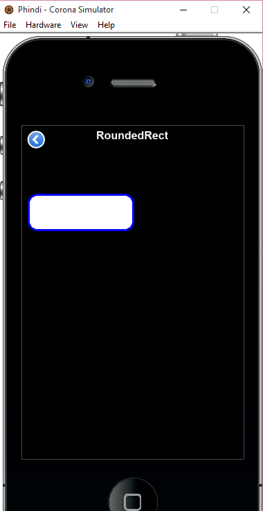
Figure 4 depicts a rectangle with a white border and a fill color the same as the scene and figure 5 a white rectangle with rounded corners.
The syntax to create a rectangle is display.newRect( x, y, width, height ) whilst the syntax for a rounded rectangle is display.newRoundedRect( x, y, width, height, cornerRadius ).
Looking at rect.lua, we have easily created this rectangle like this:
-- Add Rect to the screen named rectNew
local rectNew = display.newRect(0,0,150,150)
rectNew.strokeWidth = 2
rectNew:setStrokeColor(255,255,255)
rectNew:setFillColor(0,26,128)
--set left edge of bounding box
rectNew.anchorX = 0
--set right edge of bounding box
rectNew.anchorY = 0
rectNew.x = 10
rectNew.y = 100
sceneGroup:insert(rectNew)
The width and height are both 150. We set the strokecolor to white and fillcolor (inside color) as RGB 0,26,128. We put this at Left 10, Top 100.
For the RoundedRect, we defined it as...
-- Add RoundedRect to screen named roundedRectNew
local roundedRectNew = display.newRoundedRect(0,0,150,50,12)
roundedRectNew.strokeWidth = 3
roundedRectNew:setStrokeColor(0,0,255)
roundedRectNew:setFillColor(255,255,255)
--set left edge of bounding box
roundedRectNew.anchorX = 0
--set right edge of bounding box
roundedRectNew.anchorY = 0
roundedRectNew.x = 10
roundedRectNew.y = 100
sceneGroup:insert(roundedRectNew)
Looking at the definitions of these controls, one notes that the only difference major is the CornerRadius property that is defined as 12.
Segmented Control
This widget creates a segment control. We will delve into functionality of this control is subsequent articles but here we just talk about the design. The syntax to create a segmented control is widget.newSegmentedControl( options ).
One of the options to take consideration of when creating this control is the Segment width, the segments to create and the active segment. this control has an onPress event that one can trap to fire when a segment is pressed. Lets look into this control.
-- Add SegmentedControl to screen named nSegmentControl
-- Listen for segmented control events
local function onnSegmentControlPress( event )
local target = event.target
local trgCaption = target.segmentLabel
end
local nSegmentControl = widget.newSegmentedControl
{
id = "nSegmentControl",
left = 10,
top = 100,
defaultSegment = 2,
segments = {"One","Two","Three","Four","Five"},
onPress = onnSegmentControlPress,
labelFont = native.systemFont
}
sceneGroup:insert(nSegmentControl)
From the code above, we define a method to trap the onPress event of each segment with onnSegmentControlPress. Currently that does not do anything much but just reads the name of the segment selected with target.segmentLabel.
We put the label at left = 10 and top = 100 position, give it a default segment of 2, being the segment with "Two" and use the system font for the segments. This is depicted with Figure 6 below.
Figure 6

Slider
The slider is a range control for user to select a range between 0 and 100%. This control also has an event that can be fired when the slider value changes.
Figure 7

Selecting the slider from the buttons scene will open the slider screen created. The syntax to create a slider control is widget.newSlider( options ).
You can have a vertical and horizontal slider on a form as depicted above by changing the orientation property from horizontal to vertical. The code below creates both sliders on the screen. By default, the orientation of a slider is horizontal.
-- Add slider/range that stores values from 0% - 100%
-- Listen for value change in slider
local function progBarListener( event )
local value = event.value
end
local progBar = widget.newSlider
{
id = "progBar",
left = 50,
top = 100,
width = 200,
height = 50,
value = 25,
listener = progBarListener
}
sceneGroup:insert(progBar)
-- Add slider/range that stores values from 0% - 100%
-- Listen for value change in slider
local function vSliderListener( event )
local value = event.value
end
local vSlider = widget.newSlider
{
id = "vSlider",
left = 10,
top = 20,
width = 20,
height = 200,
value = 25,
orientation = "vertical",
listener = vSliderListener
}
sceneGroup:insert(vSlider)
The event listener here does not do nothing much except just reads the value of the slider. More will be discussed in a mobile app we will add in subsequent articles.
The TextBox (native controls)
The textbox is a multi-input field control for user input as depicted in Figure 8 below. A native text box is a scrollable and for displaying text-based content. The syntax to create a textbox is native.newTextBox( centerX, centerY, width, height ).
Figure 8
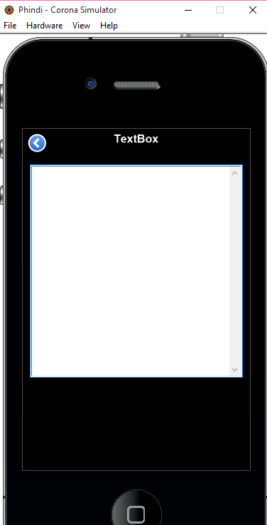
The textbox is a native object because it adapts to the devices controls within the iOs and Android spectrum. Amongst the properties that this control has, it has font, alignment, placeholder, size, text properties to mention a few. You can also make the textbox by setting the editable property to false, e.g. .isEditable = true. You can also tell the app to focus on the textbox control by setting native.setKeyboardFocus( textBoxID ) where textBoxID is the control to receive the focus.
-- Add TextBox/MultiLine textbox to screen named txtNewTextBox
local txtNewTextBox = native.newTextBox(0,0,300,300)
--set left edge of bounding box
txtNewTextBox.anchorX = 0
--set right edge of bounding box
txtNewTextBox.anchorY = 0
txtNewTextBox.x = 10
txtNewTextBox.y = 50
txtNewTextBox:setTextColor(0,0,0)
txtNewTextBox.placeholder = "Placeholder"
txtNewTextBox.font = native.newFont(native.systemFont, 12)
native.setKeyboardFocus(txtNewTextBox)
txtNewTextBox.isEditable = true
sceneGroup:insert(txtNewTextBox)
We place the textbox at left = 10 and top = 50. We tell it so have a black text color and the placeholder to be "Placeholder". The system font with size 12 is used and this should have the focus when the scene is opened and is also editable.
TextFields
Textfields are another way of getting user input for single line controls. Text fields are used to define input controls like emails, passwords, phones, websites etc. This native control by just changing the input type to:
- default (normal text)
- number
- phone
- url
- decimal
is able to accept a variety of input and the keyboards adjust accordingly to accept expected input like that. Figure 9 below just deals with a simple example of such input. The syntax to create a text field is native.newTextField( centerX, centerY, width, height ).
Figure 9

When creating input forms like this, its better to create a rectangle that fills the screen first and trap its tap event to hide the keyboard because when you select the input controls a keyboard shows up and this can be hidden easily with the background tap event. This has not been effected in this example though. From the above screen, we have created labels to show what input is needed from the user. We can however just use the placeholders for such and remove the labels/captions above the text fields.
-- Add TextField to screen named txtFirstName
local txtFirstName = native.newTextField(0,0,300,30)
txtFirstName.anchorX = 0
txtFirstName.anchorY = 0
txtFirstName.x = 10
txtFirstName.y = 70
txtFirstName:setTextColor(0,0,0)
--set input type
txtFirstName.inputType = "default"
--define the placeholder
txtFirstName.placeholder = "First Name"
--set font
txtFirstName.font = native.newFont(native.systemFont, 12)
native.setKeyboardFocus(txtFirstName)
sceneGroup:insert(txtFirstName)
Last Name
-- Add TextField to screen named txtLastName
local txtLastName = native.newTextField(0,0,300,30)
txtLastName.anchorX = 0
txtLastName.anchorY = 0
txtLastName.x = 10
txtLastName.y = 130
txtLastName:setTextColor(0,0,0)
--set input type
txtLastName.inputType = "default"
--define the placeholder
txtLastName.placeholder = "Last Name"
--set font
txtLastName.font = native.newFont(native.systemFont, 12)
sceneGroup:insert(txtLastName)
We also added two buttons to this scene and these can be programmed to perform some functions, e.g cancel the scene or save the details. That however is a discussion for another day.
For now, that's all folks. Stay tuned for more articles from me about my experiences with the Corona SDK.
Points of Interest
After you open a screen, opening it again defaults to the previous settings what were opened. E.g. for a segment control, if you select segment 5, close the screen when you open it again, it defaults to the last segment selected.
Within this app, I used different background colours for the screens. When I was playing around with the screens, the background colors were inherited from the previous screen opened. I managed to sort this by setting the default background color for each screen on the scene show event as depicted below.
-- Called when the scene is shown
function scene:show(event)
local sceneGroup = self.view
display.setDefault("background", 255,255,255)
end
I have created a simple tool called Corona.Show to help me in developing Corona SDK apps quickly however this is still at infant stages and is being developed as I go along. You can download this here. The project discussed here is Phindi, you can open and recompile it yourself. I have also included the generated apk for this app here too that you can install on your android device.
I hope this has been some valuable info about this sdk. For more details about this find my details on my profile and send word.