Introduction
Twitter Bootstrap is a very good framework to create design and running CSS based application. By Twitter Bootstrap, you can create interactive design easily. I think Twitter Bootstrap is created for developers who do not know the core CSS. Twitter Bootstrap has designed three types of forms like basic, horizontal, inline.
In this article, I have created some bootstrap form samples that are not present in bootstrap document. I have created six types of forms that are presented below with definition and example.
I am presenting six types of forms:
- Mixed of basic and horizontal
- Mixed of basic and inline
- Mixed of horizontal and basic
- Mixed of horizontal and inline
- Mixed of inline and basic
- Mixed of inline and horizontal
Descriptions
First of all, you have to download the jquery and twitter bootstrap css and jquery library from the reliable source. I have used the latest version of jquey (2.1.1) and bootstrap (v3.3.1). You can download the jquery and bootstrap library from here:
If you use the visual studio then just write the command line into TOOLS -> Nuget Package Manage -> Package Manager Console
Download Jquery Library By Command Line
PM> Install-Package jQuery
Download Bootstrap Library By Command Line
PM> Install-Package bootstrap
If you use other application which is not visual studio then you can download the jquery library from here and download the bootstrap library from here
Working Process:
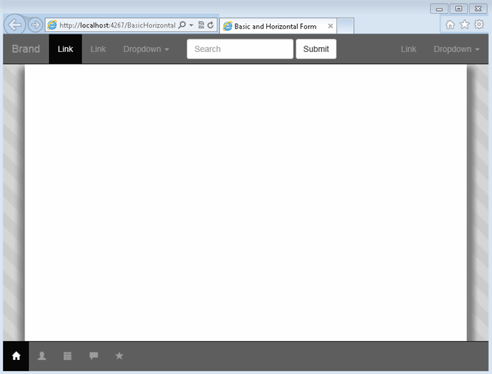
1). At first, create your html file and choose the file name as you like I have created the first file name ‘BasicHorizontalForm.html’. When I created this file by using visual studio it is empty so write the header and body tag and also write the Meta tag for responsive design and other activities. After writing header and body my page look like this
<!DOCTYPE html>
<html xmlns="http://www.w3.org/1999/xhtml">
<head>
    <title>Basic and Horizontal Form</title>
    <meta http-equiv="Content-Type" content="text/html; charset=UTF-8">
    <meta name="application-name" content="" />
    <meta name="Description" content="" />
    <meta name="Keywords" content="" />
    <meta http-equiv="imagetoolbar" content="no" />
    <meta name="robots" content="noodp" />
    <meta name="robots" content="index,follow" />
    <meta name="googlebot" content="index,follow" />
    <meta http-equiv="Content-Language" content="English" />
    <meta http-equiv="Content-Type" content="text/html; charset=utf-8" />
    <meta http-equiv="content-script-type" content="text/javascript" />
    <meta http-equiv="content-style-type" content="text/css" />
    <meta name="author" content="ecavo">
    <meta name="viewport" content="width=device-width">

    <!--Add Jquery and Bootstrap Library here-->

</head>
<body>

    <!--Add Header, Main Content and Footer here-->

</body>
</html>
2). Add the Jquery, Twitter Bootstrap library into the header section where i have added the comments ( Add Jquery and Bootstrap Library here'). So after adding both library your header section will be look like this.
If you use cdn
<!--Add Jquery and Bootstrap Library here-->
    <link href="https://cdnjs.cloudflare.com/ajax/libs/twitter-bootstrap/3.3.1/css/bootstrap.css"            rel="stylesheet">
    <script type="text/javascript" src="https://cdnjs.cloudflare.com/ajax/libs/jquery/2.1.1/jquery           .js"></script>
    <script type="text/javascript" src="https://cdnjs.cloudflare.com/ajax/libs/twitter-bootstrap/3          .3.1/js/bootstrap.min.js"></script>
If you not use cdn but you are using visual studio or other IDE or not.
<!--Add Jquery and Bootstrap Library here-->
<link href="Content/bootstrap.css" rel="stylesheet" />
<script src="Scripts/jquery-2.1.1.js"></script>
<script src="Scripts/bootstrap.js"></script>
3). To some customize bootstrap and write your own css. You have to add another css file. I have gave the name of file ‘styles.css. This file will be added after bootstrap css so the whole library section will be look like this.
<!--Add Jquery and Bootstrap Library here-->
<link href="Content/bootstrap.css" rel="stylesheet" />
<link href="styles.css" rel="stylesheet" /> <!--This is your own css file-->

<script src="Scripts/jquery-2.1.1.js"></script>
<script src="Scripts/bootstrap.js"></script>
This styles.css file also be added for cdn using.
4). Every application has header, footer and main section that’s why I have created header, footer and main section by using bootstrap. The default style of bootstrap is not good for all person so I have customized the bootstarp by writing my own css. To create header, footer and main section I have used the following html and css. You will just add html into your body section and also will add css into your own css file ‘styles.css.
HTML
<!--Add Header, Main Content and Footer here-->
    <header>
        <nav class="navbar navbar-default navbar-fixed-top navbar-inverse" role="navigation">
            <div class="container-fluid">
                <!-- Brand and toggle get grouped for better mobile display -->
                <div class="navbar-header">
                    <button type="button" class="navbar-toggle collapsed"
                            data-toggle="collapse" data-target="#bs-example-navbar-collapse-1">
                        <span class="sr-only">Toggle navigation</span>
                        <span class="icon-bar"></span>
                        <span class="icon-bar"></span>
                        <span class="icon-bar"></span>
                    </button>
                    <a class="navbar-brand" href="#">Brand</a>
                </div>
                <!-- Collect the nav links, forms, and other content for toggling -->
                <div class="collapse navbar-collapse" id="bs-example-navbar-collapse-1">
                    <ul class="nav navbar-nav">
                        <li class="active"><a href="#">Link</a></li>
                        <li><a href="#">Link</a></li>
                        <li class="dropdown">
                            <a href="#" class="dropdown-toggle"
                                  data-toggle="dropdown">Dropdown <span class="caret"></span></a>
                            <ul class="dropdown-menu" role="menu">
                                <li><a href="#">Action</a></li>
                                <li><a href="#">Another action</a></li>
                                <li><a href="#">Something else here</a></li>
                                <li class="divider"></li>
                                <li><a href="#">Separated link</a></li>
                                <li class="divider"></li>
                                <li><a href="#">One more separated link</a></li>
                            </ul>
                        </li>
                    </ul>
                    <form class="navbar-form navbar-left" role="search">
                        <div class="form-group">
                            <input type="text" class="form-control" placeholder="Search" />
                        </div>
                        <button type="submit" class="btn btn-default">Submit</button>
                    </form>
                    <ul class="nav navbar-nav navbar-right">
                        <li><a href="#">Link</a></li>
                        <li class="dropdown">
                            <a href="#" class="dropdown-toggle"
                               data-toggle="dropdown">Dropdown <span class="caret"></span></a>
                            <ul class="dropdown-menu" role="menu">
                                <li><a href="#">Action</a></li>
                                <li><a href="#">Another action</a></li>
                                <li><a href="#">Something else here</a></li>
                                <li class="divider"></li>
                                <li><a href="#">Separated link</a></li>
                            </ul>
                        </li>
                    </ul>
                </div>
                <!-- /.navbar-collapse -->
            </div>
            <!-- /.container-fluid -->
        </nav>
    </header>
    <section class="main">
        <div class="container">
            <div class="row">
                <div class="col-xs-6">
                    <!--put your form into here-->
                </div>
            </div>
        </div>
    </section>
    <footer class="navbar navbar-inverse navbar-fixed-bottom">
        <ul class="nav navbar-nav">
            <li class="active"><a href="#"><span class="glyphicon glyphicon-home"></span></a></li>
            <li><a href="#"><span class="glyphicon glyphicon-user"></span></a></li>
            <li><a href="#"><span class="glyphicon glyphicon-calendar"></span></a></li>
            <li><a href="#"><span class="glyphicon glyphicon-comment"></span></a></li>
            <li><a href="#"><span class="glyphicon glyphicon-star"></span></a></li>
        </ul>
    </footer>
CSS
html, body {
height: 100%;
}
body {
padding: 50px 0;
background-color: #ccc;
background-image: linear-gradient(45deg, rgba(255, 255, 255, 0.2) 25%,
rgba(0, 0, 0, 0) 25%, rgba(0, 0, 0, 0) 50%, rgba(255, 255, 255, 0.2) 50%,
rgba(255, 255, 255, 0.2) 75%, rgba(0, 0, 0, 0) 75%, rgba(0, 0, 0, 0));
background-size: 50px 50px;
}
.main {
height: 100%;
overflow-y: auto;
}
.main > .container {
background-color: rgb(255, 255, 255);
margin: 0px auto;
padding-left: 10px;
padding-right: 10px;
-moz-box-shadow: 10px 8px 15px gray, -10px 8px 15px gray, 10px 8px 15px gray;
-webkit-box-shadow: 10px 8px 15px gray, -10px 8px 15px gray, 10px 8px 15px gray;
box-shadow: 10px 8px 15px gray, -10px 8px 15px gray, 10px 8px 15px gray;
min-height: 100%;
}
.navbar-inverse {
background: #5f5f5f;
}
footer .navbar-nav {
float: left;
margin: 0;
}
footer .navbar-nav > li {
float: left;
}
footer .navbar-nav > li > a {
padding-top: 15px;
padding-bottom: 15px;
}
OUTPUT
By adding header, footer and main section html and css you will see the following output. I think this design will be helpful to create large scale application. To create large scale application you have to know sass or less. To know sass you can see my tips from here and here.
FORM DESIGN
If you want to mix the basic and horizontal not inline form then you have to add the following css code into your own css file ‘styles.css
**For horizontal and basic form design**
form {
padding: 15px;
}
.form-group > .form-group {
padding-left: 0px;
padding-right: 0px;
}
.form-group > .form-group:nth-child(n+1) {
padding-left: 5px;
padding-right: 0px;
}
.form-group > .form-group:first-child {
padding-left: 0px;
}
.form-group > div[class*='col-'] {
padding-left: 0px;
padding-right: 0px;
}
.form-group > div[class*='col-']:nth-child(n+1) {
padding-left: 5px;
padding-right: 0px;
}
.form-group > div[class*='col-']:first-child {
padding-left: 15px;
}
.form-group > div[class*='col-']:last-child {
padding-right: 15px;
}
@media only screen and (max-width: 768px) and (min-width: 120px) {
.form-group > div[class*='col-']:nth-child(n+1) {
padding-left: 15px;
padding-right: 15px;
padding-bottom: 15px;
}
.form-group > div[class*='col-']:first-child {
padding-right: 15px;
}
.form-group > div[class*='col-']:last-child {
padding-left: 15px;
padding-bottom: 0px;
}
}
@media only screen and (max-width: 992px) and (min-width: 769px) {
.form-group > div[class*='col-']:nth-child(n+1) {
padding-left: 15px;
padding-right: 15px;
padding-bottom: 15px;
}
.form-group > div[class*='col-']:first-child {
padding-right: 15px;
}
.form-group > div[class*='col-']:last-child {
padding-left: 15px;
padding-bottom: 0px;
}
}
Inline form is not common form design, many designer are using this form only for header with limited element so this is not important I think the default design of bootstrap will cover all of the problem. Here I am trying to mixin the inline form by using the css code. You will just add the following code into you own css file ‘styles.css
**For inline form design**
.form-inline .form-group {
padding-bottom: 10px;
width: 100%;
}
.form-inline .control-label {
padding-left: 0;
}
.form-inline .form-control {
width: 100%;
}
.form-inline .form-group > div[class*='col-'] {
padding-left: 0px;
padding-right: 0px;
}
.form-inline .form-group > div[class*='col-']:nth-child(n+1) {
padding-left: 5px;
padding-right: 0px;
}
.form-inline .form-group > div[class*='col-']:first-child {
padding-left: 15px;
}
.form-inline .form-group > div[class*='col-']:last-child {
padding-right: 0px;
}
@media only screen and (max-width: 768px) and (min-width: 120px) {
.form-inline .form-group {
padding-bottom: 0px;
}
.form-inline .form-group > div[class*='col-']:nth-child(n+1) {
padding-left: 15px;
padding-right: 15px;
padding-bottom: 15px;
}
.form-inline .form-group > div[class*='col-']:first-child {
padding-right: 15px;
}
.form-inline .form-group > div[class*='col-']:last-child {
padding-left: 15px;
padding-bottom: 0px;
}
}
@media only screen and (max-width: 992px) and (min-width: 769px) {
.form-inline .form-group {
padding-bottom: 0px;
}
.form-inline .form-group > div[class*='col-']:nth-child(n+1) {
padding-left: 15px;
padding-right: 15px;
padding-bottom: 15px;
}
.form-inline .form-group > div[class*='col-']:first-child {
padding-right: 15px;
}
.form-inline .form-group > div[class*='col-']:last-child {
padding-left: 15px;
padding-bottom: 0px;
}
}
1. Mixed of Basic and Horizontal
This is the design of basic and horizontal form, to create the form I have used some techniques. Here is the example of this.
HTML
<form>
                       <fieldset>
                           <legend>Personal Information:</legend>
                           <div class="form-group row">
                               <div class="col-md-4">
                                   <label for="firstName">First Name </label>
                                   <input type="text" class="form-control"
                                   id="firstName" placeholder="Please enter first name">
                               </div>
                               <div class="col-md-4">
                                   <label for="firstName">Middle Name </label>
                                   <input type="text" class="form-control"
                                   id="firstName" placeholder="Please enter middle name">
                               </div>
                               <div class="col-md-4">
                                   <label for="firstName">Last Name </label>
                                   <input type="text" class="form-control"
                                   id="firstName" placeholder="Please enter last name">
                               </div>
                           </div>
                           <div class="form-group row">
                               <div class="col-md-6">
                                   <label for="firstName">Age </label>
                                   <input type="text" class="form-control"
                                   id="firstName" placeholder="Please enter age">
                               </div>
                               <div class="col-md-6">
                                   <label for="firstName">Sex </label>
                                   <input type="text" class="form-control"
                                   id="firstName" placeholder="Please enter sex">
                               </div>
                           </div>
                           <div class="form-group">
                               <label for="firstName">Address1 </label>
                               <textarea class="form-control" id="firstName"
                               placeholder="Please enter address1"></textarea>
                           </div>
                           <div class="form-group">
                               <label for="firstName">Address2 </label>
                               <textarea class="form-control" id="firstName"
                               placeholder="Please enter address2"></textarea>
                           </div>
                           <div class="form-group">
                               <label for="firstName">Country </label>
                               <input type="text" class="form-control"
                               id="firstName" placeholder="Please enter country">
                           </div>
                           <div class="form-group row">
                               <div class="col-md-6">
                                   <label for="firstName">State </label>
                                   <input type="text" class="form-control"
                                   id="firstName" placeholder="Please enter state">
                               </div>
                               <div class="col-md-6">
                                   <label for="firstName">City </label>
                                   <input type="text" class="form-control"
                                   id="firstName" placeholder="Please enter city">
                               </div>
                           </div>
                           <div class="checkbox">
                               <label>
                                   <input type="checkbox">
                                   Is Active
                               </label>
                           </div>
                           <button type="submit"
                           class="btn btn-default">Submit</button>
                       </fieldset>
                   </form>
OUTPUT

DEMO
2. Mixed of Basic and Inline
This is the design of basic and horizontal form, to create the form I have used some techniques. Here is the example of this.
HTML
<form>
                        <fieldset>
                            <legend>Personal Information:</legend>
                            <div class="form-group row">
                                <div class="col-md-4">
                                    <label class="sr-only"
                                    for="exampleInputAmount">Amount (in dollars)</label>
                                    <div class="input-group">
                                        <div class="input-group-addon">$</div>
                                        <input type="text" class="form-control"
                                        id="exampleInputAmount" placeholder="Amount">
                                        <div class="input-group-addon">.00</div>
                                    </div>
                                </div>
                                <div class="col-md-4">
                                    <label class="sr-only"
                                    for="exampleInputAmount">Email</label>
                                    <div class="input-group">
                                        <div class="input-group-addon">@</div>
                                        <input type="text" class="form-control"
                                        id="exampleInputAmount" placeholder="Email">
                                    </div>
                                </div>
                                <div class="col-md-4">
                                    <label class="sr-only"
                                    for="exampleInputAmount">Amount (in dollars)</label>
                                    <div class="input-group">
                                        <div class="input-group-addon">$</div>
                                        <input type="text" class="form-control"
                                        id="exampleInputAmount" placeholder="Amount">
                                        <div class="input-group-addon">.00</div>
                                    </div>
                                </div>
                            </div>
                            <div class="form-group row">
                                <div class="col-md-6">
                                    <label for="firstName">Age </label>
                                    <input type="text" class="form-control"
                                    id="firstName" placeholder="Please enter age">
                                </div>
                                <div class="col-md-6">
                                    <label for="firstName">Sex </label>
                                    <input type="text" class="form-control"
                                    id="firstName" placeholder="Please enter sex">
                                </div>
                            </div>
                            <div class="form-group">
                                <label for="firstName">Address2 </label>
                                <textarea class="form-control" id="firstName"
                                placeholder="Please enter address2"></textarea>
                            </div>
                            <div class="form-group">
                                <label for="firstName">Country </label>
                                <input type="text" class="form-control"
                                id="firstName" placeholder="Please enter country">
                            </div>
                            <div class="form-group row">
                                <div class="col-md-6">
                                    <label for="firstName">State </label>
                                    <input type="text" class="form-control"
                                    id="firstName" placeholder="Please enter state">
                                </div>
                                <div class="col-md-6">
                                    <label for="firstName">City </label>
                                    <input type="text" class="form-control"
                                    id="firstName" placeholder="Please enter city">
                                </div>
                            </div>
                            <div class="checkbox">
                                <label>
                                    <input type="checkbox">
                                    Is Active
                                </label>
                            </div>
                            <button type="submit" class="btn btn-default">Submit</button>
                        </fieldset>
                    </form>
OUTPUT
DEMO
3. Mixed of Horizontal and Basic
This is the design of basic and horizontal form, to create the form I have used some techniques. Here is the example of this:
HTML
<form class="form-horizontal">
                        <fieldset>
                            <legend>Personal Information:</legend>
                            <div class="form-group row">
                                <div class="col-md-4">
                                    <label for="firstName">First Name </label>
                                    <input type="text" class="form-control"
                                    id="firstName" placeholder="Please enter first name">
                                </div>
                                <div class="col-md-4">
                                    <label for="firstName">Middle Name </label>
                                    <input type="text" class="form-control"
                                    id="firstName" placeholder="Please enter middle name">
                                </div>
                                <div class="col-md-4">
                                    <label for="firstName">Last Name </label>
                                    <input type="text" class="form-control"
                                    id="firstName" placeholder="Please enter last name">
                                </div>
                            </div>
                            <div class="form-group row">
                                <div class="col-md-6">
                                    <label for="firstName">Age </label>
                                    <input type="text" class="form-control"
                                    id="firstName" placeholder="Please enter age">
                                </div>
                                <div class="col-md-6">
                                    <label for="firstName">Sex </label>
                                    <input type="text" class="form-control"
                                    id="firstName" placeholder="Please enter sex">
                                </div>
                            </div>
                            <div class="form-group">
                                <label for="firstName"
                                class="col-sm-2 control-label">Address1 </label>
                                <div class="col-sm-10">
                                    <textarea class="form-control"
                                    id="firstName" placeholder="Please enter address1"></textarea>
                                </div>
                            </div>
                            <div class="form-group">
                                <label for="firstName"
                                class="col-sm-2 control-label">Address2 </label>
                                <div class="col-sm-10">
                                    <textarea class="form-control"
                                    id="firstName"
                                    placeholder="Please enter address2"></textarea>
                                </div>
                            </div>
                            <div class="form-group">
                                <label for="firstName"
                                class="col-sm-2 control-label">Country </label>
                                <div class="col-sm-10">
                                    <input type="text"
                                    class="form-control" id="firstName"
                                    placeholder="Please enter country">
                                </div>
                            </div>
                            <div class="form-group">
                                <div class="col-sm-offset-2 col-sm-10">
                                    <div class="checkbox">
                                        <label>
                                            <input type="checkbox"> Remember me
                                        </label>
                                    </div>
                                </div>
                            </div>
                            <div class="form-group">
                                <div class="col-sm-offset-2 col-sm-10">
                                    <button type="submit"
                                    class="btn btn-default">Sign in</button>
                                </div>
                            </div>
                        </fieldset>
                    </form>
OUTPUT
DEMO
4. Mixed of Horizontal and Inline
This is the design of basic and horizontal form, to create the form I have used some techniques. Here is the example of this.
HTML
<form class="form-horizontal">
                       <fieldset>
                           <legend>Personal Information:</legend>
                           <div class="form-group row">
                               <div class="col-md-4">
                                   <label class="sr-only"
                                   for="exampleInputAmount">Amount (in dollars)</label>
                                   <div class="input-group">
                                       <div class="input-group-addon">$</div>
                                       <input type="text" class="form-control"
                                       id="exampleInputAmount" placeholder="Amount">
                                       <div class="input-group-addon">.00</div>
                                   </div>
                               </div>
                               <div class="col-md-4">
                                   <label class="sr-only"
                                   for="exampleInputAmount">Email</label>
                                   <div class="input-group">
                                       <div class="input-group-addon">@</div>
                                       <input type="text" class="form-control"
                                       id="exampleInputAmount" placeholder="Email">
                                   </div>
                               </div>
                               <div class="col-md-4">
                                   <label class="sr-only"
                                   for="exampleInputAmount">Amount (in dollars)</label>
                                   <div class="input-group">
                                       <div class="input-group-addon">$</div>
                                       <input type="text" class="form-control"
                                       id="exampleInputAmount" placeholder="Amount">
                                       <div class="input-group-addon">.00</div>
                                   </div>
                               </div>
                           </div>
                           <div class="form-group row">
                               <div class="col-md-6">
                                   <label for="firstName">Age </label>
                                   <input type="text" class="form-control"
                                   id="firstName" placeholder="Please enter age">
                               </div>
                               <div class="col-md-6">
                                   <label for="firstName">Sex </label>
                                   <input type="text" class="form-control"
                                   id="firstName" placeholder="Please enter sex">
                               </div>
                           </div>
                           <div class="form-group">
                               <label for="firstName"
                               class="col-sm-2 control-label">Address1 </label>
                               <div class="col-sm-10">
                                   <textarea class="form-control"
                                   id="firstName"
                                   placeholder="Please enter address1"></textarea>
                               </div>
                           </div>
                           <div class="form-group">
                               <label for="firstName"
                               class="col-sm-2 control-label">Address2 </label>
                               <div class="col-sm-10">
                                   <textarea class="form-control"
                                   id="firstName"
                                   placeholder="Please enter address2"></textarea>
                               </div>
                           </div>
                           <div class="form-group">
                               <label for="firstName"
                               class="col-sm-2 control-label">Country </label>
                               <div class="col-sm-10">
                                   <input type="text" class="form-control"
                                   id="firstName" placeholder="Please enter country">
                               </div>
                           </div>
                           <div class="form-group">
                               <div class="col-sm-offset-2 col-sm-10">
                                   <div class="checkbox">
                                       <label>
                                           <input type="checkbox"> Remember me
                                       </label>
                                   </div>
                               </div>
                           </div>
                           <div class="form-group">
                               <div class="col-sm-offset-2 col-sm-10">
                                   <button type="submit"
                                   class="btn btn-default">Sign in</button>
                               </div>
                           </div>
                       </fieldset>
                   </form>
OUTPUT
DEMO
5. Mixed of Inline and Basic
This is the design of basic and horizontal form, to create the form I have used some techniques. Here is the example of this.
HTML
<form class="form-inline">
                        <fieldset>
                            <legend>Personal Information:</legend>
                            <div class="form-group">
                                <label class="sr-only"
                                for="exampleInputEmail2">Email address</label>
                                <input type="email"
                                class="form-control"
                                id="exampleInputEmail2" placeholder="Enter email">
                            </div>
                            <div class="form-group">
                                <label class="sr-only"
                                for="exampleInputPassword2">Password</label>
                                <input type="password"
                                class="form-control"
                                id="exampleInputPassword2" placeholder="Password">
                            </div>
                            <div class="form-group row">
                                <div class="col-md-6">
                                    <label class="col-sm-12 control-label"
                                    for="firstName">Age </label>
                                    <input type="text"
                                    class="col-sm-12 form-control"
                                    id="firstName" placeholder="Please enter age">
                                </div>
                                <div class="col-md-6">
                                    <label class="col-sm-12
                                    control-label" for="firstName">Sex </label>
                                    <input type="text"
                                    class="col-sm-12 form-control"
                                    id="firstName" placeholder="Please enter sex">
                                </div>
                            </div>
                            <div class="clearfix"></div>
                            <div class="form-group">
                                <label class="col-sm-12 control-label"
                                for="firstName">Address1 </label>
                                <textarea class="col-sm-12 form-control"
                                id="firstName"
                                placeholder="Please enter address1"></textarea>
                            </div>
                            <div class="clearfix"></div>
                            <div class="form-group">
                                <label class="col-sm-12 control-label"
                                for="firstName">Address2 </label>
                                <textarea class="col-sm-12 form-control"
                                id="firstName"
                                placeholder="Please enter address2"></textarea>
                            </div>
                            <div class="clearfix"></div>
                            <div class="form-group">
                                <label class="col-sm-12 control-label"
                                for="firstName">Country </label>
                                <input type="text"
                                class="col-sm-12 form-control" id="firstName"
                                placeholder="Please enter country">
                            </div>
                            <div class="clearfix"></div>
                            <div class="form-group row">
                                <div class="col-sm-12">
                                    <div class="checkbox">
                                        <label>
                                            <input type="checkbox"> Remember me
                                        </label>
                                    </div>
                                </div>
                            </div>
                            <div class="form-group row">
                                <div class="col-sm-12">
                                    <button type="submit"
                                    class="btn btn-default">Sign in</button>
                                </div>
                            </div>
                        </fieldset>
                    </form>
OUTPUT
DEMO
6. Mixed of Inline and Horizontal:-
This is the design of basic and horizontal form, to create the form I have used some techniques. Here is the example of this.
HTML
<form class="form-inline">
                        <fieldset>
                            <legend>Personal Information:</legend>
                            <div class="form-group">
                                <label class="sr-only"
                                for="exampleInputEmail2">Email address</label>
                                <input type="email"
                                class="form-control"
                                id="exampleInputEmail2" placeholder="Enter email">
                            </div>
                            <div class="form-group">
                                <label class="sr-only"
                                for="exampleInputPassword2">Password</label>
                                <input type="password"
                                class="form-control"
                                id="exampleInputPassword2" placeholder="Password">
                            </div>
                            <div class="form-group row">
                                <div class="col-md-6">
                                    <label for="inputEmail3"
                                    class="col-sm-2 control-label">Email</label>
                                    <div class="col-sm-10">
                                        <input type="email"
                                        class="form-control"
                                        id="inputEmail3" placeholder="Email">
                                    </div>
                                </div>
                            </div>
                            <div class="clearfix"></div>
                            <div class="form-group">
                                <label class="col-sm-4 control-label"
                                for="firstName">Address1 </label>
                                <div class="col-sm-8">
                                    <textarea class="form-control"
                                    id="firstName"
                                    placeholder="Please enter address1"></textarea>
                                </div>
                            </div>
                            <div class="clearfix"></div>
                            <div class="form-group">
                                <label class="col-sm-12 control-label"
                                for="firstName">Country </label>
                                <input type="text"
                                class="col-sm-12 form-control"
                                id="firstName" placeholder="Please enter country">
                            </div>
                            <div class="clearfix"></div>
                            <div class="form-group row">
                                <div class="col-sm-12">
                                    <div class="checkbox">
                                        <label>
                                            <input type="checkbox"> Remember me
                                        </label>
                                    </div>
                                </div>
                            </div>
                            <div class="form-group row">
                                <div class="col-sm-12">
                                    <button type="submit"
                                    class="btn btn-default">Sign in</button>
                                </div>
                            </div>
                        </fieldset>
                    </form>
OUTPUT
DEMO
Download
You can download the project from following the link
If you use other not visual studio
If you use visual studio
Conclusion
This article for beginners. I have searched many online but I did not find a proper guideline for mixing forms of bootstrap. That's why I have created this. I think this will be helpful for all CSS learners. Thanks for reading.
I am expert in AngularJs, KnockoutJs, Breezejs, NodeJS, ExpressJS, Javascript, jQuery, JSON, Html5, CSS3, Asp.Net (WebForm, MVC), WCF, Restful service, EF, C# .NET, XAML, XML, UML, SQL-SERVER, MongoDB


 General
  News
News  Suggestion
  Question
  Bug
Bug  Answer
  Joke
Joke  Praise
  Rant
Rant  Admin
Admin 


 Submit an article or tip


