Introduction
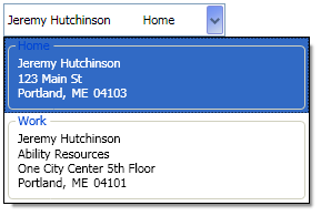
This is a WPF combobox that displays one line when closed and multiple lines when expanded.
Using the Code
The first thing I did was create the data templates that control how the address is going be displayed. When it's collapsed, I just wanted to show the AddressName and AddressType on one line:
<DataTemplate x:Key="AddressComboCollapsed" >
    <StackPanel Width="150" HorizontalAlignment="Stretch" >
        <DockPanel HorizontalAlignment="Stretch">
            <TextBlock Text="{Binding Path=AddressName}"
                       DockPanel.Dock="Left"
            />
            <TextBlock Text="{Binding Path=AddressType}"
                       DockPanel.Dock="Right"
                       HorizontalAlignment="Right"
            />
        </DockPanel>
    </StackPanel>
</DataTemplate>
When it's expanded, I want to show the whole address and suppress AddressLine2 if it's blank:
<DataTemplate x:Key="AddressComboExpanded" >
<GroupBox BorderThickness = "1"
Margin = "0,0,0,3"
Width = "Auto "
HorizontalAlignment = "Stretch"
Header = "{Binding Path=AddressType}">
<StackPanel Margin="3"
HorizontalAlignment="Stretch"
MinWidth="250">
<TextBlock Text = "{Binding Path=AddressName}"/>
<TextBlock Text = "{Binding Path=AddressLine1}"
Name = "tbAddr1"
/>
<TextBlock Text = "{Binding Path=AddressLine2}"
Name = "tbAddr2"
/>
<StackPanel Orientation = "Horizontal">
<TextBlock Text = "{Binding Path=City}" />
<TextBlock Text="," Padding="0,0,5,0"/>
<TextBlock Text = "{Binding Path=State}" Padding="0,0,5,0" />
<TextBlock Text = "{Binding Path=PostalCode}" />
</StackPanel>
</StackPanel>
</GroupBox>
<DataTemplate.Triggers>
<DataTrigger Binding = "{Binding Path=AddressLine2}" Value = "">
<Setter TargetName = "tbAddr2"
Property = "Visibility"
Value = "Collapsed"
/>
</DataTrigger>
</DataTemplate.Triggers>
</DataTemplate>
The step was to create a AddressTemplateSelector class that inherits from System.Windows.Controls.DataTemplateSelector.DataTemplateSelector, and override the SelectTemplate method.
public class AddressTemplateSelector : System.Windows.Controls.DataTemplateSelector
{
public override DataTemplate SelectTemplate(object item, DependencyObject container)
{
ContentPresenter presenter = (ContentPresenter)container;
if (presenter.TemplatedParent is ComboBox)
{
return (DataTemplate)presenter.FindResource("AddressComboCollapsed");
}
else
{
return (DataTemplate)presenter.FindResource("AddressComboExpanded");
}
}
}
After that, it's just a matter of importing the namespace of the DataTemplateSelector into the Window, merging the Resource Dictionary that contains the DataTemplates, and setting the ItemTemplateSelector of the ComboBox.
<ComboBox Height="30" Width="200"
            ItemsSource="{Binding Path=Addresses}">
    <ComboBox.ItemTemplateSelector>
        <dt:AddressTemplateSelector/>
    </ComboBox.ItemTemplateSelector>
</ComboBox>
Points of Interest
If you look closely at the templates, you'll notice that the expanded template is wider than both the combobox and the collapsed template. This allows you to have the list be wider than the original combobox. That'll be a nice feature when I move on to the state selection combo (display only StateCode, but show StateCode + StateName when expanded).
 General
  News
News  Suggestion
  Question
  Bug
Bug  Answer
  Joke
Joke  Praise
  Rant
Rant  Admin
Admin 


