Introduction
Many would have come across a scenario where-in you need to disable some of the items in comboBox based on business needs or project requirements. This tip will help you to do the same.
Using the Code
Step 1: Create Combobox in XAML and bind ItemSource of ComboBox
       <Window x:Class="ComboboxDisable.WPFComboboxWindow"
        xmlns="http://schemas.microsoft.com/winfx/2006/xaml/presentation"
        xmlns:x="http://schemas.microsoft.com/winfx/2006/xaml"
        Title="ComboboxItemDisable" Height="165" Width="332"
        xmlns:local="clr-namespace:ComboboxDisable">

    <Grid Height="130" Width="316">
        <ComboBox Height="23" HorizontalAlignment="Left"
        Margin="78,12,0,0" Name="comboBox1"
        VerticalAlignment="Top" Width="120"
                  ItemsSource="{Binding Items}"
                  Background="Bisque" Foreground="Black"
                  SelectedIndex="0" >
        </ComboBox>
    </Grid>
</Window>
Step 2: Create Class for Binding Itemsource with List<String> collections
public class ExampleClass
{
private List<String> items;
public List<String> Items
{
get { return items; }
set {items = value;}
}
public ExampleClass()
{
items = new List<String>();
items.Add("CollectionItem1");
items.Add("CollectionItem2");
items.Add("CollectionItem3");
items.Add("CollectionItem4");
items.Add("CollectionItem5");
}
}
Step 3: Create Converter Class for Disabling Items in ComboBox
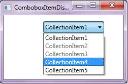
Below Converter will disable 2nd and 3rd Items from ComboBox [You can have your own custom logic for which condition the combobox item should be disabled].
namespace ComboboxDisable
{
class ComboboxDisableConverter : IValueConverter
{
public object Convert(object value, Type targetType,
object parameter, System.Globalization.CultureInfo culture)
{
if (value == null)
return value;
if (value == "CollectionItem2" ||
value == "CollectionItem3")
return true;
return false;
}
public object ConvertBack(object value, Type targetType,
object parameter, System.Globalization.CultureInfo culture)
{
throw new NotImplementedException();
}
}
}
Step 4: Now modify your XAML file by specifying the ItemContainerStyle for ComboBox and including Converter
//
<ComboBox.Resources>
<local:ComboboxDisableConverter x:Key="itemDisableconverter"/>
</ComboBox.Resources>
//
<ComboBox.ItemContainerStyle>
<Style TargetType="ComboBoxItem">
<Style.Triggers>
<DataTrigger Binding="{Binding Path=Content,
RelativeSource={RelativeSource Self},
Converter={StaticResource itemDisableconverter}}"
Value="true">
<Setter Property="IsEnabled"
Value="False"/>
</DataTrigger>
</Style.Triggers>
</Style>
</ComboBox.ItemContainerStyle>
By including the above set of blocks in your XAML, your final XAML will look like the below one:
<Window x:Class="ComboboxDisable.WPFComboboxWindow"
xmlns="http://schemas.microsoft.com/winfx/2006/xaml/presentation"
xmlns:x="http://schemas.microsoft.com/winfx/2006/xaml"
Title="ComboboxItemDisable" Height="165" Width="332"
xmlns:local="clr-namespace:ComboboxDisable">
<Grid Height="130" Width="316">
<ComboBox Height="23" HorizontalAlignment="Left"
Margin="78,12,0,0" Name="comboBox1"
VerticalAlignment="Top" Width="120"
ItemsSource="{Binding Items}"
Background="Bisque" Foreground="Black"
SelectedIndex="0" >
<ComboBox.Resources>
<local:ComboboxDisableConverter x:Key="itemDisableconverter"/>
</ComboBox.Resources>
<ComboBox.ItemContainerStyle>
<Style TargetType="ComboBoxItem">
<Style.Triggers>
<DataTrigger Binding="{Binding Path=Content,
RelativeSource={RelativeSource Self},
Converter={StaticResource itemDisableconverter}}"
Value="true">
<Setter Property="IsEnabled"
Value="False"/>
</DataTrigger>
</Style.Triggers>
</Style>
</ComboBox.ItemContainerStyle>
</ComboBox>
</Grid>
</Window>
Execute the project and open the comboBox. You will see the 2nd and 3rd items are disabled and user can't select them.
You also can download the same from the attachment at the top of this tip.
This member has not yet provided a Biography. Assume it's interesting and varied, and probably something to do with programming.


 General
  News
News  Suggestion
  Question
  Bug
Bug  Answer
  Joke
Joke  Praise
  Rant
Rant  Admin
Admin 


 Submit an article or tip

