Introduction
This tip presents an example of menu in responsive using bootstrap. Any kind of application menu is the key role because of navigation start over here. In this tip, I show how to design the menu in responsive mode like mobile, tablet, desktop, etc.
Background
Bootstrap
Bootstrap is the most popular for HTML, CSS and JS framework for developing responsive applications.
Responsive
Responsive means the single application will target any device like mobile, tablet, small PC and large PC.
Using the Code
Here is the code to display menu in responsive mode.
The JQuery is the top of all the .js libraries.
First, we need to include the required libraries.
//
// These are the required libraries
//

<link href="http://maxcdn.bootstrapcdn.com/bootstrap/3.2.0/css/bootstrap.min.css"
rel="stylesheet">
<script src="http://ajax.googleapis.com/ajax/libs/jquery/1.7.1/jquery.min.js"></script>
<script type="text/javascript"
src="http://maxcdn.bootstrapcdn.com/bootstrap/3.1.1/js/bootstrap.min.js"></script>
After including all required libraries, put your HTML menu code either static or dynamic.
Here is my code:
//
// This is the html code for menu
//
<nav class="navbar navbar-default" role="navigation"
style="border: 0; border-top: 1px solid #777777;
border-bottom: 1px solid #777777; background-color: #ffffff;">
<div class="container-fluid">
<!--
<div class="navbar-header">
<button type="button" class="navbar-toggle" data-toggle="collapse" data-target="#bs-example-navbar-collapse-1">
<span class="sr-only">Toggle navigation</span>
<span class="icon-bar"></span>
<span class="icon-bar"></span>
<span class="icon-bar"></span>
</button>
</div>
<!--
<div class="collapse navbar-collapse" id="bs-example-navbar-collapse-1">
<ul class="nav navbar-nav">
<li class="active" style="border-right:2px solid silver;">
<a href="#">Home</a></li>
<li style="border-right:2px solid silver;">
<a href="#">About Us</a></li>
<li class="dropdown" style="border-right:2px solid silver;">
<a href="#" class="dropdown-toggle"
data-toggle="dropdown">Technology <span class="caret"></span></a>
<ul class="dropdown-menu" role="menu">
<li><a href="#">.Net</a></li>
<li><a href="#">Java</a></li>
<li><a href="#">PHP</a></li>
<li class="divider"></li>
<li><a href="#">SqlServer</a></li>
<li><a href="#">MySql</a></li>
<li><a href="#">Oracle</a></li>
<li class="divider"></li>
<li><a href="#">Jquery</a></li>
<li><a href="#">JqueryUI</a></li>
<li><a href="#">Bootstrap</a></li>
<li><a href="#">AngularJs</a></li>
</ul>
</li>
<li class="dropdown" style="border-right:2px solid silver;">
<a href="#" class="dropdown-toggle"
data-toggle="dropdown">Services <span class="caret"></span></a>
<ul class="dropdown-menu" role="menu">
<li><a href="#">Banking</a></li>
<li><a href="#">Hospitality</a></li>
<li><a href="#">Education</a></li>
<li><a href="#">Government</a></li>
<li><a href="#">Travels</a></li>
<li><a href="#">Other Services</a></li>
</ul>
</li>
<li style="border-right:2px solid silver;">
<a href="#">Contact Us</a></li>
</ul>
<ul class="nav navbar-nav navbar-right">
<li><a href="#">Help</a></li>
</ul>
</div><!--
</div><!--
</nav>
After adding the code, just run it.
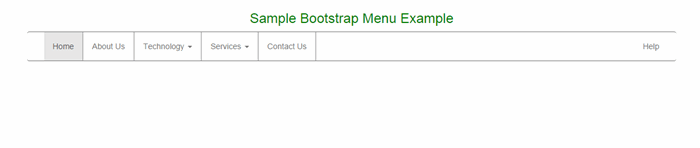
The initial output is like this:
Sometimes, we need dropdown in menu, so here I covered that as well.
When you click on Technology dropdown, the output is like this:

When you click on Services dropdown, the output is like this:
Finally in mobile view, the initial screen is like this:
When you click on the right side image, it toggles the menu. The output is like this:
Now, when you click on the Technology dropdown, the output is like this:
I hope everyone got a good idea of how to design the menu.
If you need any customization, then you can do it very easily.
Points of Interest
I am sincerely thankful to my seniors who encouraged, guided and helped me.
I like this very much because it is easier and it's very simple.
History


 General
  News
News  Suggestion
  Question
  Bug
Bug  Answer
  Joke
Joke  Praise
  Rant
Rant  Admin
Admin 


 Submit an article or tip


