|
I resent you a mail, also did so two days ago.
I remain joe!
|
|
|
|
|
That is weird: not had a thing! I've checked spam folders and everything: nothing!
I wonder if CP is holding it up. I'll send myself an email and see what happens.
Thanks for your interest.
"If you think it's expensive to hire a professional to do the job, wait until you hire an amateur." Red Adair.
Those who seek perfection will only find imperfection
nils illegitimus carborundum
me, me, me
me, in pictures
|
|
|
|
|
I just sent an email to you.
Use the best guess
|
|
|
|
|
Nothing. I sent myself one and it has not appeared. The email address is correct but I've not received a thing. Emailed the webmaster at CP yesterday but not heard anything back yet.
"If you think it's expensive to hire a professional to do the job, wait until you hire an amateur." Red Adair.
Those who seek perfection will only find imperfection
nils illegitimus carborundum
me, me, me
me, in pictures
|
|
|
|
|
I would be willing to test it out for you. I will send you a PM if you'd like instead of an email since I see you have been having troubles. Let me know if you still need some one to check it out.
|
|
|
|
|
Much appreciated: yes, that would be great.
Actually, it's open to view so any feedback would be much appreciated.
firearmagent.com
Still a work in progress so suggestions welcome.
"If you think it's expensive to hire a professional to do the job, wait until you hire an amateur." Red Adair.
Those who seek perfection will only find imperfection
nils illegitimus carborundum
me, me, me
me, in pictures
|
|
|
|
|
Hey, Sorry for the late reply. Here's my feedback.
The design is alright. It's not terribly bad, but it could be better. If you want some inspiration, you could check out Bootstrap[^] or Foundation[^] for free CSS frameworks or Theme Forest[^] for paid premium templates.
The images on the front page are squished. Try to size those with a standard ratio. The design could use more color. Again, check out the links above. The blue colors on the text in the front page listing make me think they are links, but they aren't. Blue text usually means links, so if you don't want those to be links then I would change the color.
The listing page is lacking in a lot. Again, I have to point back to those links above. It almost seems like you wrote the CSS on your own, from scratch. I admire that, but I would use a little help from a framework or a template. The "Return to Listing" button doesn't work. It doesn't take me anywhere. You might want to look at your code. The click to zoom link links to the same small image. I would try to get a bigger image to show in the zoom section instead of the same small image. That way the customer can get a better look at what they are considering purchasing.
When I go to search for a gun, it gets really complicated. Unless I know the exact gun (make, model, etc.) that I am looking for, I get pretty lost in the searching. Maybe create a simple search and an advanced search.
I'm not so sure what the point of the links page is. Is it a blog? Or like an RSS that will update with new links? Or is it a static page that you will update with links when you feel like it? It might be more simple to create a wrapper for another blog platform like Tumblr or something.
The Terms and Conditions and Privacy links are generally in the footer (which is also missing).
You could add a Captcha box to the contact form to deter spammers. I personally hate spammers and try my best to deter them as much as I can.
If you are looking for some good footer content, look no further than your About page. The bottom part of that page would make a great footer for the website. Otherwise, you could do a generic Copyright and link to the bottom part of the website. But you should have a footer.
That's what I have right now for you. I did not create an account and log in. If you want my feedback for that part of your website, I would rather you create an account for me and send me the credentials. Also, feel free to message me whenever if you have any more questions. I am always willing to help you out.
|
|
|
|
|
Thanks: really appreciate you looking at that and I'll certainly work on those points.
Note that the CSS is a framework! Plainly, not to everyone's liking! 
The images are all for testing: I'll add some more realistic ones!
Can you check the "Return to Listing" button again? Works for us on IE9 and Chrome.
The links are just... links to other sites and helpful or instructional videos. An FAQ will also be added later.
Footer: we felt the page looked cleaner without anything extraneous at the bottom.
Would you be able to create an account? That would test that functionality.
Again, thanks for your time: very much appreciated.
"If you think it's expensive to hire a professional to do the job, wait until you hire an amateur." Red Adair.
Those who seek perfection will only find imperfection
nils illegitimus carborundum
me, me, me
me, in pictures
|
|
|
|
|
Just want to get involved with fun projects outside of my job. website games would be fun
|
|
|
|
|
Are you still looking? I am working on a personal project with a few other people and it's been pretty much put on hold for a bit. If you still wanted to get on a team, we can take a look at what you can do. It's not a website game but a web application though.
Let me know.
|
|
|
|
|
hey guys.
I m looking for 1 or 2 people to start creating a RPG online game with HTML5, nodejs and any other technology that is needed.
the thing i have in mind is a 3d game with low res but good looking game like http://www.playtankworld.com/[^]
three js is awesome but i dont know if it's just in a point that such a game can be created with.
the alternative idea is a classic 2d sprite base game.
i have really good ideas in mind so it can be really awesome.
any suggestion, help will be appreciated.
|
|
|
|
|
with HTML5?? 
/* LIFE RUNS ON CODE */
|
|
|
|
|
Hey guys,
I've developed a site that I'd like to get some feedback on. I think it's ready for primetime but before I start trying to get actual users, I thought I'd ask the kind-hearted folks here on CP to help me out and shake out a few more bugs and give me some thoughts on the UI and usability.
The primary audience is criminal defense attorneys (I'll expand to others later) where they can keep track of their clients, and said clients’ bills and cases.
Any and all feedback is welcomed/begged for.
https://www.balaware.com/[^]
Thanks in advance,
Jeremy
|
|
|
|
|
The front page extends beyond the right-hand border of my browser, it would be much better if it adjusted itself to the window's dimensions. Other than that, there is nothing to see beyond a PDF file which I did not read. I think the services of a graphic designer would help you with your marketing strategy.
Use the best guess
|
|
|
|
|
Thanks for the feedback. What is your screen resolution?
I was hoping you'd sign up for an account and play with it from there. Feel free to put dummy info in if you don't want me to have it. I'm going to be deleting all the test info later anyway...
Thanks again,
Jeremy
|
|
|
|
|
Jeremy Rice wrote: What is your screen resolution?
Different from lots of others; which was the point of my comment. You cannot know what resolution any user will be at so you need to fix your pages to adjust to any one. But I do feel that your front page does not have a lot of visual appeal, nor does it really explain what the site is about.
Use the best guess
|
|
|
|
|
|
Just happened to come across this, don't know your status on this but if you are still testing, here's my input.
-Page keeps changing size depending on which aspx page your filling the content place holder with, e.g contact page is extremely thin.
-Your master page should always fill or at least appear to fill the browser.
-Logo is pixelated and needs anti-aliasing
-Lack of visual appeal... have to agree with Richard on this. In this day and age, if you want a professional looking site, the bare minimal is hover over effect for menus, yet nothing happens on your left menu, which really looks like you just stuffed some hyperlinks there.
Sorry but didn't have time to sign up and test the insides of it, but I'm sure you've tested that yourself, I know what you already done takes a good amount of work, but it could still be better.
|
|
|
|
|
In addition to the others that I agree with having the screen resident top left looks really amateurish, it should be centered or dynamic and vertically stable.
Never underestimate the power of human stupidity
RAH
|
|
|
|
|
I have to agree with the other guys.
There is a website called Theme Forest[^] that has a bunch of themes based on the Twitter Bootstrap framework that sometimes don't even resemble Bootstrap. They are cheap and very useable. If you are going to make money off your product, you can buy a $900 license or charge your customers and extra $15 or so whenever they sign up and then go buy another theme manually.
That might help your website design a lot. If you would like me to help you along this process, I certainly can. Just let me know.
|
|
|
|
|
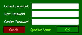
I have build a new software called "Speaker admin": http://www.greennaturesoft.com/products/spkad/
It use .Net framework 3.0.
Will it work in Vista, 7 and 8 without any installation of .Net framework (Vista comes with .net 3.0)?
I have only win7 - 32bit machine.
Can someone please test it for me in Vista, 7(64) and 8... (NO install / NO admin rights needed)
Download: http://www.greennaturesoft.com/products/spkad/spkad.zip
I will give you the activation code for free (Email the req code to info@greennaturesoft.com)
Thank you
|
|
|
|
|
I'm willing to help you out. I dual boot my 2 TB hard drive with Windows 7 (x64) and Windows 8 (x64). I also run Fedora Linux (not that applies :P). I also have VirtualBox that I can load up some other OSes and test for you.
Let me know if you want me to help you out. I can download the app tomorrow. Shoot me an email: tyler.candee@hotmail.com
Happy Coding!
|
|
|
|
|
|
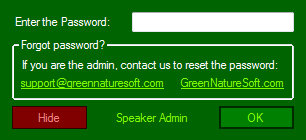
With respect to the screen (http://www.greennaturesoft.com/products/spkad/images/login.PNG[^]), I would go by an active email hyperlink which can open the default email client and/or default web browser. At the minimal, at least copying the said URL to windows clipboard is recommended.
Vasudevan Deepak Kumar
Personal Homepage
Tech Gossips
The woods are lovely, dark and deep,
But I have promises to keep,
And miles to go before I sleep,
And miles to go before I sleep!
|
|
|
|
|
Thank you very much,
I have corrected that (Email Link).
Please DOWNLOAD it from here. http://www.mediafire.com/?buf14dp8hsbnura[^]
Please give me the Request code (Press "Activate Full" in application window) to get the Activation code. My email: thusharaabc@gmail.com
Request code is based on your Hard Disk Serial number.
Thank for the Your Help
|
|
|
|


 General
  News
News  Suggestion
  Question
  Bug
Bug  Answer
  Joke
Joke  Praise
  Rant
Rant  Admin
Admin 


