Introduction
This article provides how to create a simple rollover button control in ASP.NET that can be used in different pages.
Background
While working on an ASP.NET project, my requirement was to create a rollover button in my application. Then, I searched for a solution in Google, and found different button-rollover tutorials available on the web, some using JavaScript and some using CSS. I then decided to create a rollover button server control of my own.
Basically, this control extends the ASP.NET Button and renders the button inside a table. The table contains three cells. The first cell renders the left rounded corner, the second cell contains the button, and the last cell renders the right rounded corner image. The CSS classes are used to display the rollover functionality.
The CustomButton class is defined under the Web.CustomControls namespace and extends the System.Web.UI.WebControls.Button class.
namespace Web.CustomControls
{
    [
    AspNetHostingPermission(SecurityAction.Demand,
        Level = AspNetHostingPermissionLevel.Minimal),
    AspNetHostingPermission(SecurityAction.InheritanceDemand,
        Level = AspNetHostingPermissionLevel.Minimal),

    DefaultProperty("Text"),
     ToolboxData("<{0}:CustomButton runat="\""server\"> </{0}:CustomButton>")
    ]
    [SecurityPermissionAttribute(SecurityAction.Demand,
     Flags = SecurityPermissionFlag.UnmanagedCode)]

    public class CustomButton : Button
Properties
There are two custom properties for this control: ShowImage and ImageURL.
[Bindable(true)]
[Category("Appearance")]
[Description("ShowImage")]
[DefaultValue(false)]
public bool ShowImage { get; set; }


[DefaultValue("")]
[Browsable(true)]
[UrlProperty]
public string ImageUrl
{
    get
    {
        return imgURL;
    }
    set
    {
        imgURL = value;
    }
}
ShowImage determines if there is any icon to be displayed with the button text. If ShowImage is true, then it renders an image in the button with the ImageUrl value.
Finally, the Render method renders the HTML to the browser.
protected override void Render(HtmlTextWriter writer)
{
    writer.AddAttribute(HtmlTextWriterAttribute.Id,
                        String.Format("tbl{0}", this.ID));
    writer.AddAttribute(HtmlTextWriterAttribute.Cellpadding, "0");
    writer.AddAttribute(HtmlTextWriterAttribute.Cellspacing, "0");
    writer.AddAttribute(HtmlTextWriterAttribute.Border, "0");
    writer.AddAttribute(HtmlTextWriterAttribute.Class, "imgBtnWrapperStd");
    if (!this.Enabled)
        writer.AddAttribute(HtmlTextWriterAttribute.Disabled, "disabled");
    writer.RenderBeginTag(HtmlTextWriterTag.Table);
    writer.RenderBeginTag(HtmlTextWriterTag.Tr);
    writer.AddAttribute(HtmlTextWriterAttribute.Class, "imgBtnLeftStd");
    writer.RenderBeginTag(HtmlTextWriterTag.Td);

    writer.RenderEndTag();

    writer.AddAttribute(HtmlTextWriterAttribute.Class, "btnContainer");
    writer.RenderBeginTag(HtmlTextWriterTag.Td);
    if (this.ShowImage)
    {

        writer.AddAttribute(HtmlTextWriterAttribute.Src,
                            ResolveClientUrl(this.ImageUrl));
        writer.AddAttribute(HtmlTextWriterAttribute.Align, "absMiddle");
        writer.RenderBeginTag(HtmlTextWriterTag.Img);
        writer.RenderEndTag();
    }
    writer.AddStyleAttribute(HtmlTextWriterStyle.BorderWidth, "0px");
    writer.AddStyleAttribute(HtmlTextWriterStyle.BackgroundColor,
                             "transparent");
    writer.AddStyleAttribute(HtmlTextWriterStyle.FontFamily,
                             "tahoma,arial,sans-serif");
    writer.AddStyleAttribute(HtmlTextWriterStyle.FontSize, "10pt");
    writer.AddStyleAttribute(HtmlTextWriterStyle.Color, "#FFF");
    writer.AddStyleAttribute(HtmlTextWriterStyle.FontWeight, "bold");
    writer.AddStyleAttribute(HtmlTextWriterStyle.Height, "19px");
    writer.AddAttribute(HtmlTextWriterAttribute.Class, "imgBtnStd");
    base.Render(writer);
    writer.RenderEndTag();
    writer.AddAttribute(HtmlTextWriterAttribute.Class, "imgBtnRightStd");
    writer.RenderBeginTag(HtmlTextWriterTag.Td);

    writer.RenderEndTag();
    writer.RenderEndTag();
    writer.RenderEndTag();
}
Using the code
This CustomButton can be used by creating a separate library and referencing it in your application, or by placing the CustomButton class in your App_Code folder. Here, I am going to discuss about the second approach.
In the ASPX page, register the control:
<%@ Register Namespace="Web.CustomControls" TagPrefix="cc1" %>
Add the following style tag in your page, or you can make a separate stylesheet.
<head>
    <title></title>
    <style type="text/css">
    .imgBtnWrapperStd{height:19px; margin:0; padding:0}
    .imgBtnLeftStd{background:transparent url(
      Images/Std_normal_left.gif) no-repeat; height:19px; width:4px}
    .imgBtnRightStd{background:transparent url(
      Images/Std_normal_right.gif) no-repeat; height:19px; width:4px}
    .imgBtnWrapperStd:hover .imgBtnLeftStd{
      background-image:url(Images/Std_hover_left.gif)}
    .imgBtnWrapperStd:hover .imgBtnRightStd{
      background-image:url(Images/Std_hover_right.gif)}
    .imgBtnWrapperStd:active .imgBtnLeftStd{
      background-image:url(Images/Std_active_left.gif)}
    .imgBtnWrapperStd:active .imgBtnRightStd{
      background-image:url(Images/Std_active_right.gif)}
    .imgBtnWrapperStd td.btnContainer, .imgBtnWrapperStd  input.imgBtnStd
{background:transparent url(Images/Std_normal.gif) repeat-x;
font-family:tahoma,arial,sans-serif; color:#FFF;
font-weight:bold; height:19px; font-size:10px; outline:none; cursor:pointer}
    .imgBtnWrapperStd:hover input.imgBtnStd{
      background:transparent url(Images/Std_hover.gif) repeat-x}
    .imgBtnWrapperStd:active input.imgBtnStd{
       background:transparent url(Images/Std_active.gif)
       repeat-x; outline:none}

    .imgBtnWrapperStd[disabled]
       .imgBtnLeftStd{background-image:url(Images/Std_disabled_left.gif)}
    .imgBtnWrapperStd[disabled]
      .imgBtnRightStd{background-image:url(Images/Std_disabled_right.gif)}

    .imgBtnWrapperStd[disabled] input.imgBtnStd,
    .imgBtnWrapperStd[disabled]:hover input.imgBtnStd
{background:transparent url(Images/Std_disabled.gif) repeat-x;
color:#ACA899; cursor:default}

    </style>
</head>
Finally, use the code for displaying the button:
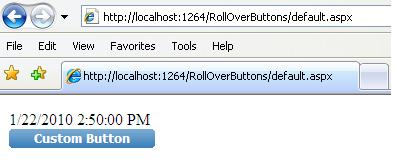
<cc1:CustomButton ID="btn" runat="server" Text="Custom Button" onclick="btn_Click" />
I am a Software Engineer and having 11+ years of experience in software industry. Currently working on a reputed MNC at Kolkata in C#,ASP.NET, SQL Server and JQuery.


 General
  News
News  Suggestion
  Question
  Bug
Bug  Answer
  Joke
Joke  Praise
  Rant
Rant  Admin
Admin 


 Submit an article or tip


