Introduction
After l lost a lot of time finding a perfect menu solution for VB.NET, I decided to write one myself. This menu system is simply incredible. The user can customize almost everything. It's upon the user how he/she wants to use the menus. Each of the menu item can be formatted. Each of the menu item will have forty five properties to play with. How does that sound? Cool yeah! Well, better start using it.
How to use UltimateMenus menus
To use this class, simply create a menu structure in Form Designer as you would usually create a Menu. Once you are happy with the layout of your Menu, just follow the simple steps as outlined below:
- Click on [Save All].
- Solution Explorer-->References-->Add Reference-->UltimateMenus.dll.
- Expand [#Region " Windows Forms Designer generated code "].
- Press Ctrl+A.
- Press Ctrl+H.
- Type [System.Windows.Forms.MenuItem] in the [Find what:] combobox.
- Type [UltimateMenus.KunalMenuItem] in the [Replace with:] combobox.
Note: The keywords are case sensitive. So type them carefully.
- Click [Replace All], then [Close].
- Click on [Save All] icon.
- Click on [Build --> Rebuild Solution].
Note: All steps are mandatory. They must be followed.
You will now have several new properties for each menu item, which can be accessed through the Properties window. These new properties have been assigned to the Appearance Category. If you add any new MenuItem, you will need to re-run the above steps.
Properties
BackColor
Use this property to set the BackColor of the MenuItems. To select more than one MenuItem, click on the first one and then click on the last MenuItem while pressing the Shift Key.
CheckedMenuItemBackColor
You can use either a tick mark or an icon to mention a checked MenuItem. Use this property to set the BackColor for the checked MenuItem’s indicator. Whether it is an icon or the tick mark.
CheckedMenuItemBorderColor
You can use either a tick mark or an icon to mention a checked MenuItem. Use this property to set the BorderColor for the rectangle of the checked MenuItem’s indicator. Whether it is an icon or the tick mark.
CheckedMenuItemDisabledBackColor
You can use either a tick mark or an icon to mention a checked MenuItem. Use this property to set the BackColor for the checked MenuItem’s indicator when the MenuItem is disabled. Whether it is an icon or the tick mark.
CheckedMenuItemIconShadowColor
You can use either a tick mark or an icon to mention a checked MenuItem. Use this property to set the ShadowColor for the checked MenuItem’s indicator when the MenuItem indicator is an icon.
CheckedMenuItemIconStyle
You can use either a tick mark or an icon to mention a checked MenuItem. Use this property to set the Style for the checked MenuItem’s indicator when the MenuItem indicator is an icon. It can be either of the following:
When the mouse hovers over the MenuItem:
IconShadow: A shadow beneath the icon is automatically created.
IconBump: All the four sides of the icon will seem to be raised up.
IconEtched: The icon will have a 3D border around it.
IconFlat: A flat look will be given to the icon.
IconRaisedInner: A box will popup around the icon.
IconRaisedOuter: The left and bottom side of the icon will be raised up.
IconSunken: The icon will go down by all sides.
IconSunkenInner: The right and top side of the icon will set down.
IconSunkenOuter: Almost similar to IconRaisedInner.
IconNone: No effect will take place.
CheckedMenuItemImage
Use this property to set the image for the checked MenuItem.
CheckedMenuItemStyle
You can use either a tick mark or an icon to mention a checked MenuItem. Use this property to select the style of the indicator for the checked MenuItem. It can be either of the following:
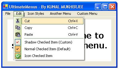
CheckedItemDefault: The default style. It will draw a tick mark as indicator. It will automatically set itself based upon the SideBarStyle property for Office2003 look.
CheckedItemIcon: The indicator is an icon. Use CheckedMenuItemImage property to set the image for the checked MenuItem.
CheckedItemTickMark: The indicator is a tick mark. Use CheckedMenuItemTickMarkColor property to customize the tick mark.
CheckedMenuItemTickMarkColor
Use this property to set the color of the tick mark when CheckedMenuItemStyle property is set to CheckedItemTickMark.
FillMenuBarItem
Use this property to confirm that a MenuItem should be filled with a color, if it is a MenuBar MenuItem.
Font
The font of the MenuItems.
ForeColor
The normal fore color of the MenuItems.
HiLightFont
The font of the MenuItem when the mouse hovers over the MenuItem.
HiLightForeColor
The normal fore color of the MenuItem when the mouse hovers over the MenuItem.
HiLightScheme
The highlight scheme for the MenuItem. It can be either of the following:
DefaultScheme: The default style. The highlight scheme is as same as that of VS.NET or Office XP. It is also automatically set for Office 2003 look when the SideBarStyle property is set to Office2003 Styles.
CustomScheme: You can set the back color and the border color of the highlight selection rectangle. Use HiLiteColor and HiLiteBorderColor properties accordingly for that.
PreDefinedSchemes: use some predefined color schemes for highlighting. Use the PreDefinedHiLiteColors property for that.
DefaultGradient: Use the default gradient mode for highlighting. It starts with CornFlowerBlue and ends with White color.
CustomGradient: Customize the gradient colors for Highlighting. Use the HiLiteGradientColor1, HiLiteGradientColor2, HiLiteGradientStyle, and HiLiteBorderColor properties for customizing the gradient effect.
PredefinedGradient: use some predefined gradient color schemes for highlighting. Use the PreDefinedHiLiteGradientColors property for that.
HiLiteBorderColor
The border color of the highlight rectangle.
HiLiteColor
The back color of the highlight rectangle.
HiLiteGradientColor1
The starting color for the gradient effect for highlighting when HiLightScheme property is set to CustomGradient.
HiLiteGradientColor2
The ending color for the gradient effect for highlighting when HiLightScheme property is set to CustomGradient.
HiLiteGradientStyle
The gradient mode for highlighting of MenuItems. It can be either of the following:
Horizontal: The gradient colors are drawn in a horizontal direction.
Vertical: The gradient colors are drawn in a vertical direction.
ForwardDiagonal: The gradient colors are drawn in a forward diagonal direction.
BackwardDiagonal: The gradient colors are drawn in a backward diagonal direction.
IconShadow: A shadow beneath the icon is automatically created.
IconBump: All the four sides of the icon will seem to be raised up.
IconEtched: The icon will have a 3D border around it.
IconFlat: A flat look will be given to the icon.
IconRaisedInner: A box will popup around the icon.
IconRaisedOuter: The left and bottom side of the icon will be raised up.
IconSunken: The icon will go down by all sides.
IconSunkenInner: The right and top side of the icon will set down.
IconSunkenOuter: Almost similar to IconRaisedInner.
IconNone: No effect will take place.
IconShadowColor
The shadow color of the icon when IconHiLiteStyle property is set to IconShadow.
Image
The image or icon for the sidebar of the MenuItem.
MakeCheckedMenuItemTransparent
If the supplied image for the checked MenuItem has a nontransparent and colored background, then set this property to True to make the image transparent.
MakeTransparentIcon
If the supplied image for the sidebar of the MenuItem has a nontransparent and colored background, then set this property to True to make the image transparent.
MenuBarItemBorderColor
The border color for the MenuBar MenuItem rectangle.
MenuBarItemFillColor
The back color of the MenuBar MenuItem rectangle.
MenuBarItemFillingStyle
The filling style of the MenuBar MenuItem. It can be either of the following:
FillColor: Fill the rectangle with a single color.
FillGradient: Use gradient colors for filling. Use MenuBarItemGradientColor1, MenuBarItemGradientColor2 properties for that.
MenuBarItemGradientColor1
The starting color for the gradient effect of the MenuBar MenuItem.
MenuBarItemGradientColor2
The ending color for the gradient effect of the MenuBar MenuItem.
MenuBarItemGradientStyle
The gradient mode for the MenuBar MenuItem. It can be either of the following:
Horizontal: The gradient colors are drawn in a horizontal direction.
Vertical: The gradient colors are drawn in a vertical direction.
ForwardDiagonal: The gradient colors are drawn in a forward diagonal direction.
BackwardDiagonal: The gradient colors are drawn in a backward diagonal direction.
Khaki
LightBlue
LightPink
LightGrey
DarkSeaGreen
YellowGreen
LightViolet
LightGreen
BrownWhite
GreenWhite
OrangeWhite
PurpleWhite
BrickRedWhiteSmoke
DarkKhakiWhite
MetalicWhite
MetalGreenWhiteSmoke
FadeBrownWhite
ShineyBlueYellow
ShowBorderAroundMenuBar
Use this property to determine if to show a border around the MenuBar MenuItem. True to show and False to not show.
ShowHiLiteOverSideBar
Set it to True to show the highlight rectangle over the sidebar of the MenuItem also. Otherwise set it to False.
ShowShadowUnderMenuBar
Set it to True to show a shadow under the MenuItem if it is a MenuBar MenuItem. Otherwise set it to False.
SideBarColor
The color of the sidebar of the MenuItem. Works when SideBarStyle is set to Standard.
SideBarStartColor
The starting color for the gradient effect of the sidebar of the MenuItem when SideBarStyle property is set to CustomGradient.
SideBarEndColor
The ending color for the gradient effect of the sidebar of the MenuItem when SideBarStyle property is set to CustomGradient.
SideBarGradientStyle
The gradient mode for the sidebar of the MenuItem. It can be either of the following:
Horizontal: The gradient colors are drawn in a horizontal direction.
Vertical: The gradient colors are drawn in a vertical direction.
ForwardDiagonal: The gradient colors are drawn in a forward diagonal direction.
BackwardDiagonal: The gradient colors are drawn in a backward diagonal direction.
Standard: the standard mode. You can set the sidebar color.
DefaultColor: The default color set. Looks like VS.NET IDE Menus.
DefaultGradient: The default gradient color set. Starts with CornFlowerBlue and ends with White color in horizontal mode.
CustomGradient: The custom gradient mode. You can specify the start and end color of the gradient. Use SideBarStartColor and SideBarEndColor properties for that.
PredefinedGradient: Use the PreDefinedSideBarGradientColor property to set the predefined gradient color set for the sidebar.
Office2003Blue: The Office 2003 look in WinXP Blue theme. If you choose this, then do not change other color properties; they will automatically reset them for the look.
Office2003OliveGreen: The Office 2003 look in WinXP Olive-Green theme. If you choose this, then do not change other color properties; they will automatically reset them for the look.
Office2003Silver: The Office 2003 look in WinXP Silver theme. If you choose this, then do not change other color properties; they will automatically reset them for the look.
Office2003Classic: The Office 2003 look in WinXP Classic theme. If you choose this, then do not change other color properties; they will automatically reset them for the look.
Shadow: When the mouse hovers over the checked MenuItem a shadow is displayed under the tick mark.
Normal: A normal tick mark is always displayed.
If you find any problem or bug when using UltimateMenus, please contact me at my e-mail ID.
Currently I am going through B.Sc.IT (5th Sem) from Manipal University. Programming is my hobby. I do it all the free time I can extract from my daily life. I have been programming since from last 1 year. I have done some small projects including some application level programms.


 General
  News
News  Suggestion
  Question
  Bug
Bug  Answer
  Joke
Joke  Praise
  Rant
Rant  Admin
Admin 


 Submit an article or tip


 component : congratulations ! And thanks !
 :
: .
. now are used to the following behaviour :