Abstract
OpenWPFChart library is the open source project at CodePlex. Its goal is to provide the component model along with base components (parts) to make it possible to assemble different Chart controls from these parts. Parts set is extensible so the developer can add its own new components. Chart controls composed from these parts could have an absolutely different look and feel.
Introduction
In the first article of the series, I've described what OpenWPFChart library Parts are and how they could be composed into Charts. In this article, some Chart control examples built from these Parts are presented.
OpenWPFChart library is intended to build Chart for the Parts. Custom Chart controls is one form of reusable components built in this manner. You should regard the controls described below as the examples on how you could develop your own Chart controls.
CurveChart Control
CurveChart Control is intended to display Chart Items with common Horizontal and Vertical ChartScale’s. All Chart Items Horizontal scales must have the same base type and the same must be true for Chart Items Vertical scales. In other respects, Chart Items data are unrelated. For example, CurveChart Control can display two sampled curves based on points sets with different abscissas sequences.
With this control, you can display any Chart Item that meets the requirements above. It can display curve Charts, scattered points, column charts, etc.
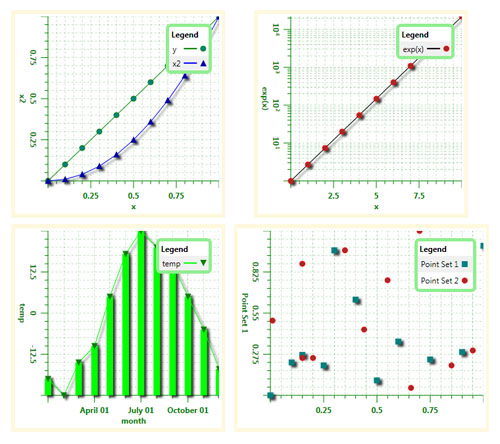
Figure 1. Curve Chart samples.
Note that the freedom in this control item types comes for some cost. If you display two Column chart items at the same chart CurveChart Control will not require that Column chart items have the same set of abscissas and will not do anything to group columns around equal abscissa value. For that purpose serves the ColumnChart Control discussed below.
Code
CurveChart Control extends WPF ListBox.
CurveChart Control has HorizontalScale and VerticalScale Dependency Properties of the ChartScale type with default values of null. By design, every ItemDataView object has its own HorizontalScale and VerticalScale properties of the same type. CurveChart Control guarantees that:
CurveChart Control HorizontalScale property and all its item's (ItemDataView objects) HorizontalScale properties point to the same ChartScale object. CurveChart Control VerticalScale property and all its item's (ItemDataView objects) VerticalScale properties point to the same ChartScale object.
To meet these requirements, CurveChart Control implements the following logic.
When CurveChart Control HorizontalScale or VerticalScale property changes, the new value is applied to all items in the Items collection. For example:
public static readonly DependencyProperty HorizontalScaleProperty
= DependencyProperty.Register("HorizontalScale",
typeof(ChartScale), typeof(CurveChart)
, new FrameworkPropertyMetadata(null
, FrameworkPropertyMetadataOptions.AffectsMeasure
| FrameworkPropertyMetadataOptions.AffectsRender
, HorizontalScalePropertyChanged
)
, HorizontalScaleValidate);
static void HorizontalScalePropertyChanged
(DependencyObject d, DependencyPropertyChangedEventArgs e)
{
CurveChart ths = d as CurveChart;
if (ths == null)
return;
foreach (var obj in ths.Items)
{
ItemDataView itemDataView = castToItemDataView(obj);
if (itemDataView != null)
{
try
{
itemDataView.HorizontalScale = ths.HorizontalScale;
}
catch (ArgumentException)
{
itemDataView.HorizontalScale = null;
}
}
}
}
static ItemDataView castToItemDataView(object obj)
{
ItemDataView itemDataView = obj as ItemDataView;
if (itemDataView == null)
{
Item item = obj as Item;
if (item != null)
itemDataView = item.ItemDataView;
}
return itemDataView;
}
When new items are added to the CurveChart Control Items collection:
- If the item is the first item in the
Items collection CurveChart Control Scale properties are set to corresponding item Scale properties. - Otherwise these items Scale properties are set to the corresponding
CurveChart Control Scale properties.
Furthermore, PropertyChanged event handler is attached to the items added. This handler forbids the change of items Scale properties.
Appropriate actions take place when items are removed, replaced, etc.
Every ItemDataView object has the VisualCue property which is used by the DataTemplateSelector as a hint to select the right template (see Chart Item Elements DataTemplates in the first article of the series).
protected override void OnItemsChanged(NotifyCollectionChangedEventArgs e)
{
base.OnItemsChanged(e);
switch (e.Action)
{
case NotifyCollectionChangedAction.Add:
foreach (object obj in e.NewItems)
{
ItemDataView itemDataView = castToItemDataView(obj);
if (itemDataView != null)
{
setCommonChartScales(itemDataView);
itemDataView.PropertyChanged += item_PropertyChanged;
}
}
break;
case NotifyCollectionChangedAction.Remove:
foreach (object obj in e.OldItems)
{
ItemDataView itemDataView = castToItemDataView(obj);
if (itemDataView != null)
itemDataView.PropertyChanged -= item_PropertyChanged;
}
break;
case NotifyCollectionChangedAction.Replace:
foreach (object obj in e.OldItems)
{
ItemDataView itemDataView = castToItemDataView(obj);
if (itemDataView != null)
itemDataView.PropertyChanged -= item_PropertyChanged;
}
foreach (object obj in e.NewItems)
{
ItemDataView itemDataView = castToItemDataView(obj);
if (itemDataView != null)
{
setCommonChartScales(itemDataView);
itemDataView.PropertyChanged += item_PropertyChanged;
}
}
break;
case NotifyCollectionChangedAction.Reset:
foreach (object obj in Items)
{
ItemDataView itemDataView = castToItemDataView(obj);
if (itemDataView != null)
{
setCommonChartScales(itemDataView);
itemDataView.PropertyChanged += item_PropertyChanged;
}
}
break;
}
if (Items.Count == 0)
{
HorizontalScale = null;
VerticalScale = null;
}
}
void setCommonChartScales(ItemDataView itemDataView)
{
if (HorizontalScale == null)
HorizontalScale = itemDataView.HorizontalScale;
else
itemDataView.HorizontalScale = HorizontalScale;
if (VerticalScale == null)
VerticalScale = itemDataView.VerticalScale;
else
itemDataView.VerticalScale = VerticalScale;
}
private void item_PropertyChanged(object sender, PropertyChangedEventArgs e)
{
ItemDataView itemDataView = castToItemDataView(sender);
if (itemDataView == null)
return;
if (e.PropertyName.StartsWith("HorizontalScale"))
{
Debug.Assert(HorizontalScale != null, "HorizontalScale != null");
if (!object.ReferenceEquals(itemDataView.HorizontalScale, HorizontalScale))
itemDataView.HorizontalScale = HorizontalScale;
}
else if (e.PropertyName.StartsWith("VerticalScale"))
{
Debug.Assert(VerticalScale != null, "VerticalScale != null");
if (!object.ReferenceEquals(itemDataView.VerticalScale, VerticalScale))
itemDataView.VerticalScale = VerticalScale;
}
if (e.PropertyName == "VisualCue")
{
DataTemplateSelector old = ItemTemplateSelector;
ItemTemplateSelector = null;
ItemTemplateSelector = old;
}
}
Unfortunately there is no nice way to force the DataTemplateSelector to reselect templates when this property changes. The workaround is to set CurveChart Control ItemTemplateSelector property to null and then back to the old DataTemplateSelector value.
Default Style
CurveChart default style defines two coordinate grids below the Chart Item Elements (in Z-order) and two coordinate axes at the left and at the bottom of the Chart Area. It looks like follows:

Figure 2. CurveChart control default style elements hierarchy.
<Setter Property="Template">
<Setter.Value>
<ControlTemplate TargetType="{x:Type local:CurveChart}">
<Border Name="Bd"
BorderThickness="{TemplateBinding Border.BorderThickness}"
BorderBrush="{TemplateBinding Border.BorderBrush}"
Background="{TemplateBinding Panel.Background}"
Padding="1,1,1,1"
SnapsToDevicePixels="True">
<ScrollViewer HorizontalScrollBarVisibility="Auto"
VerticalScrollBarVisibility="Auto"
Padding="{TemplateBinding Control.Padding}" Focusable="False">
<Grid ShowGridLines="False">
<Grid.RowDefinitions>
<RowDefinition/>
<RowDefinition/>
</Grid.RowDefinitions>
<Grid.ColumnDefinitions>
<ColumnDefinition/>
<ColumnDefinition/>
</Grid.ColumnDefinitions>
<Grid Grid.Row="1" Grid.Column="1" Focusable="False">
<Grid.Resources>
<DataTemplate DataType="{x:Type parts:ChartLinearScale}">
<parts:LinearAxis AxisScale="{Binding}"
LabelFormat="{Binding Path=HorizontalAxisLabelFormat,
RelativeSource={RelativeSource FindAncestor,
AncestorType={x:Type local:CurveChart}}}"/>
</DataTemplate>
<DataTemplate DataType="{x:Type parts:ChartLogarithmicScale}">
<parts:LogarithmicAxis AxisScale="{Binding}"
LabelFormat="{Binding Path=HorizontalAxisLabelFormat,
RelativeSource={RelativeSource FindAncestor,
AncestorType={x:Type local:CurveChart}}}"/>
</DataTemplate>
<DataTemplate DataType="{x:Type parts:ChartDateTimeScale}">
<parts:DateTimeAxis AxisScale="{Binding}"
LabelFormat="{Binding Path=HorizontalAxisLabelFormat,
RelativeSource={RelativeSource FindAncestor,
AncestorType={x:Type local:CurveChart}}}"/>
</DataTemplate>
<DataTemplate DataType="{x:Type parts:ChartSeriesScale}">
<parts:SeriesAxis AxisScale="{Binding}"
LabelFormat="{Binding Path=HorizontalAxisLabelFormat,
RelativeSource={RelativeSource FindAncestor,
AncestorType={x:Type local:CurveChart}}}"/>
</DataTemplate>
</Grid.Resources>
<Grid.RowDefinitions>
<RowDefinition/>
<RowDefinition/>
</Grid.RowDefinitions>
<ContentPresenter Name="PART_HorizontalAxisHost"
Content="{TemplateBinding HorizontalScale}" Focusable="False"/>
<TextBlock Grid.Row="1" HorizontalAlignment="Center"
Text="{TemplateBinding HorizontalAxisTitle}"
Foreground="{Binding RelativeSource={RelativeSource TemplatedParent}
, Path=(parts:Axis.Pen).Brush}"/>
</Grid>
<Grid Focusable="False">
<Grid.Resources>
<DataTemplate DataType="{x:Type parts:ChartLinearScale}">
<parts:LinearAxis AxisScale="{Binding}"
LabelFormat="{Binding Path=VerticalAxisLabelFormat,
RelativeSource={RelativeSource FindAncestor,
AncestorType={x:Type local:CurveChart}}}"/>
</DataTemplate>
<DataTemplate DataType="{x:Type parts:ChartLogarithmicScale}">
<parts:LogarithmicAxis AxisScale="{Binding}"
LabelFormat="{Binding Path=VerticalAxisLabelFormat,
RelativeSource={RelativeSource FindAncestor,
AncestorType={x:Type local:CurveChart}}}"/>
</DataTemplate>
<DataTemplate DataType="{x:Type parts:ChartDateTimeScale}">
<parts:DateTimeAxis AxisScale="{Binding}"
LabelFormat="{Binding Path=VerticalAxisLabelFormat,
RelativeSource={RelativeSource FindAncestor,
AncestorType={x:Type local:CurveChart}}}"/>
</DataTemplate>
<DataTemplate DataType="{x:Type parts:ChartSeriesScale}">
<parts:SeriesAxis AxisScale="{Binding}"
LabelFormat="{Binding Path=VerticalAxisLabelFormat,
RelativeSource={RelativeSource FindAncestor,
AncestorType={x:Type local:CurveChart}}}"/>
</DataTemplate>
</Grid.Resources>
<Grid.RowDefinitions>
<RowDefinition/>
<RowDefinition/>
</Grid.RowDefinitions>
<ContentPresenter Name="PART_VerticalAxisHost"
Content="{TemplateBinding VerticalScale}" Focusable="False"/>
<TextBlock Grid.Row="1" HorizontalAlignment="Center"
Text="{TemplateBinding VerticalAxisTitle}"
Foreground="{Binding RelativeSource={RelativeSource TemplatedParent}
, Path=(parts:Axis.Pen).Brush}"/>
<Grid.LayoutTransform>
<RotateTransform Angle="90"/>
</Grid.LayoutTransform>
</Grid>
<Grid Grid.Column="1">
<parts:Grid Name="PART_VerticalGrid"
HorizontalScale="{TemplateBinding HorizontalScale}"
VerticalScale="{TemplateBinding VerticalScale}"
GridVisibility="{TemplateBinding VerticalGridVisibility}"
/>
<parts:Grid Name="PART_HorizontalGrid" Orientation="Horizontal"
HorizontalScale="{TemplateBinding HorizontalScale}"
VerticalScale="{TemplateBinding VerticalScale}"
GridVisibility="{TemplateBinding HorizontalGridVisibility}"
/>
<ItemsPresenter Name="PART_ItemsHost"
SnapsToDevicePixels="{TemplateBinding UIElement.SnapsToDevicePixels}" />
</Grid>
</Grid>
</ScrollViewer>
</Border>
<ControlTemplate.Triggers>
<Trigger Property="UIElement.IsEnabled">
<Trigger.Value>
<sys:Boolean>False</sys:Boolean>
</Trigger.Value>
<Setter Property="Panel.Background" TargetName="Bd">
<Setter.Value>
<DynamicResource ResourceKey="{x:Static SystemColors.ControlBrushKey}" />
</Setter.Value>
</Setter>
</Trigger>
</ControlTemplate.Triggers>
</ControlTemplate>
</Setter.Value>
</Setter>
Three top elements are the Border, the ScrollViewer and the WPF Grid. The latter is the container for all CurveChart elements. It contains three elements: Horizontal Axis Container, Vertical Axis Container and Chart Area. All three elements are WPF Grid’s as well.
Every Axis Container has two elements: the Axis Host (the ContentPresenter object) and the Axis Label (the TextBlock object). Axes Containers are bound to the CurveChart control HorizontalScale and VerticalScale properties; these binding are resolved to the Axis elements through the Axes Data Templates defined somewhere in the CurveChart Control Style Resources.
The Chart Area contains three elements: Horizontal Grid, Vertical Grid and the ItemsPresenter. Grids are bound to the CurveChart Control HorizontalScale and VerticalScale properties. ItemsPresenter presents CurveChart ItemDataView object items provided with either Items or ItemsSource properties through the Item Data Templates defined somewhere in the CurveChart Control Style Resources.
ColumnChart Control
OpenWPFChart ColumnChart Control is intended to display Chart Items points as columns. In addition it can display the curve connecting the points and point markers.
All Chart Items have common Horizontal and Vertical ChartScales. Chart Items Horizontal scales must have the same base type. The same must be true for Chart Items Vertical scales. ColumnChart Control requires Chart Items have the same set of abscissas for column presentation or ordinates for bar presentation. ColumnChart Control groups columns from different Chart Items data series around equal abscissas or ordinates.
Figure 3. Column Chart samples.
Code
OpenWPFChart ColumnChart Control extends WPF ListBox.
Unlike CurveChart Control, ColumnChart Control displays only data wrapped into ColumnChartItemDataView objects.
ColumnChart Control has HorizontalScale and VerticalScale Dependency Properties of the ChartScale type with default values of null.
By design, every ItemDataView object has its own HorizontalScale and VerticalScale properties of ChartScale type. ColumnChart Control has HorizontalScale and VerticalScale properties, too. ColumnChart Control guarantees that:
ColumnChart Control HorizontalScale property and all its item's (ItemDataView objects) HorizontalScale properties point to the same ChartScale object. ColumnChart Control VerticalScale property and all its item's (ItemDataView objects) VerticalScale properties point to the same ChartScale object.
To meet these requirements, ColumnChart Control implements the following logic.
When ColumnChart Control HorizontalScale or VerticalScale property changes the new value is applied to all items in the Items collection.
When new items are added to the ColumnChart Control Items collection:
- If the item is the first item in the Items collection
ColumnChart Control Scale properties are set to corresponding item Scale properties. - Otherwise these items Scale properties are set to the corresponding
ColumnChart Control Scale properties.
Furthermore, PropertyChanged event handler is attached to the items added. This handler forbids the change of items Scale properties.
Appropriate actions take place when items are removed, replaced, etc.
In addition to Chart Scales management ColumnChart Control takes the actions to ensure that the items passed to it are legal to display and that all of them have the same orientation and column width.
When new item is added to the ColumnChart Control:
- The control checks if the item is based on the
ColumnChartItemDataView type. If it is not, it's excluded from the view by setting the item HorizontalScale and VerticalScale properties to null. - The control sets the items
Orientation property to the value of its own Orientation property. If the value of latter changes later the control sets new value to all items Orientation properties. - The control sets the items
ColumnWidth property to the value of ColumnWidth property. If the value of latter changes later the control sets new value to all items ColumnWidth properties.
protected override void OnItemsChanged(NotifyCollectionChangedEventArgs e)
{
base.OnItemsChanged(e);
switch (e.Action)
{
case NotifyCollectionChangedAction.Add:
foreach (object obj in e.NewItems)
{
ItemDataView itemDataView = castToItemDataView(obj);
if (itemDataView != null)
{
setCommonProperties(itemDataView);
if (itemDataView.HorizontalScale != null)
itemDataView.PropertyChanged += item_PropertyChanged;
}
}
break;
case NotifyCollectionChangedAction.Remove:
foreach (object obj in e.OldItems)
{
ItemDataView itemDataView = castToItemDataView(obj);
if (itemDataView != null && itemDataView.HorizontalScale != null)
itemDataView.PropertyChanged -= item_PropertyChanged;
}
break;
case NotifyCollectionChangedAction.Replace:
foreach (object obj in e.OldItems)
{
ItemDataView itemDataView = castToItemDataView(obj);
if (itemDataView != null && itemDataView.HorizontalScale != null)
itemDataView.PropertyChanged -= item_PropertyChanged;
}
foreach (object obj in e.NewItems)
{
ItemDataView itemDataView = castToItemDataView(obj);
if (itemDataView != null)
{
setCommonProperties(itemDataView);
if (itemDataView.HorizontalScale != null)
itemDataView.PropertyChanged += item_PropertyChanged;
}
}
break;
case NotifyCollectionChangedAction.Reset:
foreach (object obj in Items)
{
ItemDataView itemDataView = castToItemDataView(obj);
if (itemDataView != null)
{
setCommonProperties(itemDataView);
if (itemDataView.HorizontalScale != null)
itemDataView.PropertyChanged += item_PropertyChanged;
}
}
break;
}
if (Items.Count == 0)
{
HorizontalScale = null;
VerticalScale = null;
}
}
void setCommonProperties(ItemDataView itemDataView)
{
ColumnChartItemDataView columnItemDataView = itemDataView as ColumnChartItemDataView;
if (columnItemDataView == null)
{
itemDataView.HorizontalScale = null;
itemDataView.VerticalScale = null;
return;
}
columnItemDataView.Orientation = Orientation;
columnItemDataView.ColumnWidth = ColumnWidth;
if (HorizontalScale == null)
HorizontalScale = itemDataView.HorizontalScale;
else
{
if (CompareCoordinateSeries(columnItemDataView))
itemDataView.HorizontalScale = HorizontalScale;
else
{
itemDataView.HorizontalScale = null;
itemDataView.VerticalScale = null;
return;
}
}
if (VerticalScale == null)
VerticalScale = itemDataView.VerticalScale;
else
{
if (CompareCoordinateSeries(columnItemDataView))
itemDataView.VerticalScale = VerticalScale;
else
{
itemDataView.HorizontalScale = null;
itemDataView.VerticalScale = null;
}
}
}
bool CompareCoordinateSeries(ColumnChartItemDataView itemDataView)
{
ColumnChartItemDataView firstItemDataView = null;
foreach (object obj in Items)
{
firstItemDataView = castToItemDataView(obj) as ColumnChartItemDataView;
if (firstItemDataView != null)
break;
}
if (firstItemDataView == null)
return false;
if (Orientation == OpenWPFChart.Parts.Orientation.Horizontal)
return firstItemDataView.ItemData.IsAbscissasEqual(itemDataView.ItemData);
else
return firstItemDataView.ItemData.IsOrdinatesEqual(itemDataView.ItemData);
}
ColumnChart Control must displays multiple data series data points columns side by side. To do that, it shifts ColumnChartItem visual elements at the appropriate distance. All work is done by the custom ColumnChartPanel class. This class is derived from the WPF Panel and overrides its MeasureOverride and ArrangeOverride methods.
public class ColumnChartPanel : Panel
{
  protected override Size MeasureOverride(Size availableSize)
  {
    foreach (UIElement child in Children)
    {
      child.Measure(new Size(double.PositiveInfinity, double.PositiveInfinity));
    }
    return Size.Empty;
  }

  protected override Size ArrangeOverride(Size finalSize)
  {
    double columnWidth = 0d;
    int visibleChildrenCount = 0;
    foreach (UIElement child in Children)
    {
      ColumnChartItemDataView itemDataView = getItemDataView(child);
      if (itemDataView == null)
        continue;
      if (visibleChildrenCount++ == 0)
        columnWidth = itemDataView.ColumnWidth;
    }
    if (visibleChildrenCount == 0)
      return finalSize;

    double offset = -0.5 * columnWidth * (visibleChildrenCount - 1);
    foreach (UIElement child in Children)
    {
      if (getItemDataView(child) == null)
        continue;

      child.Arrange(new Rect(new Point(offset, 0), child.DesiredSize));
      offset += columnWidth;
    }
    return finalSize;
  }

  static ColumnChartItemDataView getItemDataView(UIElement item)
  {
    FrameworkElement fe = item as FrameworkElement;
    if (fe == null)
      return null;
    return fe.DataContext as ColumnChartItemDataView;
  }
}
The ColumnChartPanel object is then set as ItemsControl ItemsPanel in the ColumnChart Control Style.
<Setter Property="ItemsPanel">
  <Setter.Value>
    <ItemsPanelTemplate>
      <local:ColumnChartPanel />
    </ItemsPanelTemplate>
  </Setter.Value>
</Setter>
Default Style
ColumnChart Control default style defines two coordinate grids below the Chart Item Elements (in Z-order) and two coordinate axes at the left and at the bottom of the Chart Area. It looks like follows:
Figure 4. ColumnChart control default style elements hierarchy.
<Setter Property="Template">
<Setter.Value>
<ControlTemplate TargetType="{x:Type local:ColumnChart}">
<Border Name="Bd"
BorderThickness="{TemplateBinding Border.BorderThickness}"
BorderBrush="{TemplateBinding Border.BorderBrush}"
Background="{TemplateBinding Panel.Background}"
Padding="1,1,1,1"
SnapsToDevicePixels="True">
<ScrollViewer HorizontalScrollBarVisibility="Auto"
VerticalScrollBarVisibility="Auto"
Padding="{TemplateBinding Control.Padding}" Focusable="False">
<Grid ShowGridLines="False">
<Grid.RowDefinitions>
<RowDefinition/>
<RowDefinition/>
</Grid.RowDefinitions>
<Grid.ColumnDefinitions>
<ColumnDefinition/>
<ColumnDefinition/>
</Grid.ColumnDefinitions>
<Grid Grid.Row="1" Grid.Column="1" Focusable="False">
<Grid.Resources>
<DataTemplate DataType="{x:Type parts:ChartLinearScale}">
<parts:LinearAxis AxisScale="{Binding}"
LabelFormat="{Binding Path=HorizontalAxisLabelFormat,
RelativeSource={RelativeSource FindAncestor,
AncestorType={x:Type local:ColumnChart}}}"/>
</DataTemplate>
<DataTemplate DataType="{x:Type parts:ChartLogarithmicScale}">
<parts:LogarithmicAxis AxisScale="{Binding}"
LabelFormat="{Binding Path=HorizontalAxisLabelFormat,
RelativeSource={RelativeSource FindAncestor,
AncestorType={x:Type local:ColumnChart}}}"/>
</DataTemplate>
<DataTemplate DataType="{x:Type parts:ChartDateTimeScale}">
<parts:DateTimeAxis AxisScale="{Binding}"
LabelFormat="{Binding Path=HorizontalAxisLabelFormat,
RelativeSource={RelativeSource FindAncestor,
AncestorType={x:Type local:ColumnChart}}}"/>
</DataTemplate>
<DataTemplate DataType="{x:Type parts:ChartSeriesScale}">
<parts:SeriesAxis AxisScale="{Binding}"
LabelFormat="{Binding Path=HorizontalAxisLabelFormat,
RelativeSource={RelativeSource FindAncestor,
AncestorType={x:Type local:ColumnChart}}}"/>
</DataTemplate>
</Grid.Resources>
<Grid.RowDefinitions>
<RowDefinition Height="Auto"/>
<RowDefinition Height="Auto"/>
</Grid.RowDefinitions>
<ContentPresenter Name="PART_HorizontalAxisHost"
Content="{TemplateBinding HorizontalScale}" Focusable="False"/>
<TextBlock Grid.Row="1" HorizontalAlignment="Center"
Text="{TemplateBinding HorizontalAxisTitle}"
Foreground="{Binding RelativeSource={RelativeSource TemplatedParent}
, Path=(parts:Axis.Pen).Brush}"/>
</Grid>
<Grid Focusable="False">
<Grid.Resources>
<DataTemplate DataType="{x:Type parts:ChartLinearScale}">
<parts:LinearAxis AxisScale="{Binding}"
LabelFormat="{Binding Path=VerticalAxisLabelFormat,
RelativeSource={RelativeSource FindAncestor,
AncestorType={x:Type local:ColumnChart}}}"/>
</DataTemplate>
<DataTemplate DataType="{x:Type parts:ChartLogarithmicScale}">
<parts:LogarithmicAxis AxisScale="{Binding}"
LabelFormat="{Binding Path=VerticalAxisLabelFormat,
RelativeSource={RelativeSource FindAncestor,
AncestorType={x:Type local:ColumnChart}}}"/>
</DataTemplate>
<DataTemplate DataType="{x:Type parts:ChartDateTimeScale}">
<parts:DateTimeAxis AxisScale="{Binding}"
LabelFormat="{Binding Path=VerticalAxisLabelFormat,
RelativeSource={RelativeSource FindAncestor,
AncestorType={x:Type local:ColumnChart}}}"/>
</DataTemplate>
<DataTemplate DataType="{x:Type parts:ChartSeriesScale}">
<parts:SeriesAxis AxisScale="{Binding}"
LabelFormat="{Binding Path=VerticalAxisLabelFormat,
RelativeSource={RelativeSource FindAncestor,
AncestorType={x:Type local:ColumnChart}}}"/>
</DataTemplate>
</Grid.Resources>
<Grid.RowDefinitions>
<RowDefinition Height="Auto"/>
<RowDefinition Height="Auto"/>
</Grid.RowDefinitions>
<ContentPresenter Name="PART_VerticalAxisHost"
Content="{TemplateBinding VerticalScale}" Focusable="False"/>
<TextBlock Grid.Row="1" HorizontalAlignment="Center"
Text="{TemplateBinding VerticalAxisTitle}"
Foreground="{Binding RelativeSource={RelativeSource TemplatedParent}
, Path=(parts:Axis.Pen).Brush}"/>
<Grid.LayoutTransform>
<RotateTransform Angle="90"/>
</Grid.LayoutTransform>
</Grid>
<Grid Grid.Column="1">
<parts:Grid Name="PART_VerticalGrid"
HorizontalScale="{TemplateBinding HorizontalScale}"
VerticalScale="{TemplateBinding VerticalScale}"
GridVisibility="{TemplateBinding VerticalGridVisibility}"
/>
<parts:Grid Name="PART_HorizontalGrid" Orientation="Horizontal"
HorizontalScale="{TemplateBinding HorizontalScale}"
VerticalScale="{TemplateBinding VerticalScale}"
GridVisibility="{TemplateBinding HorizontalGridVisibility}"
/>
<ItemsPresenter Name="PART_ItemsHost"
SnapsToDevicePixels="{TemplateBinding UIElement.SnapsToDevicePixels}" />
</Grid>
</Grid>
</ScrollViewer>
</Border>
</ControlTemplate>
</Setter.Value>
</Setter>
Three top elements are WPF Border, ScrollViewer and Grid. The latter is the container for all ColumnChart elements. It contains three elements: Horizontal Axis Container, Vertical Axis Container and Chart Area. All three elements are WPF Grid’s as well.
Every Axis Container has two elements: the Axis Host (the ContentPresenter object) and the Axis Label (the TextBlock object). Axes Containers are bound to the ColumnChart control HorizontalScale and VerticalScale properties; these binding are resolved to the Axis elements through the Axes Data Templates defined somewhere in the ColumnChart Control Style Resources.
The Chart Area contains three elements: Horizontal Grid, Vertical Grid and the ItemsPresenter. Grids are bound to the ColumnChart Control HorizontalScale and VerticalScale properties. ItemsPresenter presents ColumnChart ItemDataView object items provided with either Items or ItemsSource properties through the Item Data Templates defined somewhere in the ColumnChart Control Style Resources.
WellLogChart Control
OpenWPFChart WellLogChart Control is intended to display Well Log curves and other pertinent information (Chart Items) as is the convention in the oil/gas industry.
Note. Well Logging is the important part of oil and gas fields research and exploration required to find where (if at all) productive layers are located, what they are and what is in their neighborhood. Well Logging measurement tools get down into the borehole and pass their data to the surface through the cable.
By convention Well Log curves are displayed with the common linear vertical Depth axis but each curve has its own horizontal value axis which can have any scale type.
Figure 5. WellLog Chart samples.
Code
WellLogChart Control has the DepthScale Dependency Property of the ChartScale type with default values of null. Because WellLogChart curves should be displayed vertically this DepthScale property relates to ItemDataView HorizontalScale property. WellLogChart Control guarantees that its DepthScale property and all its item’s (ItemDataView objects) HorizontalScale properties point to the same ChartScale object.
To meet this requirement, WellLogChart Control implements the following logic.
When WellLogChart Control DepthScale property changes, the new value is applied to the HorizontalScale property of all items in the WellLogChart Items collection.
When new items are added to the WellLogChart Control Items collection:
- If the item is the first item in the
Items collection WellLogChart Control DepthScale property is set to the item HorizontalScale property. - Otherwise this item
HorizontalScale property is set to the WellLogChart Control DepthScale property.
Furthermore, PropertyChanged event handler is attached to the items added. This handler forbids the change of items HorizontalScale property.
Appropriate actions take place when items are removed, replaced, etc.
Every ItemDataView object has the VisualCue property which is used by the DataTemplateSelector as a hint to select the right template.
Default Style
The WellLogChart Control default style defines two coordinate grids below Well Log curves (in Z-order), linear vertical Depth axis at the left of the Chart Area and WellLog header at the top. WellLog header presents the list of Well Log curves value axes. The WellLogChart Control default style looks like follows:
Figure 6. WellLogChart control default style elements hierarchy.
<Setter Property="Template">
<Setter.Value>
<ControlTemplate TargetType="{x:Type local:WellLogChart}">
<Border Name="Bd"
BorderThickness="{TemplateBinding Border.BorderThickness}"
BorderBrush="{TemplateBinding Border.BorderBrush}"
Background="{TemplateBinding Panel.Background}"
Padding="1,1,1,1"
SnapsToDevicePixels="True">
<ScrollViewer
HorizontalScrollBarVisibility="Auto" VerticalScrollBarVisibility="Auto"
Padding="{TemplateBinding Control.Padding}" Focusable="False">
<Grid ShowGridLines="False"
Visibility="{Binding RelativeSource={RelativeSource TemplatedParent},
Path=Items.Count, Converter={StaticResource itemCountToVisibility}}">
<Grid.RowDefinitions>
<RowDefinition Height="Auto"/>
<RowDefinition Height="Auto"/>
</Grid.RowDefinitions>
<Grid.ColumnDefinitions>
<ColumnDefinition/>
<ColumnDefinition/>
</Grid.ColumnDefinitions>
<ListBox Grid.Column="1" VerticalAlignment="Top"
ItemsSource="{Binding RelativeSource=
{RelativeSource TemplatedParent}, Path=ItemsSource}"
ItemTemplate="{StaticResource SampledCurveHeaderTemplate}"
SelectedItem="{Binding RelativeSource=
{RelativeSource TemplatedParent}, Path=SelectedItem}"
HorizontalContentAlignment="Stretch"
Grid.IsSharedSizeScope="True"/>
<Grid Grid.Row="1">
<Grid.RowDefinitions>
<RowDefinition/>
<RowDefinition/>
</Grid.RowDefinitions>
<parts:LinearAxis x:Name="depthAxis"
AxisScale="{Binding RelativeSource={RelativeSource TemplatedParent},
Path=SelectedItem.HorizontalScale}"/>
<TextBlock Grid.Row="1" HorizontalAlignment="Center"
Text="{TemplateBinding DepthAxisTitle}"
Foreground="{Binding RelativeSource={RelativeSource TemplatedParent},
Path=(parts:Axis.Pen).Brush}"/>
<Grid.LayoutTransform>
<RotateTransform Angle="90"/>
</Grid.LayoutTransform>
</Grid>
<Grid Grid.Row="1" Grid.Column="1">
<parts:Grid
HorizontalScale="{Binding RelativeSource=
{RelativeSource TemplatedParent},
Path=SelectedItem.VerticalScale}"
VerticalScale="{Binding RelativeSource={RelativeSource TemplatedParent},
Path=SelectedItem.HorizontalScale}"
GridVisibility="{TemplateBinding VerticalGridVisibility}"
/>
<parts:Grid Orientation="Horizontal"
HorizontalScale="{Binding RelativeSource=
{RelativeSource TemplatedParent},
Path=SelectedItem.VerticalScale}"
VerticalScale="{Binding RelativeSource={RelativeSource TemplatedParent},
Path=SelectedItem.HorizontalScale}"
GridVisibility="{TemplateBinding HorizontalGridVisibility}"
/>
<ItemsPresenter SnapsToDevicePixels=
"{TemplateBinding UIElement.SnapsToDevicePixels}" />
</Grid>
</Grid>
</ScrollViewer>
</Border>
</ControlTemplate>
</Setter.Value>
</Setter>
Three top elements are WPF Border, ScrollViewer and Grid. The latter is the container for all WellLogChart elements, WellLog Header, Depth Axis Container and Chart Area.
WellLog Header is the WPF ListBox whose ItemsSource property is bound to the WellLogChart Control Items property and WellLog Header CurrentItem property is bound to WellLogChart Control CurrentItem property. WellLog Header ItemTemplate is set to SampledCurveHeaderTemplate defined in the resources:
<DataTemplate x:Key="SampledCurveHeaderTemplate">
  <Border BorderThickness="1" BorderBrush="Bisque">
    <Grid HorizontalAlignment="Stretch" ShowGridLines="False">
      <Grid.RowDefinitions>
        <RowDefinition Height="Auto"/>
        <RowDefinition Height="Auto"/>
      </Grid.RowDefinitions>
      <Grid.ColumnDefinitions>
        <ColumnDefinition Width="Auto" SharedSizeGroup="ItemName"/>
        <ColumnDefinition Width="Auto" SharedSizeGroup="MinValue"/>
        <ColumnDefinition/>
        <ColumnDefinition Width="Auto" SharedSizeGroup="MaxValue"/>
      </Grid.ColumnDefinitions>

      <TextBlock Text="{Binding Path=ItemData.ItemName}" VerticalAlignment="Center"/>
      <TextBlock Grid.Column="1" VerticalAlignment="Center" Margin="3,0,0,0"
           Text="{Binding Path=ItemData.Points,
		Converter={StaticResource minMaxValueConverter}}"/>
      <Image Grid.Column="2" Stretch="None" HorizontalAlignment="Center"
         VerticalAlignment="Center">
        <Image.Source>
          <DrawingImage>
            <DrawingImage.Drawing>
              <Binding Path="PointMarker"/>
            </DrawingImage.Drawing>
          </DrawingImage>
        </Image.Source>
      </Image>
      <TextBlock Grid.Column="3" VerticalAlignment="Center"
        Text="{Binding Path=ItemData.Points,
	Converter={StaticResource minMaxValueConverter}, ConverterParameter=true}"/>
      <Rectangle Grid.Row="1" Grid.ColumnSpan="4"
        Fill="{Binding Path=Pen.Brush}" Height="2"
        VerticalAlignment="Center" HorizontalAlignment="Stretch"
        Margin="0,5,0,5"/>
    </Grid>
  </Border>
</DataTemplate>
Depth Axis Container has two elements: the LinearAxis bound to the WellLogChart Control DepthScale property and the Depth Axis Label (just the TextBlock). The whole container is rotated at 90 degree to show the Axis vertical.
The Chart Area contains three elements: Horizontal Grid, Vertical Grid and the ItemsPresenter. Grids are bound to the WellLogChart Control DepthScale and the current Chart Item VerticalScale properties. ItemsPresenter presents WellLogChart ItemDataView object items provided with either Items or ItemsSource properties through the Item Data Templates defined somewhere in the WellLogChart Control Style Resources.
Using the Code
Code attached to this article is the Visual Studio 2008 SP1 solution targeted to .NET Framework 3.5.
It contains OpenWPFChart Parts discussed in the Part I article of this series, Chart controls described here and the set of samples on these controls usage. The input data sample files are supplied too. Format of these data files are described in the code and in the text files in the SampleDataFiles directory.
History
- 26th March, 2009: Initial version
This member has not yet provided a Biography. Assume it's interesting and varied, and probably something to do with programming.


 General
  News
News  Suggestion
  Question
  Bug
Bug  Answer
  Joke
Joke  Praise
  Rant
Rant  Admin
Admin 


 Submit an article or tip

