
WPF User Control - NumericBox
WPF User control like well-known NumericUpDown
Introduction
As you noticed, WPF 4.0 doesn't have such a control, although this one is very useful for all kinds of application.
This article describes developing of WPF user control named NumericBox (also known as NumericUpDown). You can learn here how to create new User controls - from creating interface in XAML to registering new events and defining new templates.
If you have never heard about such kind of control, NumericUpDown (further - NumericBox) allows you to manipulate by numeric value: increasing and decreasing by defined increment value, setting up minimum and maximum permitted value (bounds), showing current value with special format (decimal, currency, etc.)
Using the Code
1) Creating Interface (XAML Code)
First and foremost, we need to define Layout type. Our control consists of two parts:
TextBox(shows value)- Two buttons (for increasing\decreasing value)
These parts are separated by two columns: TextBox on the left side and Buttons on the right side. So according to this, we must use Grid with two columns:
  <Grid>
        <Grid.ColumnDefinitions>
            <ColumnDefinition />
            <ColumnDefinition Width="15"/>
        </Grid.ColumnDefinitions>
  </Grid>
After defining layout, let's put there some standard controls we need: TextBox, Popup and 2 Buttons.
TextBox
<!-- Text field for value -->
        <TextBox x:Name="PART_NumericTextBox" Grid.ColumnSpan="2"
	PreviewTextInput="numericBox_TextInput" MouseWheel="numericBox_MouseWheel">
            <TextBox.ContextMenu>
                <ContextMenu>
                    <MenuItem x:Name="PART_MenuItem" Header="Options"
			Click="MenuItem_Click" />
                </ContextMenu>
            </TextBox.ContextMenu>
        </TextBox><span class="Apple-style-span" style="line-height: 16px;
		white-space: normal; ">
</span>
The TextBox has name - PART_NumericTextBox. This name is needed to be for setting up new ControlTemplate and according to the rule (actually you cannot follow this rule), all Users controls which will be redefined at the ControlTemplate must be named by PART_ControlName.
Then, we need to register new events:
PreviewTextInput- to have the ability to change the value directly typing it in theTextBox.MouseWheel- to change the value using mouse scroll.
(The code of these events will be described later.)
Another thing you need to add is ContextMenu. I use it for setting up Increment value runtime. For MenuItem inside of ContextMenu, we need to register Click event which will call a Popup object (will be described later).
Popup
We need the Popup control for configuring the Increment property.
<!-- Popup options content -->
        <Popup x:Name="PART_Popup" AllowsTransparency="True"
	Placement="Left" Width="180" <span class="Apple-tab-span"
	style="white-space: pre; ">
	</span>Height="36" PopupAnimation="Fade"
	MouseLeftButtonDown="optionsPopup_MouseLeftButtonDown" >
            <Grid>
                <Border BorderThickness="1" BorderBrush="Black"
		Background="White" CornerRadius="2"/>

                <StackPanel Margin="5" Orientation="Horizontal">
                    <TextBlock Text="Increment: " TextWrapping="Wrap"
			FontSize="14" Margin="5,3,5,0" />
                    <TextBox x:Name="PART_IncrementTextBox" FontSize="14"
			Width="80" KeyDown="incrementTB_KeyDown"/>
                </StackPanel>
            </Grid>
        </Popup>
The popup has a single option - changing the Increment. To realize this option, we need to add a TextBox and to attach the event KeyDown that a user could accept new Increment value and close the Popup.
Buttons
  <!-- Increase/Decrease buttons -->
        <Grid Grid.Column="1">
            <Grid.RowDefinitions>
                <RowDefinition />
                <RowDefinition />
            </Grid.RowDefinitions>
            <Button x:Name="PART_IncreaseButton" Grid.Row="0"
		Margin="0,0,0,0.2" Click="increaseBtn_Click"
                    PreviewMouseLeftButtonDown="increaseBtn_PreviewMouseLeftButtonDown"
		    PreviewMouseLeftButtonUp="increaseBtn_PreviewMouseLeftButtonUp">
                <Button.Content>
                    <Polygon Stroke="Black" Fill="LightSkyBlue"
		    StrokeThickness="0.2" Points="0,0 -2,5 2,5" Stretch="Fill"/>
                </Button.Content>
            </Button>
            <Button x:Name="PART_DecreaseButton" Grid.Row="1"
		Margin="0,0.2,0,0" Click="decreaseBtn_Click"
                    PreviewMouseLeftButtonDown="decreaseBtn_PreviewMouseLeftButtonDown"
		    PreviewMouseLeftButtonUp="decreaseBtn_PreviewMouseLeftButtonUp">
                <Button.Content>
                    <Polygon Stroke="Black" Fill="LightSkyBlue"
		    StrokeThickness="0.2" Points="-2,0 2,0 0,5 " Stretch="Fill"/>
                </Button.Content>
            </Button>
        </Grid>
To have the ability of increasing and decreasing our value, we need to add two buttons for this option. Each button has a Polygon object which looks like a small triangle and it shows to user what each button does - increase or decrease the value. We also need to register 3 events for each button:
Click- to increase\decrease the valuePreviewMouseLeftButtonDown- to invoke timer (you'll see how it works in the code later) and start to increase\decrease the value with certain timeout.PreviewMouseLeftButtonUp- to stop timer
This is the end of making the interface of our control.
2) Creating C# Code
Variables
First and foremost, let's define some variables we need:
private double value;           // value
private double increment;       // increment
private double minimum;         // minimum value
private double maximum;         // maximum value

private string valueFormat;     // string format of the value

private DispatcherTimer timer;  // timer for Increasing/Decreasing value
				// with certain time interval</span>
Methods
Than we're going to insert the essential methods: IncreaseValue() and DecreaseValue():
private void IncreaseValue()
{
    Value += Increment;
    if (Value < Minimum || Value > Maximum) Value -= Increment;
}

private void DecreaseValue()
{
    Value -= Increment;
    if (Value < Minimum || Value > Maximum) Value += Increment;
}
The value is increased\decreased by Increment and after that, we check whether the Value is inside of the range or not.
Properties
ValueFormatproperty - This property needs to show value inTextBoxwith specific format:public static readonly DependencyProperty ValueFormatProperty = DependencyProperty.Register("ValueFormat", typeof(string), typeof(NumericBox), new PropertyMetadata("0.00", OnValueFormatChanged)); private static void OnValueFormatChanged(DependencyObject sender, DependencyPropertyChangedEventArgs args) { NumericBox numericBoxControl = new NumericBox(); numericBoxControl.valueFormat = (string)args.NewValue; } public string ValueFormat { get { return (string)GetValue(ValueFormatProperty); } set { SetValue(ValueFormatProperty, value); } }Minimumproperty (same approach to definemaximumproperty) - this property says that theValuecannot be less than definedMinimum(or more than definedMaximum):public static readonly DependencyProperty MinimumProperty = DependencyProperty.Register("Minimum", typeof(double), typeof(NumericBox), new PropertyMetadata (Double.MinValue, OnMinimumChanged)); private static void OnMinimumChanged(DependencyObject sender, DependencyPropertyChangedEventArgs args) { NumericBox numericBoxControl = new NumericBox(); numericBoxControl.minimum = (double)args.NewValue; } public double Minimum { get { return (double)GetValue(MinimumProperty); } set { SetValue(MinimumProperty, value); } }Increment- when you click at the button, theValuewill change on thisincrement:public static readonly DependencyProperty IncrementProperty = DependencyProperty.Register("Increment", typeof(double), typeof(NumericBox), new PropertyMetadata((double)1, OnIncrementChanged)); private static void OnIncrementChanged (DependencyObject sender, DependencyPropertyChangedEventArgs args) { NumericBox numericBoxControl = new NumericBox(); numericBoxControl.increment = (double)args.NewValue; } public double Increment { get { return (double)GetValue(IncrementProperty); } set { SetValue(IncrementProperty, value); } }Value- This is a property of ourvalue.public static readonly DependencyProperty ValueProperty = DependencyProperty.Register("Value", typeof(double), typeof(NumericBox), new PropertyMetadata(new Double(), OnValueChanged)); private static void OnValueChanged(DependencyObject sender, DependencyPropertyChangedEventArgs args) { NumericBox numericBoxControl = (NumericBox)sender; numericBoxControl.value = (double)args.NewValue; numericBoxControl.PART_NumericTextBox.Text = numericBoxControl.value.ToString(numericBoxControl.ValueFormat); numericBoxControl.OnValueChanged ((double)args.OldValue, (double)args.NewValue); } public double Value { get { return (double)GetValue(ValueProperty); } set { SetValue(ValueProperty, value); } }
Events
So we have defined all properties. Our next step is registering a new event called ValueChanged. It will be invoked when Value property is changed.
        public static readonly RoutedEvent ValueChangedEvent =
            EventManager.RegisterRoutedEvent("ValueChanged",
	RoutingStrategy.Direct, typeof(RoutedPropertyChangedEventHandler<double>),
	typeof(NumericBox));

        public event RoutedPropertyChangedEventHandler<double> ValueChanged
        {
            add { AddHandler(ValueChangedEvent, value); }
            remove { RemoveHandler(ValueChangedEvent, value); }
        }

        private void OnValueChanged(double oldValue, double newValue)
        {
            RoutedPropertyChangedEventArgs<double> args =
		new RoutedPropertyChangedEventArgs<double>(oldValue, newValue);
            args.RoutedEvent = NumericBox.ValueChangedEvent;
            RaiseEvent(args);
        }
I will explain not all events in this control but, in my opinion, the most interesting ones. Let's look inside of MouseWheel event.
private void numericBox_MouseWheel(object sender, MouseWheelEventArgs e)
{
      if (e.Delta > 0) IncreaseValue();
      else if (e.Delta < 0) DecreaseValue();
}
Delta is a specific property which says where we move the scroll - back (< 0) or forward (> 0).
This event helps you to increase \ decrease the Value faster.
So let's see how to change the value using another way. Of course, this is a Click event - when you click the Increase/Decrease Button and the Value changes, it's too simple. What if you want to press the button and change the Value when you are keeping this button pressed? The following events will help us to realize this option:
Do you remember our value called timer? We need to create this object in the constructor of our control.
this.timer = new DispatcherTimer();
this.timer.Interval = TimeSpan.FromMilliseconds(100.0);
Here, we create a new object and set Interval. This means that the Value will be changed each 100 milliseconds when you are keeping the button pressed.
Another thing that we need to add is an event for the timer. When this event is invoked (in our case, it will be invoked each 100 milliseconds), it must run IncreaseValue() or DecreaseValue() methods.
private void Increase_Timer_Tick(object sender, EventArgs e)
{
    IncreaseValue();
}
(The same code for decreasing.)
So we have the timer. All we need to do is to run this timer when the button is pressed and stop the timer when the button is released.
private void increaseBtn_PreviewMouseLeftButtonDown
	(object sender, MouseButtonEventArgs e)
{
     this.timer.Tick += Increase_Timer_Tick;
     timer.Start();
}

private void increaseBtn_PreviewMouseLeftButtonUp
	(object sender, MouseButtonEventArgs e)
{
     this.timer.Tick -= Increase_Timer_Tick;
     timer.Stop();
}
When the Increase Button is pressed, the timer attaches the event (Increase_Timer_Tick) and runs.
When the Increase Button is released, the timer detaches the event and invokes method Stop().
The same behavior for Decrease Button.
3) Style and ControlTemplate
Code
Now we have the working user control, but we need to allow some users of your control to change style.
If you want to open this possibility, you need to override OnApplyTemplate() in the code of the control:
public override void OnApplyTemplate()
{
            base.OnApplyTemplate();

            Button btn = GetTemplateChild("PART_IncreaseButton") as Button;
            if (btn != null)
            {
                btn.Click += increaseBtn_Click;
                btn.PreviewMouseLeftButtonDown += increaseBtn_PreviewMouseLeftButtonDown;
                btn.PreviewMouseLeftButtonUp += increaseBtn_PreviewMouseLeftButtonUp;
            }

            btn = GetTemplateChild("PART_DecreaseButton") as Button;
            if (btn != null)
            {
                btn.Click += decreaseBtn_Click;
                btn.PreviewMouseLeftButtonDown += decreaseBtn_PreviewMouseLeftButtonDown;
                btn.PreviewMouseLeftButtonUp += decreaseBtn_PreviewMouseLeftButtonUp;
            }

            TextBox tb = GetTemplateChild("PART_NumericTextBox") as TextBox;
            if (tb != null)
            {
                PART_NumericTextBox = tb;
                PART_NumericTextBox.Text = Value.ToString(ValueFormat);
                PART_NumericTextBox.PreviewTextInput += numericBox_TextInput;
                PART_NumericTextBox.MouseWheel += numericBox_MouseWheel;
            }

            Popup popup = GetTemplateChild("PART_Popup") as Popup;
            if (popup != null)
            {
                PART_Popup = popup;
                PART_Popup.MouseLeftButtonDown += optionsPopup_MouseLeftButtonDown;
            }

            tb = GetTemplateChild("PART_IncrementTextBox") as TextBox;
            if (tb != null)
            {
                PART_IncrementTextBox = tb;
                PART_IncrementTextBox.KeyDown += incrementTB_KeyDown;
            }

            MenuItem mi = GetTemplateChild("PART_MenuItem") as MenuItem;
            if (mi != null)
            {
                PART_MenuItem = mi;
                PART_MenuItem.Click += MenuItem_Click;
            }
            btn = null;
            mi = null;
            tb = null;
            popup = null;
}
Method GetTemplateChild() searches the element in your template and returns it in case of success. We need to check returned element for null and if it's not null we attach all necessary events for this element.
Note: Perhaps you need to catch an Exception in this method because if user, for example, sets name PART_IncreaseButton to a CheckBox element in his template, the method GetTemplateChild() will return CheckBox element but in the code it must be a Button element. In this case, you'll get cast exception.
The last thing we need to add is special attributes. Technically, this step is not necessary but this is a piece of documentation which can help some developers who will use your control.
    [TemplatePart(Name = "PART_Popup", Type = typeof(Popup))]
    [TemplatePart(Name = "PART_IncrementTextBox", Type = typeof(TextBox))]
    [TemplatePart(Name = "PART_NumericTextBox", Type = typeof(TextBox))]
    [TemplatePart(Name = "PART_MenuItem", Type = typeof(MenuItem))]
    [TemplatePart(Name = "PART_IncreaseButton", Type = typeof(Button))]
    [TemplatePart(Name = "PART_DecreaseButton", Type = typeof(Button))]
    /// <summary>
    /// WPF User control - NumericBox
    /// </summary>
    public partial class NumericBox : UserControl
    { ... }
Style (XAML)
We have reached the end of the article and here I want to demonstrate a simple example of a style for the NumericBox control.
First and foremost, let's define some brushes which will be used in our style:
    <LinearGradientBrush x:Key="PressedBrush" StartPoint="0,0" EndPoint="0,1">
        <GradientBrush.GradientStops>
            <GradientStopCollection>
                <GradientStop Color="#BBB" Offset="0.0"/>
                <GradientStop Color="#EEE" Offset="0.1"/>
                <GradientStop Color="#EEE" Offset="0.9"/>
                <GradientStop Color="#FFF" Offset="1.0"/>
            </GradientStopCollection>
        </GradientBrush.GradientStops>
    </LinearGradientBrush>

    <SolidColorBrush x:Key="DisabledForegroundBrush" Color="#888" />

    <SolidColorBrush x:Key="DisabledBackgroundBrush" Color="#EEE" />

    <LinearGradientBrush x:Key="ConvexHorizontalBrush"
	EndPoint="0.5,1" StartPoint="0.5,0">
        <GradientStop Color="White" />
        <GradientStop Color="#FFC4C4C4" Offset="0.9" />
    </LinearGradientBrush>

    <LinearGradientBrush x:Key="HighlightBrush" EndPoint="0.5,1" StartPoint="0.5,0">
        <GradientStop Color="#FFCBE6FB" />
        <GradientStop Color="#FF6FB0D7" Offset="0.9" />
    </LinearGradientBrush>

    <LinearGradientBrush x:Key="PressedHighlightBrush"
	EndPoint="0.5,1" StartPoint="0.5,0">
        <GradientStop Color="#FFDEF0FF" Offset="0.049" />
        <GradientStop Color="#FF80C5EE" Offset="0" />
    </LinearGradientBrush>

    <SolidColorBrush x:Key="TextBrush" Color="#FF484848" />

    <SolidColorBrush x:Key="HighlightBorderBrush" Color="#FF1C6BA7" />

    <SolidColorBrush x:Key="BorderBrush" Color="#FF484848" />
Next step is setting up new styles for elements which were used at the NumericBox: Popup, TextBox, Button.
Popup
  <!-- Popup border style-->
    <Style x:Key="popupBorder" TargetType="Border">
        <Setter Property="Background" Value="{StaticResource ConvexHorizontalBrush}"/>
        <Setter Property="BorderBrush" Value="{StaticResource BorderBrush}" />
        <Setter Property="Opacity" Value="1" />
        <Setter Property="BorderThickness" Value="1" />
        <Setter Property="CornerRadius" Value="2" />
        <Setter Property="SnapsToDevicePixels" Value="True" />
    </Style>
Button
  <!-- Buttons style -->
    <Style TargetType="{x:Type Button}">
        <Setter Property="SnapsToDevicePixels" Value="true"/>
        <Setter Property="OverridesDefaultStyle" Value="true"/>
        <Setter Property="Template">
            <Setter.Value>
                <ControlTemplate TargetType="Button">
                    <Border x:Name="Border" CornerRadius="2"
			BorderThickness="1" Background="
			{StaticResource ConvexHorizontalBrush}"
			BorderBrush="{StaticResource BorderBrush}">
                        <ContentPresenter Margin="2" HorizontalAlignment="Center"
			VerticalAlignment="Center" RecognizesAccessKey="True"/>
                    </Border>
                    <ControlTemplate.Triggers>
                        <Trigger Property="IsDefaulted" Value="true">
                            <Setter TargetName="Border" Property="BorderBrush"
			Value="{StaticResource DefaultedBorderBrush}" />
                        </Trigger>
                        <Trigger Property="IsMouseOver" Value="true">
                            <Setter TargetName="Border" Property="Background"
			Value="{StaticResource HighlightBrush}" />
                        </Trigger>
                        <Trigger Property="IsPressed" Value="true">
                            <Setter TargetName="Border" Property="Background"
			Value="{StaticResource PressedBrush}" />
                        </Trigger>
                        <Trigger Property="IsEnabled" Value="false">
                            <Setter TargetName="Border" Property="Background"
			Value="{StaticResource DisabledBackgroundBrush}" />
                            <Setter Property="Foreground"
			Value="{StaticResource DisabledForegroundBrush}"/>
                        </Trigger>
                    </ControlTemplate.Triggers>
                </ControlTemplate>
            </Setter.Value>
        </Setter>
    </Style>
TextBox
<!-- TextBox style -->
    <Style x:Key="{x:Type TextBox}" TargetType="{x:Type TextBoxBase}">
        <Setter Property="SnapsToDevicePixels" Value="True"/>
        <Setter Property="OverridesDefaultStyle" Value="True"/>
        <Setter Property="Foreground" Value="{StaticResource BorderBrush}" />
        <Setter Property="KeyboardNavigation.TabNavigation" Value="None"/>
        <Setter Property="FocusVisualStyle" Value="{x:Null}"/>
        <Setter Property="AllowDrop" Value="true"/>
        <Setter Property="Template">
            <Setter.Value>
                <ControlTemplate TargetType="{x:Type TextBoxBase}">
                    <Border Name="Border" CornerRadius="2" Padding="2"
		Background="{StaticResource PressedBrush}"
		BorderBrush="{StaticResource BorderBrush}" BorderThickness="1" >
                        <ScrollViewer Margin="0" x:Name="PART_ContentHost"/>
                    </Border>
                    <ControlTemplate.Triggers>
                        <Trigger Property="IsMouseOver" Value="True">
                            <Setter TargetName="Border" Property="Background"
			Value="{StaticResource PressedHighlightBrush}"/>
                            <Setter TargetName="Border" Property="BorderBrush"
			Value="{StaticResource HighlightBorderBrush}"/>
                        </Trigger>
                        <Trigger Property="IsEnabled" Value="False">
                            <Setter TargetName="Border" Property="Background"
			Value="{StaticResource DisabledBackgroundBrush}"/>
                            <Setter TargetName="Border" Property="BorderBrush"
			Value="{StaticResource DisabledBackgroundBrush}"/>
                            <Setter Property="Foreground"
			Value="{StaticResource DisabledForegroundBrush}"/>
                        </Trigger>
                    </ControlTemplate.Triggers>
                </ControlTemplate>
            </Setter.Value>
        </Setter>
</Style>
NumericBox
<Style TargetType="{x:Type local:NumericBox}">
        <Setter Property="Template">
            <Setter.Value>
                <ControlTemplate TargetType="{x:Type local:NumericBox}">
                    <Grid>
                        <Grid.ColumnDefinitions>
                            <ColumnDefinition />
                            <ColumnDefinition Width="15"/>
                        </Grid.ColumnDefinitions>

                        <!-- Popup options content -->
                        <Popup x:Name="PART_Popup" AllowsTransparency="True"
		      Placement="Left" Width="180" Height="36" PopupAnimation="Fade" >
                            <Grid>
                                <Border Style="{StaticResource popupBorder}"/>
                                <StackPanel Margin="5" Orientation="Horizontal">
                                    <TextBlock Text="Increment: "
				TextWrapping="Wrap" FontSize="14" Margin="5,3,5,0" />
                                    <TextBox x:Name="PART_IncrementTextBox"
				FontSize="14" Width="80"/>
                                </StackPanel>
                            </Grid>
                        </Popup>

                        <!-- Text field for value -->
                        <TextBox x:Name="PART_NumericTextBox" Grid.ColumnSpan="2">
                            <TextBox.ContextMenu>
                                <ContextMenu>
                                    <MenuItem x:Name="PART_MenuItem" Header="Options"/>
                                </ContextMenu>
                            </TextBox.ContextMenu>
                        </TextBox>

                        <!-- Increase/Decrease buttons -->
                        <Grid Grid.Column="1">
                            <Grid.RowDefinitions>
                                <RowDefinition />
                                <RowDefinition />
                            </Grid.RowDefinitions>
                            <Button x:Name="PART_IncreaseButton" Grid.Row="0"
				Margin="0,0,0,0.2">
                                <Button.Content>
                                    <Polygon Stroke="Black" Fill="LightSkyBlue"
				StrokeThickness="0.2" Points="0,0 -2,5 2,5"
				Stretch="Fill"/>
                                </Button.Content>
                            </Button>
                            <Button x:Name="PART_DecreaseButton" Grid.Row="1"
				Margin="0,0.2,0,0">
                                <Button.Content>
                                    <Polygon Stroke="Black" Fill="LightSkyBlue"
				StrokeThickness="0.2" Points="-2,0 2,0 0,5 "
				Stretch="Fill"/>
                                </Button.Content>
                            </Button>
                        </Grid>
                    </Grid>
                </ControlTemplate>
            </Setter.Value>
        </Setter>
    </Style>
Notice that I used the specific names for controls which must be presented in this template.
The results of the new style:
Till:
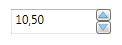
After:

Conclusion
So that's all I wanted to write today for you and I hope it was interesting and this control would be useful for your projects.
If you noticed any bugs or you think that some kinds of options can be realized in another way, I'll be very glad to hear some criticism.
History
- 28th January, 2011: Initial post