Introduction
xWindow is a simple widget host application intended to be used as an extended window. The window sits at the top of the screen and is minimized for convenience.
Background
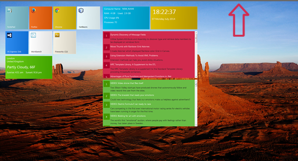
Looking at the image above, you'll no doubt have realized that the xWindow attempts to resemble the Window's 8 Start screen, and you would be right. I wanted a similar experience on my Window's 7 machine, where I could primary launch applications that I frequently used. However having a form with a whole lot of buttons to open applications would have been quite boring, so I decided to expand on the idea by using a widget approach, where different widgets could be loaded by a configuration file and perform different tasks. I also wanted the xWindow panel to be hidden and only visible when needed. For this reason, when the application is loaded, the xWindow is hidden from view. Only a thin grey bar can be seen on the top of the screen. Clicking the bar will toggle between hiding and showing the xWindow.
How the Widget Works
xWindow widgets are configured in a config.xml file and loaded when the application is started. Each widget is given a type name, which is used to create an instance of the widget. Currently there are only five widget types.
AppLauncherClockRssFeedSysInfoWeather
Widgets are configured in the config.xml file. Each widget is placed in a row and the row is placed in a group. Rows help to break the flow of controls, while groups as the name suggests help to group related widgets. The sample XML below describes how two widgets of type AppLauncher are configured.
<xwindow>
    <xgroup>
        <xrow>
            <xwidget label="NotePad"
             tag="C:\Windows\System32\notepad.exe" type="AppLauncher">
            <xwidget label="Visual Studios" tag="Path to application"
             type="AppLauncher"></xwidget></xwidget></xrow>
    </xgroup>
<xwindow></xwindow></xwindow>
First, an AppLauncher widget is a button which simply launches an application such as Notepad.exe. Notice that a widget is represented by the XML element xWidget. Each widget must have a type, which can be one of the five listed above. Because some widgets such as the AppLauncher and RssFeed require additional arguments, a tag attribute exists. This attribute value is used to configure the widget. Another attribute is the label, which is used by the AppLauncher widget to display the application name on the widget. Each widget is developed and maintained in its own class file, which makes it easy to develop new widgets and update existing widgets. The next example shows how to add an RssFeed widget to a new group.
<xgroup>
    <xrow>
        <xwidget label="NotePad" tag="C:\Windows\System32\notepad.exe" type="AppLauncher">
    </xwidget></xrow>
    <xrow>
        <xwidget backgrouncolor="105,203,20" tag="44418" type="Weather">
    </xwidget></xrow>
</xgroup>
<xgroup>
    <xrow>
        <xwidget backgrouncolor="210,42,78"
         tag="http://www.codeproject.com/WebServices/ArticleRSS.aspx" type="RssFeed">
    </xwidget></xrow>
</xgroup>
The example above configures an RssFeed widget. Notice how the feed URL is placed in the tag attribute. Also notice a new attribute backgroundColor. Every widget can have its own background color. In the case of the AppLauncher widget, if no background color is specified, the widget will attempt to get a pixel color sample from the application icon and use it as the background color. In some cases, this may not work as expected, so you override this feature by providing a default background color for the AppLauncher widget.
One of the problems I encountered was with the overall layout. Initially, I used two FlowLayoutPanel controls. The first contained the groups while the second contained the widgets. This approach however caused a problem, which was unless I set a width for each group, all controls would horizontally align next to each other in the FlowLayoutPanel. Further investigation into the FlowLayoutPanel revealed that it has a SetFlowBreak() method, which can break the flow of controls. All I had to do was place a break attribute in the widget I wanted to break to a new row and set the AutoSize properly of the FlowLayoutPanel to true, setting this property to true, would nicely wrap all controls in the FlowLayoutPanel without having to specify the FlowLayoutPanel size. Unfortunately, this did not work, no sir it didn't. The problem was not with the breaking but with the autosize of the FlowLayoutPanel. The FlowLayoutPanel would resize to fit the widget controls if the flow break was after the second control. If the break took place after the first control, the FlowLayoutPanel was not able to resize its width. It was a strange issue that I could not solve. I finally decided to use a TableLayoutPanel as the widget group container and a FlowLayoutPanel to contain the groups.
This brings me to the end of this article. Please feel free to leave your comments and suggestions.
History
- 7th July, 2014: Initial version
This member has not yet provided a Biography. Assume it's interesting and varied, and probably something to do with programming.


 General
  News
News  Suggestion
  Question
  Bug
Bug  Answer
  Joke
Joke  Praise
  Rant
Rant  Admin
Admin 


 Submit an article or tip


