Introduction
This article takes you through steps to create glass style DataGrid-headers with mouse-over and pressed states, with an animated glow effect on mouse-over. This tutorial uses Visual Studio 2010 RC and Silverlight 4. This article explains how to:
- Create a Silverlight project
- Create a
DataGrid and bind sample data - Apply style templates to a
DataGrid - Create a glassy effect for the
DataGrid header - Create
VisualStateManagers for mouse-over and pressed states - Create a glow animation on the header on mouse-over
- Change the style template for different
DataGrid header colors
Creating a Basic DataGrid
This section takes you through creating a Silverlight application and a DataGrid. If you already have a Silverlight application and data bound to a DataGrid, you can skip to the "Creating a Grid Style" section.
Create a new Silverlight Application and call it GlassyGrid. In your MainPage.xaml, create a StackPanel and then drag and drop and DataGrid from the toolbar.
<StackPanel HorizontalAlignment="Center" Margin="0,20,0,20" >
    <sdk:DataGrid Name="dataGrid1" Height="235"
       Width="400" AutoGenerateColumns="True"
       HorizontalAlignment="Center" />
</StackPanel>
Creating Sample Data for the Datagrid
Create a new class in your Silverlight Project called Data.cs. Now, add the following code to your Data class:
public string Column1 { get; set; }
public string Column2 { get; set; }
public int Column3 { get; set; }
public bool Column4 { get; set; }
Open the MainPage.xaml.cs file and change your MainPage function to this:
public MainPage()
{
InitializeComponent();
List<Data> source = new List<Data>();
int itemsCount = 100;
for (int i = 0; i < itemsCount; i++)
{
source.Add(new Data()
{
Column1 = "Data" + i,
Column2 = "Second Column" + i,
Column3 = i,
Column4 = (i % 2 == 0)
});
}
dataGrid1.ItemsSource = source;
}
This creates some data and binds the data to the DataGrid. Run the application and you should see the basic DataGrid. The next section will take you through steps to create a style and apply it to the DataGrid.

Creating a Style Resource Dictionary
To enhance the look and feel of the DataGrid, we create styles that can be applied to the DataGrid. Styles can generally be put into a ResourceDictionary file in your project. A ResourceDictionary provides a hash table/dictionary implementation that contains keyed WPF resources used by components in a WPF application, and can be used to store re-usable Styles for our DataGrid. To create a Style Resource Dictionary, right-click on your Application project and select Add -> New Folder. Name the folder Assets. Right-click on the Assets folder and Add -> New Item. Select "Silverlight Resource Dictionary" and change the "Name:" to Styles.xaml.
You should now have the Styles.xaml file in your Solution:
Include the newly created Styles.xaml in the Application.Resources tag in the App.xaml file:
<Application.Resources>
    <ResourceDictionary>
        <ResourceDictionary.MergedDictionaries>
           <ResourceDictionary Source="Assets/Styles.xaml" />
        </ResourceDictionary.MergedDictionaries>
    </ResourceDictionary>
</Application.Resources>
Creating a Grid Style
Now create a style to modify the DataGrid's row colors and GridLines and a few other styles. Before you create a new style for the DataGrid, the following references need to be added in the ResourceDictionary tag:
xmlns:local="clr-namespace:System.Windows.Controls;assembly=System.Windows.Controls.Data"
xmlns:localprimitives="clr-namespace:System.Windows.Controls.
                       Primitives;assembly=System.Windows.Controls.Data"
Add the following Style. This creates a new style called DataGridStyle targeted for the DataGrid.
<Style x:Key="DataGridStyle"  TargetType="local:DataGrid">
    <Setter Property="RowBackground" Value="#FFFFFF" />
    <Setter Property="AlternatingRowBackground" Value="#EBEBED" />
    <Setter Property="RowHeight" Value="18" />
    <Setter Property="GridLinesVisibility" Value="All"/>
    <Setter Property="HeadersVisibility" Value="Column" />
    <Setter Property="HorizontalGridLinesBrush" Value="#A0A0A0" />
    <Setter Property="HorizontalScrollBarVisibility" Value="Auto" />
    <Setter Property="VerticalScrollBarVisibility" Value="Auto" />
    <Setter Property="SelectionMode" Value="Single" />
    <Setter Property="CanUserReorderColumns" Value="False" />
    <Setter Property="CanUserResizeColumns" Value="False" />
    <Setter Property="CanUserSortColumns" Value="True" />
    <Setter Property="AutoGenerateColumns" Value="True" />
    <Setter Property="RowDetailsVisibilityMode" Value="VisibleWhenSelected" />
</Style>
Your Styles.xaml should look like this:
<ResourceDictionary
    xmlns="http://schemas.microsoft.com/winfx/2006/xaml/presentation"
    xmlns:x="http://schemas.microsoft.com/winfx/2006/xaml"
    xmlns:local="clr-namespace:System.Windows.Controls;assembly=System.Windows.Controls.Data"
    xmlns:localprimitives="clr-namespace:System.Windows.Controls.
                           Primitives;assembly=System.Windows.Controls.Data">

<Style x:Key="DataGridStyle"  TargetType="local:DataGrid">
    <Setter Property="RowBackground" Value="#FFFFFF" />
    <Setter Property="AlternatingRowBackground" Value="#EBEBED" />
    <Setter Property="RowHeight" Value="18" />
    <Setter Property="GridLinesVisibility" Value="All"/>
    <Setter Property="HeadersVisibility" Value="Column" />
    <Setter Property="HorizontalGridLinesBrush" Value="#A0A0A0" />
    <Setter Property="HorizontalScrollBarVisibility" Value="Auto" />
    <Setter Property="VerticalScrollBarVisibility" Value="Auto" />
    <Setter Property="SelectionMode" Value="Single" />
    <Setter Property="CanUserReorderColumns" Value="False" />
    <Setter Property="CanUserResizeColumns" Value="False" />
    <Setter Property="CanUserSortColumns" Value="True" />
    <Setter Property="AutoGenerateColumns" Value="True" />
    <Setter Property="RowDetailsVisibilityMode"
                    Value="VisibleWhenSelected" />
</Style>
Next, we need to tell the DataGrid in our MainPage.xaml to use this Style. Add Style="{StaticResource DataGridStyle}" to the DataGrid control:
<sdk:DataGrid Name="dataGrid1" Height="235" Width="400"
   AutoGenerateColumns="True" HorizontalAlignment="Center"
   Style="{StaticResource DataGridStyle}" />
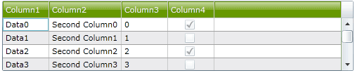
Run the application and you should see the DataGrid with alternating row colors and grid lines.
Creating a Glass Effect Style Template for the DataGrid Header
This is where we will create a glass effect template for our DataGrid header and also add the three states: normal, mouse-over, and pressed, for the header. We'll create a new style as before, with a few properties like FontSize and Foreground. We also change the DataGrid to use the new header template style when rendering the column headers.
Styles.xaml
<Style TargetType="localprimitives:DataGridColumnHeader"
            x:Key="DataGridHeaderGlassEffect" >
    <Setter Property="FontSize" Value="11"/ >
    <Setter Property="Foreground" Value="#EEEEEE"/>
</Style>
MainPage.xaml
<sdk:DataGrid Name="dataGrid1" Height="235"
   Width="400" AutoGenerateColumns="True"
   HorizontalAlignment="Center" Style="{StaticResource DataGridStyle}"
    ColumnHeaderStyle="{StaticResource DataGridHeaderGlassEffect}" />
Next, we create a style template for the DataGrid header. Just after the Setter Property-Foreground, add the following code:
<Setter Property="Template">
    <Setter.Value>
        <ControlTemplate TargetType="localprimitives:DataGridColumnHeader">
        </ControlTemplate>
    </Setter.Value>
</Setter>
The ControlTemplate is used to customize the look and feel of the object in target - in our case, the DataGrid header. This is one of the most powerful features of WPF where you can create the desired user experience. In order to place the controls we are about to create, we first create a Grid object that will be a placeholder for our elements. Create the grid inside the ControlTemplate tags:
Styles.xaml
<Grid Name="Root">
    <Grid.RowDefinitions>
        <RowDefinition Height="*" />
        <RowDefinition Height="*" />
        <RowDefinition Height="Auto" />
    </Grid.RowDefinitions>
    <Grid.ColumnDefinitions>
        <ColumnDefinition Width="Auto" />
        <ColumnDefinition Width="*" />
        <ColumnDefinition Width="Auto" />
    </Grid.ColumnDefinitions>
</Grid>
The Grid contains 3 columns and 3 rows, so we can place the header text and sorting icon and the column separator in positions. First, we create a Rectangle to display the header's background color. We use #FF679800 for a green color. This is placed inside the Grid tags and right after GridColumnDefinition.
<Rectangle x:Name="BackgroundRectangle" Stretch="Fill"
  Fill="#FF679800" Grid.ColumnSpan="2" Grid.RowSpan="2"  />
1. Creating the Header Text
To display the text for the header, we use a ContentPresenter and name it HeaderText. In order to set the properties of the ContentPresenter, we use {TemplateBinding}. TemplateBinding links the value of a property in a control template to be the value of some other exposed property on the templated control. This way, the ContentPresenter sets the data for the text, and also the cursor, alignment, and margin from the exposed properties of the grid itself.
<ContentPresenter x:Name="HeaderText" Grid.RowSpan="2"
    Content="{TemplateBinding Content}" Cursor="{TemplateBinding Cursor}"
    HorizontalAlignment="{TemplateBinding HorizontalContentAlignment}"
    VerticalAlignment="{TemplateBinding VerticalContentAlignment}"
    Margin="{TemplateBinding Padding}" />
2. Creating the Column Separator
We create another Rectangle for the Column Separator. The color of the Separator comes from the SeparatorBrush property of the DataGrid. It takes the default color if the DataGrid does not have a value for SeparatorBrush. We also do not want to display the separator if the GridLinesVisibility property of the DataGrid is set to not show the grid lines.
<Rectangle Name="VerticalSeparator" Grid.RowSpan="2"
   Grid.Column="2" Width="1" VerticalAlignment="Stretch"
   Fill="{TemplateBinding SeparatorBrush}"
   Visibility="{TemplateBinding SeparatorVisibility}" />
3. Creating the Sort Icon
In order to create the sort icon, we use Path Markup Syntax [msdn:Path Markup Syntax]. Basically, we want to construct the sort icon using the path co-ordinates (-3,3) - (3,3) - (0,0) - (-3,3).
Hence the Data for our sort icon would be "F1 M -3,3 L 3,3 L 0,0 Z". "F1" denotes that the fill rule is Nonzero, and the "Z" at the end indicates the end point should be joined to the start point.
<Path Grid.RowSpan="2" Name="SortIcon" HorizontalAlignment="Left"
        VerticalAlignment="Center" Opacity="0"
        Grid.Column="1" Stretch="Uniform" Width="8"
        Data="F1 M -3,3 L 3,3 L 0,0 Z ">
    <Path.Fill>
        <SolidColorBrush Color="#FFFFFFFF" />
    </Path.Fill>
    <Path.RenderTransform>
        <TransformGroup>
            <ScaleTransform x:Name="SortIconTransform" />
        </TransformGroup>
    </Path.RenderTransform>
</Path>
We also added a ScaleTransform under RenderTransform that can be used to flip the image when sorted descending. We'll leave the Opacity of the object to "0" instead of "1" because we want to display the sort icon only when the column header is clicked. This will be controlled by the VisualStateManager, which we will discuss shortly.
4. Creating the Glass Effect
We've now created the basic header structure, with background, text, separator, and the sort icon. To create a glass effect, we create three layers. One called the 'shine' that creates that look of glass in normal state, one called 'glow' that creates a glow effect on mouse-over, and another called "dark" that creates a darker background in pressed state. We place these layers in Borders. We would place this between the BackgroundRectangle and the HeaderText.
<Border BorderBrush="Transparent" BorderThickness="1,1,1,1"
Grid.ColumnSpan="3" Grid.RowSpan="3">
<Grid>
<Grid.RowDefinitions>
<RowDefinition Height="0.5*"/>
<RowDefinition Height="0.5*"/>
</Grid.RowDefinitions>
<Border HorizontalAlignment="Stretch" Margin="0,0,0,0"
x:Name="dark" Width="Auto"
Grid.ColumnSpan="3" Grid.RowSpan="3"
Background="#66000000" Opacity="0"/>
<Border Opacity="0" HorizontalAlignment="Stretch"
x:Name="glow" Width="Auto"
Grid.RowSpan="2" Grid.ColumnSpan="3">
<Border.Background>
<RadialGradientBrush>
<RadialGradientBrush.RelativeTransform>
<TransformGroup>
<ScaleTransform ScaleX="1.7" ScaleY="2.2"/>
<SkewTransform AngleX="0" AngleY="0"/>
<RotateTransform Angle="0"/>
<TranslateTransform X="-0.3" Y="-0.1"/>
</TransformGroup>
</RadialGradientBrush.RelativeTransform>
<GradientStop Color="#B2FFFFFF" Offset="0"/>
<GradientStop Color="#00FFFFFF" Offset="1"/>
</RadialGradientBrush>
</Border.Background>
</Border>
<Border HorizontalAlignment="Stretch" Margin="0,0,0,0"
x:Name="shine" Width="Auto" Grid.ColumnSpan="3">
<Border.Background>
<LinearGradientBrush EndPoint="0.5,0.9" StartPoint="0.5,0.1">
<GradientStop Color="#99FFFFFF" Offset="0"/>
<GradientStop Color="#33FFFFFF" Offset="1"/>
</LinearGradientBrush>
</Border.Background>
</Border>
</Grid>
</Border>
Run the application and you should see the DataGrid with the glassy headers.
Adding Visual states
Note that the grid looks the same even on the mouse-over and pressed states. And the sort icon does not show when the header is sorted. We are going to fix that now. We would have to use the VisualStateManager for our purpose. The VisualStateManager enables you to specify states for a control, the appearance of a control when it is in a certain state, and when a control changes states. Include the following references in the ResourceDictionary:
xmlns:vsm="clr-namespace:System.Windows;assembly=System.Windows"
1. Sort Icon States
We have three states for the sort icon - 'Unsorted', 'SortAscending', and 'SortDescending'. Create a <vsm:VisualStateManager.VisualStateGroups> between the <Grid Name="Root"> tag and add the three sorting states.
<vsm:VisualStateManager.VisualStateGroups>
    <vsm:VisualStateGroup x:Name="SortStates" >
        <vsm:VisualStateGroup.Transitions>
            <vsm:VisualTransition GeneratedDuration="00:00:0.1" />
        </vsm:VisualStateGroup.Transitions>
        <vsm:VisualState x:Name="Unsorted" />
        <vsm:VisualState x:Name="SortAscending">
            <Storyboard>
                <DoubleAnimation Storyboard.TargetName="SortIcon"
                    Storyboard.TargetProperty="Opacity"
                    Duration="0" To="1.0" />
            </Storyboard>
        </vsm:VisualState>
        <vsm:VisualState x:Name="SortDescending">
            <Storyboard>
                <DoubleAnimation Storyboard.TargetName="SortIcon"
                    Storyboard.TargetProperty="Opacity"
                    Duration="0" To="1.0" />
                <DoubleAnimation Storyboard.TargetName="SortIconTransform"
                    Storyboard.TargetProperty="ScaleY"
                    Duration="0" To="-1" />
            </Storyboard>
        </vsm:VisualState>
    </vsm:VisualStateGroup>
</vsm:VisualStateManager.VisualStateGroups>
In order to display the sort icon in the sorted state, we need to change the Opacity of the "SortIcon" layer from 0 to 1. This is accomplished by using a DoubleAnimation [mdsn:DoubleAnimation]. DoubleAnimation animates the value of a property between two target values using linear interpolation over a specified duration. TargetName specifies which control has to be affected by the animation, and TargetProperty specifies the property of the control that gets affected. In our case here, TargetName is set to the "SortIcon" control, and TargetProperty is set to "Opacity". We change the value of Opacity from 0 to 1. We need the animation to take effect immediately, so we set the Duration property to 0.
So on SortAscending, we change the Opacity of the "SortIcon" from 0 to 1 so that the icon becomes visible, and on SortDescending we also change the ScaleY from 1 to -1, thereby inverting the sort icon.
2. Mouse-over and Pressed States
Next, add the Visual states for the normal, mouse-over, and pressed states:
<vsm:VisualStateGroup x:Name="CommonStates">
    <vsm:VisualState x:Name="Normal"/>
    <vsm:VisualState x:Name="MouseOver">
        <Storyboard>
            <DoubleAnimationUsingKeyFrames BeginTime="00:00:00"
                     Storyboard.TargetName="glow"
                     Storyboard.TargetProperty="(UIElement.Opacity)">
                <SplineDoubleKeyFrame KeyTime="00:00:00.4000000" Value="1"/>
            </DoubleAnimationUsingKeyFrames>
        </Storyboard>
    </vsm:VisualState>
    <vsm:VisualState x:Name="Pressed">
        <Storyboard>
            <DoubleAnimationUsingKeyFrames Storyboard.TargetName="shine"
                       Storyboard.TargetProperty="Opacity">
                <SplineDoubleKeyFrame KeyTime="0" Value="0"/>
            </DoubleAnimationUsingKeyFrames>
            <DoubleAnimationUsingKeyFrames BeginTime="00:00:00"
                         Storyboard.TargetName="dark"
                         Storyboard.TargetProperty="(UIElement.Opacity)">
                    <SplineDoubleKeyFrame KeyTime="00:00:00.0000000" Value="1"/>
                </DoubleAnimationUsingKeyFrames>
            <ObjectAnimationUsingKeyFrames BeginTime="00:00:00"
                    Duration="00:00:00.0010000" Storyboard.TargetName="glow"
                    Storyboard.TargetProperty="(UIElement.Visibility)">
                <DiscreteObjectKeyFrame KeyTime="00:00:00">
                    <DiscreteObjectKeyFrame.Value>
                        <Visibility>Collapsed</Visibility>
                    </DiscreteObjectKeyFrame.Value>
                </DiscreteObjectKeyFrame>
            </ObjectAnimationUsingKeyFrames>
        </Storyboard>
    </vsm:VisualState>
</vsm:VisualStateGroup>
On MouseOver, we create an animated fade-in glow effect by changing the Opacity of the "glow" layer from 0 to 1 over a period of 4 seconds. This is accomplished by using Spline key frames, such as SplineDoubleKeyFrame in a DoubleAnimationUsingKeyFrames segment [mdsn:DoubleAnimationUsingKeyFrames]. The DoubleAnimationUsingKeyFrames animates the value of a property along a set of KeyFrames. The SplineDoubleKeyFrame creates a variable transition between values. The KeyTime specifies the precise timing when a particular key frame should take place- 4 seconds in our case ("00:00:00.4000000"). Again, Storyboard.TargetName is set to the "glow" control and Storyboard.TargetProperty is set to the "Opactity" of the "glow" control.
On Pressed state, we hide both the "glow" and the "shine" layer and display the "dark" layer. The "BackgroundRectangle" object shows through the "dark" layer in the pressed state.
...and Voila!
Run the application and you should have the following states for the DataGrid header:
Here is the complete Styles.xaml file:
<ResourceDictionary
xmlns="http://schemas.microsoft.com/winfx/2006/xaml/presentation"
xmlns:x="http://schemas.microsoft.com/winfx/2006/xaml"
xmlns:local="clr-namespace:System.Windows.Controls;
assembly=System.Windows.Controls.Data"
xmlns:localprimitives="clr-namespace:System.Windows.Controls.
Primitives;assembly=System.Windows.Controls.Data"
xmlns:vsm="clr-namespace:System.Windows;assembly=System.Windows">
<Style x:Key="DataGridStyle" TargetType="local:DataGrid">
<Setter Property="RowBackground" Value="#FFFFFF" />
<Setter Property="AlternatingRowBackground" Value="#EBEBED" />
<Setter Property="RowHeight" Value="18" />
<Setter Property="GridLinesVisibility" Value="All"/>
<Setter Property="HeadersVisibility" Value="Column" />
<Setter Property="HorizontalGridLinesBrush" Value="#A0A0A0" />
<Setter Property="HorizontalScrollBarVisibility" Value="Auto" />
<Setter Property="VerticalScrollBarVisibility" Value="Auto" />
<Setter Property="SelectionMode" Value="Single" />
<Setter Property="CanUserReorderColumns" Value="False" />
<Setter Property="CanUserResizeColumns" Value="False" />
<Setter Property="CanUserSortColumns" Value="True" />
<Setter Property="AutoGenerateColumns" Value="True" />
<Setter Property="RowDetailsVisibilityMode" Value="VisibleWhenSelected" />
</Style >
<Style TargetType="localprimitives:DataGridColumnHeader"
x:Key="DataGridHeaderGlassEffect" >
<Setter Property="FontSize" Value="11"/>
<Setter Property="Foreground" Value="#EEEEEE"/>
<Setter Property="Template">
<Setter.Value>
<ControlTemplate TargetType="localprimitives:DataGridColumnHeader">
<Grid Name="Root">
<Grid.RowDefinitions>
<RowDefinition Height="*" />
<RowDefinition Height="*" />
<RowDefinition Height="Auto" />
</Grid.RowDefinitions>
<Grid.ColumnDefinitions>
<ColumnDefinition Width="Auto" />
<ColumnDefinition Width="*" />
<ColumnDefinition Width="Auto" />
</Grid.ColumnDefinitions>
<Rectangle x:Name="BackgroundRectangle" Stretch="Fill"
Fill="#FF679800" Grid.ColumnSpan="2"
Grid.RowSpan="2" />
<Border BorderBrush="Transparent"
BorderThickness="1,1,1,1"
Grid.ColumnSpan="3" Grid.RowSpan="3">
<Grid>
<Grid.RowDefinitions>
<RowDefinition Height="0.5*"/>
<RowDefinition Height="0.5*"/>
</Grid.RowDefinitions>
<Border HorizontalAlignment="Stretch"
Margin="0,0,0,0" x:Name="dark"
Width="Auto" Grid.ColumnSpan="3"
Grid.RowSpan="3"
Background="#66000000"
Opacity="0"/>
<Border Opacity="0"
HorizontalAlignment="Stretch" x:Name="glow"
Width="Auto" Grid.RowSpan="2"
Grid.ColumnSpan="3">
<Border.Background>
<RadialGradientBrush>
<RadialGradientBrush.RelativeTransform>
<TransformGroup>
<ScaleTransform ScaleX="1.7"
ScaleY="2.2"/>
<SkewTransform AngleX="0"
AngleY="0"/>
<RotateTransform Angle="0"/>
<TranslateTransform X="-0.3"
Y="-0.1"/>
</TransformGroup>
</RadialGradientBrush.RelativeTransform>
<GradientStop Color="#B2FFFFFF"
Offset="0"/>
<GradientStop Color="#00FFFFFF"
Offset="1"/>
</RadialGradientBrush>
</Border.Background>
</Border>
<Border HorizontalAlignment="Stretch"
Margin="0,0,0,0" x:Name="shine"
Width="Auto"
Grid.ColumnSpan="3">
<Border.Background>
<LinearGradientBrush EndPoint="0.5,0.9"
StartPoint="0.5,0.1">
<GradientStop Color="#99FFFFFF"
Offset="0"/>
<GradientStop Color="#33FFFFFF"
Offset="1"/>
</LinearGradientBrush>
</Border.Background>
</Border>
</Grid>
</Border>
<ContentPresenter x:Name="HeaderText"
Grid.RowSpan="2"
Content="{TemplateBinding Content}"
Cursor="{TemplateBinding Cursor}"
HorizontalAlignment="{TemplateBinding HorizontalContentAlignment}"
VerticalAlignment="{TemplateBinding VerticalContentAlignment}"
Margin="{TemplateBinding Padding}" />
<Rectangle Name="VerticalSeparator"
Grid.RowSpan="2" Grid.Column="2"
Width="1" VerticalAlignment="Stretch"
Fill="{TemplateBinding SeparatorBrush}"
Visibility="{TemplateBinding SeparatorVisibility}" />
<Path Grid.RowSpan="2" Name="SortIcon"
RenderTransformOrigin=".5,.5"
HorizontalAlignment="Left"
VerticalAlignment="Center" Opacity="0"
Grid.Column="1" Stretch="Uniform"
Width="8" Data="F1 M -3,3 L 3,3 L 0,0 Z ">
<Path.Fill>
<SolidColorBrush Color="#FFFFFFFF" />
</Path.Fill>
<Path.RenderTransform>
<TransformGroup>
<ScaleTransform x:Name="SortIconTransform" />
</TransformGroup>
</Path.RenderTransform>
</Path>
<vsm:VisualStateManager.VisualStateGroups>
<vsm:VisualStateGroup x:Name="SortStates" >
<vsm:VisualStateGroup.Transitions>
<vsm:VisualTransition GeneratedDuration="00:00:0.1" />
</vsm:VisualStateGroup.Transitions>
<vsm:VisualState x:Name="Unsorted" />
<vsm:VisualState x:Name="SortAscending">
<Storyboard>
<DoubleAnimation Storyboard.TargetName="SortIcon"
Storyboard.TargetProperty="Opacity"
Duration="0" To="1.0" />
</Storyboard>
</vsm:VisualState>
<vsm:VisualState x:Name="SortDescending">
<Storyboard>
<DoubleAnimation Storyboard.TargetName="SortIcon"
Storyboard.TargetProperty="Opacity"
Duration="0" To="1.0" />
<DoubleAnimation
Storyboard.TargetName="SortIconTransform"
Storyboard.TargetProperty="ScaleY"
Duration="0" To="-1" />
</Storyboard>
</vsm:VisualState>
</vsm:VisualStateGroup>
<vsm:VisualStateGroup x:Name="CommonStates">
<vsm:VisualState x:Name="Normal"/>
<vsm:VisualState x:Name="MouseOver">
<Storyboard>
<DoubleAnimationUsingKeyFrames
BeginTime="00:00:00"
Storyboard.TargetName="glow"
Storyboard.TargetProperty="(UIElement.Opacity)">
<SplineDoubleKeyFrame
KeyTime="00:00:00.4000000" Value="1"/>
</DoubleAnimationUsingKeyFrames>
</Storyboard>
</vsm:VisualState>
<vsm:VisualState x:Name="Pressed">
<Storyboard>
<DoubleAnimationUsingKeyFrames
Storyboard.TargetName="shine"
Storyboard.TargetProperty="Opacity">
<SplineDoubleKeyFrame KeyTime="0" Value="0"/>
</DoubleAnimationUsingKeyFrames>
<DoubleAnimationUsingKeyFrames BeginTime="00:00:00"
Storyboard.TargetName="dark"
Storyboard.TargetProperty="(UIElement.Opacity)">
<SplineDoubleKeyFrame
KeyTime="00:00:00.0000000" Value="1"/>
</DoubleAnimationUsingKeyFrames>
<ObjectAnimationUsingKeyFrames BeginTime="00:00:00"
Duration="00:00:00.0010000"
Storyboard.TargetName="glow"
Storyboard.TargetProperty=
"(UIElement.Visibility)">
<DiscreteObjectKeyFrame KeyTime="00:00:00">
<DiscreteObjectKeyFrame.Value>
<Visibility>Collapsed</Visibility>
</DiscreteObjectKeyFrame.Value>
</DiscreteObjectKeyFrame>
</ObjectAnimationUsingKeyFrames>
</Storyboard>
</vsm:VisualState>
</vsm:VisualStateGroup>
</vsm:VisualStateManager.VisualStateGroups>
</Grid>
</ControlTemplate>
</Setter.Value>
</Setter>
</Style>
</ResourceDictionary>
Changing header colors
The basic color theme of the DataGrid header is set by the Rectangle object "BackgroundRectangle". To create a DataGrid header with any other color, all you have to do is change the Fill property of the "BackgroundRectangle" Rectangle object to any other color. Everything else, including the animated glow and the sorting, will work the same. You can also modify the look and feel of the DataGrid header by modifying the style template to, for example, create rounded borders for the grid headers and so on. The downloadable source code contains these examples.
This member has not yet provided a Biography. Assume it's interesting and varied, and probably something to do with programming.


 General
  News
News  Suggestion
  Question
  Bug
Bug  Answer
  Joke
Joke  Praise
  Rant
Rant  Admin
Admin 


 Submit an article or tip


