A while ago, I was looking at the Infragistics WPF showcase, Tangerine and I was quite jealous about the scrollbars that they managed to use. I mean styling a Button is one thing, but the ScrollBar is made of lots of nasty different control parts, (Part_XXX elements). Incidentally, I wrote an article about Part_XXX elements in a WPF article over at CodeProject right here if you are interested.
Anyways, to cut a long story short, I decided to try and have a go at Styling a bigger control such as ScrollViewer. And guess what I managed to do it. Hooray!
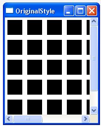
This is what it looks like:
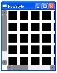 |  |
| My Styled ScrollViewer
| Original ScrollViewer
|
This blog entry outlines the steps I went through.
Step 1
Look up and copy the original ScrollViewer and ScrollBar Templates from MSDN, for example:
Then I pasted that code from MSDN into a Resources file in a WPF window.
Step 2
I examined the control parts required for the full ScrollViewer/Scrollbar controls. This was fairly ok actually as the MSDN default Styles and pretty easy to follow.
From looking at the default styles, it became clear that I needed to look at the following Style/Templates if I wished to re-style a ScrollViewer, as all of these were used in the default Style for the ScrollViewer somewhere.
Step 3
I then decided which parts I want to swap out. I chose to swap out and proceeded to hack the default Style/Templates to achieve the look I was after.
Anyway, the results ScrollViewer looks like the following image:
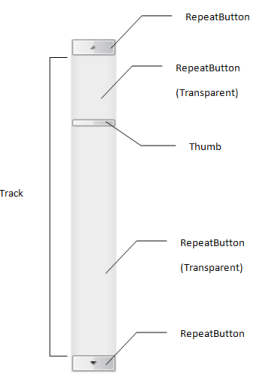
RepeatButtonThumbScrollBarScrollViewer
When you consider the following image, you can see why these are the Style/Templates that need to be altered.
So basically after that, it's just a question of cutting code. So without further ado, here is the code:
<Window
    xmlns="http://schemas.microsoft.com/winfx/2006/xaml/presentation"
    xmlns:x="http://schemas.microsoft.com/winfx/2006/xaml"
    xmlns:mc="http://schemas.openxmlformats.org/markup-compatibility/2006″
    x:Class="ScrollViewerTemplate.Window1″
    x:Name="Window"
    Title="Window1″
    Width="200″ Height="200″>

  <Window.Resources>

        <!– All the following is required to Re-Style the ScrollViewer, see
             http://msdn2.microsoft.com/en-us/library/aa970847(VS.85).aspx
             http://msdn2.microsoft.com/en-us/library/ms742173(VS.85).aspx
             for the default Styles that the ScrollViewer has out of the box
         –>

        <!– Brushes used in Styling of ScrollViewer –>
        <SolidColorBrush x:Key="StandardBorderBrush" Color="#888″ />
        <SolidColorBrush x:Key="StandardBackgroundBrush" Color="#FFF" />
        <SolidColorBrush x:Key="HoverBorderBrush" Color="#DDD" />
        <SolidColorBrush x:Key="SelectedBackgroundBrush" Color="Gray" />
        <SolidColorBrush x:Key="SelectedForegroundBrush" Color="White" />
        <SolidColorBrush x:Key="DisabledForegroundBrush" Color="#888″ />
        <SolidColorBrush x:Key="NormalBrush" Color="#888″ />
        <SolidColorBrush x:Key="NormalBorderBrush" Color="#888″ />
        <SolidColorBrush x:Key="HorizontalNormalBrush" Color="#888″ />
        <SolidColorBrush x:Key="HorizontalNormalBorderBrush" Color="#888″ />
        <LinearGradientBrush x:Key="ListBoxBackgroundBrush"
            StartPoint="0,0″ EndPoint="1,0.001″>
            <GradientBrush.GradientStops>
                <GradientStopCollection>
                    <GradientStop Color="White" Offset="0.0″ />
                    <GradientStop Color="White" Offset="0.6″ />
                    <GradientStop Color="#DDDDDD" Offset="1.2″/>
                </GradientStopCollection>
            </GradientBrush.GradientStops>
        </LinearGradientBrush>
        <LinearGradientBrush x:Key="StandardBrush"
            StartPoint="0,0″ EndPoint="0,1″>
            <GradientBrush.GradientStops>
                <GradientStopCollection>
                    <GradientStop Color="#FFF" Offset="0.0″/>
                    <GradientStop Color="#CCC" Offset="1.0″/>
                </GradientStopCollection>
            </GradientBrush.GradientStops>
        </LinearGradientBrush>
        <SolidColorBrush x:Key="GlyphBrush" Color="#444″ />
        <LinearGradientBrush x:Key="PressedBrush"
            StartPoint="0,0″ EndPoint="0,1″>
            <GradientBrush.GradientStops>
                <GradientStopCollection>
                    <GradientStop Color="#BBB" Offset="0.0″/>
                    <GradientStop Color="#EEE" Offset="0.1″/>
                    <GradientStop Color="#EEE" Offset="0.9″/>
                    <GradientStop Color="#FFF" Offset="1.0″/>
                </GradientStopCollection>
            </GradientBrush.GradientStops>
        </LinearGradientBrush>

        <!– SrollViewer ScrollBar Repeat Buttons (at each end) –>
        <Style x:Key="ScrollBarLineButton" TargetType="{x:Type RepeatButton}">
            <Setter Property="SnapsToDevicePixels" Value="True"/>
            <Setter Property="OverridesDefaultStyle" Value="true"/>
            <Setter Property="Focusable" Value="false"/>
            <Setter Property="Template">
                <Setter.Value>
                    <ControlTemplate TargetType="{x:Type RepeatButton}">
                        <Border
          Name="Border"
          Margin="1″
          CornerRadius="2″
          Background="{StaticResource NormalBrush}"
          BorderBrush="{StaticResource NormalBorderBrush}"
          BorderThickness="1″>
                            <Path
            HorizontalAlignment="Center"
            VerticalAlignment="Center"
            Fill="{StaticResource GlyphBrush}"
            Data="{Binding Path=Content,
                RelativeSource={RelativeSource TemplatedParent}}" />
                        </Border>
                        <ControlTemplate.Triggers>
                            <Trigger Property="IsPressed" Value="true">
                                <Setter TargetName="Border" Property="Background"
                                Value="{StaticResource PressedBrush}" />
                            </Trigger>
                            <Trigger Property="IsEnabled" Value="false">
                                <Setter Property="Foreground"
                                Value="{StaticResource DisabledForegroundBrush}"/>
                            </Trigger>
                        </ControlTemplate.Triggers>
                    </ControlTemplate>
                </Setter.Value>
            </Setter>
        </Style>
        <!– SrollViewer ScrollBar Repeat Buttons (The part in the middle,
             not the thumb the long area between the buttons ) –>
        <Style x:Key="ScrollBarPageButton" TargetType="{x:Type RepeatButton}">
            <Setter Property="SnapsToDevicePixels" Value="True"/>
            <Setter Property="OverridesDefaultStyle" Value="true"/>
            <Setter Property="IsTabStop" Value="false"/>
            <Setter Property="Focusable" Value="false"/>
            <Setter Property="Template">
                <Setter.Value>
                    <ControlTemplate TargetType="{x:Type RepeatButton}">
                        <Border Background="Transparent" />
                    </ControlTemplate>
                </Setter.Value>
            </Setter>
        </Style>
        <!– ScrollViewer ScrollBar Thumb, that part that can be dragged
            up/down or left/right Buttons –>
        <Style x:Key="ScrollBarThumb" TargetType="{x:Type Thumb}">
            <Setter Property="SnapsToDevicePixels" Value="True"/>
            <Setter Property="OverridesDefaultStyle" Value="true"/>
            <Setter Property="IsTabStop" Value="false"/>
            <Setter Property="Focusable" Value="false"/>
            <Setter Property="Template">
                <Setter.Value>
                    <ControlTemplate TargetType="{x:Type Thumb}">
                        <Border
          CornerRadius="2″
          Background="{TemplateBinding Background}"
          BorderBrush="{TemplateBinding BorderBrush}"
          BorderThickness="1″ />
                    </ControlTemplate>
                </Setter.Value>
            </Setter>
        </Style>

        <ControlTemplate x:Key="VerticalScrollBar"
            TargetType="{x:Type ScrollBar}">
            <Grid >
                <Grid.RowDefinitions>
                    <RowDefinition MaxHeight="18″/>
                    <RowDefinition Height="0.00001*"/>
                    <RowDefinition MaxHeight="18″/>
                </Grid.RowDefinitions>
                <Border
      Grid.RowSpan="3″
      CornerRadius="2″
      Background="#F0F0F0″ />
                <RepeatButton
      Grid.Row="0″
      Style="{StaticResource ScrollBarLineButton}"
      Height="18″
      Command="ScrollBar.LineUpCommand"
      Content="M 0 4 L 8 4 L 4 0 Z" />
                <Track
      Name="PART_Track"
      Grid.Row="1″
      IsDirectionReversed="true">
                    <Track.DecreaseRepeatButton>
                        <RepeatButton
          Style="{StaticResource ScrollBarPageButton}"
          Command="ScrollBar.PageUpCommand" />
                    </Track.DecreaseRepeatButton>
                    <Track.Thumb>
                        <Thumb
          Style="{StaticResource ScrollBarThumb}"
          Margin="1,0,1,0″
          Background="{StaticResource HorizontalNormalBrush}"
          BorderBrush="{StaticResource HorizontalNormalBorderBrush}" />
                    </Track.Thumb>
                    <Track.IncreaseRepeatButton>
                        <RepeatButton
          Style="{StaticResource ScrollBarPageButton}"
          Command="ScrollBar.PageDownCommand" />
                    </Track.IncreaseRepeatButton>
                </Track>
                <RepeatButton
      Grid.Row="3″
      Style="{StaticResource ScrollBarLineButton}"
      Height="18″
      Command="ScrollBar.LineDownCommand"
      Content="M 0 0 L 4 4 L 8 0 Z"/>
            </Grid>
        </ControlTemplate>
        <!– HorizontalScrollBar Template using the previously created Templates –>
        <ControlTemplate x:Key="HorizontalScrollBar"
            TargetType="{x:Type ScrollBar}">
            <Grid >
                <Grid.ColumnDefinitions>
                    <ColumnDefinition MaxWidth="18″/>
                    <ColumnDefinition Width="0.00001*"/>
                    <ColumnDefinition MaxWidth="18″/>
                </Grid.ColumnDefinitions>
                <Border
      Grid.ColumnSpan="3″
      CornerRadius="2″
      Background="#F0F0F0″ />
                <RepeatButton
      Grid.Column="0″
      Style="{StaticResource ScrollBarLineButton}"
      Width="18″
      Command="ScrollBar.LineLeftCommand"
      Content="M 4 0 L 4 8 L 0 4 Z" />
                <Track
      Name="PART_Track"
      Grid.Column="1″
      IsDirectionReversed="False">
                    <Track.DecreaseRepeatButton>
                        <RepeatButton
          Style="{StaticResource ScrollBarPageButton}"
          Command="ScrollBar.PageLeftCommand" />
                    </Track.DecreaseRepeatButton>
                    <Track.Thumb>
                        <Thumb
          Style="{StaticResource ScrollBarThumb}"
          Margin="0,1,0,1″
          Background="{StaticResource NormalBrush}"
          BorderBrush="{StaticResource NormalBorderBrush}" />
                    </Track.Thumb>
                    <Track.IncreaseRepeatButton>
                        <RepeatButton
          Style="{StaticResource ScrollBarPageButton}"
          Command="ScrollBar.PageRightCommand" />
                    </Track.IncreaseRepeatButton>
                </Track>
                <RepeatButton
      Grid.Column="3″
      Style="{StaticResource ScrollBarLineButton}"
      Width="18″
      Command="ScrollBar.LineRightCommand"
      Content="M 0 0 L 4 4 L 0 8 Z"/>
            </Grid>
        </ControlTemplate>
        <!– Style for overall  ScrollBar –>
        <Style x:Key="{x:Type ScrollBar}" TargetType="{x:Type ScrollBar}">
            <Setter Property="SnapsToDevicePixels" Value="True"/>
            <Setter Property="OverridesDefaultStyle" Value="true"/>
            <Style.Triggers>
                <Trigger Property="Orientation" Value="Horizontal">
                    <Setter Property="Width" Value="Auto"/>
                    <Setter Property="Height" Value="18″ />
                    <Setter Property="Template"
                        Value="{StaticResource HorizontalScrollBar}" />
                </Trigger>
                <Trigger Property="Orientation" Value="Vertical">
                    <Setter Property="Width" Value="18″/>
                    <Setter Property="Height" Value="Auto" />
                    <Setter Property="Template"
                        Value="{StaticResource VerticalScrollBar}" />
                </Trigger>
            </Style.Triggers>
        </Style>

        <!– Style for overall  ScrollViewer –>
        <Style x:Key="FavsScrollViewer" TargetType="{x:Type ScrollViewer}">
            <Setter Property="OverridesDefaultStyle" Value="True"/>
            <Setter Property="Template">
                <Setter.Value>
                    <ControlTemplate TargetType="{x:Type ScrollViewer}">
                        <Grid>
                            <Grid.ColumnDefinitions>
                                <ColumnDefinition Width="Auto"/>
                                <ColumnDefinition/>
                            </Grid.ColumnDefinitions>
                            <Grid.RowDefinitions>
                                <RowDefinition/>
                                <RowDefinition Height="Auto"/>
                            </Grid.RowDefinitions>

                            <ScrollContentPresenter Grid.Column="1″/>

                            <ScrollBar Name="PART_VerticalScrollBar"
            Value="{TemplateBinding VerticalOffset}"
            Maximum="{TemplateBinding ScrollableHeight}"
            ViewportSize="{TemplateBinding ViewportHeight}"
            Visibility="{TemplateBinding ComputedVerticalScrollBarVisibility}"/>
                            <ScrollBar Name="PART_HorizontalScrollBar"
            Orientation="Horizontal"
            Grid.Row="1″
            Grid.Column="1″
            Value="{TemplateBinding HorizontalOffset}"
            Maximum="{TemplateBinding ScrollableWidth}"
            ViewportSize="{TemplateBinding ViewportWidth}"
            Visibility="{TemplateBinding ComputedHorizontalScrollBarVisibility}"/>

                        </Grid>
                    </ControlTemplate>
                </Setter.Value>
            </Setter>
        </Style>

  </Window.Resources>

    <Grid x:Name="LayoutRoot">
        <ScrollViewer     RenderTransformOrigin="0.5,0.5″ HorizontalAlignment="Stretch"
                        Margin="0,0,0,0″
                        Width="Auto" HorizontalScrollBarVisibility="Visible"
                        Style="{StaticResource FavsScrollViewer}">
         </ScrollViewer>
    </Grid>
</Window>
And if you want to try this for yourself, here is a VS 2008 demo project.


 General
  News
News  Suggestion
  Question
  Bug
Bug  Answer
  Joke
Joke  Praise
  Rant
Rant  Admin
Admin 


 Submit an article or tip

