Introduction
Presentation layer is always the important aspect of a software. NextUI provides a list of unique controls in the hope that it is useful to anyone.
Background
This control provides a Knob like panel that is easy to use and configure.
Using the Code
This control has a few properties to be configured:
| Name | Description |
 | BackGrdColor | Set the background color of the control, the color is used to paint the background as a linear gradient brush.
To fill a solid color, consider using an image |
| BackImage | Use this to set the background Image, for example,
you can set the background to solid color by setting this image to solid color image |
| DisplayFont | The font that is used to display the label |
| FontColor | Use this to set the color of the font, the font is used to display the label |
| KnobHandleImage | To set the image of the center handle |
| Labels | It returns a collection that allows a user to add a meterlabel. |
| Marking | This property is used to set the marking. Line will display a line as a marking using the color of the font . Cont will provide a color shade between 2 marking using the "color" property of MeterLabel. Both will display Line as well as the shade None will not display anything |
| MarkingImageType | The type of label to display, if Image, the control will use the "Image" property of the MeterLabel class to display the label, if set to Font, the control will used the "Desc"
property to display the label, if None, nothing will displayed |
MeterLabel class defines the property of each label:
| Name | Description |
| Desc | This property is used for the actual text display for a label. You can set Desc to "Hello", but Value to 10, so this label will be displayed as Hello but the numerical 10 will be the actual representation of the label |
| Image | Used to show an Image for the label |
| MainColor | This is used to determine the color of the shade between the label |
| Value | Value is the actual numeric value of the label.
It is the actual value that will be raised when meter label is
used for control like knob. It is also the actual value that is used to
calculate the position of the pointer. |
This control has a rotate event that will generate the value that this control is currently selecting:
| Name | Description |
 | Rotate | To receive rotate event whenever a mouse is used to move the knob |
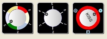
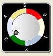
Example 1
The code snippet below is extracted from the sample code, and will generate a control that looks like:
this.controlKnob1.BackImage = global::KnobDemo.Properties.Resources.Knob1;
this.controlKnob1.DisplayFont = new System.Drawing.Font("Courier New", 8F);
this.controlKnob1.FontColor = System.Drawing.Color.White;
this.controlKnob1.KnobHandleImage = null;
this.controlKnob1.Marking = NextUI.Bar.KnobPanel.Marking.BOTH;
this.controlKnob1.MarkingImageType = NextUI.Bar.KnobPanel.MarkingImage.FONT;
MeterLabel m1 = new MeterLabel(0, "0");
m1.MainColor = Color.LightYellow;
MeterLabel m2 = new MeterLabel(1, "1");
m2.MainColor = Color.LightSteelBlue;
MeterLabel m3 = new MeterLabel(2, "2");
m3.MainColor = Color.Green;
MeterLabel m4 = new MeterLabel(3, "3");
m4.MainColor = Color.Lavender;
MeterLabel m5 = new MeterLabel(4, "4");
m5.MainColor = Color.Khaki;
MeterLabel m6 = new MeterLabel(5, "5");
this.controlKnob1.Labels.Add(m1);
this.controlKnob1.Labels.Add(m2);
this.controlKnob1.Labels.Add(m3);
this.controlKnob1.Labels.Add(m4);
this.controlKnob1.Labels.Add(m5);
this.controlKnob1.Labels.Add(m6);
Example 2
The code snippet below is extracted from the sample code, and will generate a control that looks like the one below.
As you can see, if the Marking property is set to LINE, the control will not display the color shade:

this.controlKnob2.BackImage = global::KnobDemo.Properties.Resources.Knob1;
this.controlKnob2.DisplayFont = new System.Drawing.Font("Courier New", 8F);
this.controlKnob2.FontColor = System.Drawing.Color.White;
this.controlKnob2.KnobHandleImage = null;
this.controlKnob2.Location = new System.Drawing.Point(142, 30);
this.controlKnob2.Marking = NextUI.Bar.KnobPanel.Marking.LINE;
this.controlKnob2.MarkingImageType = NextUI.Bar.KnobPanel.MarkingImage.FONT;
MeterLabel m1 = new MeterLabel(0, "0");
m1.MainColor = Color.LightYellow;
MeterLabel m2 = new MeterLabel(1, "1");
m2.MainColor = Color.LightSteelBlue;
MeterLabel m3 = new MeterLabel(2, "2");
m3.MainColor = Color.Green;
MeterLabel m4 = new MeterLabel(3, "3");
m4.MainColor = Color.Lavender;
MeterLabel m5 = new MeterLabel(4, "4");
m5.MainColor = Color.Khaki;
MeterLabel m6 = new MeterLabel(5, "5");
this.controlKnob2.Labels.Add(m1);
this.controlKnob2.Labels.Add(m2);
this.controlKnob2.Labels.Add(m3);
this.controlKnob2.Labels.Add(m4);
this.controlKnob2.Labels.Add(m5);
this.controlKnob2.Labels.Add(m6);
Example 3
This example shows if the Marking Type is set to IMAGE, control will use the "Image" property
of MeterLabel control to display the label instead of "Desc":

this.controlKnob3.BackImage = global::KnobDemo.Properties.Resources.Knob1;
this.controlKnob3.DisplayFont = new System.Drawing.Font("Courier New", 8F);
this.controlKnob3.FontColor = System.Drawing.Color.White;
this.controlKnob3.KnobHandleImage = global::KnobDemo.Properties.Resources.Knob2;
this.controlKnob3.Marking = NextUI.Bar.KnobPanel.Marking.CONT;
this.controlKnob3.MarkingImageType = NextUI.Bar.KnobPanel.MarkingImage.IMAGE;
MeterLabel m11 = new MeterLabel(0, "0");
m11.Image = global::KnobDemo.Properties.Resources.themo3;
MeterLabel m21 = new MeterLabel(1, "1");
MeterLabel m31 = new MeterLabel(2, "2");
m31.Image =  global::KnobDemo.Properties.Resources.themo4;
MeterLabel m41 = new MeterLabel(3, "3");
MeterLabel m51 = new MeterLabel(4, "4");
m51.Image = global::KnobDemo.Properties.Resources.themo5;
MeterLabel m61 = new MeterLabel(5, "5");
this.controlKnob3.Labels.Add(m11);
this.controlKnob3.Labels.Add(m21);
this.controlKnob3.Labels.Add(m31);
this.controlKnob3.Labels.Add(m41);
this.controlKnob3.Labels.Add(m51);
this.controlKnob3.Labels.Add(m61);
Points of Interest
This control is still in development. If you have any cool enhancements that you would like to suggest, send me an email at sllow@nextwavesoft.com.
History


 General
  News
News  Suggestion
  Question
  Bug
Bug  Answer
  Joke
Joke  Praise
  Rant
Rant  Admin
Admin 


 Submit an article or tip


