Introduction
TabControl is used to share common space for multiple items. For example : we are viewing TV show by changing channle, same way user can view different UI on same space by selecting TabItems, each tablitem has its own source/XMAL. All TabItems share common area on windows screen.
Background
Sometimes, we have a requirement to customize our tab control layout, so we need to create a custom template for TabControl and TabItems.
In this article, we walk-through how to change the visual appearance of the TabControl by modifying its style and Template.


Using the Code
Step 1: Create Custom ScalePanel Control for Side bar
ScalePanel.cs
public class ScalePanel : Panel
  {
      #region ScaleXProperty
      public Double ScaleX
      {
          get { return (Double)GetValue(ScaleXProperty); }
          set { SetValue(ScaleXProperty, value); }
      }
      public static readonly DependencyProperty ScaleXProperty =
          DependencyProperty.Register("ScaleX", typeof(Double), typeof(ScalePanel),
          new PropertyMetadata(1.0d, new PropertyChangedCallback(ScaleXChanged)));

      public static void ScaleXChanged(DependencyObject sender,
                                  DependencyPropertyChangedEventArgs e)
      {
          ScalePanel obj = sender as ScalePanel;
          if (obj != null)
          {
              obj.OnScaleXChanged(e);
          }
      }
      private void OnScaleXChanged(DependencyPropertyChangedEventArgs e)
      {
          InvalidateMeasure();
      }
      #endregion

      #region ScaleYProperty
      public Double ScaleY
      {
          get { return (Double)GetValue(ScaleYProperty); }
          set { SetValue(ScaleYProperty, value); }
      }

      public static readonly DependencyProperty ScaleYProperty =
          DependencyProperty.Register("ScaleY", typeof(Double), typeof(ScalePanel),
          new PropertyMetadata(1.0d, new PropertyChangedCallback(ScaleYChanged)));

      public static void ScaleYChanged(DependencyObject sender,
                                        DependencyPropertyChangedEventArgs e)
      {
          ScalePanel obj = sender as ScalePanel;
          if (obj != null)
          {
              obj.OnScaleYChanged(e);
          }
      }

      private void OnScaleYChanged(DependencyPropertyChangedEventArgs e)
      {
          InvalidateMeasure();
      }
      #endregion

      protected override Size MeasureOverride(Size availableSize)
      {
          Size finalSize = new Size();

          if (Children.Count > 0)
          {
              UIElement child = Children[0];
              child.Measure(availableSize);
              finalSize.Width = Math.Min(child.DesiredSize.Width, availableSize.Width);
              finalSize.Height = Math.Min(child.DesiredSize.Height, availableSize.Height);
          }

          finalSize.Width = finalSize.Width * ScaleX;
          finalSize.Height = finalSize.Height * ScaleY;

          return finalSize;
      }

      protected override Size ArrangeOverride(Size finalSize)
      {
          if (Children.Count > 0)
          {
              UIElement child = Children[0];
              child.Arrange(new Rect(0, 0, finalSize.Width, finalSize.Height));
          }

          return finalSize;
      }
  }
In this code, you notice that ScaleXProperty and ScaleYProperty dependency properties are defined.
So the question arises as to what is DependencyProperty? And why do we need to use it?
I give you a brief description to make you aware about DependencyProperty.
DependencyProperty
Dependency Property is like any other property, but can hold a default value, with built in mechanism for property value validation and automatic notification for changes in property value (for anyone listening to property value - especially UI) and any binding in WPF is binded to a Dependency Property.
Dependency properties are properties that are registered with the WPF property system by calling the DependencyProperty.Register method.
The purpose of dependency properties is to provide a way to compute the value of a property based on the value of other inputs.
DependencyObject defines the base class that can register and own a dependency property.
You can go into detail with an example by following this link.
So both scaleY and ScaleY properties scale the panel with content.
There are two override methods defined, one is MeasureOverride and other is ArrangeOverride.
- MeasureOverride
Provides the behavior for the Measure pass of WPF layout.
This method has a default implementation that performs built-in layout for most WPF FrameworkElement classes.
So in our code, it customizes the Measure pass logic for a custom panel implementation and it performs the following task.
- Iterates over children.
- For each child, calls
Measure, using a Size that makes sense based on how the panel logic treats the number of children and its own known size limit.
- Returns its size (determines it needs during layout, based on its calculations of child object allotted sizes).
You can go into detail by looking at an example at this link.
- ArrangeOverride
Provides the behavior for the Arrange pass of WPF layout. In simple words, it arranges the content of a FrameworkElement. ArrangeOverride customizes the Arrange pass.
- Iterates over children.
- For each child, calls
Arrange, using a Rect where Height and Width are based on DesiredSize, and X and Y are based on logic that is specific to the panel.
- Returns its size (the actual size that is used after the element is arranged in layout)
For WPF, the technique by which elements are sized and positioned in a layout is divided into two steps: a Measure pass, and then an Arrange pass.
Step 2: Create UserControl and Add namespace for Custom Panel (ScalePanel)
xmlns:control="clr-namespace:WPFTabControlCustomization.UserControls"
Step 3: Create Template for TabItem
 <ControlTemplate x:Key="TabItemTemplate"
                         TargetType="TabItem">
            <Border x:Name="TabHeaderBackgroundBorder"
                    RenderTransformOrigin="0.5,0.5"
                    BorderBrush="Black"
                    BorderThickness="1,1,0,1"
                    Background="{StaticResource TabHeaderBackground}">
                <Grid>
                    <Border x:Name="TabHeaderHighlightBackgroundBorder"
                            Opacity="0"
                            Background="{StaticResource TabHeaderHighlightBackground}" />
                    <Border x:Name="TabHeaderSelectedBackgroundBorder"
                            Opacity="0"
                            Background="{StaticResource TabHeaderSelectedBackground}" />
                    <ContentControl Content="{TemplateBinding Header}"
                                    HorizontalContentAlignment="Center"
                                    VerticalContentAlignment="Center"
                                    Margin="16,10,16,10"
                                    FontFamily="Verdana"
                                    FontSize="15"
                                    Foreground="White"
                                    FontWeight="Bold"
                                    Cursor="Hand"
                                    x:Name="ContControl">
                        <ContentControl.LayoutTransform>
                            <RotateTransform Angle="90" />
                        </ContentControl.LayoutTransform>
                    </ContentControl>
                </Grid>
                <VisualStateManager.VisualStateGroups>
                    <VisualStateGroup x:Name="CommonStates">
                        <VisualState x:Name="Normal" />
                        <VisualState x:Name="MouseOver">
                            <Storyboard>
                                <DoubleAnimation Storyboard.TargetName="TabHeaderHighlightBackgroundBorder"
                                                 Storyboard.TargetProperty="Opacity"
                                                 To="1"
                                                 Duration="0:0:0.25" />
                                <ColorAnimationUsingKeyFrames Storyboard.TargetName="ContControl"
                                                              Duration="00:00:00.25"
                                                              Storyboard.TargetProperty="(Foreground).(SolidColorBrush.Color)">
                                    <EasingColorKeyFrame KeyTime="0"
                                                         Value="Black" />
                                </ColorAnimationUsingKeyFrames>
                                <ObjectAnimationUsingKeyFrames Duration="00:00:00.25"
                                                               Storyboard.TargetName="TabHeaderBackgroundBorder"
                                                               Storyboard.TargetProperty="BorderThickness">
                                    <DiscreteObjectKeyFrame KeyTime="00:00:00">
                                        <DiscreteObjectKeyFrame.Value>
                                            <Thickness>1 1 0 0</Thickness>
                                        </DiscreteObjectKeyFrame.Value>
                                    </DiscreteObjectKeyFrame>
                                </ObjectAnimationUsingKeyFrames>
                            </Storyboard>
                        </VisualState>
                    </VisualStateGroup>
                    <VisualStateGroup x:Name="SelectionStates">
                        <VisualState x:Name="Unselected" />
                        <VisualState x:Name="Selected">
                            <Storyboard>
                                <DoubleAnimation Storyboard.TargetName="TabHeaderSelectedBackgroundBorder"
                                                 Storyboard.TargetProperty="Opacity"
                                                 To="1"
                                                 Duration="0:0:0.25" />
                                <ColorAnimationUsingKeyFrames Storyboard.TargetName="ContControl"
                                                              Duration="00:00:00.25"
                                                              Storyboard.TargetProperty="(Foreground).(SolidColorBrush.Color)">
                                    <EasingColorKeyFrame KeyTime="0"
                                                         Value="Blue" />
                                </ColorAnimationUsingKeyFrames>
                                <ObjectAnimationUsingKeyFrames Duration="00:00:00.25"
                                                               Storyboard.TargetName="TabHeaderBackgroundBorder"
                                                               Storyboard.TargetProperty="BorderThickness">
                                    <DiscreteObjectKeyFrame KeyTime="00:00:00">
                                        <DiscreteObjectKeyFrame.Value>
                                            <Thickness>1 1 0 0</Thickness>
                                        </DiscreteObjectKeyFrame.Value>
                                    </DiscreteObjectKeyFrame>
                                </ObjectAnimationUsingKeyFrames>
                            </Storyboard>
                        </VisualState>
                    </VisualStateGroup>
                </VisualStateManager.VisualStateGroups>
            </Border>
        </ControlTemplate>
The above control template provides style and template for TabItems.
VisualStateManager manages states and the logic for transitioning between states for controls.
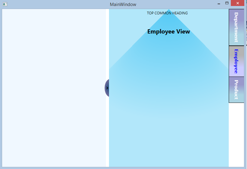
Created customStates which defines MouseOver, Normal and Selected visualstate object for each TabItems. When user puts mouse over the tab items, its background color changes to yellow and on mouse leave it will go back to red color.
 <ContentControl.LayoutTransform>
                            <RotateTransform Angle="90" />
                        </ContentControl.LayoutTransform>
The above snippet rotates TabItems from horizontal to Vertical.
Step 4 : Create Template for TabControl
<ControlTemplate x:Key="TabControlTemplate"
TargetType="TabControl">
<Grid>
<Grid.ColumnDefinitions>
<ColumnDefinition Width="Auto" />
<ColumnDefinition Width="*" />
<ColumnDefinition Width="Auto" />
</Grid.ColumnDefinitions>
<Grid Grid.Column="0">
<Button Template="{StaticResource PolygonButton}"
x:Name="CloseCall"
Cursor="Hand">
<Polyline HorizontalAlignment="Center"
VerticalAlignment="Center"
Stroke="Black"
StrokeThickness="2"
Points="0,0 4,4 0,8" />
<Button.Triggers>
<EventTrigger SourceName="CloseCall"
RoutedEvent="Button.Click">
<BeginStoryboard>
<Storyboard>
<DoubleAnimation Storyboard.TargetName="TabContentScalePanel"
Storyboard.TargetProperty="Width"
From="400"
To="0"
Duration="00:00:00.25" />
<ObjectAnimationUsingKeyFrames Duration="00:00:00.25"
Storyboard.TargetName="CloseCall"
Storyboard.TargetProperty="Visibility">
<DiscreteObjectKeyFrame KeyTime="00:00:00">
<DiscreteObjectKeyFrame.Value>
<Visibility>Collapsed</Visibility>
</DiscreteObjectKeyFrame.Value>
</DiscreteObjectKeyFrame>
</ObjectAnimationUsingKeyFrames>
<ObjectAnimationUsingKeyFrames Duration="00:00:00.25"
Storyboard.TargetName="OpenCall"
Storyboard.TargetProperty="Visibility">
<DiscreteObjectKeyFrame KeyTime="00:00:00">
<DiscreteObjectKeyFrame.Value>
<Visibility>Visible</Visibility>
</DiscreteObjectKeyFrame.Value>
</DiscreteObjectKeyFrame>
</ObjectAnimationUsingKeyFrames>
</Storyboard>
</BeginStoryboard>
</EventTrigger>
</Button.Triggers>
</Button>
<Button Template="{StaticResource PolygonButton}"
x:Name="OpenCall"
Visibility="Collapsed"
Cursor="Hand">
<Polyline HorizontalAlignment="Center"
VerticalAlignment="Center"
Stroke="Black"
StrokeThickness="2"
Points="4,0 0,4 4,8" />
<Button.Triggers>
<EventTrigger SourceName="OpenCall"
RoutedEvent="Button.Click">
<BeginStoryboard>
<Storyboard>
<DoubleAnimation Storyboard.TargetName="TabContentScalePanel"
Storyboard.TargetProperty="Width"
From="0"
To="400"
Duration="00:00:00.25" />
<ObjectAnimationUsingKeyFrames Duration="00:00:00.25"
Storyboard.TargetName="CloseCall"
Storyboard.TargetProperty="(UIElement.Visibility)">
<DiscreteObjectKeyFrame KeyTime="00:00:00">
<DiscreteObjectKeyFrame.Value>
<Visibility>Visible</Visibility>
</DiscreteObjectKeyFrame.Value>
</DiscreteObjectKeyFrame>
</ObjectAnimationUsingKeyFrames>
<ObjectAnimationUsingKeyFrames Duration="00:00:00.25"
Storyboard.TargetName="OpenCall"
Storyboard.TargetProperty="(UIElement.Visibility)">
<DiscreteObjectKeyFrame KeyTime="00:00:00">
<DiscreteObjectKeyFrame.Value>
<Visibility>Collapsed</Visibility>
</DiscreteObjectKeyFrame.Value>
</DiscreteObjectKeyFrame>
</ObjectAnimationUsingKeyFrames>
</Storyboard>
</BeginStoryboard>
</EventTrigger>
</Button.Triggers>
</Button>
</Grid>
<Border Grid.Column="1"
x:Name="TabContent">
<control:ScalePanel x:Name="TabContentScalePanel"
Width="400">
<Grid>
<Grid.RowDefinitions>
<RowDefinition Height="60" />
<RowDefinition Height="*" />
</Grid.RowDefinitions>
<Border Grid.RowSpan="2">
<Border.Background>
<RadialGradientBrush Center="0.5,0.5"
GradientOrigin="0.5,0"
RadiusX="0.6"
RadiusY="0.2">
<GradientStop Color="#B2E7FA"
Offset="1" />
<GradientStop Color="#55CAF5" />
</RadialGradientBrush>
</Border.Background>
</Border>
<Border Grid.Row="0"
VerticalAlignment="Top"
HorizontalAlignment="Stretch"
Margin="0,5,10,15">
<Grid>
<Grid.ColumnDefinitions>
<ColumnDefinition Width="*" />
</Grid.ColumnDefinitions>
<TextBlock Grid.Column="0"
HorizontalAlignment="Center"
Text="TOP COMMON HEADING" />
</Grid>
</Border>
<Border Grid.Row="1"
VerticalAlignment="Stretch">
<Grid>
<ContentPresenter x:Name="PART_SelectedContentHost"
ContentSource="SelectedContent"
Margin="0" />
</Grid>
</Border>
</Grid>
</control:ScalePanel>
</Border>
<Grid Grid.Column="2">
<ItemsPresenter />
</Grid>
</Grid>
</ControlTemplate>
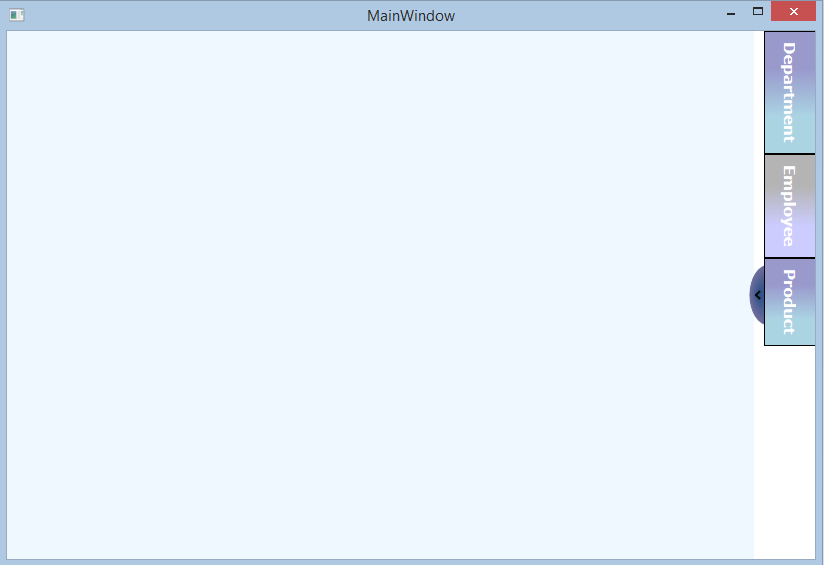
The above ControlTemplate creates Polygon button to show/hide panel (side bar) and style for TabControl background to set GradientColor.
I created one Trigger for Side bar control and storyboard for animation.
On button click, it executes trigger to show/hide side bar with doubleAnimation.
<DoubleAnimation Storyboard.TargetName="TabContentScalePanel"
       Storyboard.TargetProperty="Width"
       From="400"
       To="0"
       Duration="00:00:00.25" />
This code describes how to animate scalepanel and set width from 400 to 0.
To change button arrow (<, >) , I added "ObjectAnimationUsingKeyFrames".
<ObjectAnimationUsingKeyFrames Duration="00:00:00.25"
                                                                       Storyboard.TargetName="CloseCall"
                                                                       Storyboard.TargetProperty="Visibility">
                                            <DiscreteObjectKeyFrame KeyTime="00:00:00">
                                                <DiscreteObjectKeyFrame.Value>
                                                    <Visibility>Collapsed</Visibility>
                                                </DiscreteObjectKeyFrame.Value>
                                            </DiscreteObjectKeyFrame>
                                        </ObjectAnimationUsingKeyFrames>
Step 5: Drag & Drop TabControl into your Page and set templates
  <TabControl TabStripPlacement="Right"
                UseLayoutRounding="True"
                HorizontalContentAlignment="Stretch"
                VerticalContentAlignment="Top"
                Padding="0"
                Margin="0">
        <TabControl.Resources>
            <Style TargetType="TabItem">
                <Setter Property="Template"
                        Value="{StaticResource TabItemTemplate}" />
            </Style>
            <Style TargetType="TabControl">
                <Setter Property="Template"
                        Value="{StaticResource TabControlTemplate}" />
            </Style>
        </TabControl.Resources>

    // List of Tab items
    ......
    ......
    ......

    </TabControl>
In the above code, I am applying style and Template to TabControl and TabItems.
tep 6: Add Above created UserControl in your Mainwindow.xaml
<Window x:Class="WPFTabControlCustomization.MainWindow"
        xmlns="http://schemas.microsoft.com/winfx/2006/xaml/presentation"
        xmlns:x="http://schemas.microsoft.com/winfx/2006/xaml"
xmlns:controls="clr-namespace:WPFTabControlCustomization.UserControls"
        Title="MainWindow" Height="350" Width="525">
    <Grid x:Name="LayoutRoot">
        <Grid.ColumnDefinitions>
            <ColumnDefinition Width="*" />
            <ColumnDefinition Width="Auto" />
        </Grid.ColumnDefinitions>
        <Border Grid.Column="0"
                Background="AliceBlue"></Border>
        <Border Grid.Column="1"
                HorizontalAlignment="Right">
            <controls:SideMenuTabControl />
        </Border>
    </Grid>
</Window>
Now, Build your solution and check the output. you will see TabControl placed on Right side with all tabitems are vetically aligned on top-right. on tab item selection changed content of selected tab items are display on visible area.
