Introduction
The solution described in this article serves both practical and didactic purposes. This popular Electrical Engineering Calculator VOLTA demonstrates HTML5/CSS3 styling technique, which does not require any graphic files like .jpg or .png, etc. All aesthetic enhancements, like:
- rounded corners
- color gradients (in particular, color-stop property)
- borders
- shadows
are achieved exclusively via CSS3 styling, resulting in very small digital footprint and fast web page load. Following Demo and sample code snippets demonstrate aforementioned HTML5/CSS3 styling technique applied to the core elements of online calculator, i.e. input, button and div elements. The solution implements client-side jQuery scripting, making it rather universal, capable of running in off-line standalone mode (without Internet connectivity).
Demo screenshots
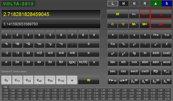
Following are sample screenshots of online Engineering Calculator utilizing aforementioned HTML5/CSS3 graphic enhancements (sample images pertain to the original VOLTA-2011 and subsequent versions including VOLTA-2013, etc.)

Calculator VOLTA-2013, landscape layout adapted for 16:9 display aspect ratio

Calculator VOLTA-2013, landscape layout, rounded corners achieved via CSS3 styling
Another screenshot corresponding to the "light" background (dynamically loaded CSS3) follows:

Calculator VOLTA with "light" background CSS3 styling

Adapted for smartphone, vertically extended version of the Electrical Engineering Calculator showing standard E-Series (E24)

Engineering Calculator with dynamically extented panel showing additional engineering and scientific functions.
Aesthetic HTML5 Button elements
Note: All aesthetic enhancements are achieved via pure HTML5/CSS3 styling; project does not use any graphic/image files.
Listing 1. HTML 5 Button and Input elements styling via pure CSS (no graphical files)
<!DOCTYPE HTML>
<html>
<head>
<title>AESTHETIC BUTTONS | HTML5, CSS3</title>
<meta http-equiv="Content-Type" content="text/html; charset=iso-8859-1" />
<meta http-equiv="Author" content="Alexander Bell" />
<meta http-equiv="Copyright" content="2011 Alexander Bell" />
<meta http-equiv="Expires" content="0" />
<meta http-equiv="Cache-control" content="no-cache">
<meta name="Robots" content="all" />
<meta name="Distribution" content="global" />
<meta name="Keywords" content="HTML5, CSS3, Buttons, CalculatorS " />
<meta name="Description" content ="Aesthetic buttons with Gradient and Rounded Corners, HTML5, CSS3" />
<style type="text/css">
input
{
width:80px;
height: 60px;
line-height:60px;
vertical-align:middle;
margin: 0px;
padding: 0px;
cursor: pointer;
cursor: hand;
font-family: Arial, Tahoma, Verdana, Calibri;
font-size: 28pt;
text-align: center;
background:#404040;
border: 2px solid #ababab;
color: #dadada;
-moz-border-radius: 10px;
-webkit-border-radius: 10px;
border-radius: 10px;
}
input:hover { font-weight:bold;}
input:active { border: 2px; }
.btnType1{
background: -moz-linear-gradient(top, #707070, #505050 48%, #bababa 50%, #303030 52%, #101010);
background: -webkit-gradient(linear, center top, center bottom, from(#707070), color-stop(0.48, #505050), color-stop(0.5, #bababa ), color-stop(0.52, #303030), to(#101010));
}
.btnType2{
background: -moz-linear-gradient(top, #dadada, #505050 5%, #bababa 50%, #bababa 50%, #303030 52%, #101010);
background: -webkit-gradient(linear, center top, center bottom, from(#707070), color-stop(0.48, #505050), color-stop(0.5, #bababa ), color-stop(0.52, #303030), to(#101010));
}
.btnType3{
background: -moz-linear-gradient(top, #dadada, #707070 5%, #515151 50%, #bababa 50%, #303030 52%, #101010);
background: -webkit-gradient(linear, center top, center bottom, from(#707070), color-stop(0.48, #505050), color-stop(0.5, #bababa ), color-stop(0.52, #303030), to(#101010));
}
.btnType4{
color:#505050;
background: -moz-linear-gradient(top, #f0f0f0, #bababa 10%, #cacaca 46%, #909090 48%, #dadada 52%, #cacaca 54%, #cacaca 90%, #ababab);
background: -webkit-gradient(linear, center top, center bottom, from(#f0f0f0), color-stop(0.1, #bababa ), color-stop(0.46, #cacaca), color-stop(0.48, #909090), color-stop(0.52, #dadada ), color-stop(0.54, #cacaca), color-stop(0.90, #cacaca), to(#ababab));
}
.btnType5{
color:#505050;
background: -moz-linear-gradient(top, #f0f0f0, #cacaca 48%, #707070 50%, #cacaca 52%, #fafafa);
background: -webkit-gradient(linear, center top, center bottom, from(#f0f0f0), color-stop(0.48, #cacaca), color-stop(0.5, #707070 ), color-stop(0.52, #cacaca), to(#fafafa));
}
.divClear { clear:both;}
</style>
</head>
<body>
<input type ="button" button value="A" class="btnType1" />
<input type ="button" button value="L" class="btnType1" />
<input type ="button" button value="E" class="btnType1" />
<input type ="button" button value="X" class="btnType1" />
<input type ="button" button value="A" class="btnType1" />
<input type ="button" button value="N" class="btnType1" />
<input type ="button" button value="D" class="btnType1" />
<input type ="button" button value="E" class="btnType1" />
<input type ="button" button value="R" class="btnType1" />
<div class="divClear"></div>
<input type ="button" button value="B" class="btnType2" />
<input type ="button" button value="E" class="btnType2" />
<input type ="button" button value="L" class="btnType3" />
<input type ="button" button value="L" class="btnType3" />
<input type ="button" button value="2" class="btnType4" />
<input type ="button" button value="0" class="btnType4" />
<input type ="button" button value="1" class="btnType5" />
<input type ="button" button value="1" class="btnType5" />
</body>
</html>
Design Notes
The box shadow effect could be achieved by using the following CSS code block shown in Listing 2:
Listing 2. Box Shadow effect using CSS
-moz-box-shadow: 5px 5px 10px rgba(0,0,0,0.3);
-webkit-box-shadow: 5px 5px 10px rgba(0,0,0,0.3);
box-shadow: 5px 5px 10px rgba(0,0,0,0.3);
Adding Tooltips. Further enhancement could be achieved by adding the context-sensitive help (a.k.a. Tooltips) to the buttons by using HTML elements "abbr" or "acronym". In this case no any Javascript is needed; the pop-up text will correspond to the title attribute of the abbr tag. Listing 3 demonstrates the sample implementation of this feature, pertinent to the Calculator Volta 2011
Listing 3
<nav>
    <menu id="menu1" class="oscMenu">
    <li>
        <a href="http://www.webinfocentral.com" title="Return to the front page">HOME</a>
    </li>
    <li id="active">
        <a href="http://webinfocentral.com/VOLTA/Manual.aspx" title="Read Instruction online">INSTRUCTION</a>
    </li>
    </menu>
</nav>
Points of Interest
Browser compatibility
Online Calculator Volta is compatible with all major Web Browsers that support HTML5, CSS3 and jQuery version(s) 2.0x
- Mozilla FireFox v.23+
- Google Chrome v.28+
- Safari v.6+
- IE9+
- Opera v.15+
Desktop version
The first desktop version of the Engineering Calculator software was created as a contest submission via direct conversion tool (HTML5 into Windows application) provided by Intel Corporation during the Ultrabooks Application Innovation Contest (AIC 2012). It was placed at the Intel's online App store for some time.
Much better results were achieved by completely re-programming the app using Microsoft .NET framework (WPF/XAML/C#) in Visual Studio 2010.

Demo screenshot: Calculator Volta-814D for Windows implements border-less WPF window with graphic enhancements via XAML, similar to the original online version utilizing HTML5/CSS3
History
- Dec 2010: Scientific Calculator ZENO-5000 has been released (HTML5 web app)
- Feb 2011: Online Electrical Engineering Calculator Volta-2011 has been released (HTML5)
- Mar 2012: Calculator VOLTA-2011 has been tested on newly released Apple iPad
- Oct 2012: Calculator Volta-2013 submitted to AppInnovation contest (app submission winner)
- Jan 2013: Calculator Volta-814D for Windows has been released
- Apr 2013: Online Calculator VOLTA was tested on Azure platform [7]
References
- Scientific Calculator ZENO-5000
