We will take the humble HTML input type="checkbox" and turned it into a Toggle switch with full state, ARIA compliance, and keyboard support usable anywhere on the page and also with Blazor EditForm support. We will also implement Light, Dark, Primary color theming, custom layouts, and lastly custom skinning with some very cool animated toggle switches.
Contents
Introduction
This is the second in a series of Blazor articles focusing on control development with light & dark theming built in. Check out the first article which sets the stage for theme support for this and the following articles.
Inspiration
In the past, I wrote an article on Flexible WPF ToggleSwitch Lookless Control in C# & VB, so the Toggle switch was the obvious choice for the first in this series on BLazor components.
Design
Requirements
The component needs to support:
- Use in Standard HTML and Blazor EditForm
- Control States:
- Enabled
- Focus
- Hover
- Checked
- Disabled
- Read-only
- Display of control parts
- Positioning
- Visibility
- All text changeable and custom markup
- Class, Style and custom attributes
- Aria compliance
- Theme support
- C# Nullable compliance
- Reusable across multiple projects
- Minimal JavaScript if unavoidable
- Latest Blazor and CSS3 coding techniques
- BEM — (Block Element Modifier) CSS class naming convention
There are many different toggle switch designs in various Blazor 3rd-party libraries. For this control, I'm basing the look off the standard Windows look.
Light Theme
Dark Theme

Custom Themes
We will explore two different implementations for switching primary theme colors:
- Applying CSS variables via styles directly on the HTML tag
- Using preset CSS Class names
Below is an example where we have applied the red primary color scheme for the base and hover colors.
Custom UI
Later in this article, we will explore how to customize the look with six different designs. Whilst the appearance and animation is different for each component, the underlying HTML remains unchanged.
Implementation
Aria Compliance
Whilst there is no specific documentation of requirements, however, as it is based on the input type="checkbox", we can adhere to Dual-state requirements. An example is also available.
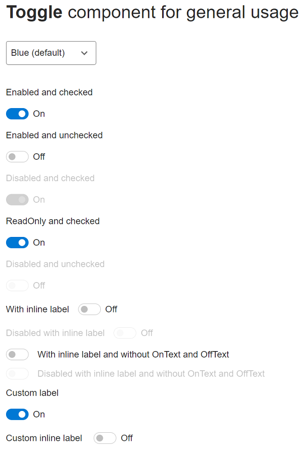
Toggle Switch UI
Toggle switches have three parts to the control:
- Label/Header - Text to inform the user what the selection is for
- Toggle - the clickable on/off switch
- State - text indicating the toggle state
For custom UI, I have added a fourth part. This is not used for the default components. When the control is rendered, the markup is as follows:
<div class="c-toggle">
    <div id="id_piLBO02PjEqg5wHdYvv4gA" class="c-toggle__label">
        Enabled and checked
    </div>
    <div class="c-toggle__container">
        <input type="checkbox" role="switch"
               id="id_VfH38gwO8UOP45Y_g7v5bg"
               class="c-toggle__pill"
               aria-labelledby="id_nB-HBiD9DUORGBYQXFU2sA"
               aria-checked="true"
               aria-readonly="false">
        <label class="c-toggle__thumb"
               for="id_VfH38gwO8UOP45Y_g7v5bg"
               aria-labelledby="id_piLBO02PjEqg5wHdYvv4gA"
               data-label="On" data-label-on="On" data-label-off="Off"
               tabindex="0">
            <span class="c-toggle__thumb-inner"></span>
        </label>
        <span id="id_nB-HBiD9DUORGBYQXFU2sA"
              class="c-toggle__state-text">On</span>
    </div>
</div>
Breakdown by class name:
c-toggle - root containerc-toggle__label - header labelc-toggle__container - holds the switch and state. Allows for flexible positioningc-toggle__pill - holds the state value for the component. It is used for HTML Form and Blazor EditForm input control requirement. The UI properties for readonly, disabled, checked and the onchange event tracking are wired up on this tag.c-toggle__thumb - The default UI for the component. The ::after selector is used to render the switch thumb position for the on and off states. There are also data-label (deleted state), data-label-on (on state text), and data-label-off (off state text) for custom UI support. tabindex attribute is used to tell the browser where to set the focus.c-toggle__thumb-inner - This is not used for the default rendering but is there for custom UI support.c-toggle__state-text - The text label for the on and off states.
Component StyleSheet
The Toggle switch is implemented as two separate components - one for working with the Blazor EditForm, and one for general usage. To allow flexibility, and reduce duplication, CSS Isolation was not used, but there is a default stylesheet included in the Razor Class Library (RCL). To use, we need to include in the index.html header.
<link href="_content/Blazor.Toggle/css/styles.css" rel="stylesheet" />
The order of the stylesheets is important to for CSS Specificity requirements:
- Base CSS Framework - e.g.: Bootstrap
- Library stylesheet(s)
- application stylesheet(s)
So, for example, for the demonstration project, the following is used:
<link href="css/bootstrap/bootstrap.min.css" rel="stylesheet" />
<link href="_content/Blazor.Toggle/css/styles.css" rel="stylesheet" />
<link href="ToggleDemo.styles.css" rel="stylesheet" />
<link href="css/app.css" rel="stylesheet" />
Theming
CSS variables are used, to enable toggling between the Light and Dark modes. Check out the previous article on how this is implemented.
I have tried to use not use CSS variable names specific to the component, but generic names instead for future use with other controls.
Light Theme
--primary-fill: #0078D4;
--primary-fill-hover: #006CBE;
--primary-foreground: #FFFFFF;
--neutral-fill: #EDEDED;
--neutral-fill-hover: #E5E5E5;
--neutral-outline: #646464;
--neutral-outline-hover: #3B3B3B;
--neutral-foreground: #2B2B2B;
--neutral-focus-visual: 0 0 0 0.25rem rgba(13, 110, 253, 0.25);
--neutral-shadow-visual:  0 10px 20px -8px #3B3B3B;
--neutral-border: #BEBEBE;
--neutral-color1: #767676;
--neutral-color2: #FFFFFF;
--neutral-background1: #FFFFFF;
--neutral-background2: #F7F7F7;
--icon-backkground: #b6d2e8;
Dark Theme
--primary-fill: #006CBE;
--primary-fill-hover: #0078D4;
--primary-foreground: #FFFFFF;
--neutral-fill: #363636;
--neutral-fill-hover: #3D3D3D;
--neutral-outline: #646464;
--neutral-outline-hover: #8A8A8A;
--neutral-foreground: #F5F5F5;
--neutral-focus-visual: 0 0 0 0.25rem rgba(120,120,120,0.25);
--neutral-shadow-visual: 0 10px 20px -8px #8A8A8A;
--neutral-border: #323232;
--neutral-color1: #8D8D8D;
--neutral-color2: #929292;
--neutral-background1: #202020;
--neutral-background2: #424242;
--icon-backkground: #0066B4
Disabled
For the disabled state, the opacity is used to reduce the number of CSS variables used.
--disabled-opacity: 0.3;
Primary Color Theming
There is some alternate colors included.
.c-toggle__primary-indigo {
    --primary-fill: #6610f2;
    --primary-fill-hover: #580ED1;
}

.c-toggle__primary-purple {
    --primary-fill: #6f42c1;
    --primary-fill-hover: #633BAD;
}

.c-toggle__primary-red {
    --primary-fill: #dc3545;
    --primary-fill-hover: #C72F3E;
}

.c-toggle__primary-orange {
    --primary-fill: #fd7e14;
    --primary-fill-hover: #EB7512;
}

.c-toggle__primary-green {
    --primary-fill: #198754;
    --primary-fill-hover: #177A4C;
}
As part of the demonstration code, I demonstrate how you can add your own custom primary theme colors using two commonly used methods: using Styles and Classes.
Custom UI
There are also six custom UIs included in the demonstration project, all using the same component properties, with the exception of the CSS Classes. The CSS classes are used to apply the changes.
As you can see from the screenshot above, the rendered markup is identical for the Toggle and ToggleInput components, so the custom UI CSS will work seamlessly with both.
Here is the code to render the Toggle components:
<div class="@CssSection">

    <h3>Standard <b>Toggle</b> Component</h3>

    <div class="o-custom__sections">
        @foreach (CustomToggleModel model in Toggles)
        {
          <section class="o-section__custom">
                <Toggle Value="@true"
                        Class="@model.CssClass"
                        OnText="@model.YesChoice"
                        OffText="@model.NoChoice" />
          </section>
        }
    </div>
</div>
And here is the code to render the ToggleInput components:
<EditForm class="@CssSection" Model="Toggles">

    <h3>EditForm <b>ToggleInput</b> Component</h3>

    <div class="o-custom__sections">
        @foreach (CustomToggleModel model in Toggles)
        {
            <section class="o-section__custom">
                <ToggleInput @bind-Value="model.IsChecked"
                        Class="@model.CssClass"
                        OnText="@model.YesChoice"
                        OffText="@model.NoChoice" />
            </section>
        }
    </div>
</EditForm>
The C# code behind to assign the CSS Classes and default choices and names:
#region BEM
private readonly string CssSection
= "o-section".JoinName("body");
#endregion
#region Fields
private const string NoChoiceValue = "No";
private const string YesChoiceValue = "Yes";
#endregion
#region Properties
private List<CustomToggleModel> Toggles { get; } = new()
{
new ()
{
NoChoice = NoChoiceValue,
YesChoice = YesChoiceValue,
CssClass = "custom__toggle
custom__toggle-2
custom__toggle--position"
},
};
NOTE: The above custom UI was selected from the Free Frontend website. Worth checking out as they have many to choose from.
The Code
Markup
The razor is pretty self explanatory:
- Positioning of each part is selectable with properties and methods:
HasLabel, HasOnOffLabel(), and Position - Custom content is supported for the Header Label via
LabelContent . - On and Off state text is set via the
OnText and OffText properties. Active state is set using StateLabel private property. - Component UI
disable, enabled>, and <checked> UI properties are set via private and public component properties on the input` tag..
<div class="@Classname" style="@Style">
    @if (HasLabel())
    {
        <div id="@LabelId" class="@CSS.Label">
            @if (LabelContent is not null)
            {
                @LabelContent
            }
            else
            {
                @Label
            }
        </div>
    }
    <div class="@CSS.Container">
        @if (Position == TogglePosition.Left)
        {
            <input type="checkbox" role="switch"
                   id="@PillId" class="@CSS.Pill"
                   aria-labelledby="@StateLabelId"
                   aria-checked="@Value.ToString().ToLower()"
                   aria-readonly="@Disabled.ToString().ToLower()"
                   checked="@Value" disabled="@Disabled"
                   onchange="@OnChange"
                   @onclick:preventDefault="@ReadOnly"/>

            <label class="@CSS.Thumb" for="@PillId"
                   aria-labelledby="@LabelId"
                   data-label="@StateLabel"
                   data-label-on="@OnText"
                   data-label-off="@OffText"
                   tabindex="0"
                   @onkeydown="@(OnKeyDownAsync)"
                   @onkeydown:preventDefault="true"
                   @onkeydown:stopPropagation="true">
                <span class="@CSS.ThumbInner"></span>
            </label>

            @if (HasOnOffLabel())
            {
                <span id="@StateLabelId" class="@CSS.State">
                    @StateLabel
                </span>
            }
        }
        else
        {
            @if (HasOnOffLabel())
            {
                <span id="@StateLabelId" class="@CSS.State">
                    @StateLabel
                </span>
            }

            <input type="checkbox" role="switch"
                   id="@PillId" class="@CSS.Pill"
                   aria-labelledby="@StateLabelId"
                   aria-checked="@Value.ToString().ToLower()"
                   aria-readonly="@Disabled.ToString().ToLower()"
                   checked="@Value" disabled="@Disabled"
                   onchange="@OnChange"
                   @onclick:preventDefault="@ReadOnly"/>

            <label class="@CSS.Thumb" for="@PillId"
                   aria-labelledby="@LabelId"
                   data-label="@StateLabel"
                   data-label-on="@OnText"
                   data-label-off="@OffText"
                   tabindex="0"
                   @onkeydown="@(OnKeyDownAsync)"
                   @onkeydown:preventDefault="true"
                   @onkeydown:stopPropagation="true">
                <span class="@CSS.ThumbInner"></span>
            </label>
        }
    </div>
</div>
The key razor code difference between the Toggle and ToggleInput components is the input tag.
For the Toggle component:
<input type="checkbox" role="switch"
       id="@PillId" class="@CSS.Pill"
       aria-labelledby="@StateLabelId"
       aria-checked="@Value.ToString().ToLower()"
       aria-readonly="@Disabled.ToString().ToLower()"
       checked="@Value" disabled="@Disabled"
       onchange="@OnChange" @onclick:preventDefault="@ReadOnly"/>
With the Toggle component, we are manually binding to the Value property and hooking into the onchange event. When the onchange event triggers, we manually update the Value property and call StateHasChanged() to update the UI.
For the ToggleInput component:
<input type="checkbox" role="switch"
       id="@PillId" class="@CSS.Pill"
       aria-labelledby="@StateLabelId"
       aria-checked="@CurrentValue.ToString().ToLower()"
       aria-readonly="@Disabled.ToString().ToLower()"
       @bind=CurrentValue disabled="@Disabled"
       @onclick:preventDefault="@ReadOnly"/>
With the ToggleInput, we are two-way binding into the base InputBae<T> class and the base class will handle the UI refreshing when there is a value change.
Code behind
I will focus on the key logic and skip the properties. The properties are straight forward.
Component part IDs
Aria and HTML markup requires for various parts to point at each other. Example: aria-labelledby, &for. We only need to set these once on component creation.
protected override void OnInitialized()
{
    _labelId = GetUniqueId();
    _pillId = GetUniqueId();
    _stateLabelId = GetUniqueId();

    if (DefaultValue)
        Value = true;

    base.OnInitialized();
}
A helper method is used for the unique ids. Can be found in the Blazor.Common library.
In the component base class:
public string GetUniqueId()
    => "id_" + Guid.NewGuid().ToShortString();
The extension method:
public static class GuidExtensions
{
    public static string ToShortString(this Guid guid)
        => Convert.ToBase64String(guid
                     .ToByteArray())
                     .Replace('+', '-').Replace('/', '_')[..22];
}
Component Configuration
CSS Class names are used to configure the UI based on the properties set:
private string Classname
{
    get
    {
        CssBuilder builder = new CssBuilder(CSS.Root);

        if (Disabled)
            builder.AddClass(CSS.Modifier.Disabled);

        if (InlineLabel)
            builder.AddClass(CSS.Modifier.InlineLabel);

        if (!HasOnOffLabel())
            builder.AddClass(CSS.Modifier.NoOnOffLabel);

        if (!string.IsNullOrEmpty(Class))
            builder.AddClass(Class);

        return builder.Build();
    }
}
I'm using a helper class from Ed Charbeneau · GitHub to build the CSS Classes - a must have for clean code!
ToggleInput Validation
The ToggleInput has extra code required by the InputBase<TValue> for parsing the Value and validation:
protected override bool TryParseValueFromString
(
    string? value,
    out bool result,
    out string validationErrorMessage
)
{
    if (bool.TryParse(value, out bool parsedValue))
    {
        result = parsedValue;
        validationErrorMessage = string.Empty;
        return true;
    }

    result = default;
    validationErrorMessage = $"The {FieldIdentifier.FieldName} field is not valid.";
    return false;
}
Keyboard Support
Aria requirements for keyboard support is only the space key. However, I have also added support for the enter key.
First, we need to hook the onkeydown event. We also need to consume the keypress:
<label class="@CSS.Thumb" for="@PillId" aria-labelledby="@LabelId"
       data-label="@StateLabel" data-label-on="@OnText" data-label-off="@OffText"
       tabindex="0"
       @onkeydown="@(OnKeyDownAsync)"
       @onkeydown:preventDefault="true"
       @onkeydown:stopPropagation="true">
Now we can handle the event. The Toggle component, we manually handle the Value change event. For the ToggleInput, the InputBase<TValue> base class handles the change event, so we need to approach it differently.
For Toggle component:
private void OnKeyDownAsync(KeyboardEventArgs arg)
{
switch (arg.Code)
{
case "Space":
case "Enter":
OnChange();
break;
}
}
private void OnChange()
{
if (_disabled)
return;
Value = !Value;
InvokeAsync(async () => await ValueChanged.InvokeAsync(Value));
}
For the ToggleInput component:
private void OnKeyDownAsync(KeyboardEventArgs arg)
{
switch (arg.Code)
{
case "Space":
case "Enter":
CurrentValue = !CurrentValue;
break;
}
}
Usage
Toggle
The sample projects has four examples:
- Basic usage with primary theming
- EditForm usage with primary theming
- Custom layout
- Custom UI design
Basic:
<Toggle Label="Enabled and checked"
        DefaultValue="true"
        OnText="On" OffText="Off"
        Style="@CustomStyle"/>
Custom Label:
<Toggle InlineLabel="true"
        OnText="On" OffText="Off"
        Class="@CustomCss"
        ValueChanged=@OnCheckedAsync>
    <LabelContent>
        Custom inline label
    </LabelContent>
</Toggle>
ToggleInput
The ToggleInput with throw an exception if not enclosed in an EditForm component.
<EditForm class="o-editform"
          Model=MyModel
          OnValidSubmit="@HandleValidSubmit">
    <ToggleInput @bind-Value=MyModel.BoundChecked2
                 Class="@CustomCss"
                 Label="Are you sure?"
                 InlineLabel="true"
                 OnText="Yes"
                 OffText="No" />
</EditForm>
Custom Layout
There is a settings demonstration that shows a custom layout. I've modernised the example used in the Flexible WPF ToggleSwitch Lookless Control in C# & VB article.
Here we are setting the Icon, Title, and Selected State in the LabelContent and using display: flex to position the elements:
<ToggleInput @bind-Value="model.IsChecked"
             Class="@CssSenderItem"
             Position="TogglePosition.Right"
             OnText="@model.YesChoice"
             OffText="@model.NoChoice"
             Disabled="@NotificationsDisabled">
    <LabelContent>
            @if (!string.IsNullOrEmpty(model.IconType))
            {
                <box-icon name='@model.IconName'
                          type='@model.IconType'
                          class="@CssSenderItemIcon">
                </box-icon>
            }
            else
            {
                <box-icon name='@model.IconName'
                          class="@CssSenderItemIcon">
                </box-icon>
            }
            <div class="@CssSenderItemText">
                <span class="@CssSenderItemTitle">
                    @model.Title
                </span>
                <span class="@CssSenderItemState">
                    @GetStateLabel(model.IsChecked)
                </span>
            </div>
    </LabelContent>
</ToggleInput>
And here is the CSS to layout and size the parts:
.c-setting {
    display: flex;
    flex-direction: column;
    gap: 0.5em;
}

.c-sender__item {
    display: flex;
    align-items: center;
}

.c-sender__item .c-toggle__label {
    display: flex;
    flex-direction: row;
    flex-grow: 1;
}

.c-sender__item-text {
    display: flex;
    flex-direction: column;
    line-height: 1.35;
}

.c-sender__item-title {
    font-size: 1.15em;
}

.c-sender__item-state {
    font-size: 0.85em;
}
ColorSelect - Bonus Component
To demonstrate Primary Color Theming, a standard Select tag dropdown could have been used. Instead, I wanted something that was more customizable that showed the color being selected. A quick Code Pen search and found this Pure CSS Select Box that I adapted and turned into a Blazor Component with Light and Dark themes.
Summary
We have taken the humble input type="checkbox" and turned it into a Toggle Switch for both normal and EditForm use. Usage in your own project is simple to implement with a handful of properties and a single event.
We have also added light, dark, and primary color theme support. We have also seen how to customize the layout of the parts. Lastly, we have also demonstrated how to take it to the next level, will cool animated custom UI.
As a bonus, a ColorSelect control was included.
Download the code and see it in action.
Enjoy!
History
- v1.0 - 7th February, 2022 - Initial release
This member has not yet provided a Biography. Assume it's interesting and varied, and probably something to do with programming.


 General
  News
News  Suggestion
  Question
  Bug
Bug  Answer
  Joke
Joke  Praise
  Rant
Rant  Admin
Admin 


 Submit an article or tip


