This article describes how to customize the default CSS setup in Blazor, and looks at the new Scoped CSS.
Introduction
This article covers:
- Customizing the deployed BootStrap
- How to switch to a different CSS Framework
- The new Scoped CSS functionality
Please note that this article is aimed at programmers relatively new to DotNetCore and Blazor, and assumes you have some knowledge of SASS. The article also assumes you're using Visual Studio 2019 - I use the Community Edition.
The code is available at Blazor.CSS on GitHub.
Getting Started
- Create a new Blazor Application using Net5. I've used Server in the supplied code, but there's no difference between Server and WASM.
- Run the site to make sure it works.
- Install the Web Compiler extension. Extensions > Manage Extensions. You'll need to restart Visual Studio to complete the installation.
Set Up SASS
- Add folder SASS to the project.
- Move wwwroot/css/site.css file to SASS and rename it custom.scss.
- Add bootstrap-site.scss to the folder.
- Right mouse click on the file > Web Compiler > Compile File.
- This will add a compilerconfig.json file to the project. This is the configuration file for Web Compiler.
compilerconfig.json will look like this:
[
  {
    "outputFile": "SASS/bootstrap-site.css",
    "inputFile": "SASS/bootstrap-site.scss"
  }
]
- Change this to output the compiled file into the web site:
[
  {
    "outputFile": "wwwroot/css/site.css",
    "inputFile": "SASS/bootstrap-site.scss"
  }
]
- Save and a new site.css should appear in wwwroot/css. There'll be nothing in it because the source file is empty.
Set up Bootstrap
- Add a Bootstrap folder to SASS.
- Add a custom folder to Bootstrap.
- Download the Bootstrap Source from the Bootstrap site and copy the scss folder to Bootstrap.
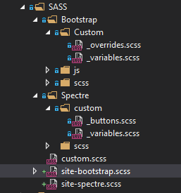
The full SASS folder (including the Spectre and other files that we will add later) should look like this:
- Edit SASS/bootstrap-site.scss.
@import "../wwwroot/css/open-iconic/font/css/open-iconic-bootstrap.min.css";
@import "Bootstrap/scss/_functions";
@import "Bootstrap/scss/bootstrap";
@import "custom.scss";
- Save and Web Compiler will compile a new site.css. Watch the status in the bottom left corner of Visual Studio.
You should have a *site.css and a site.min.css in wwwroot/css.
- Edit _Host.cshtml, and remove the reference to bootstrap.min.css - all the CSS is now compiled into site.css.
<head>
    <meta charset="utf-8" />
    <meta name="viewport" content="width=device-width, initial-scale=1.0" />
    <title>Blazor.CSS</title>
    <base href="~/" />
    \\ Remove bootstrap CSS reference
    <link rel="stylesheet" href="css/bootstrap/bootstrap.min.css" />
    \\
    <link href="css/site.css" rel="stylesheet" />
    \\ This is the new Net5 build generated Scoped CSS stylesheet
    \\ more later in this article
    <link href="Blazor.CSS.styles.css" rel="stylesheet" />
</head>
- Run the project. Everything should be the same as before.
Customize Bootstrap
We customize Bootstrap by adding new scss files. I'm assuming you have a basic understanding of SASS. If not, then do a bit of background reading - it isn't rocket science.
To demonstrate customization, we'll adjust some of the colours and add some new button styles. Most of the code is derived from the SB2 Bootstrap template.
Add _variables.scss to SASS/custom and add the following content. You can compare it with the base SASS/Bootstrap/scss/_variables.scss to see the differences.
$white: #fff !default;
$gray-100: #f8f9fc !default;
$gray-200: #eaecf4 !default;
$gray-300: #dddfeb !default;
$gray-400: #d1d3e2 !default;
$gray-500: #b7b9cc !default;
$gray-600: #858796 !default;
$gray-700: #6e707e !default;
$gray-800: #5a5c69 !default;
$gray-900: #3a3b45 !default;
$black: #000 !default;
$blue: #4e73df !default;
$indigo: #6610f2 !default;
$purple: #6f42c1 !default;
$pink: #e83e8c !default;
$red: #e74a3b !default;
$orange: #fd7e14 !default;
$yellow: #f6c23e !default;
$green: #1cc88a !default;
$teal: #20c9a6 !default;
$cyan: #36b9cc !default;
$primary: $blue !default;
$secondary: $gray-600 !default;
$success: $green !default;
$info: $cyan !default;
$warning: $yellow !default;
$danger: $red !default;
$light: $gray-100 !default;
$dark: $gray-800 !default;
$brand: #b3ccff;
$theme-colors: () !default;
$theme-colors: map-merge( (
"primary": $primary,
"secondary": $secondary,
"success": $success,
"info": $info,
"warning": $warning,
"danger": $danger,
"error": $danger,
"light": $light,
"dark": $dark,
"brand": $brand,
"add": $primary,
"new": $info,
"edit": $primary,
"delete": $danger,
"nav": $secondary,
"change": $warning,
"save": $success
),
$theme-colors );
$brand-google: #ea4335 !default;
$brand-facebook: #3b5998 !default;
$yiq-contrasted-threshold: 195 !default;
$body-color: $gray-600 !default;
$font-family-sans-serif: "Nunito", -apple-system, BlinkMacSystemFont,
"Segoe UI", Roboto, "Helvetica Neue", Arial, sans-serif, "Apple Color Emoji",
"Segoe UI Emoji", "Segoe UI Symbol", 'Noto Color Emoji' !default;
$font-size-base: .925rem !default;
$font-size-lg: $font-size-base * 1.20 !default;
$font-size-sm: $font-size-base * .875 !default;
$font-weight-light: 300 !default;
$headings-font-weight: 400 !default;
$box-shadow-sm: 0 0.125rem 0.25rem 0 rgba($gray-900, .2) !default;
$box-shadow: 0 0.15rem 1.75rem 0 rgba($gray-900, .15) !default;
$border-radius: 0.35rem !default;
$border-color: darken($gray-200, 2%) !default;
$topbar-base-height: 4.375rem !default;
$sidebar-base-width: 14rem !default;
$sidebar-collapsed-width: 6.5rem !default;
$card-cap-bg: $gray-100 !default;
$card-border-color: $border-color !default;
$spacer: 1rem !default;
$grid-gutter-width: $spacer * 1.5 !default;
$transition-collapse: height .15s ease !default;
$dropdown-font-size: 0.85rem !default;
$dropdown-border-color: $border-color !default;
$enable-rounded: false;
Add _overrides.scss to SASS/custom and add the following content. It demonstrates the sort of changes you can make - we don't actually use it on the site.
.form-group {
margin-bottom: .25rem;
}
div.alert-sm .alert {
padding: .25rem 1.25rem;
margin-bottom: 0rem;
}
Build the Customized Bootstrap
To build the custom version of Bootstrap, we need to add the new SASS files into the compile process.
Edit SASS/bootstrap-site.scss:
@import "../wwwroot/css/open-iconic/font/css/open-iconic-bootstrap.min.css";
@import "Bootstrap/scss/_functions";
@import "Bootstrap/Custom/_variables";
@import "Bootstrap/scss/bootstrap";
@import "Bootstrap/Custom/_overrides";
@import "custom.scss";
Save and this should compile.
To see the changes, edit Pages/Counter.razor and add a few extra buttons to the page.
<button class="btn btn-primary" @onclick="IncrementCount">Click me</button>
<button class="btn btn-save" @onclick="IncrementCount">Save Styled Click me</button>
<button class="btn btn-delete" @onclick="IncrementCount">Delete Styled Click me</button>
<button class="btn btn-brand" @onclick="IncrementCount">Brand Styled Click me</button>
Run the site and navigate to the counter page to check the button customization. They should look like this:

Changing CSS Frameworks
Not everyone wants to use Bootstrap - some people like being a little different! In this section, we'll change over to Spectre.
- Download the Spectre code from Github.
- Create a Spectre directory in SASS.
- Create a scss directory in Spectre.
- Copy the contents of spectre.src into SASS/Spectre/scss.
- Create site-spectre.scss in SASS and add the following code:
@import "Spectre/scss/spectre";
- Edit compilerconfig.json:
[
  {
    "outputFile": "wwwroot/css/site.css",
    "inputFile": "SASS/site.scss"
  },
  {
    "outputFile": "wwwroot/css/spectre.css",
    "inputFile": "SASS/site-spectre.scss"
  },
  {
    "outputFile": "wwwroot/css/spectre-icons.css",
    "inputFile": "SASS/Spectre/scss/Spectre-icons.scss"
  }
]
Once you save this, you should get a compiled spectre.css and spectre-icons.css in wwwroot/css.
Customization
Add folder custom to SASS/Spectre.
Add _variables.scss:
$brand-color: #7952b3 !default;
$exit-color: #66758c !default;
$save-color: #32b643 !default;
$delete-color: #e85600 !default;
Add _buttons.scss:
.btn {
&.btn-exit {
@include button-variant($exit-color);
}
&.btn-brand {
@include button-variant($brand-color);
}
&.btn-delete {
@include button-variant($delete-color);
}
}
Edit SASS/site-spectre.scss:
@import "Spectre/custom/_variables";
@import "Spectre/scss/spectre";
@import "Spectre/custom/_buttons";
Finally, change _Host.cshtml over to the new css:
<head>
    <meta charset="utf-8" />
    <meta name="viewport" content="width=device-width, initial-scale=1.0" />
    <title>Blazor.CSS</title>
    <base href="~/" />
    \\ Link to the new custom Spectre CSS
    <link href="css/spectre.css" rel="stylesheet" />
    <link href="Blazor.CSS.styles.css" rel="stylesheet" />
</head>
Run the site.
It will look a little different - it needs some work to fix small problems but basically works. Go to the Counter page to see the different buttons - Spectre and Bootstrap button class names are very similar so work.
Scoped CSS - Component Styling
A new feature in Net5 is scoped CSS a.k.a. component styling. Take a look at the Shared folder in the project and you'll see css files attached to the NavMenu and MainLayout razor components.
To explore how this works, let's re-style the FetchData data table.
- Add a new Razor component DataGrid.razor to Shared, and add the following code - it's a modified version of the existing fetchdata code.
@using Blazor.CSS.Data

@if (forecasts == null)
{
    <p><em>Loading...</em></p>
}
else
{
    <table class="table">
        <thead>
            <tr>
                <th>Date</th>
                <th>Temp.  (C)</th>
                <th>Temp.  (F)</th>
                <th>Summary</th>
                <th class="max-column">Detail</th>
            </tr>
        </thead>
        <tbody>
            @foreach (var forecast in forecasts)
            {
                <tr>
                    <td>@forecast.Date.ToShortDateString()</td>
                    <td>@forecast.TemperatureC</td>
                    <td>@forecast.TemperatureF</td>
                    <td>@forecast.Summary</td>
                    <td class="max-column">
                        <div class="grid-overflow">
                            <div class="grid-overflowinner">
                                @($"The Weather Forecast for this
                                  {forecast.Date.DayOfWeek}, the {forecast.Date.Day}
                                  of the month {forecast.Date.Month}
                                  in the year of our Lord {forecast.Date.Year}
                                  is {forecast.Summary}")
                            </div>
                        </div>
                    </td>
                </tr>
            }
        </tbody>
    </table>
}
@code {
    [Parameter] public WeatherForecast[] forecasts { get; set; } = null;
}
- Add DataGrid.razor.css to Shared. It should associate with DataGrid.razor. The component specific css goes here. We're adding some css to format the max column and handle text overflow gracefully.
.max-column {
    width:50%;
}

.grid-overflow {
    display: flex;
}

.grid-overflowinner {
    flex: 1;
    width: 1px;
    overflow-x: hidden;
    white-space: nowrap;
    text-overflow: ellipsis;
}
- Modify Fetchdata to use the new component.
@page "/fetchdata"

@using Blazor.CSS.Data
@inject WeatherForecastService ForecastService

<h1>Weather forecast</h1>

<p>This component demonstrates fetching data from a service
   and a data grid to displaying it.</p>

<DataGrid forecasts="this.forecasts"></DataGrid>

@code {
    private WeatherForecast[] forecasts;

    protected override async Task OnInitializedAsync()
    {
        forecasts = await ForecastService.GetForecastAsync(DateTime.Now);
    }
}
- Run the site and
Fetchdata should look like this:
Note the max column operating with the ellipsis shortening as the page is narrowed.
What's Going On
Open Developer Tools in the browser and take a look at the HTML.
Note the new unique ID attribute used on various elements in the HTML.
Look at Blazor.CSS.styles.css - the CSS file generated by Blazor during the build process. You can see the css scoped to the components using the unique IDs.
Finally, look at the obj view in Solution Explorer in the project. You can see the specific css files generated for each component and the bundled file based on the project name. This is exposed in the wwwroot folder.
Wrap Up
There are many ways to deploy and use custom CSS in Blazor. This is one of many, but probably one of the simplest.
I've covered Scoped CSS here, though I'm not sure how much I'll use it.
History
- 16th December, 2020: Initial version
Ex Geologist, Project Manager, Web Hoster, Business Owner and IT Consultant. Now, a traveller to places less travelled. And part time developer trying to keep up!
If you feel like saying thanks, the next time you see a charity request, DONATE. No matter how small, no matter who, it'll count. If you have a choice in the UK, Barnados.


 General
  News
News  Suggestion
  Question
  Bug
Bug  Answer
  Joke
Joke  Praise
  Rant
Rant  Admin
Admin 


 Submit an article or tip


