Introduction
This article is a continuation of my previous "controls" article and focuses on the ItemsControls (lists) in WPF. While virtually any control in WPF can be made to contain various atomic parts, these containers are designed to show collection based data; typically through data binding. The examples are written in XAML, as it can be easily copied and pasted into the Visual Studio 2008 (or any other) designer. My goal is to show how the controls work with screenshots and XAML, instead of using text descriptions.
The examples start off simple and gradually get more complex. Even though it is not shown, almost all the techniques used in one of the controls can be used in the others. For example, I did not see the need to show that you could change the text color for all the controls; the method to do so is the same for all of them.
WPF Visual Quick Start Articles by Josh Fischer
Conventions
In some of the examples, you will see references to "sys" and "col" like the following:
<sys:Decimal>1</sys:Decimal>
These are simply namespaces that have been imported into the XAML file. To import them, simply use the "xmlns" notation in your Window tag:
<Window x:Class="XViews.Window1"
xmlns="http://schemas.microsoft.com/winfx/2006/xaml/presentation"
xmlns:x="http://schemas.microsoft.com/winfx/2006/xaml"
xmlns:sys="clr-namespace:System;assembly=mscorlib"
xmlns:col="clr-namespace:System.Collections;assembly=mscorlib"
Width="250" Height="250">
Any resources used in the examples are assumed to be in the Window.Resources tag:
<Window Name="MyWindow" ... >
    <Window.Resources>
        -- Resources Here --
    </Window.Resources>
    <Canvas>
        ...
    </Canvas>
</Window>
The Controls
- ComboBox - Displays only the selected value of a list which is hidden by default.
- ListBox - Shows many and potentially all items in a list and which ones are selected.
- ListView - Functions as a ListBox, but allows greater visual customization.
- TreeView - Arranges hierarchical data in a parent/child structure.
ComboBox
Displays only the selected value of a list which is hidden by default.
Basic ComboBox
We have to start somewhere, so let's start simple.
<Canvas>
    <ComboBox Width="200">
        <ComboBoxItem>One</ComboBoxItem>
        <ComboBoxItem>Two</ComboBoxItem>
        <ComboBoxItem>Three</ComboBoxItem>
        <ComboBoxItem>Four</ComboBoxItem>
        <ComboBoxItem Content="Five" />
        <ComboBoxItem Content="Six" />
    </ComboBox>
</Canvas>
Note: Whether you specify the "Content" explicitly or not, the result is the same.
Basic Visual Changes
As with most WPF controls, you can play with the fonts, colors, sizes, etc., as much as you want.

<Canvas>
    <ComboBox Width="200" FontSize="14" BorderThickness="4" BorderBrush="Yellow">
        <ComboBoxItem Width="50" Background="Red">One</ComboBoxItem>
        <ComboBoxItem HorizontalAlignment="Right" Foreground="Green">Two</ComboBoxItem>
        <ComboBoxItem FontWeight="Bold" FontFamily="Wide Latin">Three</ComboBoxItem>
        <ComboBoxItem FontSize="8">Four</ComboBoxItem>
        <ComboBoxItem Content="Five" BorderBrush="Black" BorderThickness="4" />
        <ComboBoxItem FontSize="8" Background="Blue" Content="Six" />
    </ComboBox>
</Canvas>
Note: Using the "<Item></Item>" syntax (as opposed to data binding) allows you to fully customize each element.
Basic Formatting
The "<Item></Item>" syntax is actually not necessary, and valid items can be added directly.
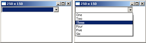
 <ComboBox Width="200" IsDropDownOpen="True" MaxDropDownHeight="75"
         SelectedIndex="1" HorizontalContentAlignment="Center"
         ItemStringFormat="$#.##">
    <sys:Decimal>1</sys:Decimal>
    <sys:Decimal>2.2</sys:Decimal>
    <sys:Decimal>3.33</sys:Decimal>
    <sys:Decimal>4.444</sys:Decimal>
    <sys:Decimal>5.5555</sys:Decimal>
    <sys:Decimal>6.66666</sys:Decimal>
</ComboBox>
Note: Entry "$1" is initially hidden because "MaxDropDownHeight" is not large enough. "IsDropDownOpen" only causes the ComboBox to be open initially. Afterwards, it opens and closes normally.
ListBox
Shows many and potentially all items in a list and which ones are selected.
Basic ListBox
The ListBox lets us see all the items, and allows multiple selections.
<Canvas>
    <ListBox Width="200" Height="100" SelectionMode="Multiple">
        <ListBoxItem IsSelected="True">One</ListBoxItem>
        <ListBoxItem>Two</ListBoxItem>
        <ListBoxItem>Three</ListBoxItem>
        <ListBoxItem IsSelected="True">Four</ListBoxItem>
        <ListBoxItem IsSelected="True">Five</ListBoxItem>
        <ListBoxItem>Six</ListBoxItem>
    </ListBox>
</Canvas>
Note: The "IsSelected" property only defines which items are initially selected. Afterwards, selections can be made and un-made normally.
Diverse Items
The items do not have to be of the same type, and you can add virtually anything you want.
<Canvas>
    <ListBox Width="200" Height="112" SelectionMode="Single" >
        <ListBoxItem>
            <Rectangle Width="150" Height="20" Fill="Red" />
        </ListBoxItem>
        <Ellipse Width="100" Height="20" Fill="Blue" />
        <StackPanel Orientation="Horizontal">
            <TextBox Text="One" Width="50" />
            <TextBox Text="Two" Width="50" />
            <TextBox Text="Three" Width="50" />
        </StackPanel>
        <sys:DayOfWeek>Monday</sys:DayOfWeek>
        <Button Background="Black" Foreground="White" Width="100"
            HorizontalContentAlignment="Right">Click Me</Button>
        Six
    </ListBox>
</Canvas>
Note: The "<Item></Item>" syntax is optional. Panels can be used as items and nested, thus allowing limitless customization possibilities.
Data Binding
Often, you will not be able to specify the items manually; you will want to display all the items in a collection. This is where data binding comes into play.
<Window.Resources>
    <col:ArrayList x:Key="MyDataSource">
        <sys:DateTime>1/2/2003 5:00:00</sys:DateTime>
        <sys:DateTime>4/5/2006 13:13:13</sys:DateTime>
        <sys:DateTime>7/8/2009 23:59:59</sys:DateTime>
    </col:ArrayList>
</Window.Resources>

<Canvas>
    <ListBox Width="200" Height="100"
      DisplayMemberPath="Ticks"
      ItemsSource="{StaticResource MyDataSource}" />
</Canvas>
Note: The "ItemsSource" property allows you to use data bindings to locate and bind to a collection or data source. Because "Ticks" is a property on the DateTime structure, we can use it as the DisplayMember for the items even though the dates are specified in traditional format. The collection "MyDataSource" could exist in the application resources, another class, etc. I hard coded it into the XAML to best demonstrate the functionality.
Data Templates
Often, you will want to do more then the simple "DisplayMemberPath" allows you to do. This example uses DataTemplates to show more information about the dates.
<Window.Resources>
    <col:ArrayList x:Key="MyDataSource">
        <sys:DateTime>1/2/2003 5:00:00</sys:DateTime>
        <sys:DateTime>4/5/2006 13:13:13</sys:DateTime>
        <sys:DateTime>7/8/2009 23:59:59</sys:DateTime>
    </col:ArrayList>
</Window.Resources>

<Canvas>
    <ListBox Width="200" Height="100"
          ItemsSource="{StaticResource MyDataSource}">
        <ListBox.ItemTemplate>
            <DataTemplate>
                <StackPanel Orientation="Horizontal">
                    <Label Content="{Binding DayOfWeek}"
                       Width="80" Background="Red" />
                    <Label Content="{Binding DayOfYear}"
                       Width="50" Background="Yellow" />
                    <Label Content="{Binding TimeOfDay}"
                       Background="LightBlue" />
                </StackPanel>
            </DataTemplate>
        </ListBox.ItemTemplate>
    </ListBox>
</Canvas>
Note: Again, virtually any control can be used inside a DateTemplate, allowing you to do any customization you want. The "Content" of the Labels are bound to public properties on the DateTime structure.
ListView
Functions as a ListBox, but allows greater visual customization.
Basic ListView
A ListView is more powerful then a ListBox, but let's start at the beginning.
<Canvas>
    <ListView Width="200" Height="100" SelectionMode="Multiple">
        <ListViewItem Background="Red">One</ListViewItem>
        <ListViewItem IsSelected="True" Width="50">Two</ListViewItem>
        <ListViewItem HorizontalAlignment="Right">Three</ListViewItem>
        <ListViewItem IsSelected="True" Height="24">Four</ListViewItem>
        Five
        <ListViewItem FontSize="18">Six</ListViewItem>
    </ListView>
</Canvas>
Note: Again, the "<Item></Item>" syntax is optional.
Grid View
The ListView provides a sub "GridView" that allows you to create tabular data.
<Window.Resources>
    <col:ArrayList x:Key="MyDataSource">
        <sys:DateTime>1/2/2003 5:00:00</sys:DateTime>
        <sys:DateTime>4/5/2006 13:13:13</sys:DateTime>
        <sys:DateTime>7/8/2009 23:59:59</sys:DateTime>
    </col:ArrayList>
</Window.Resources>
<Canvas>
    <ListView Width="200" Height="100" SelectionMode="Multiple"
      ItemsSource="{StaticResource MyDataSource}">
        <ListView.View>
            <GridView>
                <GridViewColumn Header="Day" Width="70"
                                DisplayMemberBinding="{Binding DayOfWeek}" />
                <GridViewColumn Header="Month" DisplayMemberBinding="{Binding Month}" />
                <GridViewColumn Header="Day" DisplayMemberBinding="{Binding Day}" />
                <GridViewColumn Header="Year" DisplayMemberBinding="{Binding Year}" />
            </GridView>
        </ListView.View>
    </ListView>
</Canvas>
Note: The GridViewColumns are bound to public properties on the DateTime structure.
Cell Templates
Each GridViewColumn can be configured independently, including both header and cell templates.
<Window.Resources>
    <col:ArrayList x:Key="MyDataSource">
        <sys:DateTime>1/2/2003 5:00:00</sys:DateTime>
        <sys:DateTime>4/5/2006 13:13:13</sys:DateTime>
        <sys:DateTime>7/8/2009 23:59:59</sys:DateTime>
    </col:ArrayList>
</Window.Resources>

<Canvas>
    <ListView Width="200" Height="110" ItemsSource="{StaticResource MyDataSource}"
           SelectionMode="Multiple">
        <ListView.View>
            <GridView>
                <GridViewColumn DisplayMemberBinding="{Binding DayOfWeek}" Width="70">
                    <GridViewColumn.Header>
                        <TextBox Background="LightBlue" Width="60" Text="Type Here" />
                    </GridViewColumn.Header>
                </GridViewColumn>
                <GridViewColumn Header="Month">
                    <GridViewColumn.CellTemplate>
                        <DataTemplate>
                            <Border BorderBrush="Red" BorderThickness="4">
                                <Grid>
                                    <Button Content="{Binding Month}" />
                                </Grid>
                            </Border>
                        </DataTemplate>
                    </GridViewColumn.CellTemplate>
                </GridViewColumn>
                <GridViewColumn Header="Day" DisplayMemberBinding="{Binding Day}" />
                <GridViewColumn Header="Year" DisplayMemberBinding="{Binding Year}" />
            </GridView>
        </ListView.View>
    </ListView>
</Canvas>
Note: The columns are still bound to DateTime properties.
TreeView
Arranges hierarchical data in a parent/child structure.
Basic TreeView
A TreeViewItem is different then the other "Items" because you must specify a header. This acts as the "parent" category.
<Canvas>
    <TreeView Width="200" Height="114">
        <TreeViewItem Header="Dates" IsExpanded="True">
            <TreeViewItem.Items>
                <Label Content="1/2/2003" />
                <Label Content="4/5/2006" />
            </TreeViewItem.Items>
        </TreeViewItem>
        <TreeViewItem Header="Times" IsExpanded="True">
            <TreeViewItem Header="Early" IsExpanded="True">
                5:00:00 AM
            </TreeViewItem>
        </TreeViewItem>
    </TreeView>
</Canvas>
Note: TreeViewItems can be nested as many times as you want.
Data Binding
Individual items can be bound to a different source. They can also be bound to the same source, but configured to display the data differently.
<Window.Resources>
    <col:ArrayList x:Key="DataSource">
        <sys:DateTime>1/2/2003 5:00:00</sys:DateTime>
        <sys:DateTime>4/5/2006 13:13:13</sys:DateTime>
        <sys:DateTime>7/8/2009 23:59:59</sys:DateTime>
    </col:ArrayList>
</Window.Resources>

<Canvas>
    <TreeView Width="200" Height="114">
        <TreeViewItem Header="Dates" ItemStringFormat="MM/dd/yyyy"
          IsExpanded="True" ItemsSource="{StaticResource DataSource}" />
        <TreeViewItem Header="Times" ItemStringFormat="hh:mm:ss"
          IsExpanded="True" ItemsSource="{StaticResource DataSource}" />
   </TreeView>
</Canvas>
Note: The format string is applied and visually transforms the items automatically.
Hierarchical Data Binding
The real power of a TreeView comes when it is bound to hierarchical data. This examples uses a hard coded XML document as a data source, but many other sources could be used.
<Window.Resources>
    <XmlDataProvider x:Key="MyDataSource" XPath="/Companies">
        <x:XData>
            <Companies xmlns="">
                <Company>
                    <Name>Acme Inc.</Name>
                    <Contact>
                        <Name>John Doe</Name>
                        <PhoneNumber>111</PhoneNumber>
                        <PhoneNumber>222</PhoneNumber>
                    </Contact>
                    <Contact>
                        <Name>Billy Bob</Name>
                        <PhoneNumber>333</PhoneNumber>
                        <PhoneNumber>444</PhoneNumber>
                    </Contact>
                </Company>
                <Company>
                    <Name>Large Corp.</Name>
                </Company>
            </Companies>
        </x:XData>
    </XmlDataProvider>

    <HierarchicalDataTemplate DataType="Company"
                 ItemsSource ="{Binding XPath=Contact}">
        <TextBlock Text="{Binding XPath=Name}" />
    </HierarchicalDataTemplate>

    <HierarchicalDataTemplate DataType="Contact"
               ItemsSource ="{Binding XPath=PhoneNumber}">
        <TextBlock Text="{Binding XPath=Name}" />
    </HierarchicalDataTemplate>
</Window.Resources>

<Canvas>
    <TreeView Name="MyTreeView" Width="200" Height="114"
         ItemsSource="{Binding Source={StaticResource MyDataSource}, XPath=Company}"/>
</Canvas>
Note: The "HierarchicalDataTemplates" tell the TreeView how to locate the child nodes for the given "DataType". The TextBlocks are used to actually display the text on the screen; otherwise, no text would be shown. The TreeView tag itself does none of the work except to set the binding.
WPF Craziness
As expected, any number of nested panels and controls can be used to display the elements in a TreeView.
<Window.Resources>
    <XmlDataProvider x:Key="MyDataSource" XPath="/Companies">
        <x:XData>
            <Companies xmlns="">
                <Company>
                    <Name>Acme Inc.</Name>
                    <Contact>
                        <Name>John Doe</Name>
                        <Address>123 Main St.</Address>
                        <PhoneNumber>111</PhoneNumber>
                        <PhoneNumber>222</PhoneNumber>
                    </Contact>
                    <Contact>
                        <Name>Billy Bob</Name>
                        <Address>456 Main St.</Address>
                        <PhoneNumber>333</PhoneNumber>
                        <PhoneNumber>444</PhoneNumber>
                    </Contact>
                </Company>
                <Company>
                    <Name>Large Corp.</Name>
                </Company>
            </Companies>
        </x:XData>
    </XmlDataProvider>

    <HierarchicalDataTemplate DataType="Company"
      ItemsSource ="{Binding XPath=Contact}">
        <StackPanel Orientation="Horizontal">
            <Button Width="20" Content="X" />
            <TextBlock Text="{Binding XPath=Name}" />
        </StackPanel>
    </HierarchicalDataTemplate>

    <HierarchicalDataTemplate DataType="Contact"
      ItemsSource ="{Binding XPath=PhoneNumber}">
        <TabControl>
            <TabItem Header="Name">
                <TextBlock Text="{Binding XPath=Name}" />
            </TabItem>
            <TabItem Header="Addr">
                <TextBlock Text="{Binding XPath=Address}" />
            </TabItem>
        </TabControl>
    </HierarchicalDataTemplate>
</Window.Resources>

<Canvas>
    <TreeView Name="MyTreeView" Width="200" Height="214"
      ItemsSource="{Binding Source={StaticResource MyDataSource}, XPath=Company}" />
</Canvas>
Expert in C#, .NET, WinUI/WPF, Azure, and SQL Server.
I started working with .NET and C# professionally in 2003 and never looked back. I have been an integral part of a dozen complete software lifecycles, been a driving force behind two successful startups, and have led development teams.


 General
  News
News  Suggestion
  Question
  Bug
Bug  Answer
  Joke
Joke  Praise
  Rant
Rant  Admin
Admin 


 Submit an article or tip


