In this article. you will learn how to add a close button to a React Native, and how to close the modal by clicking beside it.
Introduction
I’ve been working with React Native lately, and I’ve come across a few unimplemented features I needed to add to the basic components. One of those components is the React Native Modal component that is used to show a view above another one. It doesn’t promise more features than that, but it can be very useful to implement your own popup.
On the other hand, since it’s only a simple modal, it does not include everything you would expect for a popup component like an X to close it, or closing the modal when you tap beside it. I’ll be walking you through how to add those two features when you’re starting from a Modal component.
If you’re in a hurry, you can also find the final result on my GitHub at https://github.com/CindyPotvin/react-native-popup.
How to Close a Modal
Let’s start with a basic App.js that shows a popup. I also added a few styles to have a shadow so the popup is visible, and a generous amount of margin so we can test closing the popup by clicking beside it later.
import React, { useState } from 'react';
import { StyleSheet, Modal, Text, View } from 'react-native';

export default function App() {
  const [modalVisible, setModalVisible] = useState(true);

  return (
    <View style={styles.container}>
      <Text>Open up App.js to start working on your app!</text>
      <Modal visible={modalVisible}>
        <View style={styles.modal}>
          <Text>
            Popup content.
          </Text>
        </View>
      </Modal>
    </View>
  );
}

const styles = StyleSheet.create({
  container: {
    flex: 1,
    backgroundColor: "white",
    alignItems: "center",
    justifyContent: "center",
  },
  modal: {
    flex: 1,
    margin: 50,
    padding: 5,
    backgroundColor: "white",
    shadowColor: "black",
    shadowOffset: {
      width: 0,
      height: 2,
    },
    shadowOpacity: 0.25,
    shadowRadius: 4,
    elevation: 5,
  },
});
The Modal is displayed according to its visible prop. Right now, the value in the state is always true, so the popup will always be visible.
Even without a button or another way to change the state, the Modal can be closed on Android with the back button (the menu button on Apple TV should have the same effect according to the documentation, but I don’t have one to test).
Pressing the button calls the function specified in the onRequestClose prop of the modal, so let’s change the state to hide the popup when it is pressed, which will show the main screen of the application :
<Modal
  visible={modalVisible}
  onRequestClose={() => setModalVisible(false)}>
How to Add Close Button to a React Native Modal
First, we have to add the button itself so we can then use it to close the popup. In that case, I wanted to add a small X in the top right corner of the popup, but it could be anywhere else.
Given how the positioning work, there are two options for this:
- Positioning absolutely the button in the top right corner. You can then do anything you want for the rest of the content, but then you run the risk of having the content overlapping the X since it’s out of the normal layout flow. If you want to use the space beside and under the button at the same time, it’s pretty much impossible, which leads us to the second option.
- Positioning the button with flexbox, leaving space to the left of the button for a header. You can then fill in the header and the content at the bottom separately. If you’re doing something that’s meant to be a popup, having a title is also a pretty standard feature.
Here is what the component now looks like with an X added:
import React, { useState } from 'react';
import { StyleSheet, Modal, Text, View, TouchableOpacity } from 'react-native';
export default function App() {
const [modalVisible, setModalVisible] = useState(true);
return (
<View style={styles.container}>
<Text>Open up App.js to start working on your app!</Text>
<Modal visible={modalVisible} onRequestClose={() => setModalVisible(false)}>
<View style={styles.modal}>
<View style={styles.modalHeader}>
<View style={styles.modalHeaderContent}><Text>Other header content</Text></View>
<TouchableOpacity><Text style={styles.modalHeaderCloseText}>X</Text>
</TouchableOpacity>
</View>
<View style={styles.modalContent}>
<Text>
Popup content.
</Text>
</View>
</View>
</Modal>
</View>
);
}
const styles = StyleSheet.create({
container: {
flex: 1,
backgroundColor: "white",
alignItems: "center",
justifyContent: "center",
},
modal: {
flex: 1,
margin: 50,
padding: 5,
backgroundColor: "white",
shadowColor: "black",
shadowOffset: {
width: 0,
height: 2,
},
shadowOpacity: 0.25,
shadowRadius: 4,
elevation: 5,
},
modalContent: {
flex: 1
},
modalHeader: {
flexDirection: "row",
},
modalHeaderContent: {
flexGrow: 1,
},
modalHeaderCloseText: {
textAlign: "center",
paddingLeft: 5,
paddingRight: 5
}
});
The header is a flex container that’s displayed as a row, with flexGrow:1 to indicate that it should take up all the remaining space.
The rest of the content in the popup is a flex:1 item so it takes up all the remaining height.
The only thing remaining at this point is to wire up the button so it does close the popup, in the same way we set it in on the onRequestClose event earlier:
<TouchableOpacity onPress={() => setModalVisible(false)}>
  <Text style={styles.modalHeaderCloseText}>X</Text>
</TouchableOpacity>
How to Close the Modal by Clicking Outside
To also close the modal by tapping outside, we need an additional component to catch those taps.
On the other hand, we don’t want this component to catch taps meant for the child component: clicking the popup itself should not close it. By checking event.target == event.currentTarget, we validate that the item selected is the component itself and not one of its children.
I used a Pressable component because I didn’t want the “dimming” effect on tap when touching outside the popup that comes with the TouchableOpacity. This new Pressable component wraps all the components we previously defined in the modal.
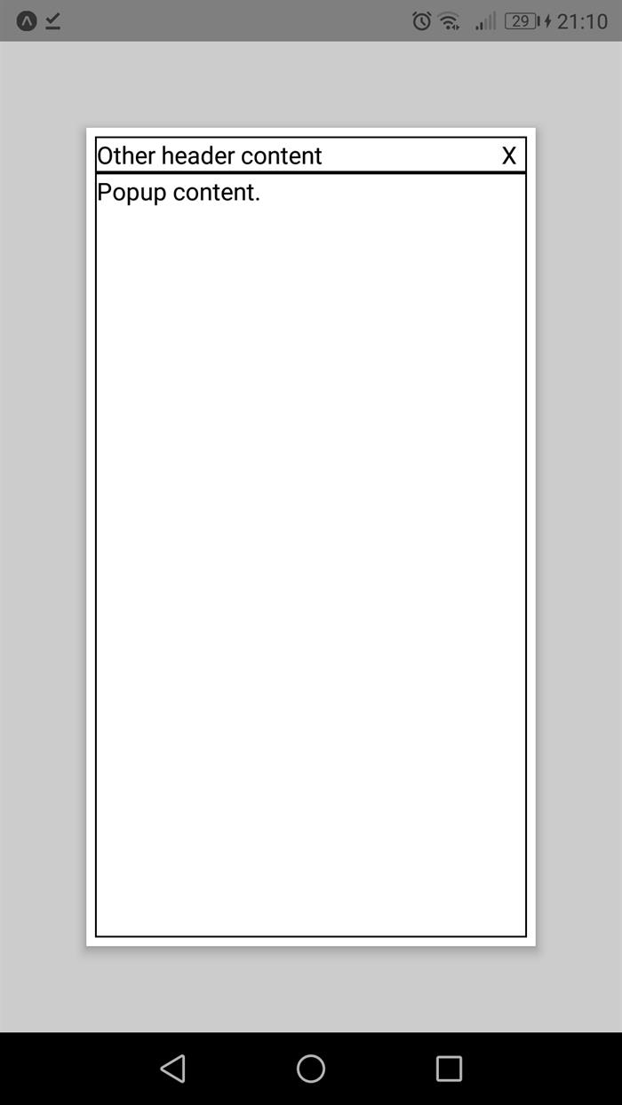
Here is the completed popup, with a few extra borders to show where are the header and popup content :
import React, { useState } from 'react';
import { StyleSheet, Modal, Text, View, Pressable, TouchableOpacity } from 'react-native';
export default function App() {
const [modalVisible, setModalVisible] = useState(true);
return (
<View style={styles.container}>
<Text>Open up App.js to start working on your app!</Text>
<Modal
visible={modalVisible}
onRequestClose={() => setModalVisible(false)}>
<Pressable style={styles.outsideModal}
onPress={(event) => { if (event.target == event.currentTarget) {
setModalVisible(false); } }} >
<View style={styles.modal}>
<View style={styles.modalHeader}>
<View style={styles.modalHeaderContent}>
<Text>Other header content</Text></View>
<TouchableOpacity onPress={() => setModalVisible(false)}>
<Text style={styles.modalHeaderCloseText}>X</Text>
</TouchableOpacity>
</View>
<View style={styles.modalContent}>
<Text>
Popup content.
</Text>
</View>
</View>
</Pressable>
</Modal>
</View>
);
}
const styles = StyleSheet.create({
container: {
flex: 1,
backgroundColor: "white",
alignItems: "center",
justifyContent: "center",
},
modal: {
flex: 1,
margin: 50,
padding: 5,
backgroundColor: "white",
shadowColor: "black",
shadowOffset: {
width: 0,
height: 2,
},
shadowOpacity: 0.25,
shadowRadius: 4,
elevation: 5,
},
modalContent: {
flex: 1,
borderWidth: 1,
borderColor: "black"
},
modalHeader: {
flexDirection: "row",
borderWidth: 1,
borderColor: "black"
},
modalHeaderContent: {
flexGrow: 1,
},
modalHeaderCloseText: {
textAlign: "center",
paddingLeft: 5,
paddingRight: 5
},
outsideModal: {
backgroundColor: "rgba(1, 1, 1, 0.2)",
flex: 1,
}
});
Please note that there is a small limitation to this: the background color for a Pressable or a TouchableOpacity cannot be set to a transparent or a semi-transparent value, so the content under the popup will no longer be visible.
A next step to make this better would be to package the Modal components and all its content into a new component that can be reused in your application so you can insert any header or content in the popup, but this is outside the scope of the current article.
If you want to execute the final version yourself and try it out, you can see it on GitHub at https://github.com/CindyPotvin/react-native-popup and as an Expo Snack at https://snack.expo.dev/@cindyptn/react-native-popup-with-x-button.
History
- 11th September, 2021: Initial version
Cindy Potvin is a software developer based in the Montreal area. At her day job, she creates web applications using the ASP.NET MVC framework and mobile applications using the Android SDK.


 General
  News
News  Suggestion
  Question
  Bug
Bug  Answer
  Joke
Joke  Praise
  Rant
Rant  Admin
Admin 


 Submit an article or tip

