Accordion versus TreeView and the DataGrid in the navigation data in Silverlight.
Motivation
If you want to use Silverlight capabilities we need to know well the Silverlight SDK. The main task of this paper is to look carefully at some techniques in the context of comparing three controls:
TREEVIEW vs ACCORDION vs DATAGRID.
And it all started with:

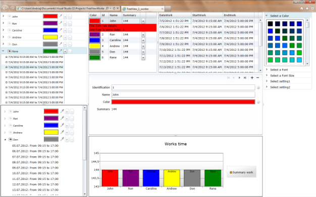
Trying to find a job I came across a commission tasked with creating a look and feel like the picture above. How I'd do it, I will present it in this article.
In addition, we will look at the objects, most of which were added by SDK v. December 2011 and will include:
- TREEVIEW
- TREEVIEWITEM
- ACCORDION
- ACCORDIONITEM
- DATAGRID
- CHART
- SERIES
- SERIESDATAPOIND
- WRAPPANEL
- CONTEXTMENU
And in addition:
- How to change the FontFamily and FontSize dynamic (two techniques).
- How to store the user's own settings (simplification).
- How to style visualization controls: CheckBox, RadioButtom, DataGrid
Requirements
- Knowing how to create a new Silverlight project in Visual Studio C #
- Knowledge Base Fundamentals of Xaml
- Basics of Silverlight or WPF
- In addition, the Silverlight SDK installed 5 vs. Decamber 2011.
How it works:
The screenshot shows a functional breakdown of the application window.
- Navigation data
- Accordion
- Treeview
- DataGata
- Form data entry nodes of the main
- Chart data
- Settings
- color settings
- set the font
- setting the font size
- to implement
- to implement
- Child window to enter data-dependent master data, and assigned to specific nodes data.
Introduction
Ad.1a. Accordion control is a list of many types of controls Expander. Implemented as AccordionItem. AccorionItem HeaderedContentControl is a development and a header and contents.
In this topic I used AccordionItem and his header to the root node name of the presentation and demonstration of its assigned color, and the ability to change the color, which is reflected in the presented data on this node. Another arrow icon in the header is used to develop as an icon of the eye (CheckBox) is sharpened when the node is selected. Next to it is title of the data presented in the content.
Next is the color square icon and context of the pipette (RadioButton) allows to change the color. When the pipette icon lit (by clicking on it), you can select a color from the window of 4a, clicking the right mouse button anywhere slow down this functionality.
Ad. 1b. Action is analogous to 1.a. However, in this discussion I used the TreeView control.
TreeView control and its implementation
The header file that implements a TreeView add references to a namespace:
xmlns:controls="clr-namespace:System.Windows.Controls;assembly=System.Windows.Controls"
Control itself is a declaration:
<controls:TreeView x:Name="navigateTreeView"
                      ItemsSource="{StaticResource listEmployee}"
                      ItemTemplate="{StaticResource employeeEntry}"/>
We have three attributes - the first is the name of which we will refer both XAML (most use a {Binding ElementName = nameTargetControl, Path = PrapertyTargetControl}) and IL (C # or VB), the second is the source of data which follows, and the pattern element in turn subordinate display panels.
Source of data in the control TreeView is hierarchization, ie each level must provide the source node to his subordinate. Each node has its own pattern of display which can be delivered or used the default, without dealing with it. We, however, a little mess here because we want to use their own models to provide both the header and the elements. We do this by means of the control HierarchicalContentControl which wraps a specific node for both the data and to adjust the style and functionality. Main levels in our example looks like this:
Let's find a line of code <!-- HierarchicalDataTemplates Level One-->
<Grid x:Name="LayoutRoot" Background="White">
        …
        <Grid>
            <Grid.Resources>
                <Style TargetType="RadioButton">
		…
                </Style>
                <Style TargetType="CheckBox">
		…
                </Style>
                <Style TargetType="layoutToolkit:AccordionItem">
                    …
                </Style>
                <!-- HierarchicalDataTemplates Level Two-->
                <common:HierarchicalDataTemplate x:Key="timeWorksEntry">
                    <StackPanel Orientation="Horizontal">
                        <ContentPresenter Margin="0 0 4 0"
                                          Content="{Binding Icon}" />
                        <TextBlock Text="{Binding DateWork, FallbackValue=test_DayWork, StringFormat='{}{0:dd.MM.yyyy}'}" />
                        <TextBlock Text="{Binding AnyText, FallbackValue=': From '}" />
                        <TextBlock Text="{Binding Path=StartWork, FallbackValue=test_StartWork, StringFormat='{}{0:HH:mm}'}" />
                        <TextBlock Text="{Binding AnyText, FallbackValue=' to '}" />
                        <TextBlock Text="{Binding EndWork, FallbackValue=test_EndWork, StringFormat='{}{0:HH:mm}'}">
                        </TextBlock>
                    </StackPanel>
                </common:HierarchicalDataTemplate>
                <!-- HierarchicalDataTemplates Level One-->
                <common:HierarchicalDataTemplate x:Key="employeeEntry"
                                                 ItemsSource="{Binding Path=TimeWorks}"
                                                 ItemTemplate="{StaticResource timeWorksEntry}">
                    <StackPanel Orientation="Horizontal">
                        <controlsInputToolkit:ContextMenuService.ContextMenu>
                            <controlsInputToolkit:ContextMenu>
                                <controlsInputToolkit:MenuItem Header="Add Node"
                                                               Click="MenuItem_Add"></controlsInputToolkit:MenuItem>
                                <controlsInputToolkit:MenuItem Header="Add SubNode"
                                                               Click="MenuItem_AddSubNode"></controlsInputToolkit:MenuItem>
                                <controlsInputToolkit:MenuItem Header="Remove Node"
                                                               Click="MenuItem_Del"></controlsInputToolkit:MenuItem>
                            </controlsInputToolkit:ContextMenu>
                        </controlsInputToolkit:ContextMenuService.ContextMenu>
                        <Grid Cursor="Hand">
                            <Grid.ColumnDefinitions>
                                <ColumnDefinition Width="150" />
                                <ColumnDefinition Width="Auto" />
                                <ColumnDefinition Width="Auto" />
                                <ColumnDefinition Width="Auto" />
                                <ColumnDefinition Width="Auto" />
                            </Grid.ColumnDefinitions>

                            <CheckBox FontFamily="{Binding Source={StaticResource userSetting},Path=FontLabel}"
                                      FontSize="{Binding Source={StaticResource userSetting},Path=FontSize}"
                                      Cursor="Hand"
                                      VerticalAlignment="Center"
                                      Margin="3,0,2,0"
                                      IsChecked="{Binding RelativeSource={RelativeSource AncestorType=controls:TreeViewItem,AncestorLevel=1},Path=IsExpanded,Mode=TwoWay}"
                                      Content="{Binding Name, FallbackValue='Main Name'}"></CheckBox>
                            <RadioButton x:Name="pipetaCB"
                                         Grid.Column="2"
                                         Cursor="Hand"
                                         Checked="RadioButton_Checked_1"
                                         Tag="{Binding}"
                                         GroupName="pipete"
                                         Margin="3,0,2,0">
                                <RadioButton.Content>
                                    <Image Height="16"
                                           Width="16"
                                           Opacity="{Binding RelativeSource={RelativeSource AncestorType=RadioButton, AncestorLevel=1},Path=IsChecked,Converter={StaticResource tToO}}"
                                           Source="pipete.png" />
                                </RadioButton.Content>
                            </RadioButton>
                            <Border BorderBrush="Black"
                                    BorderThickness="1"
                                    Padding="1"
                                    Grid.Column="1"
                                    Width="60"
                                    x:Name="pipetaBorder"
                                    Margin="0,0,0,2">
                                <Rectangle x:Name="pipetaRec">
                                    <Rectangle.Fill>
                                        <SolidColorBrush Color="{Binding Color}" />
                                    </Rectangle.Fill>
                                </Rectangle>
                            </Border>
                            <Button Margin="3,0,2,0"
                                    Grid.Column="3"
                                    Width="16"
                                    Click="MenuItem_AddSubNode"
                                    IsEnabled="{Binding RelativeSource={RelativeSource AncestorType=controls:TreeViewItem,AncestorLevel=1},Path=IsSelected,Mode=TwoWay}"
                                    Content="+"></Button>
                            <Button Margin="2,0,2,0"
                                    Content="-"
                                    Grid.Column="4"
                                    Width="16">
                            </Button>
                            <ContentPresenter />
                        </Grid>
                    </StackPanel>
                </common:HierarchicalDataTemplate>
            </Grid.Resources>
Everything that is located below the first level is the style of our control and, finally, the next node. The figure shows this visually.
Noteworthy is the description of the functionality and versatility they satisfy the matching appearance. Checkbox control eye was used to mirror the indications expander and its contents to the description of the node. It can be used for example shown in the chart of a node. And the graphics to include or not the channel or level controls, etc. A very important feature of the CheckBox control is to have the properties of the Command and CommandParametr that will make the most of it in the patterns of views does not depend on data (MVP, MVVM, MVC, etc.). In his example, but I used a simple reference to the parent container (TreeViewItem) and its IsExpanded which doubles as I mentioned his behavior.
IsChecked="{Binding RelativeSource={RelativeSource AncestorType=controls:TreeViewItem,AncestorLevel=1},Path=IsExpanded,Mode=TwoWay}"
Content="{Binding Name, FallbackValue='Main Name'}"
The content is linked with the supplied data source and its path Name, Option FallbackValue = "Main Name 'means that if the bond will provide a null value or anything that will show what has this property. It is worth noting that the FallbackValue You can also use bond FallbackValue = "{Binding ... but one has to reckon with the fact that in case of error in the binding properties of the Silverlight engine does not ignore this error and crashes the application. I recommend extreme caution in the binding FallbackValue. Similarly, it is in WPF but there exists
<PriorityBinding>
  Bindings
</PriorityBinding>
What, unfortunately, I lack in Silverlight. In particular, the Async what is common in WebServices. Border of a Rectangle is included visualization of a color that is assigned to the data node. The color change in this implementation is done by moving the pipette on the icon (a stylized RadioButton) click and how to illuminate this indicates the color palette included in SetColor in another part of the screen. RadioButton control has been deprived of part of the presentation (RadioIcon) and the image was placed in the content property. This control has handled an event
Checked="RadioButton_Checked_1"
C# behid-code:
private void RadioButton_Checked_1(object sender, RoutedEventArgs e)
{
    fe = sender as FrameworkElement;
    this.setColor.SelectionChanged += setColor_SelectionChanged;
    this.MouseRightButtonDown += MyProposition_MouseRightButtonDown;
}
void MyProposition_MouseRightButtonDown(object sender, MouseButtonEventArgs e)
{
    ToggleButton rb = fe as ToggleButton;
    if (rb != null) rb.IsChecked = false;
    this.setColor.SelectionChanged -= setColor_SelectionChanged;
    this.MouseRightButtonDown -= MyProposition_MouseRightButtonDown;
}

void setColor_SelectionChanged(object sender, SelectionChangedEventArgs e)
{
    Shape selectObj = (Shape)e.AddedItems[0];
    SolidColorBrush color = selectObj.Fill as SolidColorBrush;
    (fe.Tag as Employee).Color = color.Color;
    this.Cursor = Cursors.Arrow;
}
To transmit the color I used the Tag property which is not very elegant but effective and functional tests even when necessary to control passed value. An interesting functionality added to Silverlight is free use of the ContextMenu. I added to handle the node context menu contains three items:
- Add Node forward the cursor to the form, adding the root node.
- Add SubNode initiates the new entry in the current node and opens a pop-up window presenting the data and waits for confirmation of these data add to the node.
- Remove Node - removes the node on which the cursor is located.
#region treeViewContextMenu
private void MenuItem_Del(object sender, RoutedEventArgs e)
{
Employee employee = ((FrameworkElement)sender).DataContext as Employee;
if (null != employee)
{
_employees.Remove(employee);
}
}
private void MenuItem_AddSubNode(object sender, RoutedEventArgs e)
{
Employee contextEmployee = (Employee)((FrameworkElement)sender).DataContext;
bool resultDialog = false;
this.twEmployee_ChildWindow = new TimeWorkEmployeeChildWindow();
TimeWork newTimeWork = new TimeWork();
newTimeWork.DateWork = DateTime.Now;
newTimeWork.StartWork = DateTime.Parse("9:15");
newTimeWork.EndWork = DateTime.Parse("17:15");
twEmployee_ChildWindow.Closed += (s, arg) =>
{
resultDialog = (bool)twEmployee_ChildWindow.DialogResult;
if (resultDialog)
{
contextEmployee.TimeWorks.Add(newTimeWork);
}
};
this.twEmployee_ChildWindow.DataContext = newTimeWork;
this.twEmployee_ChildWindow.Title = contextEmployee.Name;
this.twEmployee_ChildWindow.Show();
}
private void MenuItem_Add(object sender, RoutedEventArgs e)
{
this.navigateDataForms.Focus();
}
#endregion
The next figure shows the
<!-- HierarchicalDataTemplates Level Two-->
Accordion and its implementation
As already mentioned Control type is a set of controls HeaderContentControl and its implementation is very similar to the list of controls Expander. Accordion control consolidates and optimizes a certain function.
Declaration of Accordion:
<layoutToolkit:Accordion x:Name="navigatorAccordion"
                           SelectionMode="ZeroOrOne"
                           ItemsSource="{StaticResource listEmployee}"/>
Do not forget about the project references to the libraries of the SDK. The Xaml file header we need to put references to the library:
xmlns:layoutToolkit="clr-namespace:System.Windows.Controls;assembly=System.Windows.Controls.Layout.Toolkit"
ItemsSource="{StaticResource listEmployee}"
is the name of the control and it will refer to C # code to the controls.
ItemsSource="{StaticResource listEmployee}"
is the data source control. The individual elements are displayed according to the structure of the hierarchy node and its components but the basic implementation of a single level subordination implies that at a certain job can be changed, and even some of the scenarios were to allow this dream. The header of the root node, both the visualization and functionality is very similar to that of the TreeView and the plan was, after all. Unlike the TreeView whole dress in one style:
<Style TargetType="layoutToolkit:AccordionItem">
    <Setter Property="ContentTemplate">
        <Setter.Value>
            <DataTemplate>
                <ListBox ItemsSource="{Binding TimeWorks }"
                         HorizontalAlignment="Stretch"
                         ScrollViewer.HorizontalScrollBarVisibility="Disabled">
                    <ListBox.ItemTemplate>
                        <DataTemplate>
                            <StackPanel Orientation="Horizontal"
                                        HorizontalAlignment="Stretch">
                                <Rectangle Margin="15,0,5,0"
                                           Width="6"
                                           Height="6"
                                           Stroke="Black" />
                                <TextBlock Text="{Binding StartWork, FallbackValue=test}" />
                                <TextBlock Text="{Binding YouText, FallbackValue=' to '}" />
                                <TextBlock Text="{Binding EndWork, FallbackValue=test}" />
                            </StackPanel>
                        </DataTemplate>
                    </ListBox.ItemTemplate>
                </ListBox>
            </DataTemplate>
        </Setter.Value>
    </Setter>
    <Setter Property="VerticalContentAlignment"
            Value="Center" />
    <Setter Property="HeaderTemplate">
        <Setter.Value>
            <DataTemplate>
                <Grid Cursor="Hand">
                    <controlsInputToolkit:ContextMenuService.ContextMenu>
                        <controlsInputToolkit:ContextMenu>
                     <controlsInputToolkit:MenuItem Header="Add Node" Click="MenuItem_Add" />
                      <controlsInputToolkit:MenuItem Header="Add SubNode" Click="MenuItem_AddSubNode" />
                       <controlsInputToolkit:MenuItem Header="Remove Node" Click="MenuItem_Del" />
                          </controlsInputToolkit:ContextMenu>
                      </controlsInputToolkit:ContextMenuService.ContextMenu>
                   <Grid.ColumnDefinitions>
                        <ColumnDefinition Width="150" />
                        <ColumnDefinition Width="Auto" />
                        <ColumnDefinition Width="Auto" />
                        <ColumnDefinition Width="Auto" />
                        <ColumnDefinition Width="Auto" />
                    </Grid.ColumnDefinitions>
                    <CheckBox Cursor="Hand"
                              VerticalAlignment="Center"
                              Margin="2,0,2,0"
                              IsChecked="{Binding RelativeSource={RelativeSource AncestorType=layoutToolkit:AccordionItem,AncestorLevel=1},Path=IsSelected,Mode=TwoWay}"
                              Content="{Binding Name, FallbackValue='Tytuł Imię i nazwisko'}"></CheckBox>
                    <RadioButton x:Name="pipetaCB"
                                 Grid.Column="2"
                                 Cursor="Hand"
                                 Checked="RadioButton_Checked_1"
                                 Tag="{Binding}"
                                 GroupName="pipete"
                                 Margin="2,0,2,0">
                        <RadioButton.Content>
                            <Image Height="12"
                                   Width="12"
                                   Opacity="{Binding RelativeSource={RelativeSource AncestorType=RadioButton, AncestorLevel=1},Path=IsChecked,Converter={StaticResource tToO}}"
                                   Source="pipete.png" />
                        </RadioButton.Content>
                    </RadioButton>
                    <Button Margin="3,0,2,0"
                            Grid.Column="3"
                            Width="16"
                            Click="MenuItem_AddSubNode"
                            IsEnabled="{Binding RelativeSource={RelativeSource AncestorType=layoutToolkit:AccordionItem,AncestorLevel=1},Path=IsSelected,Mode=TwoWay}"
                            Content="+"></Button>
                    <Button Margin="2,0,2,0"
                            Content="-"
                            Grid.Column="4"
                            Width="16">
                    </Button>
                    <Border BorderBrush="Black"
                            BorderThickness="1"
                            Padding="1"
                            Grid.Column="1"
                            Width="60"
                            x:Name="pipetaBorder"
                            Margin="0,0,0,2">
                        <Rectangle x:Name="pipetaRec">
                            <Rectangle.Fill>
                                <SolidColorBrush Color="{Binding Color}" />
                            </Rectangle.Fill>
                        </Rectangle>
                    </Border>
                </Grid>

            </DataTemplate>
        </Setter.Value>
    </Setter>
</Style>
Some ContentTemplate requires perhaps the least comments. It is included as the contents of a ListBox control which presents in its container items associated with a subordinate node root. More attention should be paid to the header but this is basically a reflection of the header used in the TreeView while maintaining functionality. Supports the same events.
DataGrid and its implementation
Namespace
xmlns:datagrid="clr-namespace:System.Windows.Controls;assembly=System.Windows.Controls.Data"
Declaration:
<datagrid:DataGrid x:Name="navigateDataGrid"
                    AutoGenerateColumns="False"
                    ItemsSource="{StaticResource listEmployee}"/>
The declaration of the names I used to identify controls, property
AutoGenerateColumns="False"
I set it to false to indicate that I want to give the same patterns of columns. Next is the data source. I pause for a moment by the data source because I used the same syntax for all the controls that operate the control system supplied to the time data. In this view, declaration, ie UserControl.Resource declared and created the object named in the declaration of Xaml:
<local:ListEmployee x:Key="listEmployee" />
a provider class is contained in a file ListEmployee ListEmployee.cs. This declaration actually fulfills only the role of data providers in the design phase of work on solutions. But nothing stands in the way it was a target data source, however, there arise some difficulties in data synchronization. I as a dynamic source of data used the assignment that takes place in the course of the IL code (C # or VB) in the background. Specifically, the Loaded event handling class view.
void MyProposition_Loaded(object sender, RoutedEventArgs e)
{
    GenerateColorForSetColor();
    this.navigatorAccordion.ItemsSource = _employees;
    this.navigateTreeView.ItemsSource = _employees;
    this.navigateDataGrid.ItemsSource = _employees;
    this.navigateDataForms.ItemsSource = _employees;
    this.myChart.DataContext = _employees;
}
Patterns of columns added directly to the control:
<datagrid:DataGrid x:Name="navigateDataGrid"
                     AutoGenerateColumns="False"
                     ItemsSource="{StaticResource listEmployee}">
      <datagrid:DataGrid.Columns>
          <datagrid:DataGridTemplateColumn Header="Color">
              <datagrid:DataGridTemplateColumn.CellTemplate>
                  <DataTemplate>
                      <Border BorderBrush="Black"
                              BorderThickness="1"
                              Padding="2"
                              CornerRadius="2">
                          <Rectangle MouseLeftButtonDown="Rectangle_MouseLeftButtonDown">
                              <Rectangle.Fill>
                                  <SolidColorBrush Color="{Binding Color}" />
                              </Rectangle.Fill>
                          </Rectangle>
                          <controlsInputToolkit:ContextMenuService.ContextMenu>
                              <controlsInputToolkit:ContextMenu>
                                  <controlsInputToolkit:MenuItem Header="Add Node"
                                                                 Click="MenuItem_Add"></controlsInputToolkit:MenuItem>
                                  <controlsInputToolkit:MenuItem Header="Add SubNode"
                                                                 Click="MenuItem_AddSubNode"></controlsInputToolkit:MenuItem>
                                  <controlsInputToolkit:MenuItem Header="Remove Node"
                                                                 Click="MenuItem_Del"></controlsInputToolkit:MenuItem>
                              </controlsInputToolkit:ContextMenu>
                          </controlsInputToolkit:ContextMenuService.ContextMenu>
                      </Border>
                  </DataTemplate>
              </datagrid:DataGridTemplateColumn.CellTemplate>
          </datagrid:DataGridTemplateColumn>
          <datagrid:DataGridTextColumn Header="Id"
                                       Binding="{Binding Id}" />
          <datagrid:DataGridTextColumn Header="Name"
                                       Binding="{Binding Name}" />
          <datagrid:DataGridTextColumn Header="Summary"
                                       Binding="{Binding Summary, Mode=TwoWay,UpdateSourceTrigger=PropertyChanged}" />
          <datagrid:DataGridTemplateColumn>
              <datagrid:DataGridTemplateColumn.CellTemplate>
                  <DataTemplate>
                      <StackPanel Orientation="Horizontal">
                          <Button Content="+"
                                  Margin="5,0,2,0"
                                  Width="16"
                                  Click="MenuItem_AddSubNode" />

                      </StackPanel>
                  </DataTemplate>
              </datagrid:DataGridTemplateColumn.CellTemplate>
          </datagrid:DataGridTemplateColumn>
      </datagrid:DataGrid.Columns>
The first column contains the familiar but changed the color to define the functionality of the node. In this case, click directly on the square and includes a color and then choose a new force on the color. Clicking on any point outside the function cancels the navigation controls. The last column adds a button to begin adding a new element subordinate to the selected node. Other elements do not require much attention. The destination node is also indicated by the DataGrid Control that connects to a data source that provides the selected node in the control of navigation.
<datagrid:DataGrid x:Name="subDataGrid" ItemsSource="{Binding ElementName=navigateDataGrid, Path=SelectedItem.TimeWorks}">
Simply indicate the name of the element and the concrete path in the control.
Summary vs
In this application, in my opinion better is to use the Accordion. When we use only a single level hierarchical data.
Treview control is equally attractive, but it seems that her destiny is appropriate tree structures of unknown depth or known elements, but more convenient to pass on this form above.
In the above example shows a DataGrid worst, and not because of inadequacies. DataGrid gives great service in the structures that require a large number of items presented in a logical level. Neither the TreeView or Accordian will not give full requirements of the scenario though everything before us.
Additionally
Additional aspects of this comparison were to use a Chart, Series and SeriesDataPoint and WrapPanel, ChildWindow, DataForm and DataField and a few others.
Chart control is a graphical presentation of data container that can contain one or more classes of such series (PieSeries, ColumnSeries, BarSeries and many others). Series are a concrete visualization of data.
I am in your article that I used ColumnSeries added to the control chart declaring it inside a collection Series:
<chartingToolkit:Chart Grid.Row="4"
                           Title="Works time"
                           x:Name="myChart"
                           DataContext="{StaticResource listEmployee}"
                           Palette="{StaticResource GrowDataPointPalette}"
                           Style="{StaticResource ChartStyle}">
        <chartingToolkit:Chart.Series>
            <chartingToolkit:ColumnSeries x:Name="presentationData"
                                          LegendItemStyle="{StaticResource LegendItemStyle}"
                                          ItemsSource="{Binding}"
                                          DependentValueBinding="{Binding Summary}"
                                          >
                <chartingToolkit:ColumnSeries.DataPointStyle>
                    <Style TargetType="chartingToolkit:ColumnDataPoint">
                        <Setter Property="Template">
                            <Setter.Value>
                                <ControlTemplate TargetType="chartingToolkit:ColumnDataPoint">
                                    <Grid x:Name="Root"
                                          Opacity="1">
                                        <ToolTipService.ToolTip>
                                            <StackPanel Margin="2,2,2,2">
                                                <ContentControl Content="{TemplateBinding DependentValue}" />
                                            </StackPanel>
                                        </ToolTipService.ToolTip>
                                        <Rectangle StrokeThickness="{TemplateBinding BorderThickness}"
                                                   Stroke="{TemplateBinding BorderBrush}">
                                            <Rectangle.Fill>
                                                <SolidColorBrush Color="{Binding Color}" />
                                            </Rectangle.Fill>
                                        </Rectangle>
                                        <TextBlock HorizontalAlignment="Center"
                                                   Text="{Binding Name}"
                                                   FontFamily="{Binding Source={StaticResource userSetting},Path=FontLabel}"
                                                   FontSize="11" />
                                    </Grid>
                                </ControlTemplate>
                            </Setter.Value>
                        </Setter>
                    </Style>
                </chartingToolkit:ColumnSeries.DataPointStyle>
            </chartingToolkit:ColumnSeries>
        </chartingToolkit:Chart.Series>
    </chartingToolkit:Chart>
Summary
Moreover, in the above two techniques I used to change settings like font size font. In the construction of 1.a. (Accordion), I used the technique of direct binding (binding NameElement), which automatically involves change and we need to use other techniques to read the settings to keep them
The second technique is to use an intermediary in a class UserSetting that records directly in the Xaml initialize its fields. Any change settings from the control 3.b, 4.b, 3.c is written to the object and received by subscribers on selected items. It is obvious that it is very simple to use, record and update through an intermediary such additional services.
Regards Andrzej Skutnik.
Explanation
6 Jul 2012
Through my project inadvertently left at a piece of "useless" code. Now in your region remained My_Proposition.xaml.cs
#region treeView
void navigateTreeView_Unloaded(object sender, RoutedEventArgs e)
{
TreeView v = sender as TreeView;
v.SelectedItemChanged -= v_SelectedItemChanged;
v.MouseRightButtonDown += (senderMRBU, argMBRD) => { argMBRD.Handled = false; };
}
void navigateTreeView_Loaded(object sender, RoutedEventArgs e)
{
TreeView v = sender as TreeView;
v.Opacity = 0;
v.SelectedItemChanged += v_SelectedItemChanged;
v.MouseRightButtonDown += (senderMRBU, argMBRD) => { argMBRD.Handled = true; };
IEnumerable<object> items = v.Items;
if (items != null)
{
v.ApplyTemplate();
v.UpdateLayout();
foreach (var d in items)
{
TreeViewItem item = v.ItemContainerGenerator.ContainerFromItem(d) as TreeViewItem;
item.Selected += item_Selected;
item.Expanded += item_Expanded;
if (item.Items.Count > 0)
{
OnSelected_Expanded(item);
}
}
}
v.Opacity = 1;
}
private static void OnSelected_Expanded(ItemsControl item)
{
item.SetValue(TreeViewItem.IsExpandedProperty, true);
item.ApplyTemplate();
item.UpdateLayout();
foreach (var d1 in item.Items)
{
TreeViewItem itemChild = item.ItemContainerGenerator.ContainerFromItem(d1) as TreeViewItem;
itemChild.Selected += (s, e_arg) =>
{
};
item.SetValue(TreeViewItem.IsExpandedProperty, false);
}
}
void item_Expanded(object sender, RoutedEventArgs e)
{
}
void item_Selected(object sender, RoutedEventArgs e)
{
}
void v_SelectedItemChanged(object sender, RoutedPropertyChangedEventArgs<object> e)
{
}
#endregion
If, however, found himself in a project I owe an explanation of why and what was their purpose. Method
void navigateTreeView_Loaded(object sender, RoutedEventArgs e) {…}
Loaded event handler is a TreeView control and occurs when loading the class. In the body of the method of successively performing the task:
- Hiding the action from the user - although at this stage and so it is not visible but when we want to reconstruct the function to run the application it is worth remembering.
- I establish event handling changes in the element and the abandonment of support right mouse button.
- …
- Restore the visibility of the control.
And that's all we need to maintain functionality. The remainder of this method is performed only once and was used to test the correctness of my building a TreeView tree structure. Identifies specific containers and their elements or assigned TreeViewItem Selected event handlers. We know that every object in the tree lights are encased in what class TreeViewItem. And so down the entire hierarchy structure. So if you subscribe to the event is a particular instance of the DataContext is specified by the user specific data object associated with the container. In our case, respectively, and TimeWork Employee. When added to handle the control event overrides the parent and new sources of data, all the activities of this part of the method have been canceled. If we abandon the overwriting
void MyProposition_Loaded(object sender, RoutedEventArgs e)
{
GenerateColorForSetColor();
}
;
of data sources Selected event
void item_Selected(object sender, RoutedEventArgs e) { }
individual elements such as TreeViewItem control while clicking will handled. Keep in mind that new items added after the passage of this method when you initialize the control will not be respected. So will not respond to selection. Here we have to take care of ourselves if we accept such a strategy. Similarly, this applies to Expanded events. At the moment, support for these events are not doing anything except being.
Sorry for the inconvenience.
This member has not yet provided a Biography. Assume it's interesting and varied, and probably something to do with programming.


 General
  News
News  Suggestion
  Question
  Bug
Bug  Answer
  Joke
Joke  Praise
  Rant
Rant  Admin
Admin 


 Submit an article or tip


