Introduction
I needed to add filtering to a list view. The list view already had a ToolStrip to which I could add the appropriate widget. I decided a drop-down ComboBox with CheckBoxes to turn items on and off was the most space-efficient, and intuitive way to implement it. However, this requires an owner-draw ComboBox. Fortunately, the .NET Framework as of 2.0 includes a helper class, CheckBoxRenderer, that will render the check box into the drop-down list for you, given the right parameters.
Using the Code
The first step was to subclass the System.Windows.Forms.ComboBox class:
public partial class CheckComboBox : ComboBox
{
    public CheckComboBox()
    {
        this.DrawMode = DrawMode.OwnerDrawFixed;
        ...
    }

    ...
}
Notice that I set the DrawMode property to tell the ComboBox that we intend to render the drop-down list items ourselves. The next step was to define a class to contain our drop-down list item data and maintain the state. This is a simple class:
public class CheckComboBoxItem
{
    public CheckComboBoxItem( string text, bool initialCheckState )
    {
        _checkState = initialCheckState;
        _text = text;
    }

    private bool _checkState = false;
    public bool CheckState
    {
        get { return _checkState; }
        set { _checkState = value; }
    }

    private string _text = "";
    public string Text
    {
        get { return _text; }
        set { _text = value; }
    }

    public override string ToString()
    {
        return "Select Options";
    }
}
Then we wire up a delegate to the ComboBox's DrawItem event:
this.DrawItem += new DrawItemEventHandler(CheckComboBox_DrawItem);
and implement it as follows:
void CheckComboBox_DrawItem( object sender, DrawItemEventArgs e )
{
    if (e.Index == -1)
    {
        return;
    }

    if( !( Items[ e.Index ] is CheckComboBoxItem ) )
    {
        e.Graphics.DrawString(
            Items[ e.Index ].ToString(),
            this.Font,
            Brushes.Black,
            new Point( e.Bounds.X, e.Bounds.Y ) );
        return;
    }

    CheckComboBoxItem box = (CheckComboBoxItem)Items[ e.Index ];

    CheckBoxRenderer.RenderMatchingApplicationState = true;
    CheckBoxRenderer.DrawCheckBox(
        e.Graphics,
        new Point( e.Bounds.X, e.Bounds.Y ),
        e.Bounds,
        box.Text,
        this.Font,
        ( e.State & DrawItemState.Focus ) == 0,
        box.CheckState ? CheckBoxState.CheckedNormal :
            CheckBoxState.UncheckedNormal );
}
In this delegate, the first thing we do is to verify that the item we are rendering was added as a CheckComboBoxItem. If it is not, we render it as a simple string. Otherwise, we get the appropriate CheckComboBoxItem from the Items collection (using the DrawItemEventArgs.Index property). Then we call the CheckBoxRenderer.DrawCheckBox() method, passing in the Graphics object, into which we want to render the CheckBox, and the location, size, text, font, focus and check states.
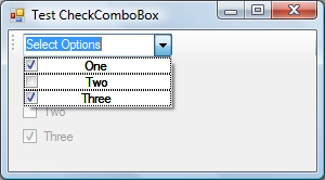
The result is that it will render our drop-down list items to look like check boxes:

Next we want to toggle the check state when one of the items is selected. So we wire up another delegate, but this time to the SelectedIndexChanged event:
this.SelectedIndexChanged +=
    new EventHandler( CheckComboBox_SelectedIndexChanged );
and implement it as follows:
void CheckComboBox_SelectedIndexChanged( object sender, EventArgs e )
{
    CheckComboBoxItem item = (CheckComboBoxItem)SelectedItem;
    item.CheckState = !item.CheckState;
    ...
}
This allows us to toggle the check box in the drop-downs, but doesn't allow the user of this control to know that anything has happened. So we also add a public event to notify the control's users of a change to the check state of an item in the drop-down list:
public event EventHandler CheckStateChanged;
and we fire this event when we toggle the state above, so the full method looks like this:
void CheckComboBox_SelectedIndexChanged( object sender, EventArgs e )
{
    CheckComboBoxItem item = (CheckComboBoxItem)SelectedItem;
    item.CheckState = !item.CheckState;
    if (CheckStateChanged != null)
        CheckStateChanged(item, e);
}
Using the Control
To use the control, you simply add it to the container of your choice and add items to it like this:
checkComboBox1.Items.Add(new CheckComboBox.CheckComboBoxItem("One", true));
checkComboBox1.Items.Add(new CheckComboBox.CheckComboBoxItem("Two", true));
checkComboBox1.Items.Add(new CheckComboBox.CheckComboBoxItem("Three", true));
To get notifications that a check state has been changed by the user:
this.checkComboBox1.CheckStateChanged +=
    new EventHandler(this.checkComboBox1_CheckStateChanged);
That can be handled like this:
private void checkComboBox1_CheckStateChanged(object sender, EventArgs e)
{
    if (sender is CheckComboBox.CheckComboBoxItem)
    {
        CheckComboBox.CheckComboBoxItem item =
            (CheckComboBox.CheckComboBoxItem)sender;
        ...
    }
}

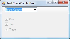
The finished sample application.

The drop-down.
Points of Interest
There was one annoyance that I'm sure there's a better solution to than the one I came up with. I'd like the TextBox portion of the control to contain fixed text and not be editable. So, as a stop-gap I initialize it to the string "Select Options" and override the CheckComboBoxItem class' ToString() method to always return that same string. This way, whichever item the user selects last, the string never changes. This does not make it non-editable.
There are many additions I'd like to make as time permits:
- Correctly align the text so it left-justifies (need to find out how to calculate the width of the check box bitmap to do this correctly)
- Add "Select All" and "Select None" items with a separator to the top of the drop-down
- Allow other control types into the drop-down (e.g. - radio buttons)
History
- 24th May, 2007: Original version posted
