Introduction
As a definition, a layout is "a specialized subtype of a View, and ultimately acts as a container for other layouts or views.” A layout contains logic (XAML and code –behind in c#) to set the position and size of child controls and elements in applications.
In this part, we will organize our views (Controls: gather and display). We will describe the way of assembling views into a horizontal or vertical stack with the StackLayout panel.
But first, remember that this is an XML description of a page. I notice that the first namespace that’s focused there is:
<ContentPage xmlns="http://xamarin.com/schemas/2014/forms"
             xmlns:x="http://schemas.microsoft.com/winfx/2009/xaml"
             xmlns:local="clr-namespace:Test"
             x:Class="Hondew.MainPage">
StackLayout
StackLayout allows you to stack views one about the others or side by side, it’s the layout the most used. Check out the docs for more details.
   <StackLayout>
        <Label x:Name="MainLable"
               HorizontalOptions="Center"
               FontSize="30"
               TextColor="Black"></Label>
    </StackLayout>
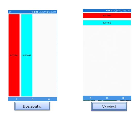
Horizontal or Vertical. The default is Vertical.
<StackLayout Orientation="Horizontal"> or <StackLayout Orientation="Vertical">
- Position with LayoutOptions
The view can be given VerticalOptions and HorizontalOptions depending on the view position relative to the layout. In this part, we will describe how we can assemble views into a horizontal or vertical stack with the StackLayout panel.
   <StackLayout Orientation="Horizontal">
           <Button x:Name="Button1" Text="Button1" BackgroundColor="Red"></Button>
           <Button x:Name="Button2" Text="Button2" BackgroundColor="Aqua"></Button>
  </StackLayout>

  <StackLayout Orientation="Vertical">
           <Button x:Name="Button1" Text="Button1" BackgroundColor="Red"></Button>
           <Button x:Name="Button2" Text="Button2" BackgroundColor="Aqua"></Button>
  </StackLayout>
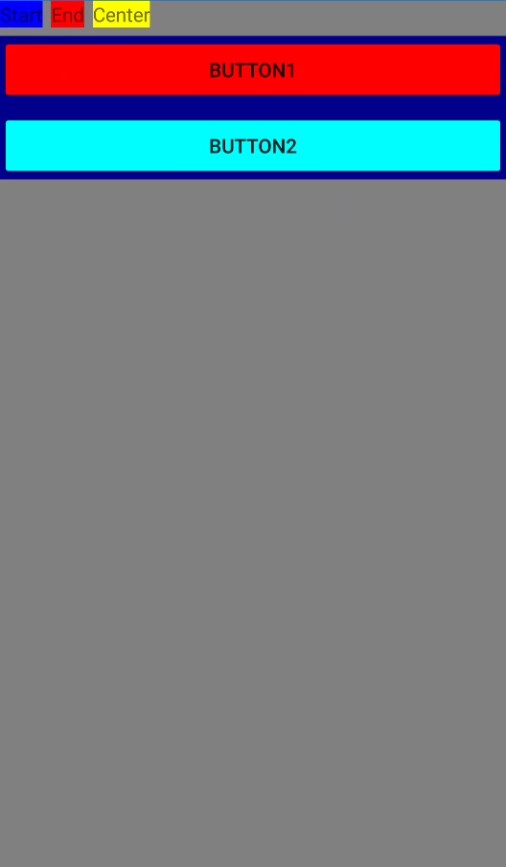
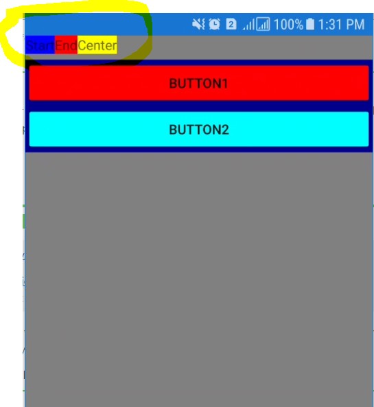
In our sample, we will assemble two buttons into a horizontal stack (first picture).
VerticalOptions and HorizontalOptions use these values:
- Start: it places the view at the beginning of the layout.
- End: it is the opposite of Start, it places it in the end.
- Fill: it places the view without a padding.
- Center: it places the viewer in the middle within the layout.
How is the view aligned with the parent view?
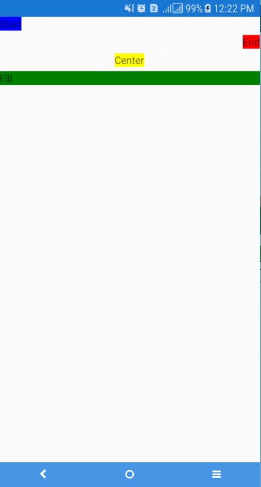
<StackLayout>
        <Label HorizontalOptions="Start" BackgroundColor="Blue" Text="Start"></Label>
         <Label HorizontalOptions="End" BackgroundColor="Red" Text="End"></Label>
         <Label HorizontalOptions="Center" BackgroundColor="Yellow" Text="Center"></Label>
         <Label HorizontalOptions="Fill" BackgroundColor="Green" Text="Fill"></Label>
</StackLayout>
And in C#
        var stack = new StackLayout();
        var labelStart = new Label()
        {
            HorizontalOptions = LayoutOptions.Start,
            BackgroundColor = Color.Blue,
            Text = "Start"
        };
        var labelEnd = new Label()
        {
          HorizontalOptions = LayoutOptions.End,
          BackgroundColor = Color.Red,
          Text = "End"
        };
        var labelCenter = new Label()
       {
        HorizontalOptions = LayoutOptions.Center,
        BackgroundColor = Color.Yellow,
        Text = "Center"
        };
          var labelFill = new Label()
      {

    HorizontalOptions = LayoutOptions.Fill,

    BackgroundColor = Color.Green,

    Text = "Fill"

};

stack.Children.Add(labelStart);

stack.Children.Add(labelEnd);

stack.Children.Add(labelCenter);

        stack.Children.Add(labelFill);

Content = stack;
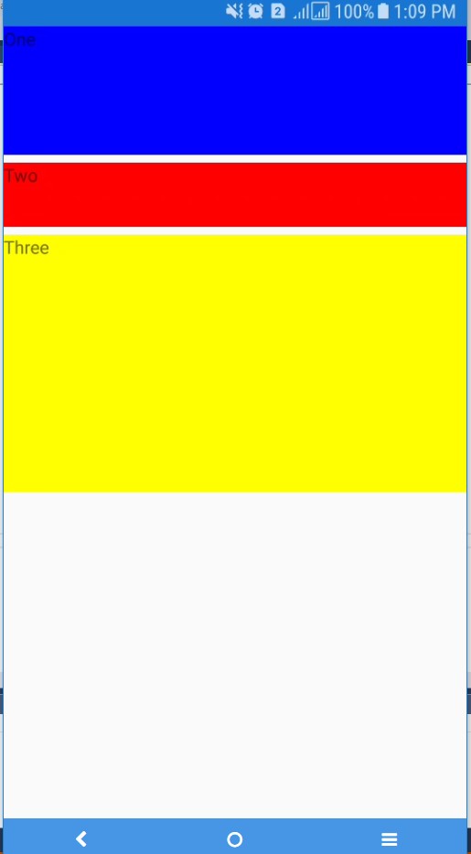
<StackLayout Orientation="Vertical">

          <Label HeightRequest="100" BackgroundColor="Blue" Text="One"/>

            <Label HeightRequest="50" BackgroundColor="Red" Text="Two"/>

           <Label HeightRequest="200" BackgroundColor="Yellow" Text="Three"/>

</StackLayout>

var stack = new StackLayout()

    {

        Orientation = StackOrientation.Vertical

    };

            var labelOne = new Label()

            {

                HeightRequest = 100,

                BackgroundColor = Color.Blue,

                Text = "One"

            };

            var labelTwo = new Label()

    {

        HeightRequest = 50,

                BackgroundColor = Color.Red,

        Text = "Two"

            };

            var labelThree = new Label()

    {

        HeightRequest = 200,

                BackgroundColor = Color.Yellow,

        Text = "Three"

    };


    stack.Children.Add(labelOne);

    stack.Children.Add(labelTwo);

    stack.Children.Add(labelThree);

            Content = stack;
It can be an integer or decimal.
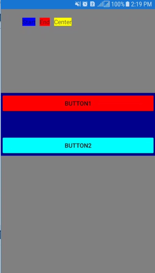
<StackLayout Orientation="Vertical" BackgroundColor="Gray">

            <StackLayout Orientation="Horizontal">

                <Label  BackgroundColor="Blue" Text="Start"></Label>

                <Label BackgroundColor="Red" Text="End"></Label>

                <Label BackgroundColor="Yellow" Text="Center"></Label>

            </StackLayout>

            <StackLayout Orientation="Vertical" BackgroundColor="DarkBlue">

                <Button x:Name="Button1" Text="Button1" BackgroundColor="Red"></Button>

                <Button x:Name="Button2" Text="Button2" BackgroundColor="Aqua"></Button>

            </StackLayout>

</StackLayout>
If we add Spacing for the first StackLyout:
<StackLayout Orientation="Horizontal" Spacing="-6"> or

<StackLayout Orientation="Horizontal" Spacing="0">
We have this view:
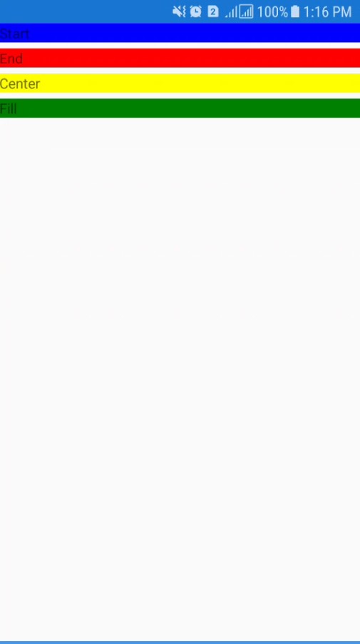
<StackLayout>

            <Label VerticalOptions="Start" BackgroundColor="Blue" Text="Start"></Label>

            <Label VerticalOptions="End" BackgroundColor="Red" Text="End"></Label>

            <Label VerticalOptions="Center" BackgroundColor="Yellow" Text="Center"></Label>

            <Label VerticalOptions="Fill" BackgroundColor="Green" Text="Fill"></Label>

</StackLayout>
Expand defines if the element will occupy more space if available.
So, we add the Suffix Expand: If the parent view is larger than the combined size of all its children, (i.e. if additional space is available), then the space is proportioned amongst child views with that suffix. Those children will "occupy" their space, but do not necessarily "fill" it. We'll have a look at this behavior in the example below.
No suffix: The children without the Expand suffix won't get additional space, even if we have available space.
This is an example:
  <StackLayout Orientation="Vertical" BackgroundColor="Gray" >

            <StackLayout Orientation="Horizontal" Spacing="10" Padding="50,20,100,150">

                <Label  BackgroundColor="Blue" Text="Start"></Label>

                <Label BackgroundColor="Red" Text="End"></Label>

                <Label BackgroundColor="Yellow" Text="Center"></Label>

            </StackLayout>

            <StackLayout Orientation="Vertical" BackgroundColor="DarkBlue" Spacing="50">

                <Button x:Name="Button1" Text="Button1" BackgroundColor="Red"></Button>

                <Button x:Name="Button2" Text="Button2" BackgroundColor="Aqua"></Button>

            </StackLayout>

</StackLayout>
AbsoluteLayout
AbsoluteLayout allows you to position a child element at an absolute requested position.
Sometimes, you want to have more control over the positioning of objects on the screen, for example, you want to anchor them to the edges of the screen or you want to overlay multiple elements.
In AbsoluteLayout, we use four values and eight flags.
Values
It can be Absolute Values (in Pixel) or Proportional Values (from 0 to 1)
-
Position:
- X: for horizontal position of the view anchor.
- Y: for the vertical position of the view anchor.
-
Size:
- Width: it’s the width of our view.
- Height: it defines the height of our view.
Values are specified as a combination of bounds and a flag. LayoutBounds is a Rectangle consisting of four values: x, y, width, height.
Flags
It can be Absolute Flags (in Pixel) or Proportional Flags (from 0 to 1)
- None: all these numbers are absolute values. (Values are in pixel).
- All: all numbers in layout bounds are propositional. (Values are from 0 to 1).
- WidthProportional: interprets the Width value as proportional and all other values as absolute.
- HeightProportional: interprets only the height value as proportional with all other values absolute.
- XProportional: interprets the X value as proportional, while treating all other values as absolute.
- YProportional: interprets the Y value as proportional, while treating all other values as absolute.
- PositionProportional: interprets the X and Y values as proportional, while the size values are interpreted as absolute.
- SizeProportional: interprets the Width and Height values as proportional while the position values are absolute.
Refer to this link for more details.
Structure:
<AbsoluteLayout>

      <BoxView Color="Olive"

               AbsoluteLayout.LayoutBounds="X, Y, Width, Height"

               AbsoluteLayout.LayoutFlags="FlagsValue" />

  </AbsoluteLayout>
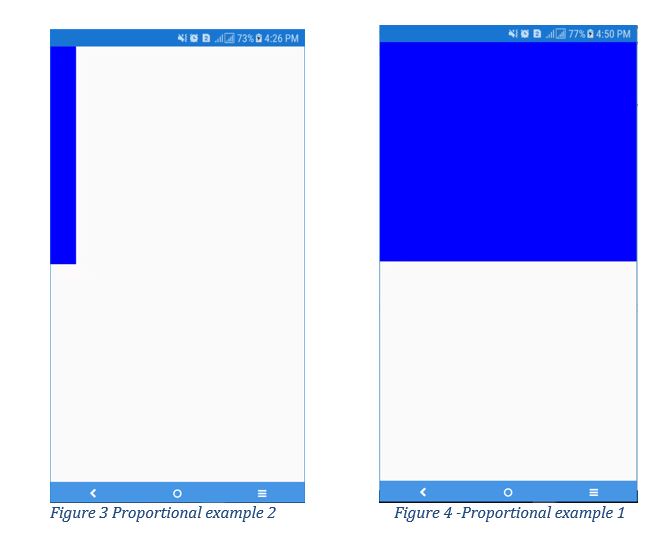
Proportional example 1:
<BoxView Color="Blue"

                 AbsoluteLayout.LayoutBounds="0, 0, 0.1, 0.5"

                 AbsoluteLayout.LayoutFlags="All" />
Proportional example 2:
<BoxView Color="Blue"

               AbsoluteLayout.LayoutBounds="0, 0, 1, 0.5"

               AbsoluteLayout.LayoutFlags="All" />
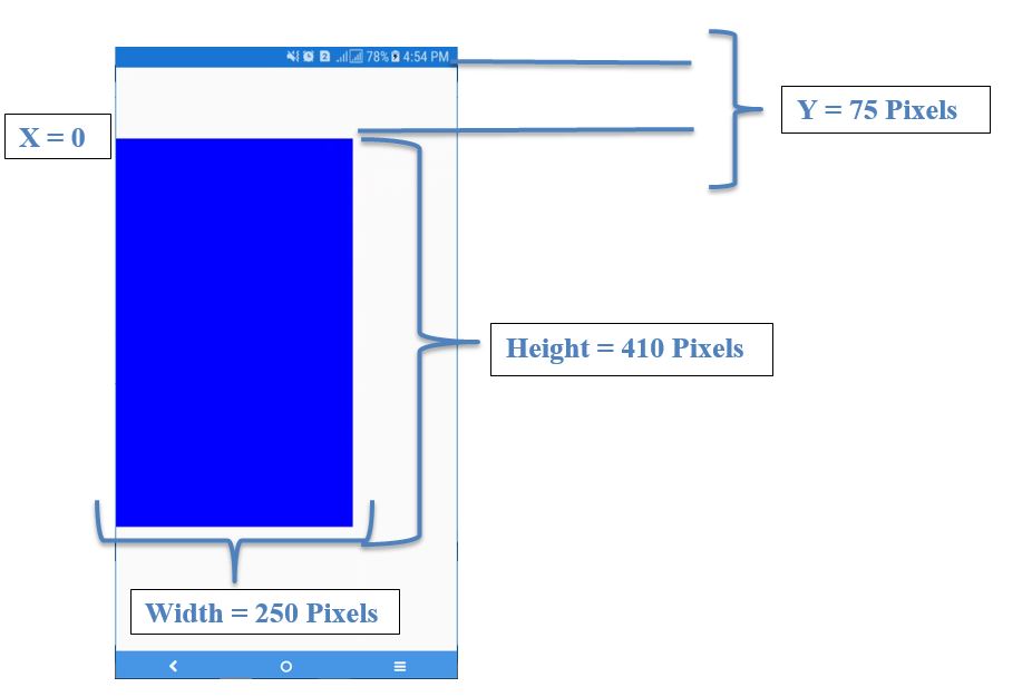
Absolute Example 1:
<BoxView Color="Blue"

                   AbsoluteLayout.LayoutBounds="0, 75, 250, 410"

                   AbsoluteLayout.LayoutFlags="None" />
RelativeLayout
RelativeLayout uses a constraint to layout children. Go to this link for more details.
Similar to AbsoluteLayout, with RelativeLayout, we can overlay elements on top of each other, but it's more powerful that AbsoluteLayout because you are able to apply a constraint to position or size of an element relative to another element. It offers more controls related to the position and size of the element.
This is an example:
Constraints
- Type: it defines if this will be relative to the parent or to a view: we use as a value: RelativeToParent or Constant or RelativeToView.
- Property: it defines what we need to use as the basis of the constraints. It can be Width or Height or X or Y.
- Factor: it is dedicated to applying to the property value, this value a decimal between 0 and 1 and can be written in this way: 0.5è.5
- Constant: it is the value to be used as an offset of the value.
- ElementName: the name of the view that the constraint relative to, in case that we used the type RelativeToView.
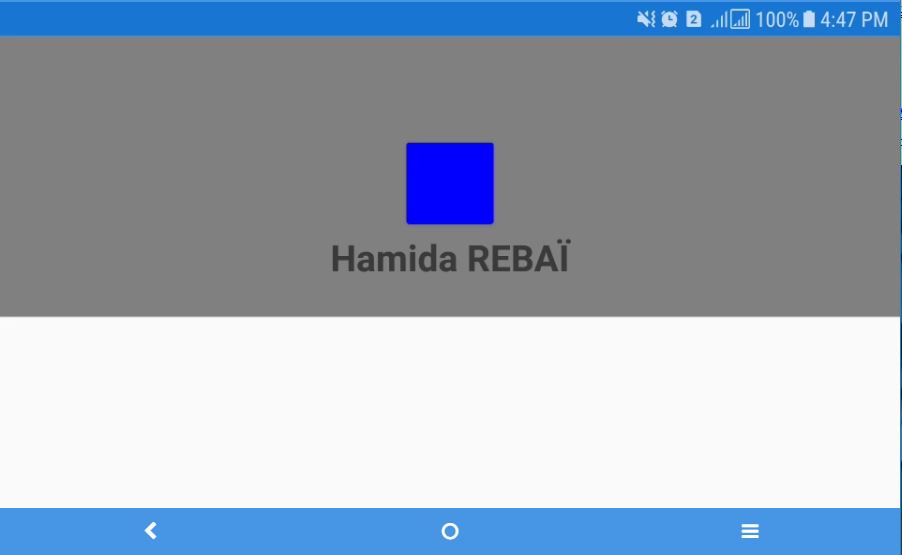
<ScrollView>
<RelativeLayout>
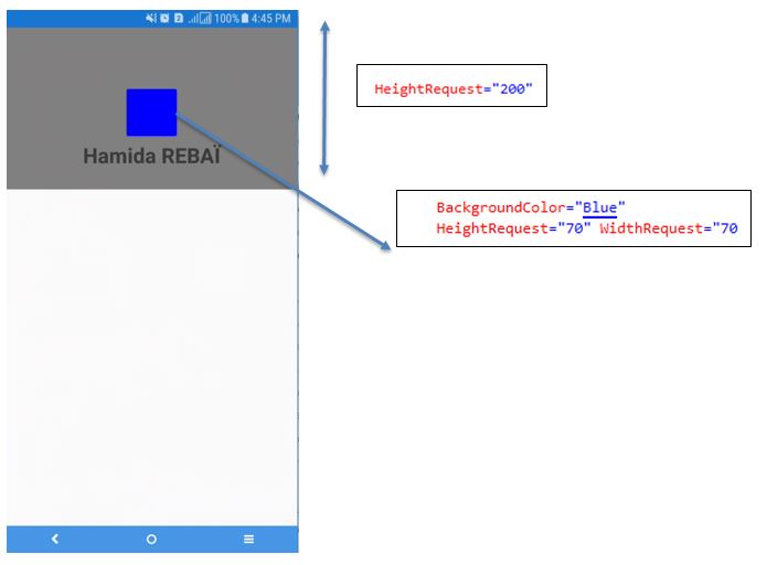
<BoxView Color="Gray" HeightRequest="200"
RelativeLayout.WidthConstraint="{ConstraintExpression
Type=RelativeToParent,
Property=Width,
Factor=1}" />
<Button BorderRadius="35"
x:Name="ImageCircleBack"
BackgroundColor="Blue"
HeightRequest="70" WidthRequest="70"
RelativeLayout.XConstraint="{ConstraintExpression Type=RelativeToParent, Property=Width, Factor=.5, Constant = -35}"
RelativeLayout.YConstraint="{ConstraintExpression Type=RelativeToParent, Factor=0, Property=Y, Constant=70}" />
<Label Text="Hamida REBAÏ" FontAttributes="Bold" FontSize="26" HorizontalTextAlignment="Center"
RelativeLayout.YConstraint="{ConstraintExpression Type=RelativeToParent, Property=Y, Factor=0, Constant=140}"
RelativeLayout.WidthConstraint="{ConstraintExpression Type=RelativeToParent, Property=Width, Factor=1}" />
</RelativeLayout>
</ScrollView>
And we get this result:
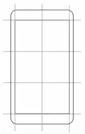
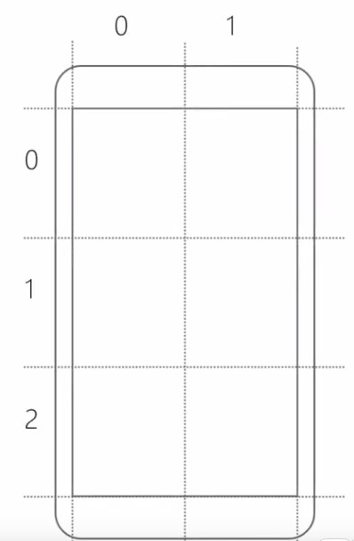
Grid
Grid is like a table. It’s more is more versatile than a StackLayout, giving two dimensions to work with: columns and rows. It's also easy to align views across different rows. You can go to this link for more details.
In this part, we will learn how to create a Grid and specify rows and columns.
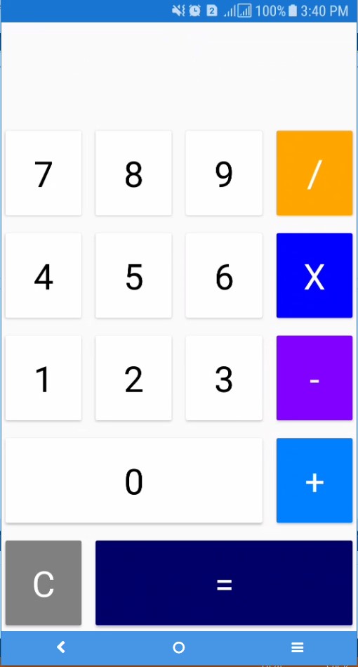
<Grid>
<Grid.RowDefinitions>
<RowDefinition/>
<RowDefinition/>
<RowDefinition/>
<RowDefinition/>
<RowDefinition/>
<RowDefinition/>
</Grid.RowDefinitions>
<Grid.ColumnDefinitions>
<ColumnDefinition/>
<ColumnDefinition/>
<ColumnDefinition/>
<ColumnDefinition/>
</Grid.ColumnDefinitions>
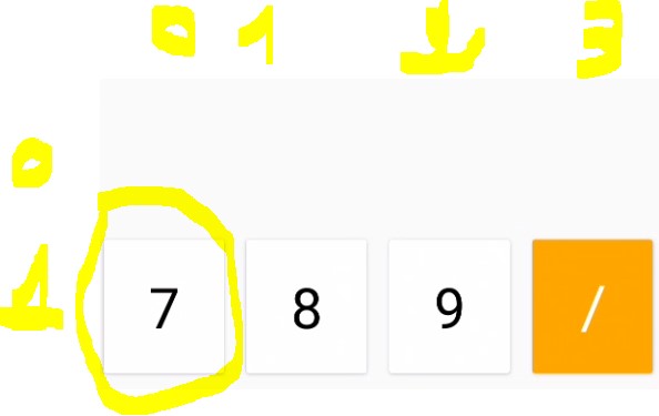
<Button Text="7" Grid.Row="1" Grid.Column="0"
BackgroundColor="White" TextColor="Black"
FontSize="36" BorderRadius="0" />
<Button Text="8" Grid.Row="1" Grid.Column="1"
BackgroundColor="White" TextColor="Black"
FontSize="36" BorderRadius="0" />
<Button Text="9" Grid.Row="1" Grid.Column="2"
BackgroundColor="White" TextColor="Black"
FontSize="36" BorderRadius="0" />
<Button Text="4" Grid.Row="2" Grid.Column="0"
BackgroundColor="White" TextColor="Black"
FontSize="36" BorderRadius="0" />
<Button Text="5" Grid.Row="2" Grid.Column="1"
BackgroundColor="White" TextColor="Black"
FontSize="36" BorderRadius="0" />
<Button Text="6" Grid.Row="2" Grid.Column="2"
BackgroundColor="White" TextColor="Black"
FontSize="36" BorderRadius="0" />
<Button Text="1" Grid.Row="3" Grid.Column="0"
BackgroundColor="White" TextColor="Black"
FontSize="36" BorderRadius="0" />
<Button Text="2" Grid.Row="3" Grid.Column="1"
BackgroundColor="White" TextColor="Black"
FontSize="36" BorderRadius="0" />
<Button Text="3" Grid.Row="3" Grid.Column="2"
BackgroundColor="White" TextColor="Black"
FontSize="36" BorderRadius="0" />
<Button Text="0" Grid.Row="4" Grid.Column="0" Grid.ColumnSpan="3"
BackgroundColor="White" TextColor="Black"
FontSize="36" BorderRadius="0" />
<Button Text="/" Grid.Row="1" Grid.Column="3"
BackgroundColor="#FFA500" TextColor="White"
FontSize="36" BorderRadius="0" />
<Button Text="X" Grid.Row="2" Grid.Column="3"
BackgroundColor="#0000ff" TextColor="White"
FontSize="36" BorderRadius="0" />
<Button Text="-" Grid.Row="3" Grid.Column="3"
BackgroundColor="#8000ff" TextColor="White"
FontSize="36" BorderRadius="0" />
<Button Text="+" Grid.Row="4" Grid.Column="3"
BackgroundColor="#0080ff" TextColor="White"
FontSize="36" BorderRadius="0" />
<Button Text="C" Grid.Row="5" Grid.Column="0"
BackgroundColor="#808080" TextColor="White"
FontSize="36" BorderRadius="0" />
<Button Text="=" Grid.Row="5" Grid.Column="1" Grid.ColumnSpan="3"
BackgroundColor="#000066" TextColor="White"
FontSize="36" BorderRadius="0" />
</Grid>
We start by defining the number of Rows and Columns using these tags inside the Grid.
<Grid.RowDefinitions>
<RowDefinition/>
<RowDefinition/>
<RowDefinition/>
<RowDefinition/>
<RowDefinition/>
<RowDefinition/>
</Grid.RowDefinitions>
<Grid.ColumnDefinitions>
<ColumnDefinition/>
<ColumnDefinition/>
<ColumnDefinition/>
<ColumnDefinition/>
</Grid.ColumnDefinitions>
After that, we will arrange views inside it.
For example:
<Button Text="7" Grid.Row="1" Grid.Column="0" BackgroundColor="White" TextColor="Black" FontSize="36" BorderRadius="0" />
This button will be placed in the second row (Grid.Row="1") and first column (Grid.Column="0").
To define the Height of the Row, we use the Height attribute:
<Grid.RowDefinitions>

  <RowDefinition Height="Auto" />
This value can be Auto or 100 or *, we can use 2* (even n*).
To define the Width of the Column, we use the Width attribute:
<Grid.ColumnDefinitions>

                <ColumnDefinition Width="*"/>
This value can be Auto or 100 or *, we can use 2* (even n*).
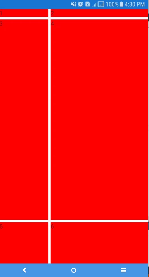
<Grid>

            <Grid.RowDefinitions>

                <RowDefinition Height="Auto" />

                <RowDefinition Height="*" />

                <RowDefinition Height="100" />

            </Grid.RowDefinitions>

            <Grid.ColumnDefinitions>

                <ColumnDefinition Width="*"/>

                <ColumnDefinition Width="2*"/>

            </Grid.ColumnDefinitions>

            <Label Grid.Column="0" Grid.Row="0" Text="1" BackgroundColor="Red" ></Label>

            <Label Grid.Column="1" Grid.Row="0" Text="2" BackgroundColor="Red"></Label>

            <Label Grid.Column="0" Grid.Row="1" Text="3" BackgroundColor="Red"></Label>

            <Label Grid.Column="1" Grid.Row="1" Text="4" BackgroundColor="Red"></Label>

            <Label Grid.Column="0" Grid.Row="2" Text="5" BackgroundColor="Red"></Label>

            <Label Grid.Column="1" Grid.Row="2" Text="6" BackgroundColor="Red"></Label>

        </Grid>
ScrollView
ScrollView is a scrolling content.
Without the use of ScrollView:
<StackLayout>

            <BoxView Color="Blue" HeightRequest="200"/>

            <BoxView Color="Green" HeightRequest="200"/>

            <BoxView Color="Firebrick" HeightRequest="200"/>

            <BoxView Color="YellowGreen" HeightRequest="300"/>

</StackLayout>
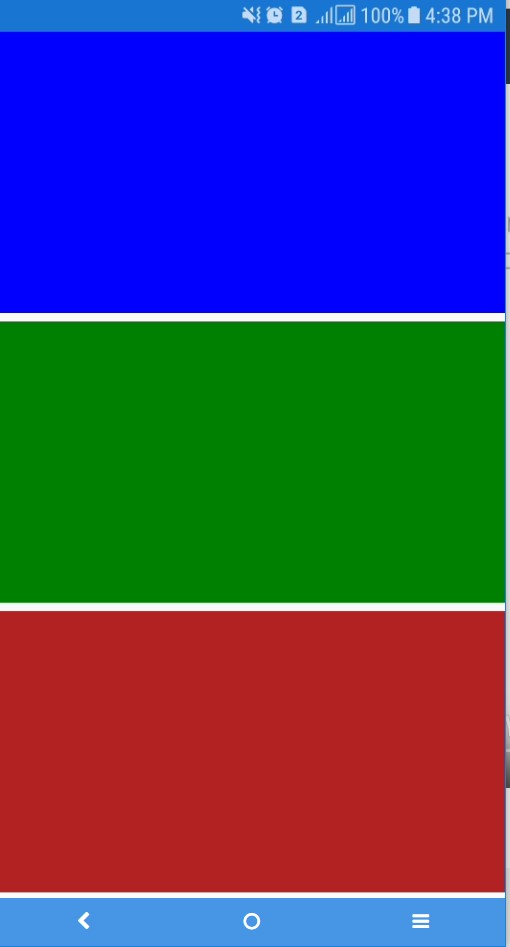
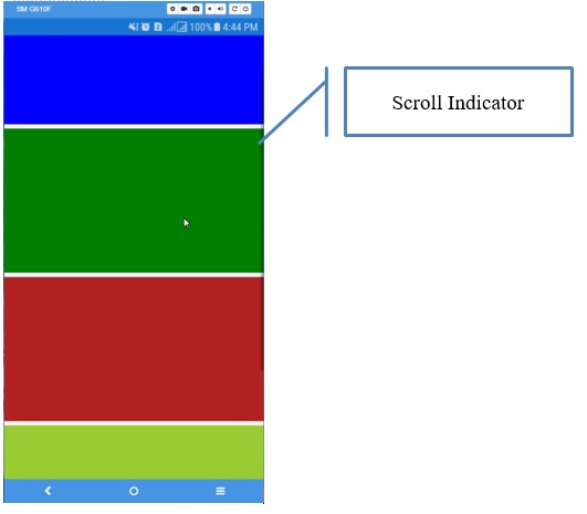
In our case, the Yellow Green BoxView is not displayed, so when we add the ScrollView, we will be able to get all the content by scrolling. ScrollView will add scroll indicators to the UI. We can use the orientation property if I want to request the horizontal Scroll Indicator or Vertical to display it vertically or both to display both of them.
<ScrollView Orientation="Horizontal"> or <ScrollView Orientation="Vertical"> or <ScrollView Orientation="Both">

<ScrollView>

            <StackLayout>

                <BoxView Color="Blue" HeightRequest="200"/>

                <BoxView Color="Green" HeightRequest="200"/>

                <BoxView Color="Firebrick" HeightRequest="200"/>

                <BoxView Color="YellowGreen" HeightRequest="300"/>

</StackLayout>

</ScrollView>
For more details, go to this link.
ScrollView is most used to display a list (ListView).
We will talk about Frame in the next article).
I am Rebaï Hamida, Microsoft MVP in Visual Studio and Development Technologies.
I'm a software architect and developer who like to build open source projects, writing articles, learning and teaching best practices. you can find out in my blog : http://hamidarebai.blogspot.com/
Innovative Software engineer : hands-on, competent software engineer, passionate and proficient C# developer, offering more than seven years of experience in the full software development lifecycle – from concept through delivery of next-generation applications and customized solutions, producing code to a consistently high standard and testing software across a variety of platforms.
Expert in advanced development methodologies, tools and processes contributing to the design and roll-out of cutting-edge software applications.
Known for excellent troubleshooting skills – able to analyze code and engineer well-researched, cost-effective and responsive solutions.
Success is only a consequence of a continuous work and remarkable intelligence.
I believe that I have to make a change in my country, I can’t live without leaving my footprint.


 Submit an article or tip