Introduction
I initially came up with this concept when working on a device that is used for cataract surgery. There was the image of the eye, and over the image there were a lot of graphic elements that displayed information about the measurements of the eye (sphere, cylinder, axis), and helped in alignment, and showed that there was a quality reading. The front end was WPF, which is why I was hired to work on the project. I decided that the best way to do this was to overlay the eye image with a Canvas for each graphics element, and to keep each Canvas simple.
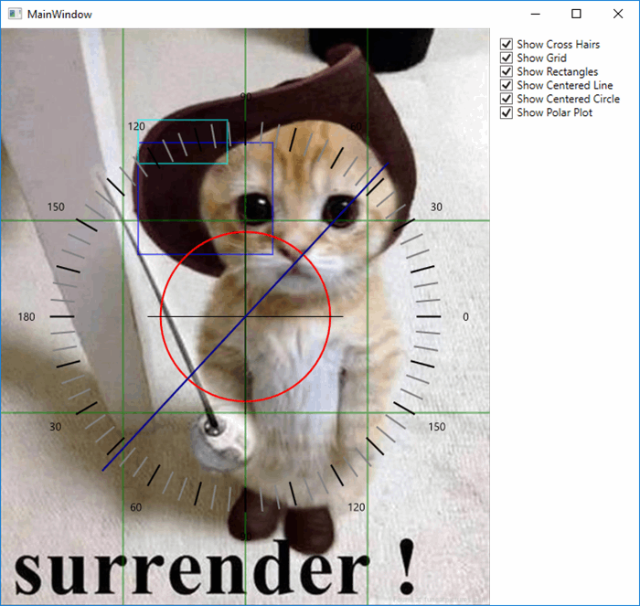
An Example of a Canvas
There are quite a few of these Graphics Canvas examples in the sample. They are all pretty similar.
This is the implementation for the requirement to displayed rectangles over an image:
public class RectangleObserableCollectionCanvas : Canvas
{
    static RectangleObserableCollectionCanvas()
    {
        IsHitTestVisibleProperty.OverrideMetadata(typeof(RectangleObserableCollectionCanvas),
    new FrameworkPropertyMetadata(false));
        BackgroundProperty.OverrideMetadata(typeof(RectangleObserableCollectionCanvas),
    new FrameworkPropertyMetadata(new SolidColorBrush(Colors.Transparent)));
    }

    public static readonly DependencyProperty RectanglesProperty =
            DependencyProperty.Register("Rectangles",
        typeof(ObservableCollection<Tuple<Rect, Color>>),
                typeof(RectangleObserableCollectionCanvas),
        new PropertyMetadata(null, ObservableCollectionChangedCallback));
    public ObservableCollection<Tuple<Rect, Color>> Rectangles
{
    get { return (ObservableCollection<Tuple<Rect, Color>>)GetValue(RectanglesProperty); }
    set { SetValue(RectanglesProperty, value); }
}

    public static readonly DependencyProperty ShowProperty =
            DependencyProperty.Register("Show", typeof(bool),
    typeof(RectangleObserableCollectionCanvas),
    new PropertyMetadata(true, PropertyChangedCallback));
    public bool Show
{
    get { return (bool)GetValue(ShowProperty); }
    set { SetValue(ShowProperty, value); }
}

    public static readonly DependencyProperty ScaleProperty =
            DependencyProperty.Register("Scale", typeof(double),
    typeof(RectangleObserableCollectionCanvas),
    new PropertyMetadata(1.0, PropertyChangedCallback));
    public double Scale
{
    get { return (double)GetValue(ScaleProperty); }
    set { SetValue(ScaleProperty, value); }
}

    public static readonly DependencyProperty StrokeThicknessProperty =
            DependencyProperty.Register("StrokeThickness", typeof(double),
    typeof(RectangleObserableCollectionCanvas),
    new PropertyMetadata(1.0, PropertyChangedCallback));
    public double StrokeThickness
{
    get { return (double)GetValue(StrokeThicknessProperty); }
    set { SetValue(StrokeThicknessProperty, value); }
}

    public static readonly DependencyProperty StrokeDashStyleProperty =
            DependencyProperty.Register("StrokeDashStyle", typeof(DoubleCollection),
    typeof(RectangleObserableCollectionCanvas),
    new PropertyMetadata(new DoubleCollection { }, PropertyChangedCallback));
    public DoubleCollection StrokeDashStyle
{
    get { return (DoubleCollection)GetValue(StrokeDashStyleProperty); }
    set { SetValue(StrokeDashStyleProperty, value); }
}

    protected override void OnRenderSizeChanged(SizeChangedInfo sizeInfo)
    {
        base.OnRenderSizeChanged(sizeInfo);
        Redraw();
    }

    private static void ObservableCollectionChangedCallback(DependencyObject dependencyObject,
        DependencyPropertyChangedEventArgs dependencyPropertyChangedEventArgs)
    {
        var rectangleObserableCollectionCanvas =
        (RectangleObserableCollectionCanvas)dependencyObject;
        rectangleObserableCollectionCanvas.Rectangles.CollectionChanged += (s, e) =>
            rectangleObserableCollectionCanvas?.Redraw();
        rectangleObserableCollectionCanvas?.Redraw();
    }

    private static void PropertyChangedCallback(DependencyObject dependencyObject,
    DependencyPropertyChangedEventArgs dependencyPropertyChangedEventArgs)
    {
        (dependencyObject as RectangleObserableCollectionCanvas)?.Redraw();
    }

    private void Redraw()
    {
        Children.Clear();
        if (!Show) return;
        try
        {
            if (Math.Abs(ActualHeight) < 1 || Math.Abs(ActualWidth) < 1) return;

            foreach (var rectangleProperties in Rectangles)
            {
                var rectangle = new System.Windows.Shapes.Rectangle
                {
                    Stroke = new SolidColorBrush(rectangleProperties.Item2),
                    HorizontalAlignment = HorizontalAlignment.Left,
                    VerticalAlignment = VerticalAlignment.Top,
                    StrokeDashArray = StrokeDashStyle,
                    Width = rectangleProperties.Item1.Width,
                    Height = rectangleProperties.Item1.Height,
                    StrokeThickness = StrokeThickness / Scale,
                };
                Canvas.SetLeft(rectangle, rectangleProperties.Item1.Left);
                Canvas.SetTop(rectangle, rectangleProperties.Item1.Top);
                Children.Add(rectangle);
            }
        }
        catch { }
    }
}
The changes to most of the DependencyProperties results in the ReDraw method being called. This Control has the following DependencyProperties that allow easy change to the look:
StrokeThickness: specifies the thickness of the border of the rectanglesStrokeDashStyle: specifies the dash style for the border of the rectanglesScale: speicied the scaling of the rectangle borders. This is required because this particular control is used in a Zoom and Pan control, and meant that the thickness of the borders was visually the same no matter what the zoom level was.Show: this determines if the rectangle is shown or not. Could use Visibility, but many times want to bind to a boolean value, and so would require a converter.
In this control the major property is the Rectangles DependencyProperty. I used the ObservableCollection for the DependencyProperty because if there was a change in the collection, the display needed to be refreshed (meaning the ReDraw method is called).I also used a Tuple for the items in this collection because of the design of the project, which made it very difficult to have a class that was shared between the ViewModel and the View. The two properties of the Tuple is Rect class that specifies the postiion of the rectangle and its Height and Width, and the second property is the color for the border.
Using the code
This is just an example of the XAML for one of the controls that is used in this project:
<graphicsSample:RectangleObserableCollectionCanvas Grid.Column="0"
                         HorizontalAlignment="Stretch"
                         VerticalAlignment="Stretch"
                         StrokeThickness="2"
                         Opacity=".5"
                         Rectangles="{Binding Rectangles}"
                         Show="{Binding ElementName=RectangleObserableCollectionCanvasCheckBox,
                                                     Path=IsChecked}" />
This sample also does not show the use of all the properties available for the Control..
Other Controls Included in the Sample
Here is a list of the Canvas derived classes for displaying graphic included in the sample project. Not all are actually used in the MainWindow:
CenteredCircleCanvas: Displays a circle center on the image.CenteredCrossHairCanvas: Displays a cross hair centered on the image that does not have to extend to the edgesEndMarkerCanvas: Used to display a plus or minus at the end of a centered line.GridlineesCanvas: Displays a grid over the image.PolarPlotCanvas: Displays a compass that has two sizes of tick marksPolarPlotCanvas2: Displays a compass that has three sizes of tick marksRadialMouseMoveCanvas: Used with the polar plots to move the compassRectangleObserableCollectionCanvas: draws rectangles over the image.TextPath: Displays text over the imageTickMarkCanvas: Puts a little marker that is supposed to be outside the compass to indicate points of interest.
They tend to have very different properties because they are different complexities, and different needs. The most complex one is the PolarPlotCanvas which has properties to specify the tick marks and font for the numbers.
History
- 2016-09-21: Initial Version
determines
Has been working as a C# developer on contract for the last several years, including 3 years at Microsoft. Previously worked with Visual Basic and Microsoft Access VBA, and have developed code for Word, Excel and Outlook. Started working with WPF in 2007 when part of the Microsoft WPF team. For the last eight years has been working primarily as a senior WPF/C# and Silverlight/C# developer. Currently working as WPF developer with BioNano Genomics in San Diego, CA redesigning their UI for their camera system. he can be reached at qck1@hotmail.com.


 Submit an article or tip